
Weekly 2-Min CRO & UX insights for higher eCommerce conversions
Discover essential UX best practices and their significance
Master the art of captivating users’ hearts and wallets
Get industry-specific answers to your burning questions


.svg)


How we can help boost your online sales
We reveal common eCommerce gaps that hinder your sales growth
You receive actionable optimization tips and industry insights
Watch your sales soar after implementing our tips!
Inbox us your questions!
Have burning questions or simply curious about a UX topic? We're here to provide guidance! Just hit 'Reply' to our newsletter, and we'll feature your questions in our upcoming editions.
Each week, one of our team members delves into a fresh and pertinent topic within the realm of eCommerce CRO & UX
Take a glimpse at the insights we provide:
Effective landing page design
Balancing user experience with conversion goals
Simple things you can do today to improve eCR
Key strategies to boost conversions on mobile devices
Emerging technologies and UX trends


a new, relevant topic related to the CRO & UX world. Follow along and learn how different seemingly insignificant details can change the user experience
for the better and help you boost your sales!

you do that!


have no issues finding needed products.
.avif)
.png)
.avif)
.png)
Try to combine long menus into broad categories
to avoid having an overwhelming number of categories presented all at once.
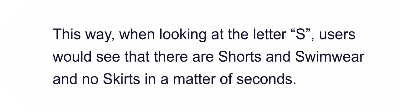
relevant products sooner.
.avif)
relevant products sooner.
.avif)
Senior UX Researcher
What our readers are saying
I look forward to this newsletter every week. It's a goldmine of UX insights and tips that have made a real impact on my work. Highly recommended!
Sarah Mitchell
eCommerce Manager
I've subscribed to many UX newsletters, but this one stands out. It's well-curated and always provides fresh perspectives on user experience. I can't thank you enough for the valuable content!
Emily Anderson
Graphic Designer
The quality of content in this UX newsletter is exceptional. I've learned so much from it, and it's become an invaluable resource for my UX projects.
Benjamin Carter
Marketing Manager
Discover how small details can enhance user experience and boost sales!
Meet the content creators


Additional industry insights and practical solutions from eCommerce experts for your success

Read Blog
Digital solutions appraised by the community, marketing and analytics insights, UX strategies, and case studies worth reading.

Watch Webinars
Recordings and upcoming webinars covering industry trends and how-tos, hosted by eCom experts to help you keep up with the latest trends.

Explore Ebooks & Checklists
Growth knowledge library with useful resources based on dozens of case studies and success recipes by our digital growth gurus.
Looking for something else?
Here are two other ways we can help you:
We are a team of 14 seasoned UX experts with a robust portfolio and a demonstrable track record of excellence in the field of UX, spanning various industries worldwide.


