As more brands and retailers than ever are leveraging the potential of eCommerce, the ability to quickly create and deliver fresh content is crucial if you want to succeed. With Magento (Adobe Commerce), merchants usually need to hire designers and developers for content development due to the limited functionality. Hiring resources implies additional time and costs. To allow Magento users to create content, the Magento team introduced Magento Page Builder.
If the customer’s content manager needs to change some part of the page, like the title or featured product, they can do that in the Magento admin without the involvement of developers.
We’ve prepared a Magento 2 Page Builder guide for its default content management functionality to help you rapidly create, manage, and customize content with pre-built controls. Get to know the Magento Page Builder extension in and out, and start building modern pages on your website with minimal effort and time investment.
What is Magento 2 Page Builder?
Magento 2 Page Builder is an extension that allows structuring, designing, and managing responsive content-rich landing pages and requires minimal effort and technical expertise. It is often the tool you use to design your Magento homepage and other key landing pages. Magento’s Page Builder has a quick and intuitive interface for creating catalog content, content for products, as well as whole content pages.
Key features and benefits of Magento 2 Page Builder
Drag-and-drop functionality
The page builder has a versatile drag-and-drop interface. By adding columns and shifting objects around the page with pre-built controls, also called content types, you can quickly create a wide range of layouts. Drag and drop functions are available for columns, pictures, headings, buttons, and more to improve the website’s new and old content.
Live previews
Real-time editing and live previews allow you to see how the content will appear in the frontend immediately. That makes it easy for the developers to check how their creation in the backend looks on the storefront even before the page is published to catch errors and make improvements before the launch.
New element creation
With the use of Page Builder, basic elements, such as text, headings, buttons, dividers, HTML code, and many more, can be quickly built. In addition, there are a lot of other components, as well as element customizations. You can tailor the added content by designing borders, fonts, and custom text styling variations.
No coding skills required
No need for developers to write complicated codes to import products and add product lists on the website. Magento 2 Page Builder offers to build and easily edit full-page layouts supported for CMS pages, products, and categories right from the frontend, which makes this extension an excellent tool for eCommerce merchants without extensive coding knowledge.
Easy-to-use interface
You can easily place all content elements on the page using drag & drop functionality and change inline texts. With Page Builder Magento’s user-friendly interface and content editor, creating and launching your content is very simple.
Rich content for customer engagement
Businesses can quickly build CMS pages and dynamic blocks with promotional content that engage website users. Custom layouts and various content kinds allow for swift deployment of content updates to adapt to user behavior in real time.
Content management
Build a page now and go live at a designated date! Page Builder on Magento allows you to schedule, preview, and publish content changes at any moment and automate your content creation and management process.
What content realization approaches does Page Builder provide?
With Page Builder, you can create content with the following approaches:
- Drag and drop of rebuild Page builder elements
- By inserting the HTML Code element and pasting your code into it
- By creating a widget and inserting that into the page.
What is the drag-and-drop approach?
Drag and drop is an approach that allows users to create content via Page Builder just by dragging and dropping the built-in Page Builder elements via the admin panel. In the best-case scenario, there’s no need for a developer to add content to a page.
Whether new to Commerce or an experienced user, we encourage you to complete the official Page Builder tutorial. The official tutorials provide all the essential information required to start working with the Page Builder elements.
In some cases, for example, when it is a requirement, it is necessary to create a custom content type representing some manageable page block or element in the page builder.
Custom content type pros
- Can improve the page builder’s ability to create rich content
- It can be styled for both the admin view and frontend view, meaning that the admin preview will be more or less the same as the content rendered on a frontend
- Admin can use custom content types to build the page with a proper preview.
Custom content type cons
- Development is complicated and time-consuming
- ScandiPWA is not compatible with custom content types, meaning that you should develop the ScandiPWA compatibility component too
- Custom content type adjustments will require both admin/frontend changes to preview the changes in both admin/frontend.
To get familiar with custom content types, check our guide about Magento Page Builder content types.
Drag and drop pros
- You can add elements to a page by dragging and dropping
- Users can change page contents, add images, button links, and paddings
- In most cases, no coding knowledge is required
- Magento admin users can use it
- Relatively easy to use
- It has official tutorials and documentation.
Drag and drop cons
- It becomes complicated with more advanced content
- High risk of losing styles or attribute values
- Difficult to modify styles for existing content.
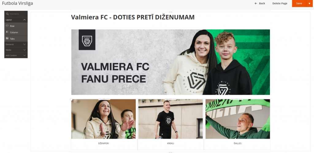
Refer to the example below for the page content we added with the drag & drop approach:
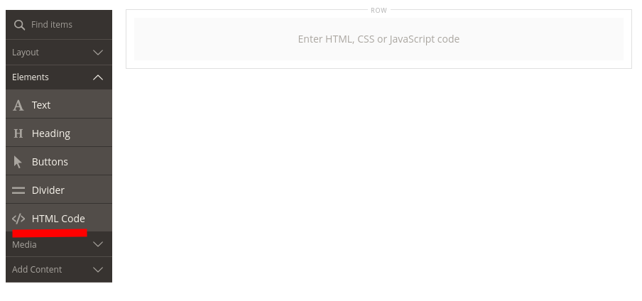
What is the HTML code approach?
You can select Elements → HTML Code in Page Builder and add your code there. However, this is a good approach for minimal use cases, like adding a tracking script or video embed code.
Remember that the user must understand the page structure, and it should be hard to mess it up by breaking something in the code.
If the element is simple, try creating it by drag and drop. Use the widget approach if the element you need to add to the page is more complex.
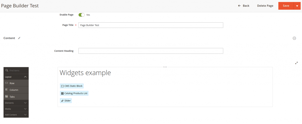
What is the widgets approach?
The widgets approach is the approach that allows a user to structure the page by adding multiple widgets that represent page blocks. Content of any complexity can be implemented as widgets by a developer and added to a page by the user.
Widgets are the recommended approach to implementing CMS content.
Widgets pros
- It can be used at any level of content complexity
- Relatively easy to maintain
- Can be safely configured by a user with no risk of losing styles
- Developers can implement any HTML
- Have access to the backend, which implies any project data can be used in the widget
- Can add dynamic content
- Can use translations
- Supported by ScandiPWA.
Widgets cons
- Requires developer resources for implementing content
- Requires developers for content change or style change if not covered by widget configurations
- No preview in the admin panel when rendering widget contents via ScandiPWA.
How to choose an approach?
Since Page Builder provides multiple approaches for content implementation, it is necessary to understand how to choose the right one.
Content blocks that should be manageable can be adjusted via widget configurations by the user via the admin panel. Widget configurations should be a part of widget implementation; all manageable block parts have to be defined before widget development.
Use drag and drop when
- The content consists of simple elements, texts, buttons, and images
- There’s no complicated overlapping or positioning of elements or animations
- There’s no dynamic content, like a reference to some product or featured category.
Use plain HTML when
- A single code block has to be added, like tracking code to video embed.
Use widgets when
- Contents are complicated
- You need to add a CSS class to a Page Builder element in the admin to get the desired effect or style
- Content implementation requires an advanced element structure
- Contents have dynamic elements.
Choose the drag-and-drop approach for basic contents and the widget approach whenever possible. To understand how to add widgets to the Magento 2 or ScandiPWA theme, please check the How to implement a widget in the Magento CMS guide.
Page Builder guide simplified: Page Builder panel
When Magento Page Builder is enabled on your website, you can begin the content creation process. In this section, let’s look at all content types in the Page Builder panel.
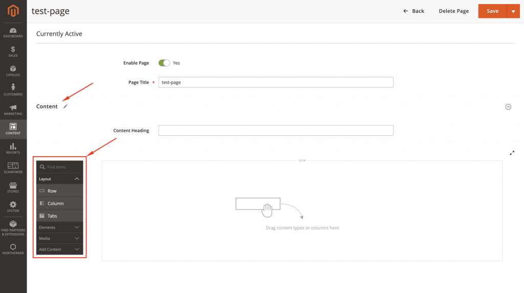
How to access the menu
To access the menu, you should be logged in to the Magento Admin Panel.
Go to Admin Panel -> Content -> Pages -> find the “Action” column -> choose “Edit” from the drop-down.
Once you are redirected to the Page customization, scroll down to find and expand the “Content” section.
Page Builder side menu should appear next to the Admin Panel.
General configurations
- Move: allows you to drag-and-drop selected elements across the page to place them between other components
- Edit: opens a menu with Advanced options for the selected element customization
- Hide: allows you to hide the selected field so it’s not presented on the Page front end, but is kept on the back end panel
- Duplicate: make the same element with all the configurations and paste it below
- Remove: delete the selected element with all configuration and adjustments.
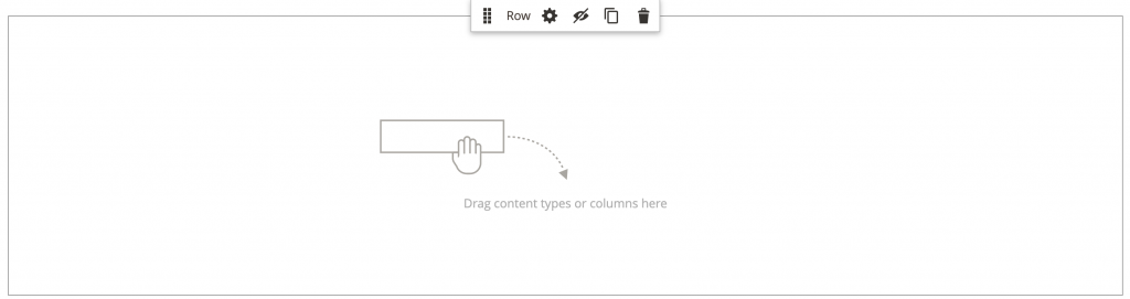
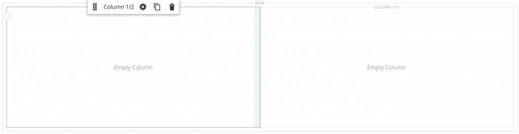
Layout
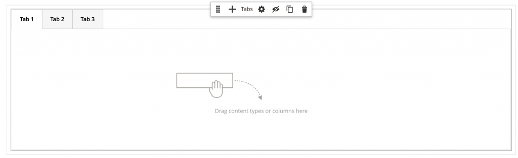
Using the Layout section, page admins can drag a content type from the panel to add rows, columns, or tabs. Once the action is performed, you’ll see a container with a toolbox to format the content type. By default, the Page Builder stage is empty. You can position layout content types anywhere on the page near layout containers by dragging them from the panel to the stage.
Row
Edit: expands the menu with a variety of extra configurations according to the selected element. Includes customizations for Appearance, Background, Parallax Background, and Advanced options, e.g., Padding.
Column
Grid size: determines the maximum number of columns available per one side. Adjustable by middle lane drag-and-drop functionality.
Tabs
Allows keeping content in separate tabs. Add: adds a tab to the element.
Elements
From the Elements field, you can add text, headings, buttons, dividers, and HTML code to any layout container. When you drag a content type from the panel to a row, column, or tab placed on the stage, a container will appear. To get the appropriate settings for the type, use the content type toolbox.
- Text: original field of input with standard options of text customization, widget insertion, etc.
- Heading: a field for page Heading and alignment adjustments
- Buttons: adds a customizable button with a variety of options: Text, Link, Padding, CSS Styling, etc.
- Divider: creates a line for content types separation on the frontend
- HTML Code: gives the option to add custom HTML, declare a CSS class that you can apply to an element on the page, or add a code snippet code for a logo, button, or banner that you received from a third-party provider.
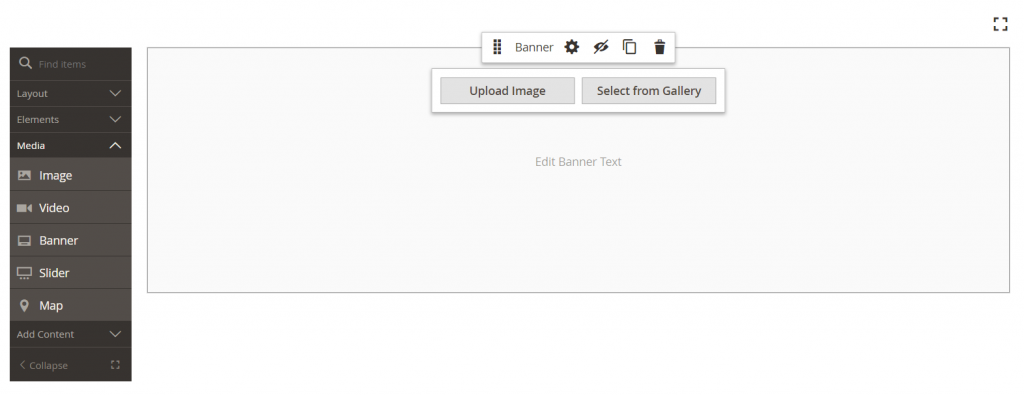
Media
You can add banners, images, videos, sliders, and Maps from the Media section to any layout container on Page Builder. When you drag a media content type from the panel to the stage, you will also be able to access the toolbox.
Add content
This section works very similarly to the sections above and allows you to add pre-existing content such as dynamic blocks and products to the Page Builder stage.
Magento Page Builder how-to’s
In this section, we’ll walk you through the steps to create a simple banner, create a category banner, and create a product grid using Page Builder.
Create a simple banner
1) Drag a Banner placeholder to the stage
2) Hover over the banner container and choose Edit
3) Select “Collage Center” under the Appearance section
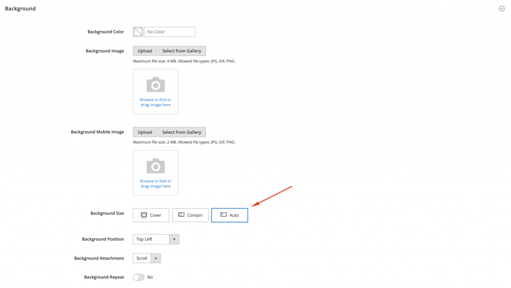
4) Add desktop and mobile background images in the Background section. Select Background Size as Cover and Background Position as Center
5) Add a link in banner Settings from the Content section. Change the Link variation to a Category and select the existing Product Listing Page
6) Adjust Margins and Padding in the Advanced section if further customization is required.
Make sure that each Row has “Auto” selected for the Background Size option. This functionality allows for better user experience while resizing the browser window.
Expected result
End-users should be redirected to a certain category, once the banner is selected on Store View.
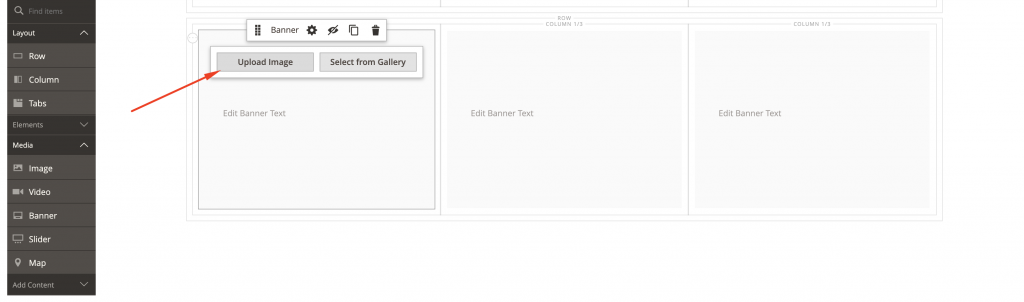
Create a Category banner
1) Add Category from the Layout section in the menu to the existing Row
2) Change the Grid Size value
3) Add one more Column to the existing row with columns with pre-set value
4) Drag-and-Drop Banner content type to each created column and upload images from the hover menu of the banner
In case of image identical resolution, a customized banner could be Duplicated and moved to another column keeping the same customizations.
5) Adjust options for each banner in Settings from the hover menu
- Appearance: Collage Center
- Choose Maximum Height according to your image—200px
- Background Size: Contain
- Background Position: Center
- Link: Select Category and choose from the list
- Alignment: Center—will keep an image in the center during Desktop Browser Window rescaling
- Margins and Paddings: choose appropriate values according to design requirements.
Please keep in mind that customizations listed before are set specifically for our example Homepage.
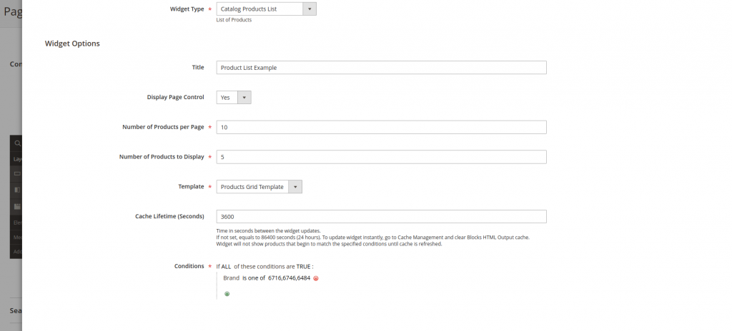
Create a Product Grid
The “Products” content type allows the creation of a grid of products with a variety of sorting options (e.g., Newest Products, Oldest products, etc.), as well as products related to certain brands.
1) Drag-and-drop Products from Page Builder Menu to active Row
2) Navigate to Settings from Products hovered menu
3) Select the following options in the Appearance section:
- Choose Product Grid
- Select Products by category
- Category: Select the product category of your choice
Important note: Ensure that products in the selected category are available in-stock, enabled, and are visible in the catalog. Otherwise, items won’t be presented!
4) Sort By: Choose the appropriate sorting option
5) Number of Products to Display: Add the number of products that should be displayed
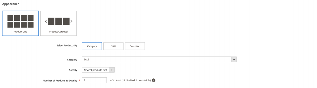
6) Follow the list of options below for Advanced section:
- Alignment: Default
- The rest of the options could be left without any changes or as default.
Have you tried Magento 2 Page Builder extension yourself? Need additional descriptions, assistance, or any type of Magento 2 support? Let us help you! Drop us a line at [email protected], and we’ll be happy to assist!
Related articles:
Magento Series: Working with Categories
COMPLETE GUIDE TO MAGENTO (ADOBE COMMERCE)


Share on: