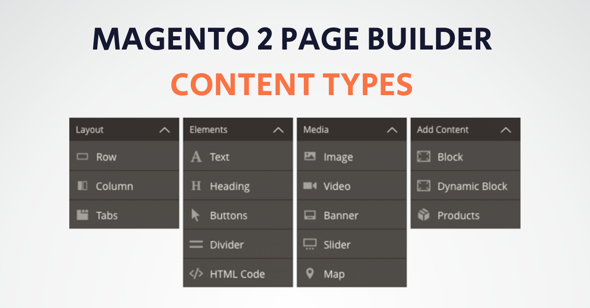
Page Builder is a Magento extension for creating content by dragging-and-dropping pre-built controls. We call these controls content types. You can see the available content types in Page Builder’s menu:
These content types provide several key features, including:
- Drag-and-drop functionality for content creation
- Live previews of how the content will look on the storefront
- Form editors for entering and customizing the content.
For end-users, this means no coding is required. For you as a developer, it means you will use content types to customize Page Builder to meet the end-user’s needs. There are two ways to customize Page Builder using content types:
- Extend existing content types
- Create new content types.
This guide describes how to create new content types. For extending the existing content type, refer to Adobe’s official Introduction to extending content types.
Content type creation steps
The steps for creating any content type are illustrated and described below. The reality is not this linear, but these steps represent the essential phases and flow for building new Page Builder content types.
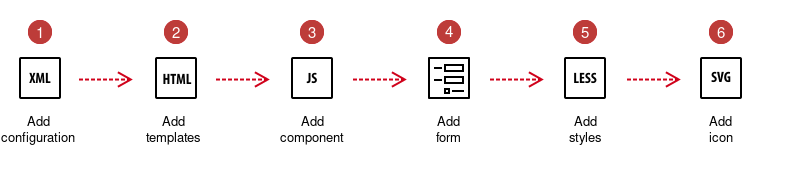
1. Add configuration: Create an XML file to define your content type and reference the other files that control the appearance and behavior of your content type.
The configuration file defines the settings and references your content type files. You will return to this file often to update references and change settings during the development process.
Files referenced from the configuration include the HTML templates, the JavaScript components, the icon displayed for your content type in the Page Builder panel, and the UI component form for your content type editor within the Admin.
2. Add templates: Create HTML templates that define the appearance of your content types on the Admin stage (preview.html) and the storefront (master.html).
Content type templates are the HTML files (HTML fragments) that define how your content type appears on both the Admin stage and within your storefront. Combining these templates (one
preview.htmland onemaster.html) creates anappearance.
3. Add component: Create a JavaScript file that defines the behavior of your content type on the Admin stage (preview.js) and the storefront (master.js).
Components are JavaScript files that define the behaviors of your content type when they appear on the Admin stage (using the
preview.jscomponent) and in the storefront (using themaster.jscomponent). Refer to the official docs for more info.
4. Add a form: Create a UI component form and a layout so Admin users can edit your content type within the Page Builder editor.
Page Builder provides two base forms that give you a ton of functionality you can inherit right out of the box:
pagebuilder_base_formpagebuilder_base_form_with_background_attributes(inherits frompagebuilder_base_form)
Inheriting from either base form gives you an editor for your content type that slides out from the right side of the Admin screen. Refer to the official docs for more info.
5. Add styles: Create LESS files to style your content types when rendered in the Admin UI and on the storefront.
Page Builder provides two ways to style your content type’s HTML templates using LESS:
- You can use the standard
classattribute to define a content type’s base look and feel - You can use the
cssattribute to provide end-users with CSS customization options.
Refer to the official docs for more info.
6. Add an icon: Create or use an existing SVG icon to visually identify your content type within the Page Builder panel. You can find all icons in vendor/magento/module-page-builder/view/adminhtml/web/css/source/_icons.less. E.g., @icon-pagebuilder-image__content in the content type configuration file (examplevendor_examplebanner.xml), you can use the icon="icon-pagebuilder-image" in the type node to change the content type icon to the icon used for the page builder image content type.
The icons used for Page Builder’s built-in content types are font icons (). Although you could create font icons and use those within your module, we recommend using SVG or PNG images instead.
To create and add an icon, you must:
- Create your SVG or PNG icon
- Create a CSS class for the icon
- Reference the icon class in the config file.
Refer to the official docs for more info.
Content type conventions
The conventions specific to Page Builder content types appropriately start within the directories called content_type or content-type. Page Builder instantiates a content type from the files defined within these directories. We will discuss these content-type conventions within each step of the process.
Configuration conventions
By convention, Page Builder requires the configuration file to be in the <module_name>/view/adminhtml/pagebuilder/content_type directory. The name of your configuration file should reflect the name of your content type prefixed by your module vendor name and separated by an underscore (_). For example, our module name is ExampleVendor/PageBuilderExampleBanner, and our content type is a quote control, so we name our configuration file examplevendor_examplebanner.xml and add it to our module within the following directory structure (view/adminhtml/pagebuilder/content_type/):
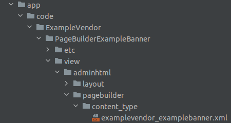
We suggest prefixing your content type with your vendor name to prevent Magento from merging your content type configuration file with another configuration file of the same name or with a future content type published by Magento.
Template conventions
Conventions for adding content-type templates are as follows.
Page Builder requires you to name your templates preview.html for the Admin preview template and master.html for the master format storefront template.
Page Builder requires the name of an appearance to match the name of the directory containing the appearance templates. If they don’t match, your content type appearances will not render.
For example, suppose you navigate to the Banner’s appearance templates (vendor/magento/module-pagebuilder/view/adminhtml/web/template/content-type/banner). In that case, you can see that the names of the template directories match the names of the four appearances defined in the banner.xml configuration file, as shown here:
  <appearances>
      <appearance name="collage-left"...>
      <appearance name="collage-centered"...>
      <appearance name="collage-right"...>
      <appearance name="poster" default="true" ...>
  </appearances>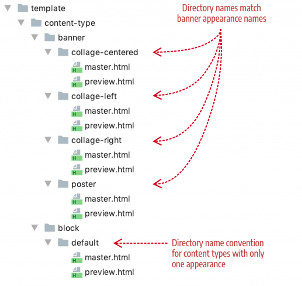
For content types with only one appearance, we use the name default for both the content type’s appearance name and the name of the template directory.
Component conventions
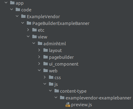
The conventions for naming your components and adding them to your module are as follows:
- Your preview component must be named
preview.jsand placed toview/adminhtml/web/js/content-type/<your_custom_content_type_name>/in your module:
- Your master component must be named
master.jsand placed in your module toview/frontend/web/js/content-type/<your_custom_content_type_name>/.
In case it is not planned to modify the custom content type behavior on the frontend, adding a
master.jscomponent file is unnecessary. You can configure the content type to use the default master componentMagento_PageBuilder/js/content-type/master.
Form and layout conventions
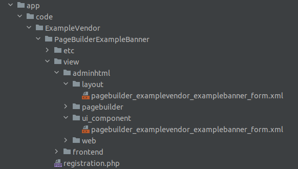
The conventions for naming your form and its layout are as follows:
- The name for your layout must match the name of your form; in this case:
pagebuilder_examplevendor_examplebanner_form.xml - The name for your form should follow this pattern:
pagebuilder_+content_type_name_+form.xml, for example,pagebuilder_examplevendor_examplebanner_form.xml.
You have to place form and layout files in your module in the following locations:
view/adminhtml/layout/view/adminhtml/ui_component/.
Content type XML configurations
The configuration file, e.g., project-root/ap/code/ExampleVendor/PageBuilderExampleBanner/view/adminhtml/pagebuilder/content_type/examplevendor_examplebanner.xml defines the settings and references to your content type files. You will return to this file often to update references and change settings during the development process.
Files referenced from the configuration include the HTML templates, the JavaScript components, the icon displayed for your content type in the Page Builder panel, and the UI component form for your content type editor within the Admin.
Configuration nodes
We’ll describe only a subset of configuration nodes in this section (enough to understand the primary role of the configuration file). For more details, refer to the official Content type configurations and Additional configurations.
An example of the XML configuration contents (project-root/ap/code/ExampleVendor/PageBuilderExampleBanner/view/adminhtml/pagebuilder/content_type/examplevendor_examplebanner.xml):
:<?xml version="1.0"?>
<!--
/**
 * ExampleVendor_PageBuilderExampleBanner
 *
 * @category ExampleVendor
 * @package  ExampleVendor_PageBuilderExampleBanner
 * @author   John Doe <[email protected]>
 */
-->

<config xmlns:xsi="http://www.w3.org/2001/XMLSchema-instance"
        xsi:noNamespaceSchemaLocation="urn:magento:module:Magento_PageBuilder:etc/content_type.xsd">
    <type name="examplevendor_examplebanner"
          label="ExampleBanner"
          menu_section="media"
          component="Magento_PageBuilder/js/content-type"
          preview_component="ExampleVendor_PageBuilderExampleBanner/js/content-type/examplevendor-examplebanner/preview"
          master_component="Magento_PageBuilder/js/content-type/master"
          form="pagebuilder_examplevendor_examplebanner_form"
          icon="icon-pagebuilder-banner"
          sortOrder="21"
          translate="label">
        <children default_policy="deny"/>
        <parents default_policy="deny">
            <parent name="row" policy="allow"/>
            <parent name="column" policy="allow"/>
        </parents>
        <appearances>
            <appearance name="default"
                        default="true"
                        preview_template="ExampleVendor_PageBuilderExampleBanner/content-type/examplevendor-examplebanner/default/preview"
                        master_template="ExampleVendor_PageBuilderExampleBanner/content-type/examplevendor-examplebanner/default/master"
                        reader="Magento_PageBuilder/js/master-format/read/configurable">
                <elements>
                    <element name="main">
                        <style name="text_align" source="text_align"/>
                        <style name="border" source="border_style" converter="Magento_PageBuilder/js/converter/style/border-style"/>
                        <style name="border_color" source="border_color"/>
                        <style name="background_color" source="background_color"/>
                        <style name="background_image" source="background_image" converter="Magento_PageBuilder/js/converter/style/background-image" preview_converter="Magento_PageBuilder/js/converter/style/preview/background-image"/>
                        <style name="border_width" source="border_width" converter="Magento_PageBuilder/js/converter/style/border-width"/>
                        <style name="border_radius" source="border_radius" converter="Magento_PageBuilder/js/converter/style/remove-px"/>
                        <style name="margins" storage_key="margins_and_padding" reader="Magento_PageBuilder/js/property/margins" converter="Magento_PageBuilder/js/converter/style/margins"/>
                        <style name="padding" storage_key="margins_and_padding" reader="Magento_PageBuilder/js/property/paddings" converter="Magento_PageBuilder/js/converter/style/paddings"/>
                        <style name="display" source="display" converter="Magento_PageBuilder/js/converter/style/display" preview_converter="Magento_PageBuilder/js/converter/style/preview/display"/>
                        <attribute name="name" source="data-content-type"/>
                        <attribute name="appearance" source="data-appearance"/>
                        <css name="css_classes"/>
                    </element>

                    <element name="banner_image">
                        <attribute name="banner_image_src" source="src" converter="Magento_PageBuilder/js/converter/attribute/src" preview_converter="Magento_PageBuilder/js/converter/attribute/preview/src"/>
                        <attribute name="banner_image_alt" source="alt"/>
                        <attribute name="banner_image_title" source="title"/>
                    </element>
                    <element name="banner_title">
                        <html name="banner_title" converter="Magento_PageBuilder/js/converter/html/tag-escaper" />
                    </element>
                    <element name="banner_button_text">
                        <html name="banner_button_text" converter="Magento_PageBuilder/js/converter/html/tag-escaper" />
                    </element>
                    <element name="banner_button_href">
                        <attribute name="banner_button_href" source="value"/>
                    </element>

                    <element name="banner_stepone_icon">
                        <attribute name="banner_stepone_icon_src" source="src" converter="Magento_PageBuilder/js/converter/attribute/src" preview_converter="Magento_PageBuilder/js/converter/attribute/preview/src"/>
                        <attribute name="banner_stepone_icon_alt" source="alt"/>
                        <attribute name="banner_stepone_icon_title" source="title"/>
                    </element>
                    <element name="banner_stepone_text">
                        <html name="banner_stepone_text" converter="Magento_PageBuilder/js/converter/html/tag-escaper" />
                    </element>

                    <element name="banner_steptwo_icon">
                        <attribute name="banner_steptwo_icon_src" source="src" converter="Magento_PageBuilder/js/converter/attribute/src" preview_converter="Magento_PageBuilder/js/converter/attribute/preview/src"/>
                        <attribute name="banner_steptwo_icon_alt" source="alt"/>
                        <attribute name="banner_steptwo_icon_title" source="title"/>
                    </element>
                    <element name="banner_steptwo_text">
                        <html name="banner_steptwo_text" converter="Magento_PageBuilder/js/converter/html/tag-escaper" />
                    </element>

                    <element name="banner_stepthree_icon">
                        <attribute name="banner_stepthree_icon_src" source="src" converter="Magento_PageBuilder/js/converter/attribute/src" preview_converter="Magento_PageBuilder/js/converter/attribute/preview/src"/>
                        <attribute name="banner_stepthree_icon_alt" source="alt"/>
                        <attribute name="banner_stepthree_icon_title" source="title"/>
                    </element>
                    <element name="banner_stepthree_text">
                        <html name="banner_stepthree_text" converter="Magento_PageBuilder/js/converter/html/tag-escaper" />
                    </element>

                    <element name="banner_stepfour_icon">
                        <attribute name="banner_stepfour_icon_src" source="src" converter="Magento_PageBuilder/js/converter/attribute/src" preview_converter="Magento_PageBuilder/js/converter/attribute/preview/src"/>
                        <attribute name="banner_stepfour_icon_alt" source="alt"/>
                        <attribute name="banner_stepfour_icon_title" source="title"/>
                    </element>
                    <element name="banner_stepfour_text">
                        <html name="banner_stepfour_text" converter="Magento_PageBuilder/js/converter/html/tag-escaper" />
                    </element>
                </elements>
            </appearance>
        </appearances>
    </type>
</config>
The type node
The type node defines the main properties of your content type. The type node attributes from the previous code example are described here:
| ATTRIBUTE | DESCRIPTION |
| name | Name of the content type that Magento uses for XML merging. The convention for using multi-word names is to separate the words with hyphens. |
| label | Label displayed in the Page Builder panel, option menu, and on the Admin stage. |
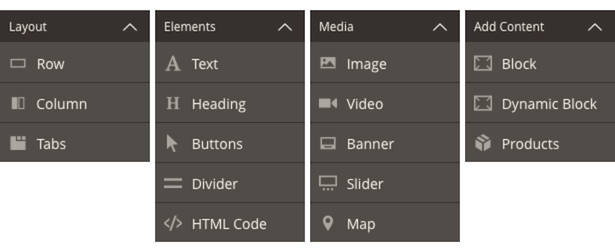
| menu_section | Menu section or category in the panel menu where your content type is displayed. The default menu sections are Layout, Elements, Media, and Add Content. See Panel configurations for more details. |
| component | View model responsible for rendering the preview and master format. The component does not need to specify the .js extension. There are two component types to choose from—content-type and content-type-collection. Use Magento_PageBuilder/js/content-type for static content types that do not have children. Use Magento_PageBuilder/js/content-type-collection for content types containing children, otherwise known as container content types. |
| preview_component | JavaScript file (preview.js or preview-collection.js) that provides rendering logic within the Admin UI. The preview component does not need to specify the .js extension. For collection content types, you need to reference your preview-collection component or Page Builder’s preview-collection (preview_component="Magento_PageBuilder/js/content-type/preview-collection"). If you don’t specify the preview_component, Page Builder uses the base Preview component shown in the code: Magento_PageBuilder/js/content-type/preview. |
| master_component | JavaScript file (master.js or master-collection.js) that provides rendering logic generic for all appearances of your content type when rendered on the storefront. The master component does not need to specify the .js extension. For collection content types, you need to reference your master-collection component or Page Builder’s master-collection (master_component="Magento_PageBuilder/js/content-type/master-collection"). If you don’t specify the master_component, Page Builder uses the base Master component shown in the code: Magento_PageBuilder/js/content-type/master. |
| form | UI component form that provides the form controls for editing your content type. |
| icon | Optional. Class name for your PNG or SVG image (or font icon) displayed in the Page Builder panel alongside the label. If you don’t provide an icon value, the Page Builder panel displays the content type name without an icon. |
| sortOrder | Optional. The listed order is within the menu section. For example, sortOrder=21 puts the content type third in the Elements menu section, after the content types with sortOrder values of 10 and 20. |
| translate | Identifies the attribute you want Magento to translate. Here, the label value is set for translation. |
The children node
The children node determines if your content type can contain other content types as children. The Admin UI allows or prevents you from dragging and dropping other content types from the panel into your content type.
<children default_policy="deny"/>In our configuration, we don’t allow any other content types to be children of our content type. Put another way, our content type cannot be a parent; we only want it to be the child of other content types, which leads us to the parent node.
The parent node
The parent node determines if other content types can be a parent to your content type. The Admin UI allows or prevents you from dragging and dropping your content type into other content types on the stage.
<parents default_policy="deny">
    <parent name="row" policy="allow"/>
    <parent name="column" policy="allow"/>
</parents>
In our configuration, the parent node first prevents our content type from having any parents. If we left it there, we could not drag our content type onto the stage because even the stage is a parent. So, we limit our content type’s parents to only the row and column content types. This allows you to drag and drop your content type into rows or columns but nowhere else.
The appearances node
The <appearances> node specifies one or more views for displaying your content type. For example, the default Banner content type has four appearances you can choose from within its editor, as shown here:
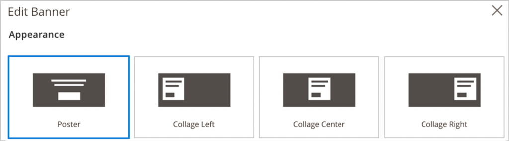
Each of these views is defined as an appearance within the Banner configuration file as an examplevendor/magento/module-pagebuilder/view/adminhtml/pagebuilder/content_type/banner.xml:
<appearances>
    <appearance name="collage-left"...>
    <appearance name="collage-centered"...>
    <appearance name="collage-right"...>
    <appearance name="poster" default="true" ...>
</appearances>
Going further, each appearance is defined by two HTML templates, one to display a preview appearance in the Admin (preview.html) and the other to show the master appearance (master.html) on your storefront.
The elements node
The <elements> node, as defined within an appearance, is to map the data from the content type’s form editor to the content type’s master format so that the values entered in the form can be stored and rendered correctly on the Admin stage and storefront.
Template configuration
The templates that will render the admin preview and frontend contents are defined in the appearance node. The example below demonstrates the default appearance for the custom content type, meaning that the content type will have a single visual representation:
<appearance name="default"
            default="true"
            preview_template="ExampleVendor_PageBuilderExampleBanner/content-type/examplevendor-examplebanner/default/preview"
            master_template="ExampleVendor_PageBuilderExampleBanner/content-type/examplevendor-examplebanner/default/master"
            reader="Magento_PageBuilder/js/master-format/read/configurable">
The following table describes each appearance attribute in our example.
| ATTRIBUTE | DESCRIPTION |
| name | As noted by convention, the name of the appearance and the name of the directory for the appearance templates must match. |
| default | Every content type must have a default appearance. You must set the default to true if you only define one appearance for your content type. |
| preview_template | References the preview.html (the Admin preview template) for rendering your content type preview appearance on the stage within the Admin UI. |
| master_template | References the master.html (the master format storefront template) for rendering your content type appearance on the storefront for customers to see. |
| reader | Reads content-type data from the master format. |
Component configuration
<config xmlns:xsi="http://www.w3.org/2001/XMLSchema-instance"
        xsi:noNamespaceSchemaLocation="urn:magento:module:Magento_PageBuilder:etc/content_type.xsd">
    <type name="examplevendor_examplebanner"
          menu_section="media"
          component="Magento_PageBuilder/js/content-type"
          preview_component="ExampleVendor_PageBuilderExampleBanner/js/content-type/examplevendor-examplebanner/preview"
          master_component="Magento_PageBuilder/js/content-type/master"
					...>
A description of each component-related attribute from the configuration follows:
| ATTRIBUTE | DESCRIPTION |
| component | Page Builder provides two component types to choose from—content-type and content-type-collection. Use Magento_PageBuilder/js/content-type for static content types that do not have children (like our Quote). Use Magento_PageBuilder/js/content-type-collection for content types containing children (container content types). You can also create and specify your own component implementations, provided they conform to the Page Builder interfaces. |
| preview_component | Optional. The preview.js file provides rendering logic to the Admin preview template. If your content type does not require changes to Page Builder’s standard rendering logic, you can omit this attribute from the type element. When you omit the attribute, Page Builder will use Magento_PageBuilder/js/content-type/preview by default. However, if you want to make changes to the options menu for your content type or customize other user interactivity in the Admin, you need to create your own preview component as we have done for the Quote content type. |
| master_component | Optional. The master.js file provides rendering logic to the master format storefront template. As with the preview_component, if your content type does not require any specific user interactivity or other behavior when displayed in the storefront, you can simply omit this attribute from the type element. When you omit the attribute, Page Builder will use Magento_PageBuilder/js/content-type/master by default. In the Quote configuration, the master_component attribute is only included for discussion. It simply points to the Page Builder default master.js component that would be used if the attribute was omitted. |
Form configuration
To link the form with the content type, in the configuration file, add your form name (without the .xml file extension) to the form attribute within the <type> node, as shown here:
<config xmlns:xsi="http://www.w3.org/2001/XMLSchema-instance"
        xsi:noNamespaceSchemaLocation="urn:magento:module:Magento_PageBuilder:etc/content_type.xsd">
    <type name="examplevendor_examplebanner"
          label="ExampleBanner"
          form="pagebuilder_examplevendor_examplebanner_form"
...>| ATTRIBUTE | DESCRIPTION |
| form | Name of the UI component form that provides the form editor for your content type. |
Refer to the official custom Quote content type form docs to understand how to configure forms. Refer to the official Form component page for the available form fields’ configurations.
Developer notes
preview.html is used to generate the preview in the admin panel. master.html is used to generate the contents that will be saved in the database when the page builder contents are saved.
- In the form, appearance_fieldset is required; otherwise, the form will not be loaded.
- In both preview.html and master.html, it is necessary to create as many elements as defined in the content-type configuration file. Every element in the master.html must have
attr="data.<element_name>.attributes"added; otherwise, the element bindings will not be available in the admin/frontend, as well as contents might not be saved properly. - It is prohibited to use numbers in element names; e.g., if step1_text is invalid, it should be stepone_text instead.
- The element field in the content-type configuration file represents the data object available in the
preview.html. The element attributes should have both “name” and “source”. The name attribute should be equal to the form field name, and the source attribute is the element attribute object that will store the saved data and will be available in the template viadata.<element_name>.attributes().<source_name>. - Be careful with the form field naming; it has to be the same as the element attribute name. Any mistake will result in an infinite loader during saving.
- Form components are available on the official docs page.
- The frontend styles are not required in the ScandiPWA rendering case because the styles should come from the ScandiPWA component.
- For M2 FE rendering, the fonts have to be placed in the
project_root/lib/web/fontsdirectory, and the URL for fonts has to be changed to@{baseDir}fonts/RobotoCondensed-Bold.woff2. - In the latest CMA/CSA with varnish, it is necessary to purge the varnish cache via
docker exec page-builder-1639150974_varnish varnishadm "ban req.url ~ /"to see the changes in the admin. - For ScandiPWA, there are two ways how to render the FE contents.
- Rely on the master.html file and just add styling in some components. In this case, you won’t be able to use ScandiPWA power to modify FE contents.
- Use the <widget> tag in the master.html to pass the widget to the WidgetFactory. As a result, you will have to add FE rendering in the ScandiPWA components.
The simplest way to add a content type is via forms, like widgets. If some dragging and dropping or live editing is required in the content type, then there has to be some advanced guide describing how to do that (there will be knockout.js logic that handles live actions).
Other examples
Here are pre-built content types you can use as a basis for your project.
Was this article helpful? For more Magento (Adobe Commerce) insights, browse the Magento category in the scandiweb blog. scandiweb is the most certified Magento team in the world—get your comprehensive Magento support services. If you need assistance with Magento Page Builder or your eCommerce project, contact our team directly!

Share on: