About the client
Läderach is a premium manufacturer of the finest handcrafted Swiss chocolate. The family-owned company was founded in Ennenda, Switzerland in 1962 by Swiss chocolatier Rudolph Läderach. Läderach has distribution in over 50 countries across the globe. Customers can experience Läderach chocolate at branded stores in 10+ countries as well as on laderach.com.
Recently, scandiweb team visited the Läderach headquarters in Switzerland to discuss how we can improve their site and user journey.
Challenge
The client’s partner agency researched the market and prepared customer journeys, identifying 2 main gaps:
- People don’t understand the high price of Läderach chocolate
- People don’t associate Läderach as a chocolate brand to give as a gift
Based on the research, the client asked how we can help them improve their eCommerce site by making sure we cover both main gaps previously identified.
Approach
Considering none of our current audit templates fit the task requirements, we had to come up with a new approach to validate the site and provide suggestions.
To do so, we decided to tackle one journey gap at a time and review the main pages covering the user journey within each page.
1. Looking at data
To understand the pages we need to prioritize, we looked at the data and identified that most sessions start on the Homepage, and in more than half of the sessions users do not reach the product page.
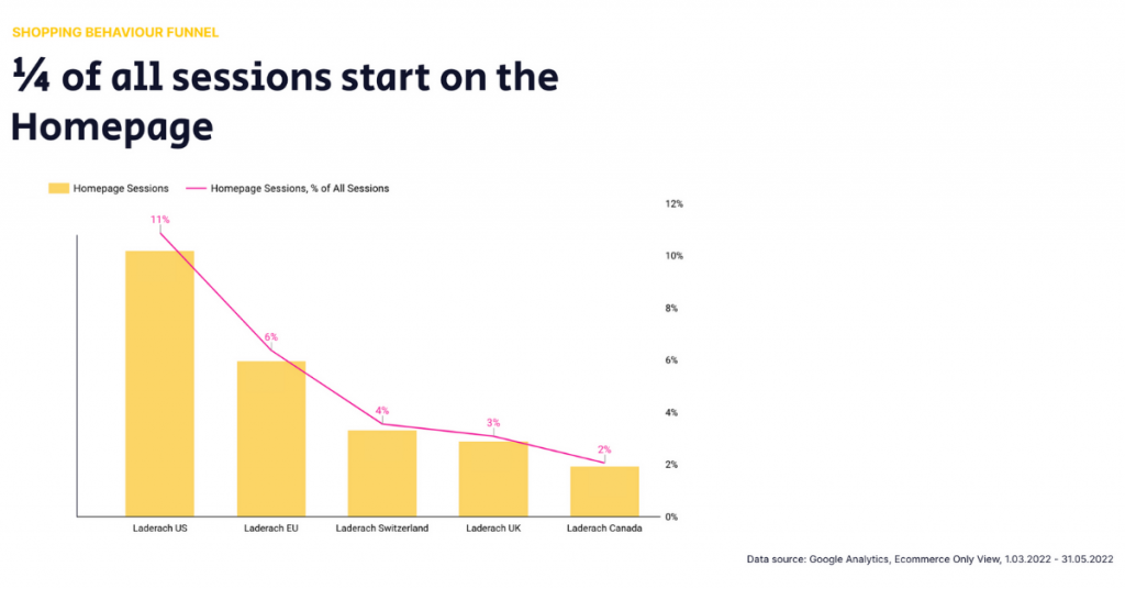
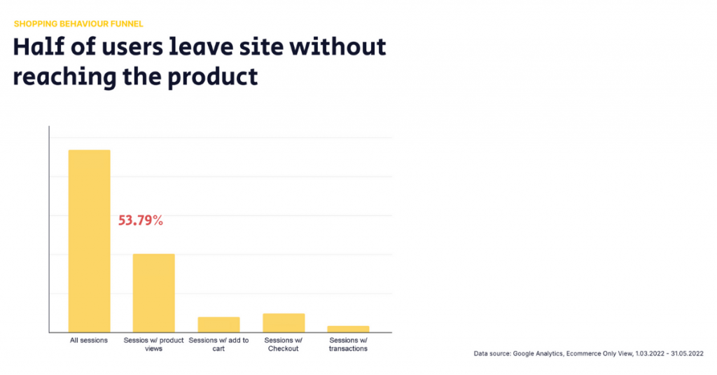
This supported the hypothesis that people don’t understand the price and are not convinced the product is worth exploring further.
2. Listing the gaps
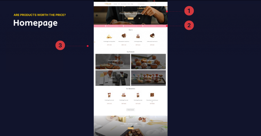
Next, we looked at the Homepage trying to answer the question “Are products worth the price?” and listed content gaps we saw:
- The hero banner doesn’t show the product or ingredients—a sieve is at the center of attention instead
- 2/3 of the USPs are generic and do not communicate Läderach’s competitive advantages to the visitors or tell them why it can be considered a premium brand
- The first block new users see is New products, however, it doesn’t communicate the wide range of assortment
3. Providing suggestions & examples
We then answered each gap with particular solutions and examples from the competitors or related industries.
Customer journey gap: people don’t understand the high priceFor the hero banner, we suggested making chocolate the center of attention to show the product and communicate its value. Highlighting the product in a lifestyle setting on the hero banner can nudge visitors to imagine what it’s like to treat themselves or their loved ones with Läderach chocolate, hence nudging them to explore the page further.
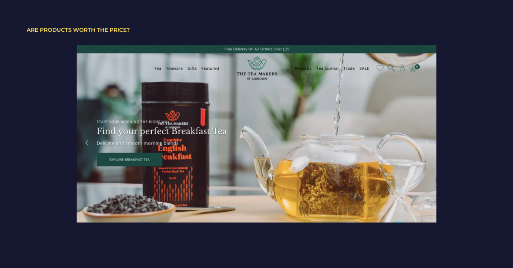
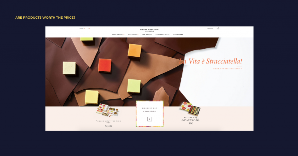
Customers are ready to go above the average price point to pay for the product and, especially, get it as a gift if they are confident in the brand. Therefore another hero banner suggestion was to highlight the craftsmanship and the number of years Läderach has been making chocolate to increase brand credibility and trust in the quality of the product.
USPs should highlight the competitive advantages and differentiating unique qualities to help convince visitors to try the products, for example, a family-owned business in 3rd generation, Swiss quality, etc.
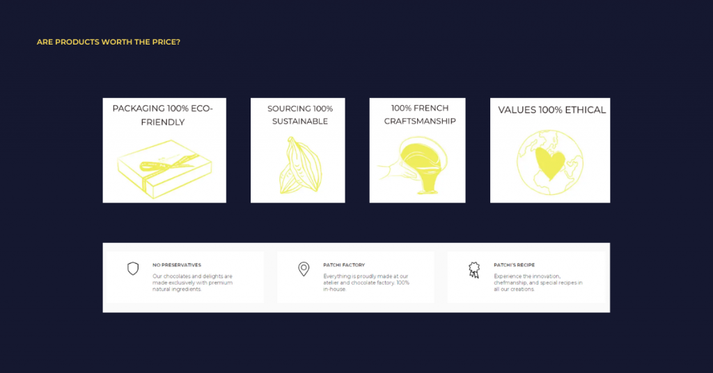
This approach was repeated for the rest of the pages and journey gaps.
Other suggestions included:
- Highlight physical stores on the site to boost credibility
This is a great way to tell the site visitors that you are a well-established and known brand around the world. Store images communicate a feeling of a premium experience when interacting with the brand. Moreover, it is a great way to invite new prospects to visit the stores and try the product before committing to purchase.
- Leverage authority by mentioning other brands
Mentioning well-recognized brands as your partners or companies that have acknowledged your product can help increase the trust towards the brand and be one of the points to help justify the price.
- Create premium appeal with high-quality visuals
One of the principles that help create a feeling of a premium brand online is using high-resolution visuals, from photos to videos. They should not only showcase products themselves but also present ingredients and products in lifestyle settings. High-quality large images not only show the product in different variations and set a clear expectation about the packaging but also convey critical information about key ingredients and flavors prospects will get.
- Offer product sampling
Product sampling gives prospects a feasible chance to understand how they feel about the product. Myriad of studies show that more than 70% of consumers are more likely to buy a product after trying it. Samples could also cross-sell and introduce prospects to new products. Provide free samples for first-time visitors and ask to pay only for shipping. After giving out free samples, you can also offer a monthly subscription to get premium chocolate each month.
- Encourage users to leave a review
Social proof in a form of user ratings and reviews is a powerful way to increase the site’s overall credibility. With a prominently placed user rating average near the product title, visitors might be convinced to consider the products.
Customer journey gap: People don’t associate Läderach as a gifting brandNext, we looked at the second customer journey gap of Laderach not being the first choice for people as a gifting brand and how we can leverage the eCommerce site to guide visitors toward gifting.
We suggested making gifts more prominent on the homepage. Highlighting gifting options on the homepage and throughout the site can help to build a perception of this brand being your number one choice for a gift.
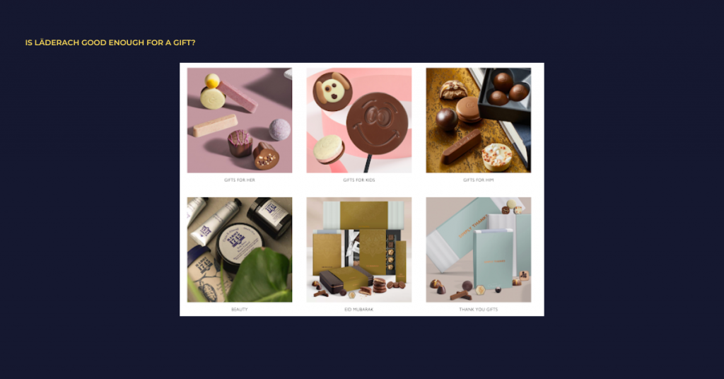
Other suggestions included:
- Create custom landing pages highlighting gift products
Explaining the process of crafting each product carefully and with love shows it is worth being a gift for a loved one.
- Extend menu navigation with more options
Segmenting gift types for the users into subcategories can speed up the decision-making process by lifting off some strain when considering gifts for different events and making them confident that you’ve got them covered for all occasions.
- Offer gift cards
Gift cards are easy to purchase and take away the stress of selecting a personalized gift. They might also generate more traffic and new leads and has the potential to drive more revenue.
Next steps
To move the project further, scandiweb began work on creating wireframes with guides for Läderach’s design agency on the suggested content and structure for the main pages according to the CRO research done prior.
Need help optimizing your customer journey? Identify the areas of improvement and bridge the customer experience gap with the help of scandiweb’s CRO experts. Contact us today and we’ll be in touch within 48h!

Share on: