An ad’s success hinges on its message and, more importantly, on its ability to captivate and convert. Standing out means being remembered and, even better, being acted upon. But what separates generic and high-converting ads?
The secret lies in the meticulous creation of ad assets tailored for maximum engagement. In this article, we’ll outline our approach to crafting ad assets that capture attention and drive conversions. From conceptualization to design, testing to optimization, discover the strategy behind creating powerhouse ad assets.
Understanding the digital consumer
The digital consumer is not a monolithic entity. Their behaviors, preferences, and motivations vary widely based on age, geography, cultural background, and individual interests. Yet, there are some general trends.
Multichannel engagement
Most digital consumers don’t stick to one platform. They browse social media, read blogs, watch videos, and search for information across multiple devices and platforms.
According to Shopify’s latest research, which concluded in October 2023, the most popular social media platform remains Facebook (Meta), with 3.03 billion users, followed by YouTube, WhatsApp, and Instagram. Important channels here are WeChat and Douyin, which are exclusive to China.
Short attention span
Theories and opinions about the decreasing attention span of the public keep rising. King College of London conducted research showing that almost half the respondents (49%) feel like their attention span is shorter than it used to be, while 23% disagree.
The same study shows that technologies can interfere with our ability to focus. For example, switching attention between social media, tablets, and smartphones, as well as TV, radio, or other media, harms humans’ ability to complete simple tasks.
According to Wyzowl’s research, videos hold consumers’ attention these days. The average watch time of a single internet video is 2.7 minutes. Furthermore, 59% of senior executives would rather watch a video than read text when both are available.
Seeking authenticity
The days when consumers just want ‘nice and shiny’ products are gone. According to Psychology Today, consumers’ expectations of brands have grown, and nowadays, they expect businesses to represent their values and beliefs.
More than 70% of consumers reportedly spend more time with authentic brands, which makes authenticity a key component in marketing strategy. It refers to how consumers perceive the brand to be transparent, genuine, and consistent in communication and behavior.
Principles for high-converting ad copy
Creating ad copy requires understanding human psychology, market trends, and the precise language that will compel your audience to take action. Below, we delve into the principles that can help you craft high-converting ad copy.
Messaging
The core message of your ad copy must resonate with your audience. It should align with their needs, wants, and pain points. To achieve this:
- Identify your audience—understand who you’re talking to and their interests, problems, and desires
- Speak their language—use words and phrases that echo your audience’s way of speaking to establish rapport
- Highlight benefits—focus on how your product or service improves the customer’s life or solves their problems
- Keep it clear and concise—your message should be straightforward and easy to understand, avoiding jargon or complex language
- Consistent brand voice—ensure your messaging reflects your brand’s personality across all platforms.
Hooks
A hook is a compelling statement or question that grabs attention and piques interest. For a powerful hook:
- Start with a bang—begin with strong, attention-grabbing headlines that make the reader want to learn more
- Invoke curiosity—pose questions or present surprising facts that make your audience curious about your offering
- Use emotional triggers—leverage emotions like excitement, fear of missing out (FOMO), or happiness to create a connection
- Create urgency—encourage immediate action with time-sensitive offers or limited availability.
Ad copy
The body of your ad copy is where you expand on your message and hook, guiding your audience toward conversion.
- Feature to benefit transformation—don’t just list features; explain how each feature translates into a tangible benefit for the customer
- Use social proof—include testimonials, reviews, or endorsements to build trust and credibility
- Call to action (CTA)—end with a strong CTA that tells the reader exactly what to do next, whether it’s to click, subscribe, buy, or call
- A/B testing—continuously test different versions of your ad copy to see what resonates best with your audience and drives conversions
- Compliance and clarity—ensure that your ad copy complies with legal requirements and platform guidelines and that the intent and offer are clear to avoid confusion.
By adhering to these principles, you can craft ad copy that captures attention and converts that attention into action, driving sales and growth for your business.
Design principles for high conversions
Once the objective of your advertising campaign is figured out, the next step is moving on with the visuals. When crafting the visuals, it’s essential to remember what was discussed in the chapter on understanding the present consumer and how it will be reflected in your visual communication.
Additionally, some design principles need to be followed. Let’s explore the rules creatives have to keep in mind.
- Structure & composition
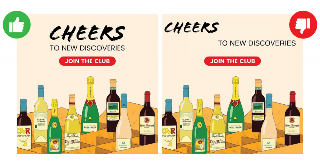
Imagine that you need a static banner to launch a Black Friday campaign. Think about your banner as a room. Would you put all the furniture in one corner? Composition is essential; it is created through correct alignment and equilibrium. Ensuring the structure, we guide the viewer’s eye and help them comprehend the message.
- Clear background
For static banners, having a clear background is one of the critical elements to ensure that your target audience comprehends the message.

- Readability and clarity—a noisy background makes the text and graphics on the banner difficult to read or discern. A banner’s primary purpose is to communicate a message quickly and effectively; anything that impedes this can reduce its effectiveness
- Professionalism and aesthetics—clean and simple designs often appear more professional and visually appealing, while a noisy background makes the banner appear cluttered and haphazard, reducing the perceived quality of the design and, by extension, the associated brand or message
- Avoiding distraction—a noisy background and many competing elements can draw attention away from the main content of the banner. Viewers might be looking elsewhere instead of focusing on the message or CTA.
- Contrast
Ensuring good contrast on static banners is crucial for several reasons.
- Visibility and readability—contrast between the text and its background ensures that the content is easily readable, even from a distance, while low contrast can make it difficult for viewers to discern the message, rendering the banner ineffective
- Attention and engagement—a banner with proper contrast will catch the viewer’s attention more effectively than one where the elements blend into one another; high contrast can emphasize CTA or brand logo, ensuring they stand out
- Accessibility—individuals with visual impairments, such as color blindness, rely on contrast to differentiate between elements; ensuring good contrast makes the banner more inclusive and accessible to a broader audience.

How we do it at scandiweb
At scandiweb, we prefer a straightforward and transparent approach. We begin with our game plan—the creative brief. It is a document that summarizes what and how we will do it. The goal of a brief is to achieve stakeholder alignment on a project before it begins. Here’s what the brief consists of!
1. Overview: what are we doing?
Brief starts with understanding what exactly we are doing. Are we making a simple campaign on Instagram, or are we producing video ads? This gives everyone on the team an idea of the upcoming production.
2. Objective: why are we doing this?
Understanding the intention and setting clear goals is crucial as they will be the main driver when developing your strategy and later measuring the success of advertising efforts.
Here’s an example of simplified ad objectives and how they sync with business goals.
| Ad objective | Business goal |
|---|---|
| Awareness | Bringing awareness to your business. For example, if your business is brand new or has recently gone through rebranding, awareness will help your potential customers get familiar with your business. |
| Traffic | Increasing traffic to your chosen online destination, e.g., your eCommerce is having a flash sale, or you want to send people to a page on your website describing your services. |
| Engagement | Finding people who are the most likely to engage with your business online, send a message, or take a desired action on your ad or business page. |
| Leads | Collecting leads for your business through messages, phone calls, or sign-ups. |
| Sales | Finding people likely to purchase your goods or services. |
Our example
The new scouting season starts in September, making it a perfect time to sell uniforms. Therefore, we launched ads for our client, The Boy Scouts of America, with the sales objective of initiating gearing up for the new season. We tried different approaches, focusing on general scout shop advertising.

3. Target audience: who are we trying to reach?
To make our ads as relevant as possible, we need to understand who will see them so we learn as much as possible about the potential audience beyond just their location and age.
One of our clients launched a new sportswear brand in Germany. After researching their existing ads, we saw no data backing up the types of models they mainly focused on in their ads. Below is an example of the data we collected while researching the market this client wanted to advertise in.
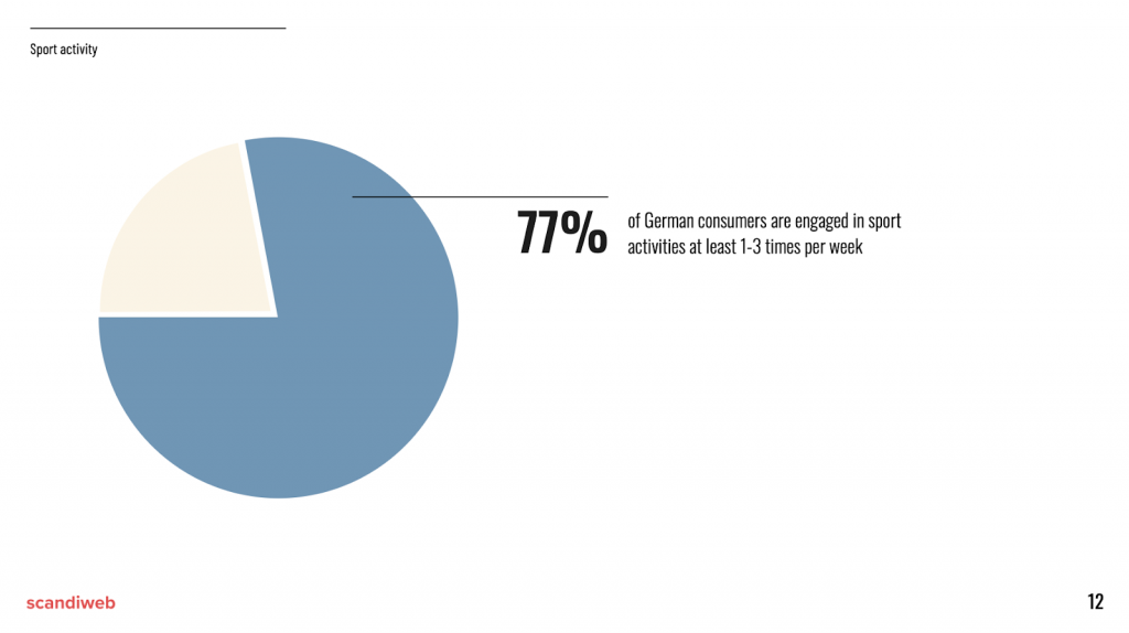
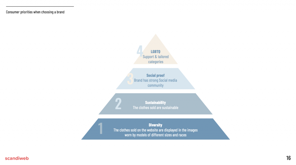
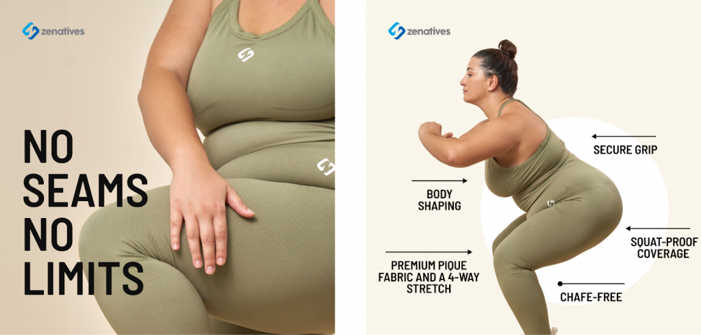
Based on our research, diversity is a priority for consumers when choosing a brand, and our client was failing to fulfill this. We launched another campaign focusing on plus-size models to make the brand’s message more inclusive.
4. Tone: describe the vibe
The tone must align with the brand identity and objectives of our campaign. When describing the tone, the best approach is to use adjectives like professional, funny, inspirational, etc.
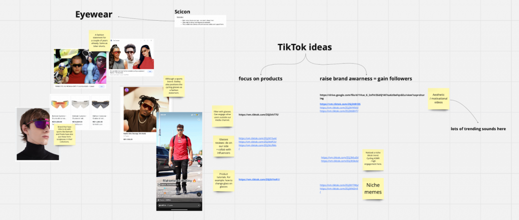
5. Visuals: examples and/or a mood board
Providing examples helps to communicate with the creative team on what is expected to be developed and helps align with the client about the planned creatives. The more we get with the client, the less time we spend on corrections to match the vision.
Here’s how we collect examples using Miro.
6. Ad copy
A well-written ad copy can capture the audience’s attention and compel them to take a desired action, whether it’s making a purchase, signing up for a newsletter, or simply gaining awareness.
Besides just ad copy, thinking about the hook when working on video ads is essential. You have 3 seconds or less to catch viewers’ attention. The hook needs to evoke the viewer’s curiosity to watch the video till the end and listen to the message you’re trying to deliver.
Below is a screenshot from our working board with copywriters on ads for our client. Our campaign focused on the pain points of leggings women usually experience and how this brand can solve them. We developed various hooks that elicit different emotions, such as fear (“your leggings are probably see through”).

7. Technical requirements
We also provide all the technical requirements for the needed ad assets: size, weight limitations (if any), length, amount of deliverables, and placement. This information ensures your requested ads look great and work in the desired platform. As a client, you don’t have to worry about that—we handle all the corresponding technical details.
Test, test & test!
Although there are predefined rules teams should follow when working on ad asset development, there isn’t one magic formula that will work for every business. Each business has its own best practices, which can only be discovered by testing every wild idea you have!
That’s why we are big believers in testing. We gather the team to look at our ads and think as consumers, not from a professional point of view. We get out all the ideas and test them! Additionally, testing ad concepts should be based on the actual data.
Read about the role of a Creative Strategist in producing ad assets.
The journey to creating high-converting ad assets is meticulous, requiring creativity, strategic planning, and a deep understanding of your target audience. From developing a compelling message that speaks directly to the hearts and minds of your prospects to designing a visually appealing format that captures and retains their attention, each step is crucial.
Are you looking to elevate your digital presence with ads that engage your audience and convert? Our team is here to help! Let’s discuss how we can collaborate and begin your brand’s success story.


Share on: