What should you do when you go to your favourite Magento online store, choose your favourite colour shirt, put it in the shopping cart, ready to click pay only to realise that the checkout is not working?
Where to write? What to do?
The mood is ruined and with it the whole day.
And then, to our Support Team Lead Dmitry Gallamov, came the idea ofmaking a service that will check your online store page for various types of errors and promptly let you know about them via email or text message. Similarly, if server requests aren’t receiving a response, you would be on top of it as soon as it happens.
In short, you’ll be notified about errors before you get an unsatisfied customer. That sounds great, but it was necessary to understand how to properly display the information. How to convey the idea to people in a visual way that is easy to remember and has a positive feel to it.
Our goals
Our goal was — logo, landing page and GUI, plus some additional things that can make this project more complete and visually appealing.
It was not an easy task. Many ideas were had, but they were too boring or too beaten.
Then we have tried to draw a parallel between the error and the request process and figure out how to reflect that in our design.
We decided to select 6 main areas to represent our design and concept.

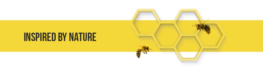
The oh-so-familiar and recognisable Magento logo gave us a clue in which direction to move. They say that in nature everything is already invented. And that proved to be true in this case as well. The neat and laconic hexagon form was just what we needed to suited our concept ideally. And the hexagon associated with … with BEES! And then everything aligned perfectly. Bees are perfect representatives of our characteristics.
Smart & Clear symbolism
Everyone knows and can clearly identify bees with “Smart” and “Organized” structures.
Structured & Hierarchical
Bees know their role in the hive and report to the queen bee, or the master server in our case.
Worker bee server checks
Worker bee concept relates to our server “ping” health checks.
Then we started to create the mood board. Which gave the inspiration to create a Landing Page and choose the color direction.
Color palette
Choosing a bee — a concept that relates to our service will obviously lead to choosing strong, robust, yellow themed colors for our palette. The color we took is the perfect yellow increment of the Magento color in the chromatic scale.

Logo
No project is complete without a logo. Once we understood that we are going with bees, that’s when we came up with…
 We tried to avoid the detailed complexion of bees, and to simplify the form without losing its meaning and visual recognisability.
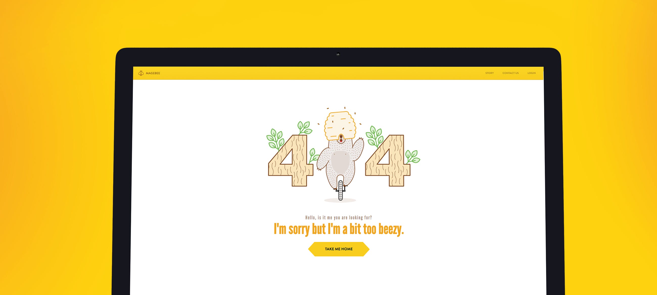
Landing page
On the Landing page, we used various elements related to bees and their lifestyle to bring out the “bee” mentality for the product. Such complex things as the base data, code become absolutely clear and not frightening to those who do not understand it.
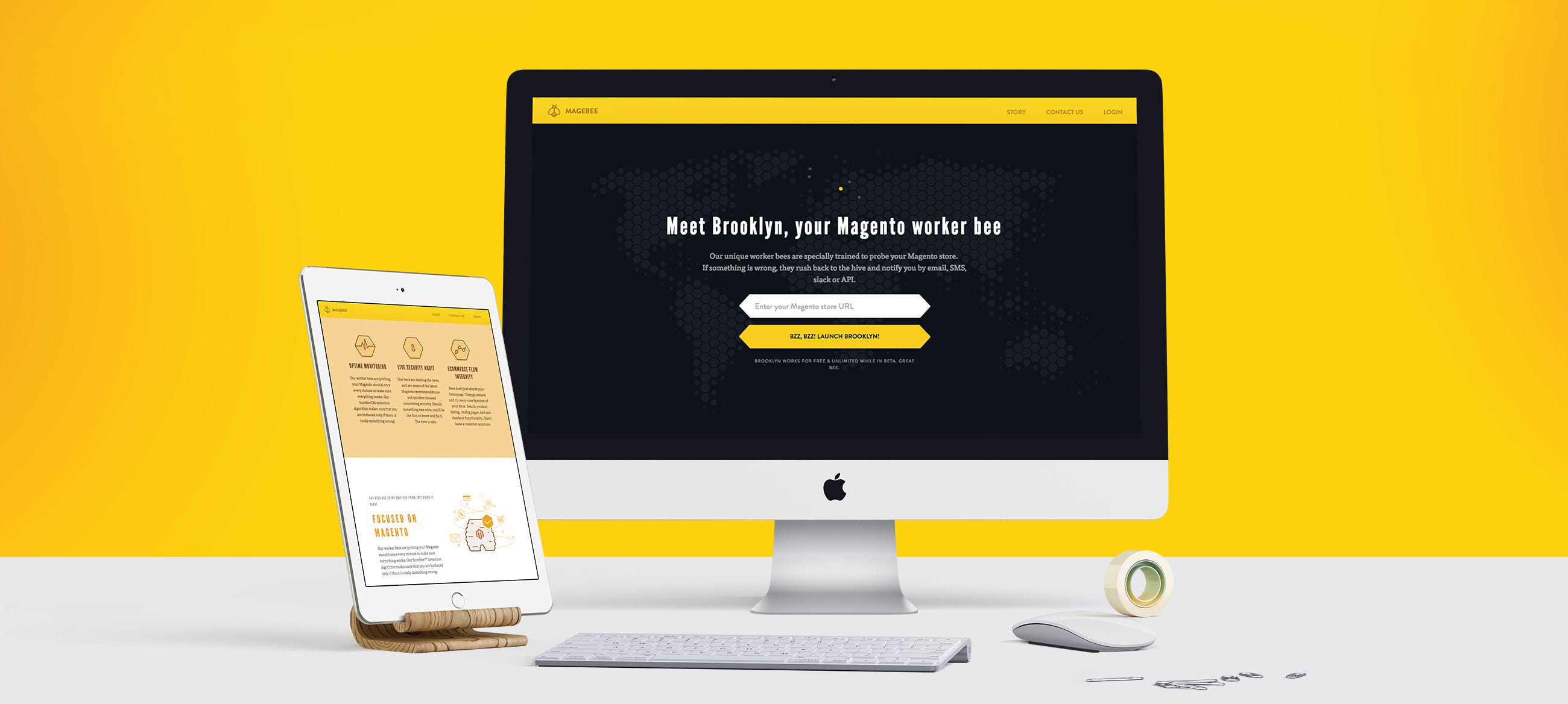 Landing page
The same principle was held for the dashboards. It had to be very simple but demonstrate what happens to the customers website, and if there is an error to inform them in an understandable and accessible way.
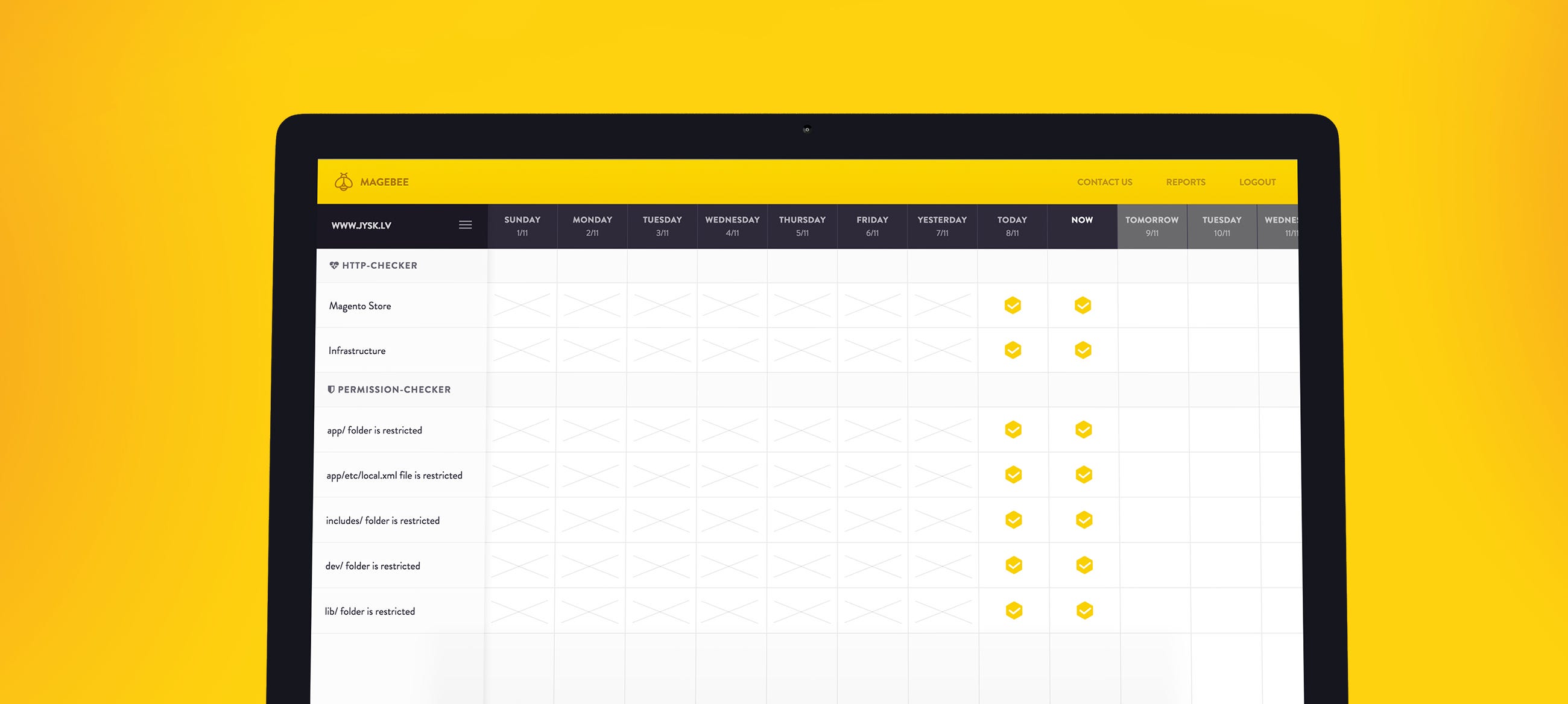 Dashboard preview
Illustration and other nice pages
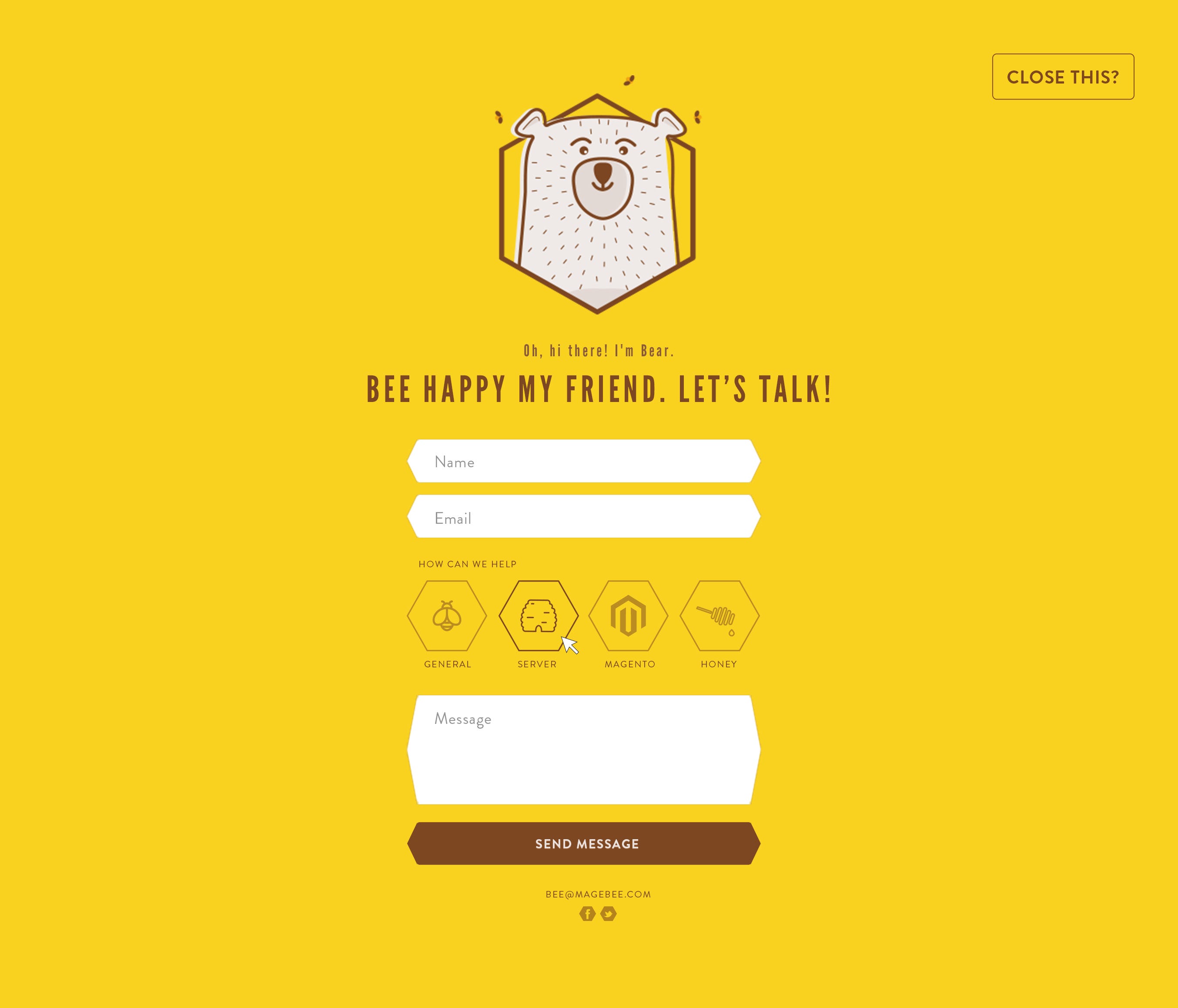
Since our childhood we know that bears love honey. Therefore, in our story about bees, we decided to include another character – a bear.
It complements our history and acts as a support or a guide. We can see him in our email when he comes with notifications about errors and it is he who accompanies us during registration. In general, he’s always there to lift your spirit.
I think it’s time I finish my story.
If you want to see him live – come and visit magebee.com
Bee happy my friends! 🙂

Share on: