Customer experience in luxury eCommerce defines how customers remember the brand. Navigation, layout, language, and even micro-interactions are expressions of the same quality and attention that customers expect from the product itself.
At scandiweb, we treat each CX audit as a structured entry point into long-term growth. Our approach combines expert insight, real customer behavior, and benchmarked data to form a foundation of clarity, mapping the relationship between brand promise and customer journey, and identifying the points where expectation and experience start to drift apart.
This is an immersive process. Rather than applying a standard checklist, we begin our CX audits for luxury and premium brands (as for B2B and B2C brands across an array of other industries) by understanding how the brand defines and presents itself, and then we look for the points in the digital experience that fall short of that definition. That clarity becomes the input for everything that follows, from optimization to redesign to full transformation. Let us elaborate.
A structured discovery for premium CX
When we’re tasked to improve the digital experience of a luxury brand, we treat the first phase as an orientation. The goal is to understand what the brand thinks it’s offering and what the customer is actually experiencing. That gap, often small but critical, is where we usually discover growth.
We approach this orientation through:
- Expert insight to evaluate usability, UX patterns, accessibility, and messaging through the eyes of experienced eCommerce practitioners
- Real customer input via recorded tests with actual brand users, revealing the emotional and behavioral cues that data alone can’t show
- Benchmarking, comparing the brand’s experience against modern UX standards and its direct industry competitors
- Performance data to ground our observations in reality and identify friction in the current customer journey.
We map out what needs to be true for the experience to fully support the brand promise, and then we use that as our direction.
When insight becomes action
Every CX audit produces a long list of insights. But insight without action is just a nice presentation. What transforms our approach into value is how quickly we move from discovery to decision, organizing priorities, scoping fixes, and preparing for implementation.
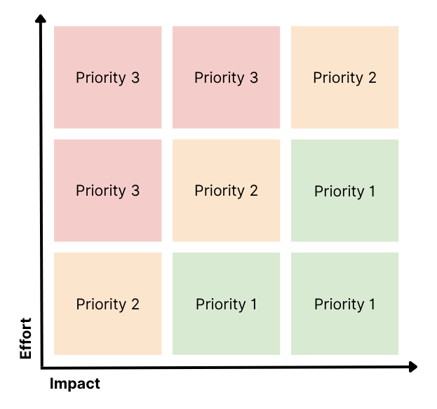
To do that, we sort findings into three operational layers:
- Quick wins: minor changes that improve experience with minimal effort, often immediately deployable
- UX misalignments: areas where the design doesn’t match user expectations or the brand promise (these are mapped for deeper UX rework or optimization sprints)
- Structural gaps: issues that stem from deeper logic, tech limitations, or architecture, and feed into long-term roadmaps.
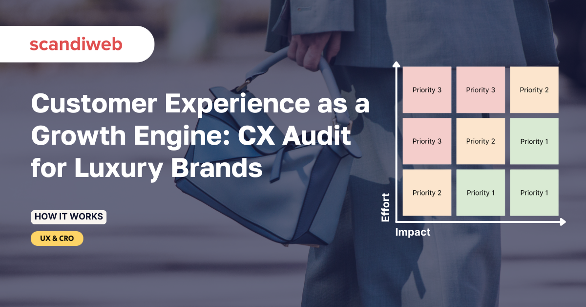
By the time the discovery phase concludes, we’ve identified problems and converted them into a structured backlog, organized by impact, effort, and dependency.
What our CX audit looks like in luxury fashion
In a recent CX audit for a premium fashion brand, we conducted a comprehensive experience audit combining user behavior analysis, expert UX review, benchmarking, and direct customer testing. At the end, we produced a roadmap grounded in 130+ distinct recommendations and strategic opportunities. Below are just a few examples of how small experience gaps can have a significant impact.
Homepage insights: structure and scannability
❌ Unclear key content hierarchy
More than half of homepage users failed to reach the brand’s editorial content or key seasonal campaign messaging. High-intent users dropped off after only scanning the top 1–2 content blocks.
→ We proposed a restructured homepage layout, anchored in clear entry points for new arrivals, style stories, and promotional themes, ensuring better visibility above the fold.
❌ Banner designs blending with the layout
Hero banners lacked visual separation from adjacent sections, making it difficult for users to recognize when one theme ended and another began.
→ A recommendation was made to introduce subtle visual cues such as whitespace, typography shifts, and scroll indicators to improve orientation without disrupting elegance.
PDP insights: purchase friction in the details
❌ Fit, fabric, and care info hidden too low
Most testers scrolled to find fabric composition and fit guidance after having added items to their cart, often just to confirm.
→ We suggested repositioning these details directly below the price or CTA, framed in a structured quick-specs format to reduce uncertainty and prevent drop-off.
❌ Color swatch UX causing accidental selections
Users unintentionally changed product variants by interacting with color swatches, expecting them to trigger zoom or detail views.
→ We suggested swatch interactions with hover preview, clear variant change confirmations, and mobile-specific interaction improvements.
❌ Missing section anchors for long-form content
High-value items often had extensive product copy but lacked a clear way to navigate it.
→ We recommended collapsible content blocks or anchored tab navigation for smoother scrolling and better readability on desktop and mobile.
Mobile UX: path to product
❌ Filters rarely used
Mobile filter menus showed a high open rate but very low actual usage. Users found the open/close interaction unintuitive and frequently closed filters before making selections.
→ We proposed a persistent “Filter” chip UI with improved click targets and scroll locking during filter interaction, modeled after top luxury benchmarks.
❌ New arrivals buried
One of the site’s key traffic drivers, new arrivals, was not accessible directly from the homepage or the main navigation on mobile.
→ Added a recommendation to create a mobile-first “Just In” experience with pinned access and adaptive scroll previews.
User testing highlights: behavior patterns
❌ Promotion banners caused hesitation
While most testers recognized site-wide promotions (e.g., free shipping thresholds), several ignored them entirely – not because of irrelevance, but due to presentation that felt “non-premium” or “noisy.”
→ Reworking promo language, tone, and integration into the layout was proposed to match the brand’s elevated feel.
❌ Returns policy anxiety
On mobile, many testers struggled to find return policy details until late in the journey, often not until the cart or checkout stage.
→ To improve confidence earlier in the journey, we suggested a subtle but visible placement of returns messaging on PDPs and a “Returns” link in the mobile navigation.
Benchmarking insights: what competitors do differently
- Product education – competitors more often used editorial-style modules on PDPs to tell the story behind the product
- Checkout clarity – others offered progress indicators, delivery date estimates, and stronger address input UX
- Brand presence in cart – where most kept branding cues and style strong throughout checkout, our client had a notable drop in visual consistency after the cart.
CX optimization project roadmap
A CX audit is the beginning. Its true value comes from what happens next: turning all of the observations into a manageable roadmap for actual experience improvement.
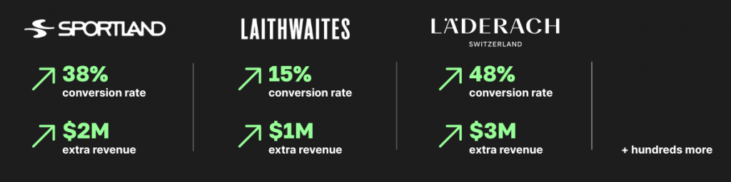
Clients see an avg. of 30% eCR increase in 12 months with scandiweb’s conversion growth program.
We’ve designed a workflow that translates audit output into prioritized implementation:
- CX audit presentation
Final presentation of the audit to inform future UX/UI updates and optimization roadmap, combining expert review, user testing, data insights, and benchmarking.
- Client feedback loop
The client team reviews findings and shares feedback on specific recommendations to move forward with.
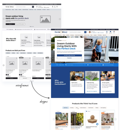
- UX/UI for key pages
Based on confirmed priorities, our designers begin crafting updated wireframes and final designs.
- Conversion growth program
Once redesigns go live, we move into A/B testing, ongoing UX improvements, and CRO-driven iterations. This phase is run by a CRO strategist, but the client gets a full exposure to all scandiweb growth team knowledge and skills to ensure the program is successful. Each sprint concludes with a detailed report outlining the completed tasks and priorities for the next sprint. Through bi-weekly standups, monthly program reports, quarterly roadmap reviews, and ROI reporting, we align on performance. The original CX audit becomes a living roadmap for continued optimization.
Are you ready to see your digital experience through your customers’ eyes and build a roadmap for meaningful change? Reach out to our team to schedule a free individual consultation and develop a growth plan tailored to your business.

Share on: