
How a store looks is only part of the equation. How it feels to use, how easily shoppers can find products, move between categories, and complete a purchase plays a bigger role in whether they convert or drop off. As more Shopify brands expand their catalogs and partner with third-party sellers, site structure and UX become just as critical as design. Updates to product pages, filters, navigation, and even the menu can have a direct impact on revenue, especially during high-traffic seasons.
With Q4 approaching, Salt Life needed their Shopify storefront to convert better without disrupting day-to-day operations. The catalog was expanding fast, and mobile UX issues were starting to impact discoverability and cart performance.
This case study covers the redesign of the Salt Life Shopify storefront ahead of the busiest shopping season, aiming to address key friction points, modernize the design, and support growth now, while also preparing a design system to scale the client’s wider portfolio in the future.
About
Salt Life is one of several lifestyle and apparel brands managed by Thread Collective, a Canadian company that owns and distributes recognized international clothing labels like Mexx, Nautica, Kenneth Cole, and Kanuk. Our redesign focused on the Salt Life store with a long-term vision to use components, templates, and design principles across other brands.
Project goals
Salt Life’s current Shopify store had design gaps on key pages and missed opportunities to guide users through the product discovery process. We aimed to redesign the Salt Life Shopify storefront ahead of the busiest shopping season:
- Improve the design and UX of Salt Life’s Shopify store to increase conversions and support Q4 sales
- Update core storefront templates: homepage, PLP, PDP, mini-cart, search, and main menu
- Make it easier for users to navigate a growing catalog (30+ categories expected by the end of the year)
- Introduce PDP enhancements to connect related products with different fits or styles
- Support drop shipping categories operated by third-party licensees
- Deliver updates efficiently within the existing Shopify theme to avoid disruption
- Test AI-generated product imagery, homepage banners, and video content as part of the visual refresh
- Create a scalable design foundation for future brand stores within Thread Collective’s portfolio.
Approach
Discovery revealed that the existing store structure couldn’t support the upcoming 30+ category expansion. Mobile filtering was already underperforming, and navigation issues made it harder for newer audiences to find what they needed. The storefront was struggling to keep up with the growing catalog demands and the expectations of new audiences, particularly younger shoppers and women.
UX research
We defined customer personas, key user journeys, and what success should look like from a UX and conversion perspective. Salt Life’s internal team provided valuable input early on, and we worked collaboratively through reviews to refine each page without unnecessary iterations.
We ran a UX audit, benchmarking the site against eCommerce best practices to see how top-performing eCommerce brands in the industry approach layout, navigation, and feature design. Some key issues included:
- A confusing mobile menu with non-functional chevrons and poor category hierarchy
- Lack of a clear value proposition on the homepage for new users
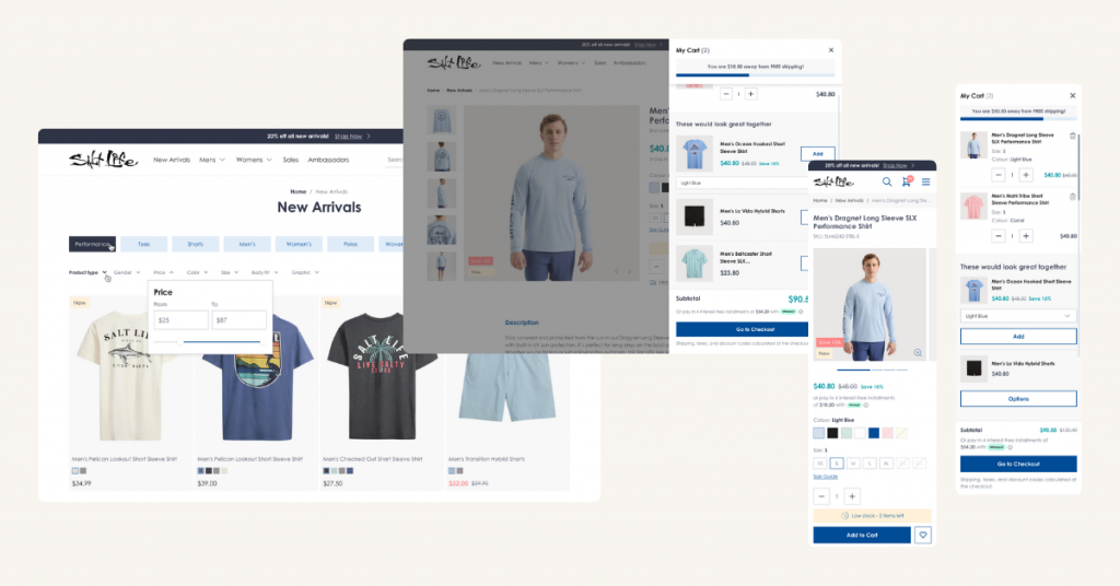
- Filtering issues on PLPs, particularly on mobile
- No visual product labels to highlight promotions or categories
- Cart UX that didn’t allow users to remove items, increasing friction.
Scalable design system
With plans to scale the same design across other Thread Collective brands, we approached Salt Life as the foundation for our design.
The design system was then adapted for Thread Collective’s Ecko brand, showing how quickly the Salt Life base could support other storefronts with minimal rework.
UX upgrades introduced:
- Improved filtering with custom logic and UI
- Category sliders and product connections on PDPs
- Larger, bolder imagery with lifestyle visuals
- Better size guides with measurement support
- Clean site-wide navigation with visual hierarchy.
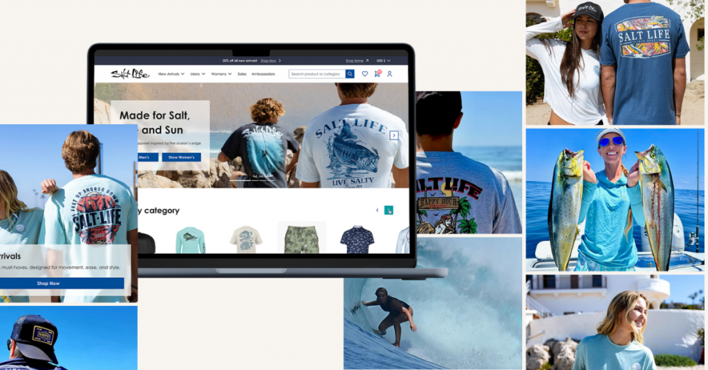
Shopify store redesign
We adapted the existing Shopify theme’s core templates with new high-fidelity UX-optimized wireframes (homepage, PLP, PDP, cart, mini-cart, search, and navigation), layouts, and components. This phased approach let us move quickly while preserving the client’s operational stability during Q4, i.e., the critical revenue season.
Platform workarounds
To make the growing catalog easier to navigate, especially on mobile, we needed a more intuitive way to filter collections. Shopify didn’t support it natively, so we introduced a custom workaround using meta objects to enable seamless sub-collection filtering.
Our solution was to create a new meta object called Categories, mirroring their existing Product Size Chart structure. This allowed us to:
- Pre-populate each product with collection titles via automation
- Display sub-collections in a horizontal slider
- Enable dynamic filtering with no page reload
- Maintain performance and style consistency across devices.
AI-generated visuals
Salt Life also introduced AI-generated content across the site, including homepage banners and product images. Our team ensured the visuals were supported throughout the new design, optimized for performance, and aligned with brand tone.
Results
The new storefront launched ahead of Q4 and resolved key UX friction points. Mobile filtering and navigation are now structured to support the full 30+ category catalog. Product discovery is faster and clearer, cart usability issues are removed, and content speaks more directly to new audiences.
The new design system has already been adapted for another Thread Collective brand with minimal rework, proving its scalability across the portfolio.
Planning to scale your Shopify catalog or unify design across multiple brands? Let’s identify the UX friction points that might be holding growth back and build a foundation that converts.

Share on: