It’s no secret that today’s consumer is more demanding and picky as ever before regarding the products he buys and the online stores he visits.
If a website is not working correctly or not offering an excellent user experience, visitors will often leave it in a matter of seconds with no intention to return. As an online eCommerce brand, this could mean certain death for the success of your business.
Consumers need to see a clear value proposition that holds their attention and convinces them to stick around. This is why intuitive web design is critical for an online business to keep customers engaged from start to finish.
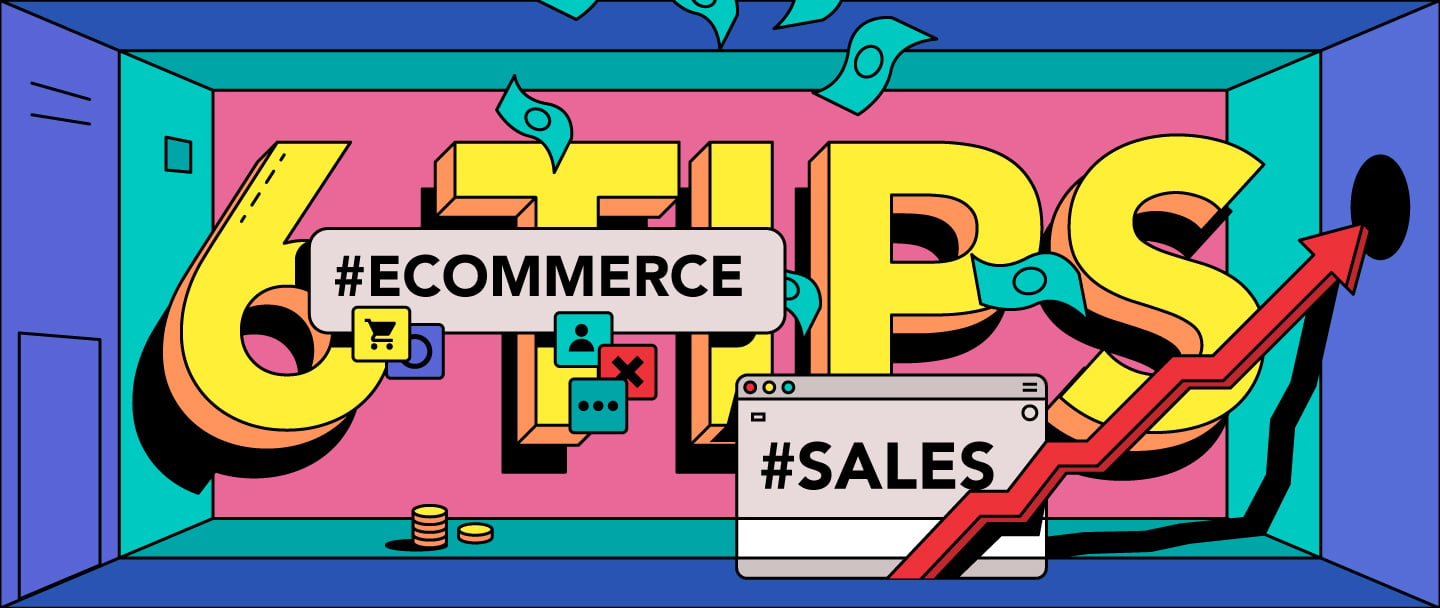
Many begin the online store design with wireframes, determining the target audience, stakeholder interviews, the main goals of the store or technical specifications. But what if we went another way? In this article, we’ll cover the basis for all the steps that we usually go through when creating an online store.
I was sitting at the interview with a customer once. He spoke about colors he wants to see, the goods, the target audience, showed examples of his competitors, chart of conversions. He even mentioned what color the buttons should be in because it’s important to follow the style guide.
That’s a lot of information that gives only a vague idea of the final design.
Then I asked him a question: “Tell me, what values would be important to your product if it were a person? Tell me 3-5 strong words that characterize this person?”
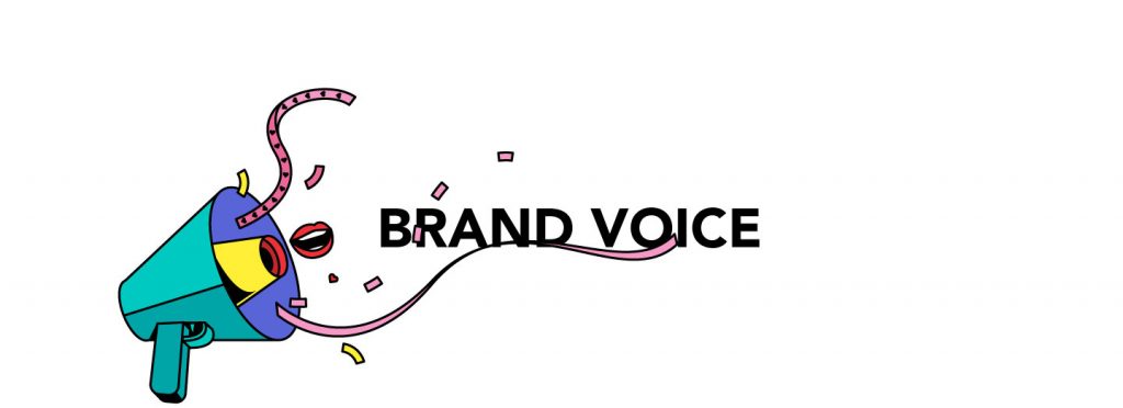
The definition of values helps to feel the mood and feelings that should carry the website. Try to define what type of emotions users should experience when using different functions of your product.
“Brand personality refers to the human characteristics, emotions, and attributes embodied by a brand on the concrete design elements.”
Juan Carlos Ortiz Nicolás
You won’t find here how to develop brand personality, user personas, tone of voice, and we won’t identify which archetype according to Jung’s theory this person we described above belongs to.
Just remember that people buy from people they like, know, and trust based on a relationship and emotions, cultivated over time.
Now that we have a concept of what a site should be in terms of mood, we can focus on specific functionality.
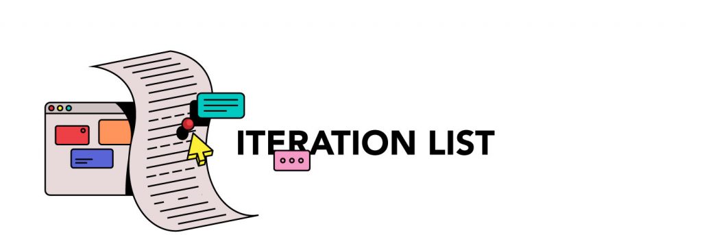
We always believe that people want something new, but to be honest, all sites are similar. We don’t invent the bicycle, but always try to improve it.
The iteration list helps to identify primary functions and select the most important sections, thereby letting us focus on small, but very important iterations instead of the whole page. It also gives us the big picture on elements that aren’t that necessary as we thought before.
The most important thing when working out the main function is to remember: put yourself in your visitors’ shoes during the design process.
- What kind of layout is going to be the easiest for them to navigate?
- How can you organize your products in a way that makes sense for the user?
- How can you simplify the whole process?
Your goal is to make users find what they are looking for within your design as easy as possible.
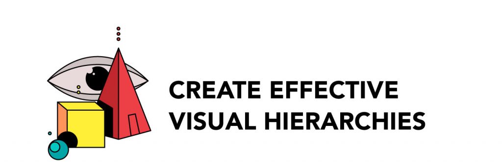
My favorite and most important rule I usually begin to train colleagues with is understanding how to offer a proper visual hierarchy.
When you scan a page, nothing should make you feel annoyed and lost by the number of elements or information that you offer. There are always elements that are more important or less important and they all must organically be together.
I will not teach that you need to make buttons bigger or to highlight by color or move the main elements to the top of the page. It’s enough to understand that sometimes you just need to combine them into one group that’s under one style and one heading, highlighted with the proper color.
How do you usually read the site? I can’t remember ever sitting down and reading through each section more than once. The focus is mostly on the block that interests me, but it won’t take more than a couple of seconds for me to continue scrolling. Even surfing through the pages with goods, we usually scroll rather quickly without having time to read the titles and react to the pictures.
For example, imagine a situation: you’re a mother with two young children, there’s dinner cooking on the stove and you need to book plane tickets for the weekend. How much time do you have for ordering tickets? Will you be exploring options for a long time?
According to a research study, users read only 20 percent of the content. Therefore, to make their stay on your page as comfortable as possible, don’t complicate things and highlight key information.
At such moments, the issues of correctly prioritizing the page are especially acute to facilitate work and speed up the process. Usability is the idea that any person should be able to navigate your website without finding the process frustrating or annoying.
“People go online to save time not to spend it.”
Steve Krug
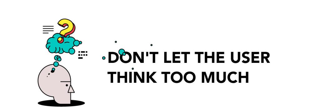
If you make people think, you make them unhappy. Users don’t want to treat your site or app like a cryptic crossword — they want to know what they should do and then immediately do it. Don’t make the user think, you need to think for them. Make their life easier and they will come back to you and your website.
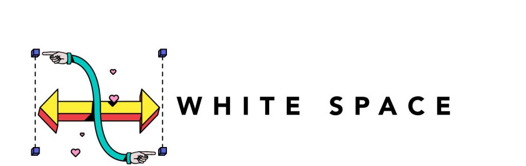
You’ve probably been in this situation — many customers ask to fill all empty space on the page with content. They want to put banners, registration forms, a photo of the product or occupy the empty pixels any other way.
In fact, empty (or negative) space can help make an important element stand out, and this is true not only for desktop websites but for apps and responsive mobile websites too.
Using white space evenly makes the content in the design easily scannable and significantly improves legibility. A study conducted indicates that proper use of white space between lines of paragraphs and left and right margins can increase comprehension by up to 20%.
White space isn’t neat or nice; it’s effective and valuable.
You must understand when and where to use white space. As soon as you learn this, you’ll realize how powerful this instrument is in design, which not only gives a general view of composition but also optimally prioritizes functions and content. Less is more.
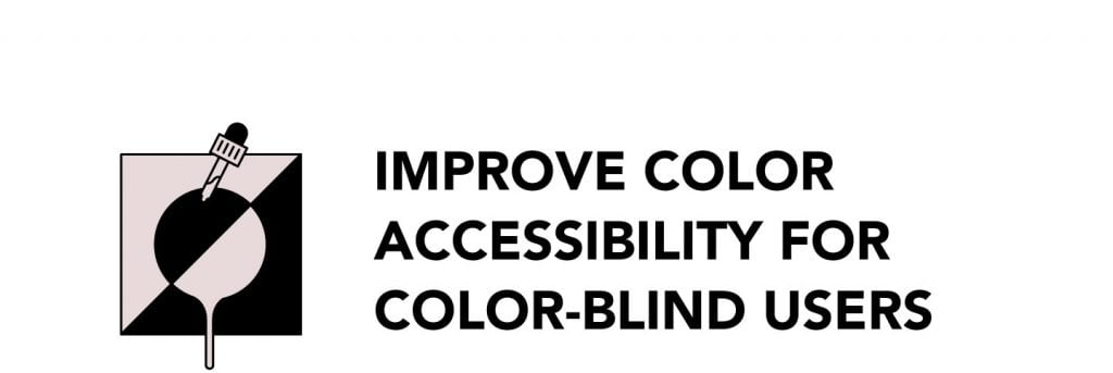
Today, about 8 percent of people can’t distinguish colors to one degree or another. That’s quite a lot. Therefore, correctly prioritized content, a well-considered user journey or a clear understanding of the brand voice won’t be enough to make your site easy-to-read for everyone.
Since color blindness affects people differently, it’s difficult to determine which colors are ‘safe’ to use in web design.
Make it look good in the grayscale.
This doesn’t mean that you need to go with black and white, just remember to check the site after. If all the elements are visible, then you have added enough contrast and shades. Try to avoid making colors at the same temperature and brightness, the best option is to play with a combination of light and dark tones.
Of course, you can find many services on the Internet that will help you determine whether or not you’re doing everything correctly regarding colors, but I’ve given you a very quick and proven option.
I hope this article helps you start the process of building your own site. If you have questions or problems with creating a website that sells, we’ll be happy to help you! Follow us on Dribbble and Facebook to get more tips and tricks for eCommerce websites, web app UX/UI, and development.


Share on: