These days online experience goes hand to hand with real life experience- user friendly design is a must have. If you are not sure what to improve or if there is even something to be improved on your website (there always is), a UX audit would be the best thing to start with.
UX AUDIT GOALS
- Conversion rate increase
- Banners CTR increase
- Top landing pages bounce rate decrease
- Conversion funnel abandonment rate decrease
STEPS OF A UX AUDIT
- Customer web-journey map creation
- Task scenarios creation for usability testing
- Usability testing based in developed scenarios (heatmaps, eye tracking, EEG snapshots)
- Gathered data analysis and finding common user behaviour patterns
- Improvement suggestion based on the audit results
Improvements are evaluated based on A/B resting results, heatmaps and Google Analytics data.
TASK SCENARIO EXAMPLES FOR USABILITY TESTING
Here are examples of what issues you can find on the website while doing usability test scenarios with eye tracking.
Scenarios:
- Add “{Name} Museum” to trip planner
- Find top-10 restaurants for brunch at {City}
- Find all 5-star hotels in {City}
EYE-TRACKING FIXATION POINTS ANALYSIS — Example #1
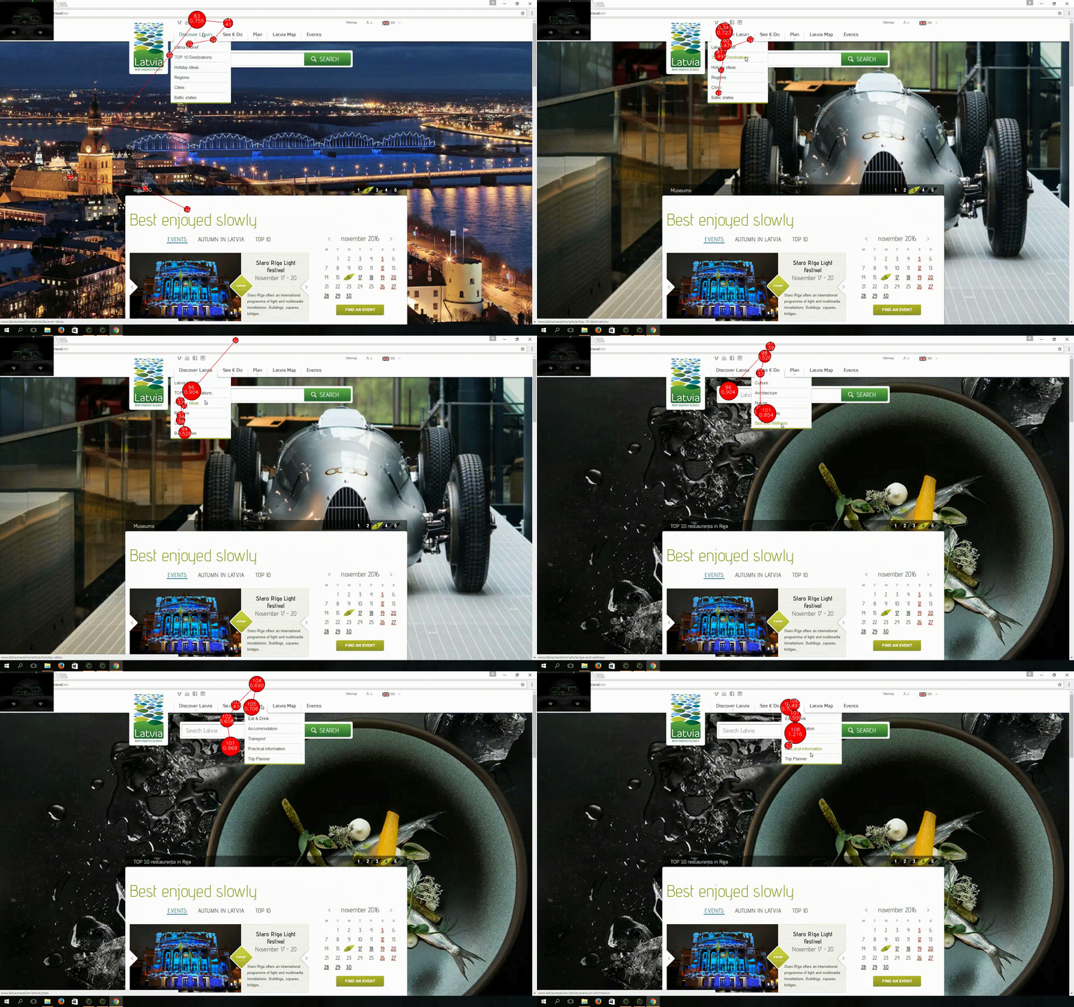
User Spent 15 seconds looking for the necessary subcategory (trip planner), which is one of the key features of the website.
This means that categories and subcategories might need to be rearranged in order to simplify user navigation on the website. This could be done in a variety of ways, for example:
- Putting most visited categories first (based on Google Analytics data)
- Survey users of the website and ask them to rearrange categories based on their needs, then find out common patterns and rearrange categories based on these findings
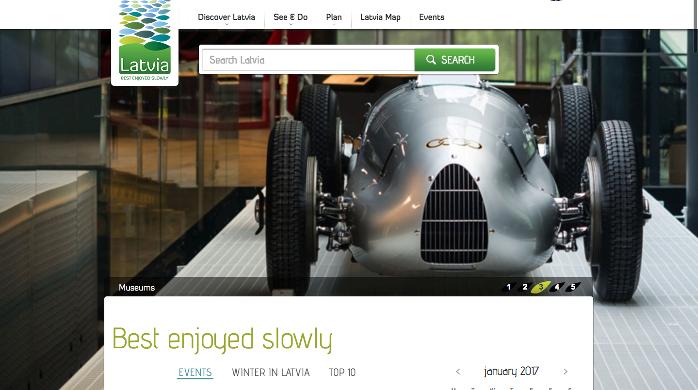
- Too much empty space between search tab and content
- Search tab placeholder does not provide clear CTA
Suggested improvements (1):
- Move content closer to the top of homepage or place a banner below search tab
- Change search tab placeholder to a self-explaining one (for example:”Find place to visit in Latvia”
EYE-TRACKING FIXATION POINTS ANALYSIS — Example #2
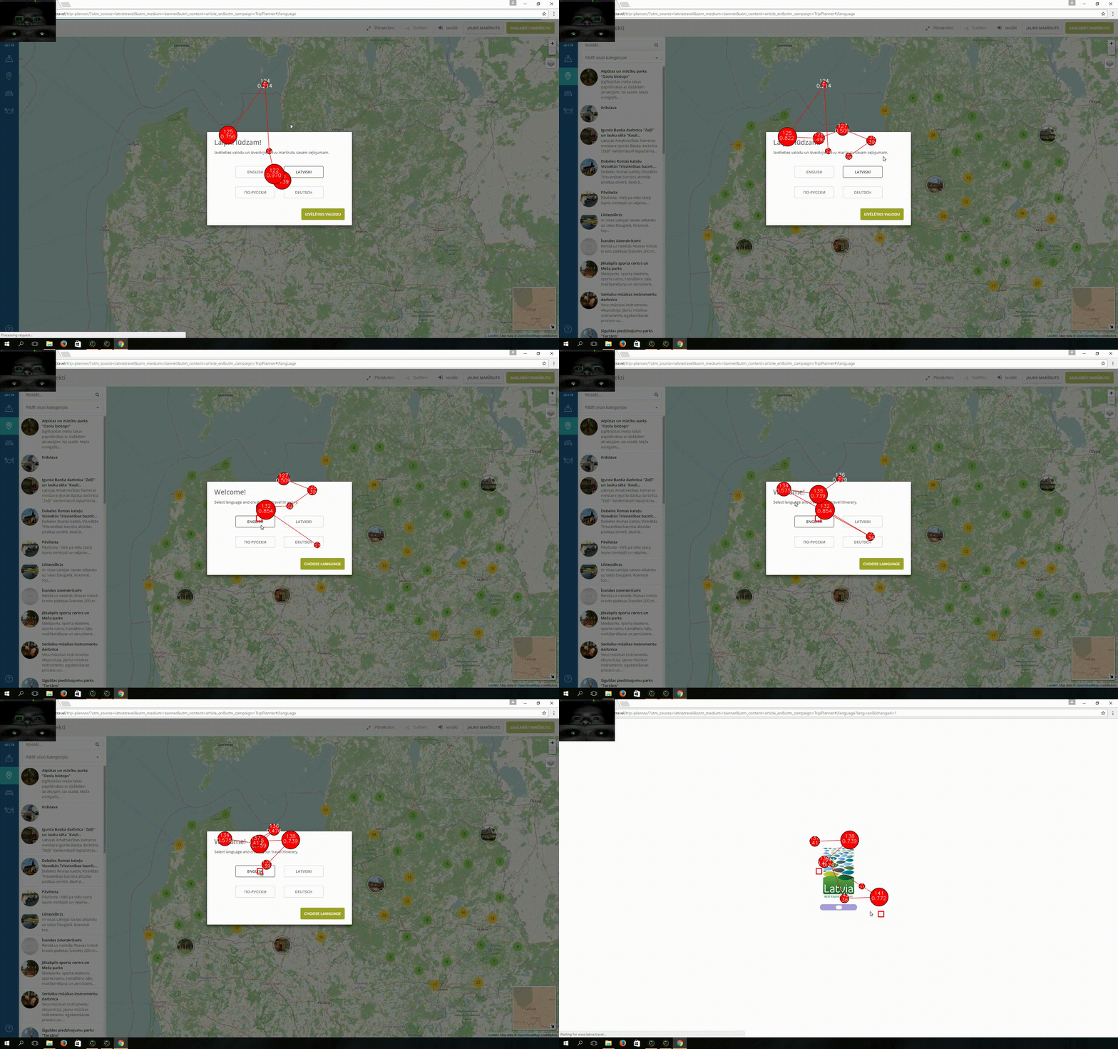
User spent 5 seconds on the “Choose language” Popup when opened “Trip Planer”.
Suggested improvements (2):
- To save users time, language of “Trip Planner” could be set to website language.
EYE-TRACKING HEATMAPS ANALYSIS — Example #3
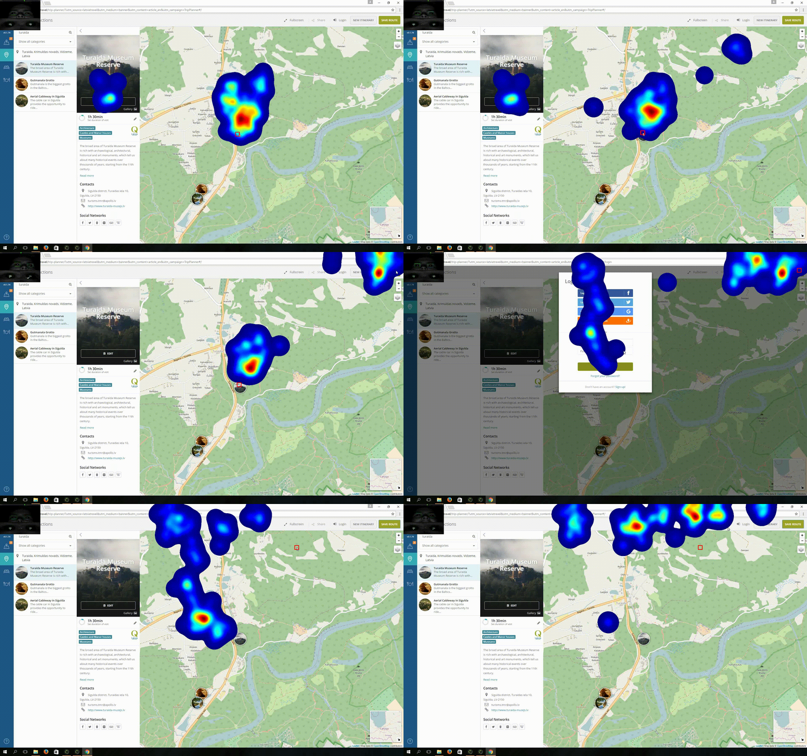
There is no “Back to Homepage” button in “Trip Planner” section of the website.
According to Eye tracking heatmaps user started looking for “Back to Homepage” button in right upper corner of a page
Suggested improvements (3):
- Locate “Back to Homepage” in the right upper corner since it will be intuitive for users to find it in that place.
EYE-TRACKING OPACITY MAP ANALYSIS — Example #4

Eye tracking results show us that the user focuses his attention on a subcategory title instead of a picture which implies that either pictures are not illustrative enough either user prefers to read tittles in text.
Suggested improvements (4):
- Change images so they would clearly represent subcategories
- Make the title larger so users could find it faster
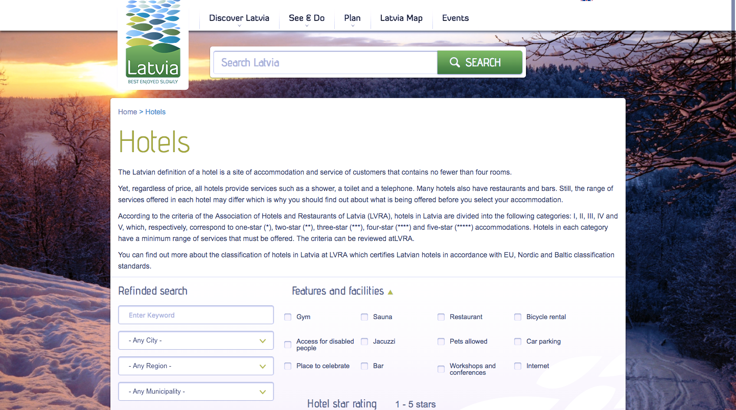
EYE-TRACKING OPACITY MAP ANALYSIS — Example #5
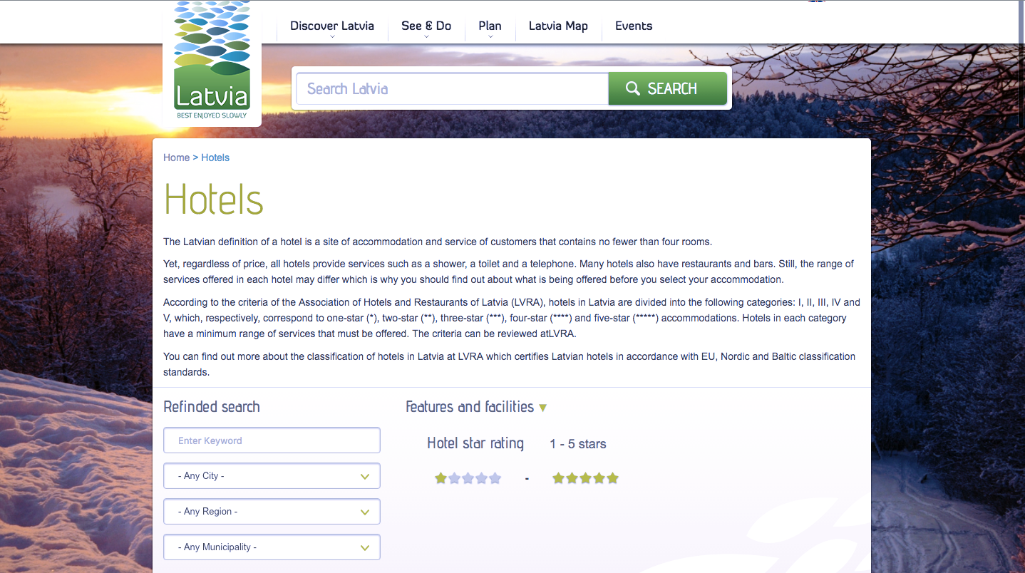
Large amount of text could be confusing for users.
Suggested improvements (5):
- Best practice is to keep it short and simple with one clear CTA per page.
- Keep available filters visible by default.
All these findings are not critical for website usage, and all the hypothesis should be validated with A/B tests to measure improvement success or failure.
However all the findings were vital for improvement suggestion development and will lead to better overall user experience on the website.
Let us help you:
Need help improving your eCommerce stores’ UX and CRO? You’ve come to the right place! Scandiweb is the most certified Magento agency in the world with more than a hundred experienced coders and more than a decade of experience under its belt. We’re here to help, so if you have any questions – drop us a line at [email protected] or check out our CRO services page.


Share on: