
ECOMMERCE UX AUDIT GOALS:
- Conversion rate increase
- Banners CTA click through rate increase
- Top landing pages bounce rate decrease
- Exit rate decrease
- Conversion funnel abandonment rate decrease
STEPS OF A UX AUDIT FOR ECOMMERCE:
- Customer web-journey map creation
- Task scenarios creation for usability testing
- Usability testing based on developed scenarios (heatmaps, eye tracking, EEG snapshots)
- Gathered data analysis and finding common user behaviour patterns
- Improvement suggestion based on the audit results
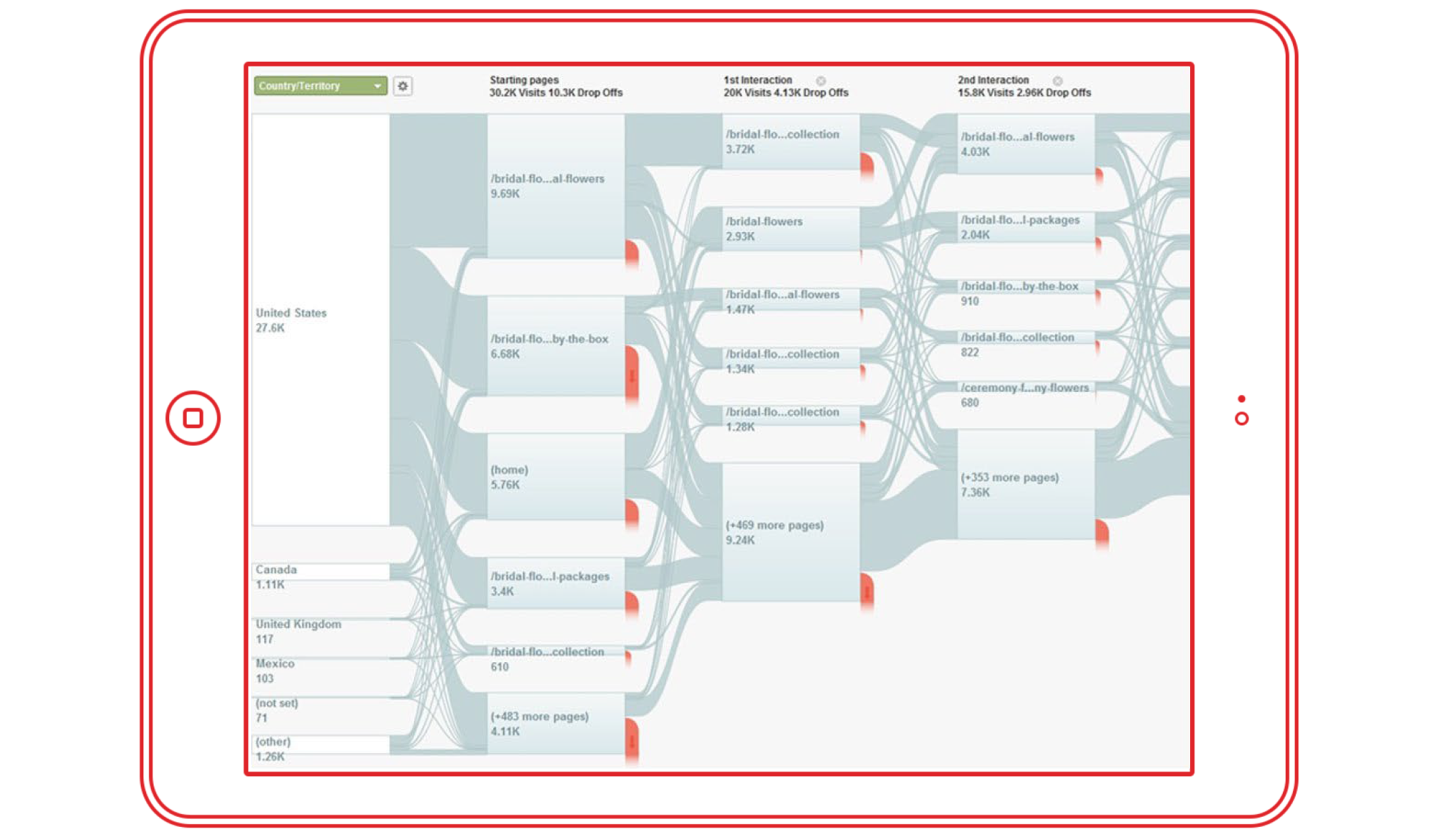 Improvements are evaluated based on A/B resting results, heatmaps and Google Analytics data.
UX AUDIT TESTING SCENARIO
Scenarios of UX audit should be:- Realistic
- Actionable
- Avoid clues and describing the steps while preparing a task
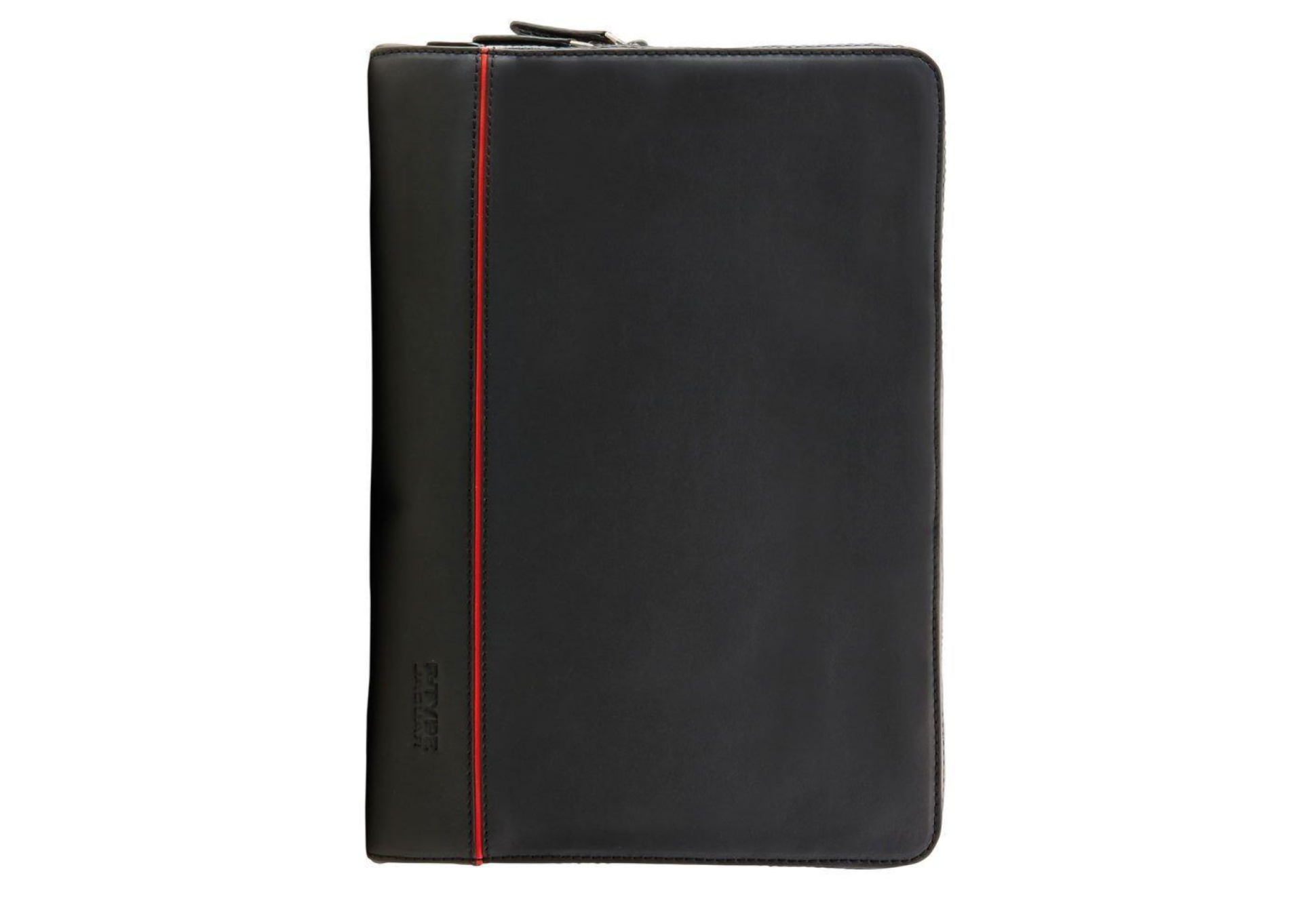
Find a branded F-Type leather portfolio from the new collection
EYE-TRACKING HEATMAP ANALYSIS — Example #1
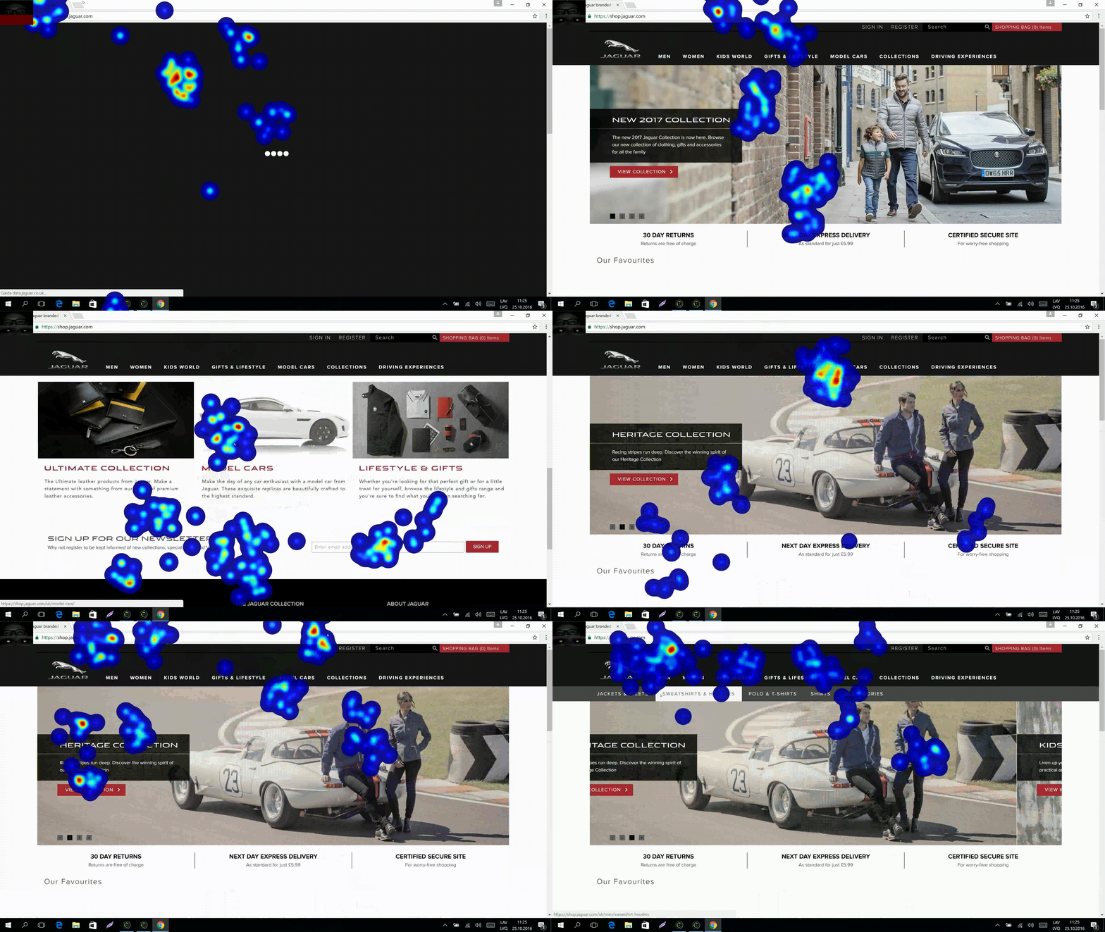 Eye-tracking heatmap, user recording example
- User focused on the middle of the promo banner, this can be due to people tend to recognise faces.
- User tends to look at central product column.
Suggested improvements (1):
- Move offer text to the middle of the banner OR make it more prominent

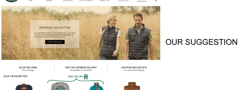
- Put bestselling products in the middle column vs current placement of products, since probability of a purchase goes up
- Put most expensive products in the middle column vs current placement of products, it should create anchoring effect, so other products will seem less expensive for users.
EYE-TRACKING FIXATION POINTS ANALYSIS — Example #2
 Eye-tracking fixation points, user recording example While navigating to subcategory user accidentally opening near located categories instead of clicking on a subcategory
Suggested improvements (2):
- Place subcategories right under parent category, increasing the height of the menu dropdown.


EYE-TRACKING OPACITY MAP ANALYSIS — Example #3
 Eye-tracking opacity map, user recording example This recording represents opacity maps of user who is browsing the website using the navigation menu. Opacity map shows areas at which user focused his sight. We can notice, that:
- Area above categories is in a range of user sight while user is searching a specific category.
- Search bar is out of users sight.
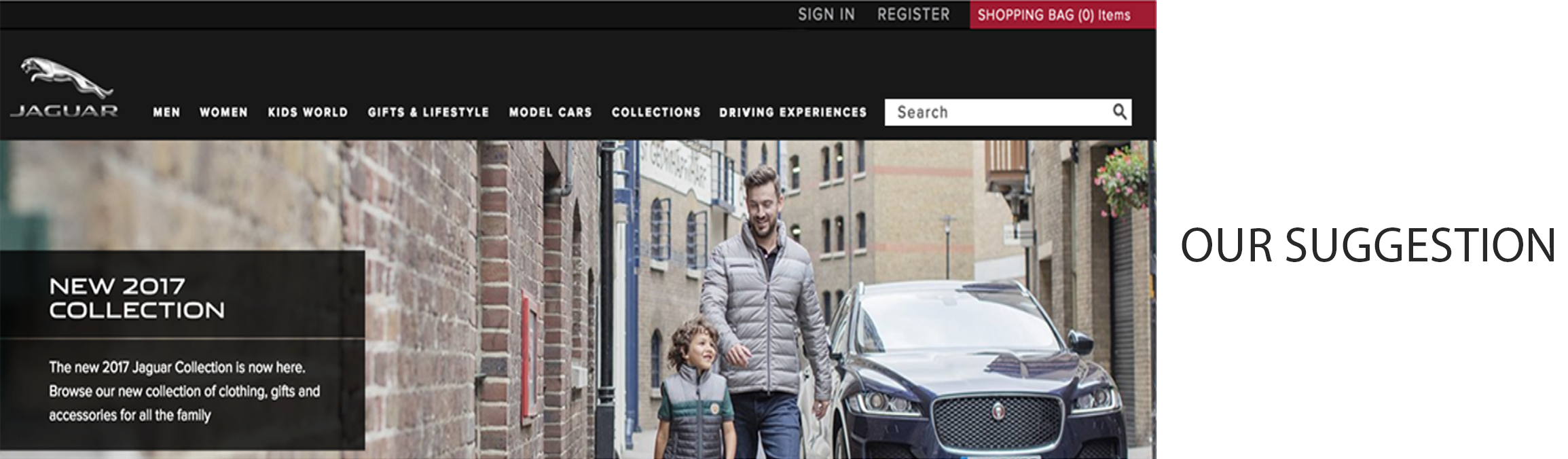
Suggested improvements (3):
- Move search tab to the side
- Change search tab design to make it more noticeable

 All these findings are not critical for website usage, and all the hypothesis should be validated with A/B tests to measure improvement success or failure. However all the findings were vital for improvement suggestion development and will lead to better overall user experience on the website.
Let us help you:
Need help with improving the UX of your eCommerce store? We can help! With more than a decade of experience designing and handling eCommerce stores and a strong team of experts, Scandiweb can tackle any challenge. Shoot us a message to [email protected] or check out our CRO Services Page.Related articles:

Share on: