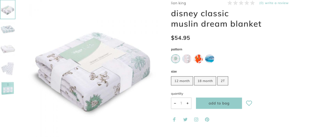
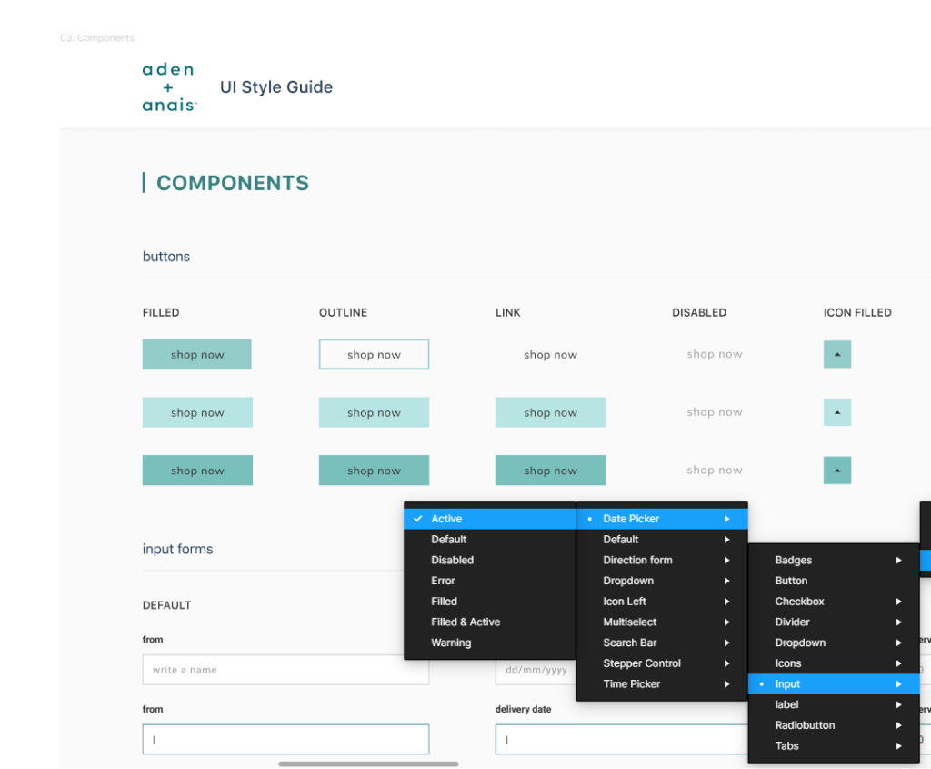
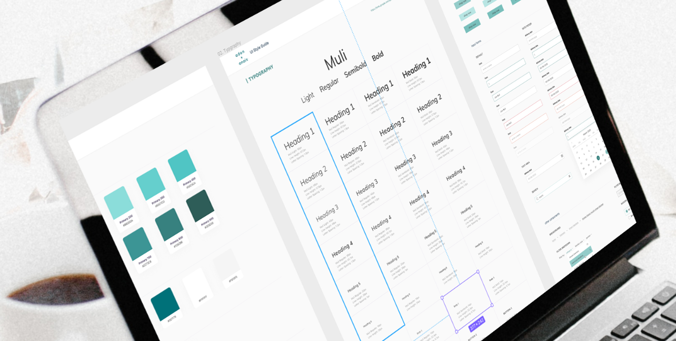
The design system is the brand’s way of communicating with customers about its product. From colors to the tone of voice, margins, and illustrations’ style, there are a lot of nuances that go into the conversation between a brand’s product and customer.
When this direction is absent or not fine-tuned, as in the case with Scandiweb’s client, then the brand communication may become noisy, cluttered, and lead to frustration, which in the eCommerce field means fewer sales.
Through consistency, the visual design should reflect the brand’s themes, thus reinforcing its values and credibility. Sure, you can set some primary colors, font sizes for headlines and call it a day, but the result will still be underwhelming. Directionless visual change of elements will not ever make up for a solid brand UI voice but can result in sales decrease.
Ideally, you should develop the design system before interacting with the customer. In this particular case though, it was an existing product. We will show you how we built upon existing assets and unified elements into one design system.
A design system for business
Identifying the problem
We chatted with the client and explored the situation. Functionality was there, quite a few sales were coming in, yet the website still lacked something. There was that feeling of ‘it’s not quite there yet’.
During the conversation with the client, we found out that there were no design templates for existing or new pages. Layouts were created with default configurations, they had used different grid systems, and the visual style of many elements seemed out of place, doing a disservice to the product.
Upon further investigation, it became crystal clear that there was no connection between the brand’s voice — soft and tender, yet trustworthy — and the visual design of the website. It was clunky and all over the place.
Something was absent and that was a unifying set of rules that design obeys to. In other words — a design system.
Why does a website need the design system
There are many reasons to develop a design system. How about saving a lot of time when prototyping new features? That alone is a great reason to start working on a design system.

Another one is strengthening the brand’s voice by unifying the website’s visual design. It enhances the product’s value by efficiently using every single pixel on the screen (white space, fonts, colors — everything you see on a page). Just like content strategy, marketing, and market research, visual design is another fine tool capable of increasing your product’s accessibility, but only when done right.
When the design system is in place, and all the elements on the website speak with one voice, more importantly, in one tone, then the conversation with a customer ensures higher success rates. From the development side, it’s much easier and more efficient to code when one element has the same style on all pages.
A design system is more than just good looking visuals. It’s a thought and care put into a product to direct a conversation with customers in the right way.
Research
We faced quite a large issue. How should you go about evaluating the existing clunkiness of an interface and the brand’s voice misuse? What are the UI elements you should use as tools when talking to a customer through a website?
We dove deep into profound research on similar projects while continuing the conversation with the client and applying their wishes to the process.
Collecting existing assets
There is no other way around it. If the goal is to enhance, unify, and better the existing assets, you can’t just start from scratch. You’ve got to find them all manually and collect them in one place.
Plot twist! There was no Figma or Sketch file of the original design. Not even Photoshop files. Nothing we could start the actual design work with.
So we examined every page and every UI element, finding inconsistencies and mismatches in sizes and colors. It took quite some time.
Evaluation of those assets

When collected, existing assets will tell you why a unified design system is needed. Several fonts, different styles for one category of elements, such as buttons or icons — that was our foundation, which we then took further.
Unifying existing assets
With all the visual elements collected and inspected, we set sail to edit all the inconsistencies and create a direction, under which to combine those elements.

We turned links to category and product pages into buttons, left only two fonts, and color thematic usage became a guiding power for customer’s attention. Moreover, we restructured the navigation and reorganized the content to maximize the efficiency of user experience.
We also created a naming convention for design assets, allowing for flexible categorization.
System designed
After organizing design elements, testing, and going back-and-forth with the client, the final version of the design system stepped into effect.
With every page and every style speaking in one, organized, directed tone, the website turned into a better, more efficient version of itself.

But is it final though? The new conversation with the customer has only started, and the design system must adapt and evolve to help keep this conversation relevant and useful for both sides.
Is your checkout struggling? High drop-off rates? Clunky UI? Let us help you! Our team loves finding ways to optimize! Write to us at [email protected] and let us know — we’re here to help you solve your eCommerce store issues!


Share on: