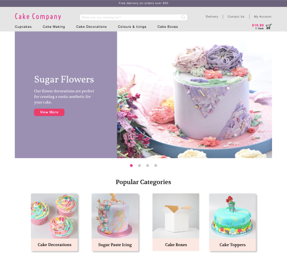
The homepage is the gateway to the rest of the website content. Some might say it’s the place on a website where customers feel the safest, such as the front page of a newspaper or the cover of a book. And we all know how crucial this first impression can be.
Despite the definition you prefer, the homepage is essentially the face of a website that helps users get to a point they want to. Therefore every detail has to be carefully considered when building it.
In this case study, we’ll share a story of how the Scandiweb Growth team helped a company that sells cake-baking items to build an improved homepage (or the front page) that explains brand values, emphasizes it’s positioning, and leads to top content.
Why redesign?
This homepage was not initially screaming for a redesign. The current design matched industry basics, the products group company represents was clear, and navigation was rather simple.
However, the homepage needed several improvements. The styling was a bit outdated, and it lacked product category blocks. Moreover, in previous months of cooperation, we fixed crucial user experience issues. Therefore we could spend time on improving the website itself.
How to create a data-driven homepage redesign?
Step 1: Investigate Google Analytics, Google Ads, and Google Search Console data to understand how and why users land on the homepage
First, we analyzed quantitative data regarding messaging in traffic acquisition channels and how it matches the content on the homepage. By using Google Analytics landing page dashboard, Google Ads keyword performance report, and Search Console data, we found answers to the following questions:
- From which channels do users land on the homepage? Does the message shared in the channel match with the one on the landing page?
- Which keywords have brought users to the website? Are those keywords visible on the homepage?
- What are the top landing pages? Can users get there from the homepage?
The data helped us formulate the new value proposition shared in the improved designs, as well as identify opportunities for content that speaks to website visitors. E.g., out of the top 20 landing pages, 5 were blog articles. It means that the homepage should have direct links to the most popular articles.
Step 2: Analyze user session recordings & heatmaps to clarify user flow
Although we had quite a clear picture of what users do next after landing on a homepage already, based on GA data, we decided to check session recordings and heatmaps.
By analyzing user flow with session recordings and heatmaps, we discovered that visitors mainly use menu navigation when visiting the website on desktop, and search functionality from mobile. As the majority of sessions were on mobile devices, the search bar in new designs should be accessible and easy to notice.
Another goal of the new homepage was to have category blocks. These methods indicated that the 1st level categories users click the most are: Decorations, Boxes & Boards, Icings & Colours.
Step 3: Clarify which categories are the most profitable according to Enhanced eCommerce data
The homepage has to explain to customers why they should purchase at this store and not in any other. One of the ways to speak about the competitive advantages is to show the bestsellers. Given the company had a working set-up of Enhanced eCommerce in Google Analytics, we could quickly check the category and product performance.
A great thing about EEC reports is that they show not only the number of transactions and revenue but also in-depth interactions with website visitors. Why is that important?
Apart from categories that are money-makers, you might find ones that are broadly visited but do not convert, so it would not make sense to add them to the homepage. There also might be categories only a few people know about (hidden deep down in the menu) that are converting very well, therefore they should be emphasized more.
At this point, the Enhanced eCommerce data lets us prioritize 2nd level categories that should have a place on the homepage.
Step 4: Determine industry trends by competitor analysis
The homepage should be following the general concepts of the industry. To discover what homepage trends are common for the cake-baking industry, we performed a competitor analysis focused on only their homepages. The main purpose was to clarify:
- The structure of the header & menu
- The value proposition showed in the homepage
- Elements that are included in the first fold of the homepage
- Product categories added in the homepage
- The overall structure of the homepage
The findings were important for the tone of voice and the visuals (i.e., colors) as well as when planning the information architecture. We concluded that users visiting a cake-baking industry website should feel as if they are at a friendly party which has decorations in cheerful colors, everyone is happy and nice to one another, and there are a lot of amazing sweets.
Step 5: Create a summary and build data-driven wireframes
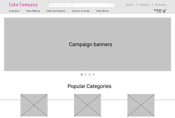
Finally, we gathered insights to build wireframes. Below you can see the first mock-up of the desktop homepage. It has a styling that goes in hand with industry trends, product categories, and links to top-rated content that motivates users to proceed further in the purchase funnel.

Thinking of redesigning your website’s homepage? Need help improving your eCommerce stores’ UX and CRO? You’ve come to the right place! Drop us a line at [email protected] or click the orange chat bubble, and we’ll kick off the optimization process for your website within 24 hours.


Share on: