
There is an old saying: You never get a second chance to make a first impression. You can apply it to websites, too. When designing a website, it is important to remember to treat its homepage the same as the first impression a person would give about themselves.
One of the most important if not the most crucial aspect of any homepage, that can make or break the first impression, is the value proposition. A value proposition is a promise of value to be delivered. It’s the primary reason a user should buy from you. In case the value proposition is weak or doesn’t exist at all, the possibility of users bouncing the website increases dramatically.
In Scandiweb, we have observed a lack of propper value proposition that harms the website performance countless times. This case study will describe how we achieved an increase in the clickthrough rate and element interaction rate with A/B testing and optimization of the value proposition.
Analysis and preparation for A/B testing
Scandiweb’s Growth team was performing conversion research for an eCommerce store selling bicycle covers. During the research, we discovered that the Homepage had a higher bounce rate for new non-converting users overall, even though most of the traffic was coming from paid search campaigns. Brand-related or bike cover related keywords are expected to have an audience with a much higher interest in the product and brand, yet that wasn’t the case.

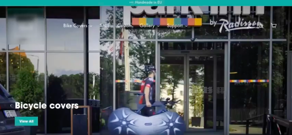
Also, the CTR of the value proposition block was very low. The video above the fold wasn’t clickable, and the main CTA wasn’t visible enough due to low contrast. Moreover, it was located over the video which was the main focus for the users.
Based on the findings, we decided to run an A/B test in which we suggested optimizing the value proposition and add USP block on the Homepage to increase the engagement and click-through rate of new and returning users.
Optimization of the Homepage
Based on the low-hanging fruits detected on the Homepage, we optimized the following aspects of the Homepage for the A/B test variation:
1. Value proposition
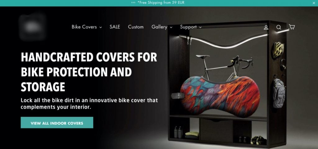
Instead of the looped video used as the value proposition (on the left), we suggested adding a static image with clear UPS and distinct CTA (on the right) to improve focus and reduce the number of dynamic elements on the page.
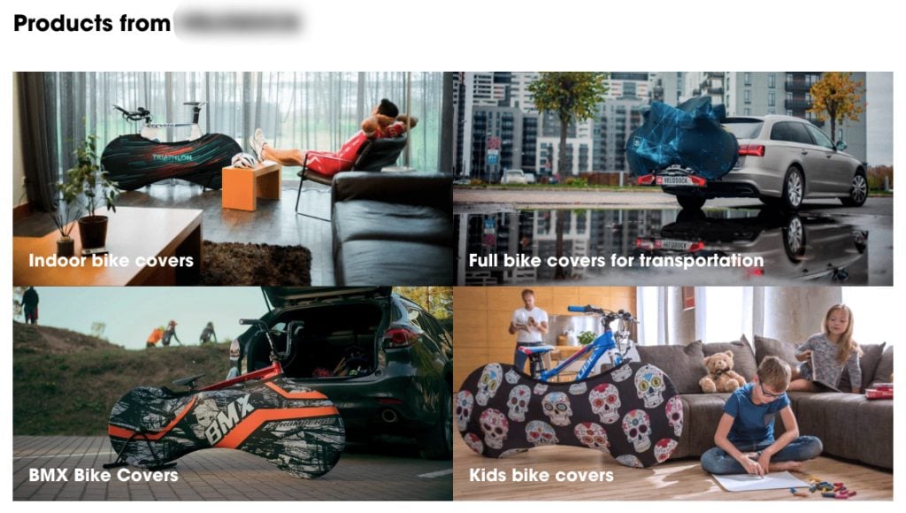
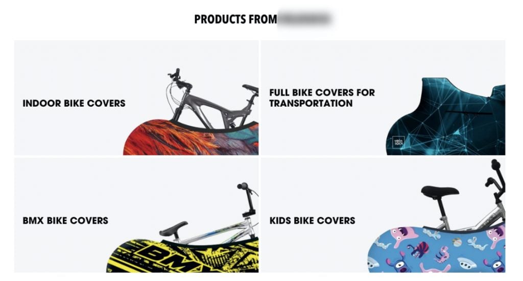
2. Category block
By reducing the clutter in the category block images, we increased the user focus and made the product more prominent and noticeable.
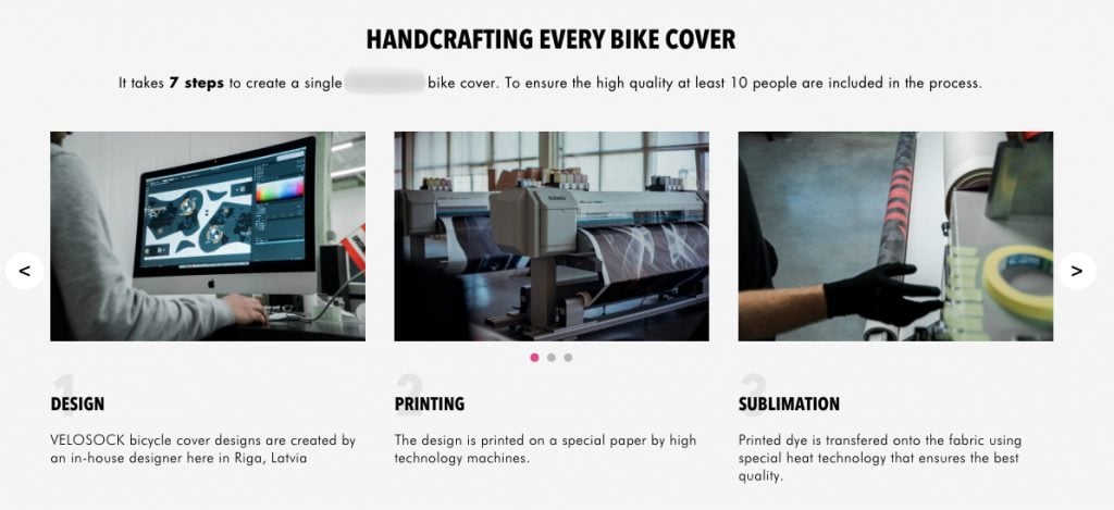
3. UPS / How it’s made block
To draw user attention to the quality of the product and introduce the process of product manufacturing, we added a UPS block to the Homepage containing a detailed description of steps to create a single bicycle cover.
A/B test results
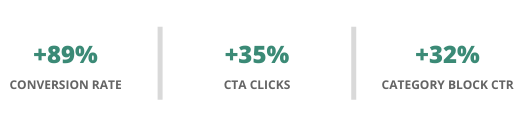
1. CTA Clicks
Across all segments, we reached the statistical significance in the Value proposition CTA clicks for the Variation. Overall variation reached a 35% increase in CTA clicks compared to the original.
A clear and easy-to-spot CTA ensured a more efficient transfer of visitors to other pages.
2. Category block clicks
Across all segments, we reached the statistical significance in the Variation for the increase in CTR for the category block. Overall variation reached a 32% increase in clicks compared to the original.
Category block with less clutter and more noticeable product images improves the perception of the product and ensures an efficient transfer of visitors to other pages.
3. UPS block’s impact on conversions
Based on the A/B test results, we detected that the Add to Cart rate was higher for users who saw the “How it’s made” block compared to the users who did not scroll down to see it.
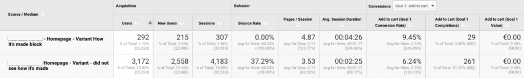
Besides, the conversion rate improved by 89% for users who saw this block compared to those who didn’t.
Conclusion
Based on the A/B test results, we recommended the client to implement applied changes to the Homepage as:
- the improved value proposition increased the interaction rate with the value proposition CTA by 35%
- optimized category block increased the CTR by 32%
- users who have interacted with “How it’s made” block on the homepage are more likely to add products to cart and purchase them.
Are you planning to launch A/B tests on your website? Let us help you! Feel free to drop us a line at [email protected] or check out our Conversion Optimization services!

Share on: