It is 9 a.m., your sale email goes out in three hours, and the template still looks like a newsletter from 2015. You know the copy is fine. What you are not sure about is whether the layout, the buttons, and the way it renders on a phone will actually get someone to click and buy.
That is the real job of an eCommerce email template: not to look pretty, but to move a reader from inbox to checkout. This guide covers both halves of that job, the design rules that make a template convert and the lifecycle templates that drive the most revenue, plus the sender requirements you now have to meet to reach the inbox at all.
Overview
- A converting email template is built like a mini landing page: one clear path from a scannable header to a single, obvious call to action.
- The templates that earn the most revenue are automated lifecycle emails, with abandoned-cart and welcome flows leading by a wide margin.
- In 2026, Gmail and Yahoo actively enforce the bulk-sender rules they introduced in 2024: authenticate your domain, offer one-click unsubscribe, and keep spam complaints under 0.3%, or your emails stop reaching the inbox.
🚀 Quick takeaway
Design and deliverability are not separate problems. The best-designed email in the world earns nothing if it lands in spam.
What makes an eCommerce email template convert?
A converting template guides the eye down one clear path to a single action. Treat every email like a mini landing page with a defined header, body, and footer, then remove anything that competes with the click you want.
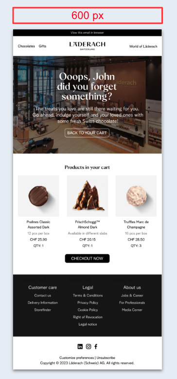
Structure
Keep a well-defined header, central body, and footer. The header carries your brand identity, a short menu, and a link to the browser version. The footer holds contact details, social icons, and the unsubscribe option. A single-column layout reads best and adapts to mobile far more reliably than multi-column grids.
Headings
Skip decorative captions. Clear, direct headings guide attention and break up the message so it can be skimmed in seconds, which is how most people read email.
Call to action
One email, one primary action. Make the main button bold, high-contrast, and written as a verb the reader can act on. Segment your list and match the call to action to each group, since a returning customer and a first-time subscriber are not deciding the same thing.
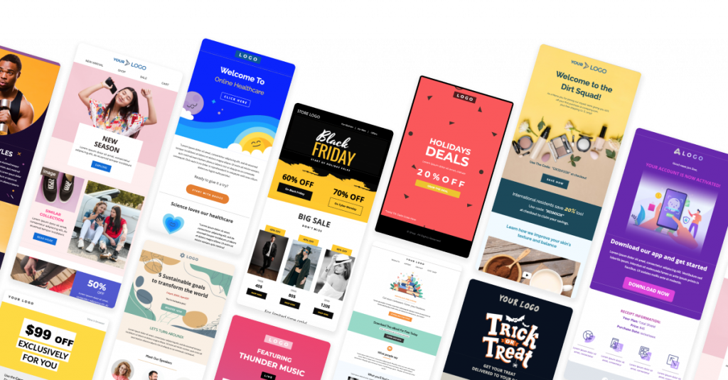
Visuals
Images, GIFs, and product shots carry the message when text alone would lose the reader. Use them to show the product in context, not as decoration. Stacked paragraphs with no visual break are the fastest way to lose attention.
Color
Color sets the emotional tone before a word is read, and the right palette depends on the occasion. A Black Friday email and a spring launch should not look the same. Match the palette to the campaign and to your brand, and use a single accent color to make the call to action unmistakable.
Typography
The typeface sets the tone and has to stay readable on every screen. A few rules hold up well:
- Use distinct fonts for headings and body text.
- Avoid ornate display fonts in the body.
- Set body text at 14 to 16px and headings at 20 to 30px.
- Keep spacing and styles consistent across the email.
🚀 Quick takeaway
If a reader cannot find the one button you want them to press within two seconds, the template is doing your competitor a favor, not you.
Email design best practices
Width and length
A template width of 600 to 640px renders well across email clients, including the ones that frame your message next to other panels. Length depends on content: text newsletters can run longer, but image-heavy emails risk being clipped by Gmail, so front-load the message and the call to action.
Brand consistency
Use the same tone, colors, and fonts you use everywhere else. A reader should recognize the email as yours before they read the sender name. Carry your logo, link to your site and social profiles, and keep the call to action in your brand voice.
Layout patterns
Two layouts reliably guide the eye:
- Inverted pyramid: start with a wide header, narrow the content, and end on the call to action. It funnels attention straight to the click.
- Zigzag: alternate text and image blocks side to side. It shows products well on desktop but can break awkwardly on mobile, so test it before sending.
Video
Video lifts engagement, but most email clients do not play it inline. The reliable workaround is a clickable thumbnail, a static image or a GIF with a play icon, that opens the video in the browser. You get the attention without the rendering risk.
🚀 Quick takeaway
Every design choice is a tradeoff between impact and rendering. When in doubt, pick the version that survives a cheap Android phone in a dark room.
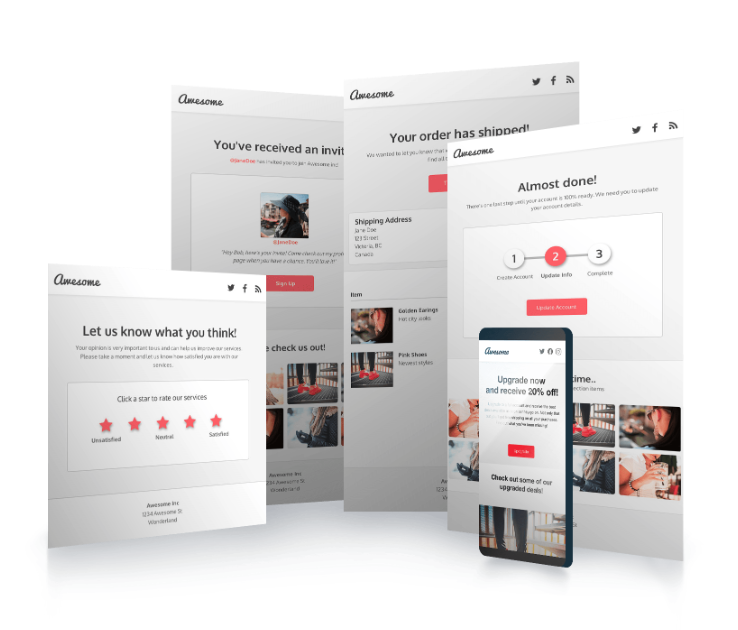
The eCommerce email templates that drive revenue
Design gets the click. Template type decides how often you get to ask. The highest-return emails are automated lifecycle flows triggered by behavior, not one-off campaigns. According to industry benchmarks, automated flows like abandoned cart and welcome series consistently outperform broadcast sends, with abandoned-cart emails reaching open rates near 45% and welcome emails often hitting 50 to 60%. These are the templates worth building well:
- Welcome series: the highest open rates you will ever see. Introduce the brand, set expectations, and make a first offer.
- Abandoned cart: the single highest-revenue automation for most stores. Show the cart, handle the objection, and keep the first email simple.
- Browse abandonment: for shoppers who viewed but never added to cart. Lighter touch than a cart email.
- Post-purchase: order confirmation, shipping updates, and a follow-up that sets up the next purchase or a review request.
- Replenishment: for consumable products, timed to when the customer is likely to run out.
- Win-back: for lapsed customers, often paired with an incentive. This is where a connected loyalty program does a lot of the work.
- Review request: turns a recent buyer into social proof for the next one.
Each of these is a reusable template once it is built. The work is getting the structure, timing, and trigger right once, then letting it run.
🚀 Quick takeaway
A great campaign email earns once. A great abandoned-cart template earns every day, for every shopper who hesitates.
Make your emails mobile-responsive and dark-mode ready
More than half of email opens happen on a phone, so a desktop-only design leaves money on the table. Build one email that adapts cleanly between screens rather than hoping a fixed layout holds up.
Mobile best practices
- Set body text at 14 to 16px and headlines at 20 to 22px.
- Make sure any landing page you link to is also mobile-optimized.
- Hide non-essential elements on small screens to reduce clutter.
- Repeat the main call to action in longer emails so the reader never has to scroll back.
Dark mode
A large and growing share of readers use dark mode, which flips your palette to light text on a dark background. Design for it rather than against it:
- Use transparent PNGs so images do not sit on a clashing white block.
- Add a thin light outline to dark logos and icons so they do not vanish.
- Preview in a tool like the GetResponse or Litmus email tester, since dark-mode rendering varies by client.
🚀 Quick takeaway
Dark mode is not an edge case anymore. If your logo disappears on a dark background, a real slice of your list is seeing a broken email.
Which Gmail and Yahoo sender rules apply in 2026?
Reaching the inbox in 2026 means meeting the bulk-sender rules Gmail and Yahoo introduced in February 2024 and now actively enforce, because a beautiful template does nothing if it never arrives. Per Google’s sender guidelines, senders mailing 5,000 or more messages a day to Gmail must meet three rules:
- Authenticate your domain with SPF, DKIM, and DMARC.
- Offer one-click unsubscribe in every promotional email, and honor it within two days.
- Keep your spam-complaint rate under 0.3%. At 10,000 sends, that is only 30 people marking you as spam.
Gmail ramped up enforcement through late 2025, so in 2026 non-compliant senders see real delivery failures, not just warnings. The practical takeaway: the unsubscribe link and your authentication setup are no longer optional polish. They decide whether the inbox accepts you at all.
🚀 Quick takeaway
Deliverability is now a design requirement. A visible unsubscribe and a clean authentication record protect every other email you send.
How scandiweb approaches eCommerce email marketing
We build email as a system, not a series of one-off sends. That means a template library tied to the lifecycle flows that earn the most, design that holds up on real devices, and a deliverability setup that keeps you in the inbox as volume grows. It is the same retention thinking behind our broader email marketing best practices, and it connects to the on-site work in conversion rate optimization, since the email and the landing page have to tell one story.
Across more than 2,100 eCommerce projects since 2003, the pattern is consistent: the brands that win on email are not the ones with the prettiest single send. They are the ones whose templates, timing, and triggers work together, especially around peak moments like Black Friday.
🚀 Quick takeaway
The template is the visible part. The revenue comes from the flow it sits inside.
Frequently asked questions
What is an eCommerce email template?
An eCommerce email template is a reusable, branded layout for a specific type of marketing email, such as a welcome, abandoned cart, or promotional send. A good template defines structure, typography, and the call to action once, so every email stays consistent and renders correctly across devices.
What size should an eCommerce email be?
Use a template width of 600 to 640px, which renders well across email clients. Keep the message focused: front-load your main content and call to action so it is visible before any clipping by clients like Gmail.
Which email templates make the most money in eCommerce?
Automated lifecycle flows outperform one-off campaigns. Abandoned-cart and welcome emails lead, followed by post-purchase, browse abandonment, replenishment, and win-back flows. These run continuously once built, so they compound over time.
How do I make an email template dark-mode friendly?
Use transparent images, add a light outline to dark logos so they stay visible, and test in a dark-mode preview tool. Dark mode flips your color scheme, so anything that relies on a white background needs to be checked.
What are the Gmail and Yahoo sender rules in 2026?
The rules, introduced in February 2024, are fully enforced in 2026. Bulk senders to Gmail and Yahoo must authenticate their domain with SPF, DKIM, and DMARC, include one-click unsubscribe in promotional emails, and keep spam complaints under 0.3%.
How long should a marketing email be?
There is no fixed length. Text-led newsletters can run longer, while image-heavy promotional emails should stay short to avoid clipping. Match length to the single action you want the reader to take.
Staring at a template that looks fine but is not converting? That gap is usually structure, timing, or deliverability, not copy. Book a working session with our email team and we will look at your templates and the flows behind them together.
About this guide
Maintained by the scandiweb Growth team. Reviewed by the scandiweb email marketing specialists. Last updated May 2026.

Share on: