While working on the ViewStart project we realized that there is so much more we can do and experiment with such platform. We went further and thought of a next step by thinking — how it is possible to synchronize online store with user’s personal needs. That’s when we came up with a ViewStart “spin-off project”.
ViewSence is the world first custom personalization platform for video content and product placement. It’s mission is to help us bring retail innovation to customers and enable them to deliver truly unique experiences for their shoppers.
ViewSence is collecting and storing thousands of data entries every minute. It structures large data arrays and present users with insights on how to action the data they are gathering. Having thousands of data collection points across the world, we can benefit from pooling the data and sharing it across the platform’s users.
Branding process
Where do we start? We start answering following questions in order to develop a concept — why users need ViewSence, what it is for, what value it carries, how does it tries to change the world?
In our case inventory concept for ViewSence brand identity is that it should:
- be connected to the project concept,
- be visually simple and balanced,
- convey a message of a revolutionary project.
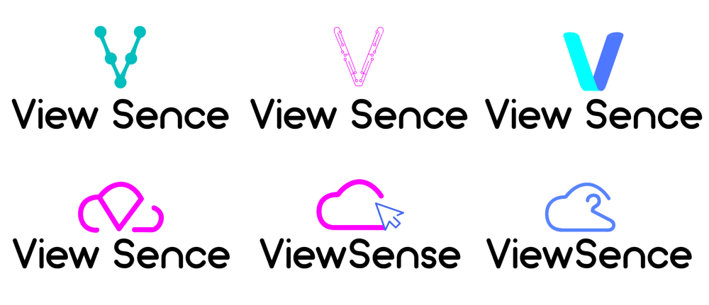
Distilling the essence of the brand down to its core, we started developing visual identity by converting texts into visuals, and coming up with first drafts for the ViewSence logo.
Looking at these results we concluded that the visuals doesn’t connect to the concept. So we returned to the start with thinking of the concept.
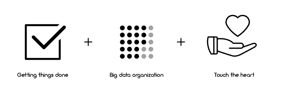
Final result for us came for us any any other “a-ha” moment. To finalize the work we used a project’s motto, which is “touch customer’s heart”.
BIG DATA — Decision making + Touch the heart

Final design for the logo comes in shape of a tick, which stands for that ViewSence can organize big data and we can make things DONE. In the center of the logo is a shape of a heart, to show that ViewSence closer to the client’s wishes. All together ViewSence is built from chaotic flowing dots (aka huge amount of data) into organized structure (aka tick). This shows how we make user’s decision-making process quicker, more efficient and organized.
For the logotype we chose Arciform — simple, humble and approachable font, which fits perfectly together with the logo. The type is similar to ViewStart, this way we show that these projects are connected to each other.
With logo final result we’ve managed to develop a identity, which stands for organizing data. The final logo was tested at various sizes for maximum legibility in all the new digital contexts.
Video making
Logo design was only one part of the effort. As in ViewStart, we decided to show the idea of the ViewSence concept with the video format. We weren’t really satisfied with the result we did before, so we updated it.
The style of the video was chachedfrom “completely flat” to “completely outlined”. We worked more on texts and focusing on details.
Landing pages
When the style and concept were settled, it was time for landing page designs. We made the landing pages clean, organised and informative as much as possible.
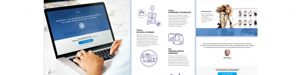
The same principle was held in ViewSence page.
When we had enough material for the project we made a a final stage of branding — we made the promotional leaflet designs for ViewSence.

And, of course, part of branding are also business cards for the clients.

As we are moving forward and creating new products and experiences, we hope this project will continue to deliver all expectations from users.
Our articles on ViewStart projects:
Accelerating ViewStart — platform for eCommerce in video streams
Logo Re-design for ViewStart video platform
Motion video for ViewStart + Magento project
Custom personalization platform ViewSence


Share on: