Giving online customers the option to adjust and customize their chosen products while shopping used to be a rather rare occurrence. Last year’s shift in shopping habits has increased this demand significantly, and customers now expect the opportunity to personalize and try on the items online before making a purchase.
Online product configurators help to meet this growing demand.
According to configit.com, the product configuration is an interactive process where the user chooses a feature, which is validated via a configuration rules engine, before allowing the user to make the next choice about the remaining features on their product. Whether they’re shopping for sneakers, interior items, or any other product, configurators allow customers to make real-time adjustments and customizations.
Why are configurators good for online stores?
Reduce returns
Users have the chance to see the product in greater detail and imagine it in their own hands. Plus, if users customize the products themselves, chances are the product will feel more special, and the user won’t want to return it.
Increase margins
Customers are creating customized products that are unique and will belong only to them. They are likely to pay more for that!
Shorter sales cycle
Customers can create the product in minutes and make an order. No calls to the store, no endless emails with the team – everything happens much faster!
Less inventory
If you sell customized products on the website, there is no need to keep a big inventory of in-stock items.
Let’s take a look at some great product configurator examples:
Users can switch between the elements to configure on the left side, and the photo in the middle changes accordingly. The photo itself and level of detail are high-quality, and all sections of what to configure are displayed with easy access. Beautiful!

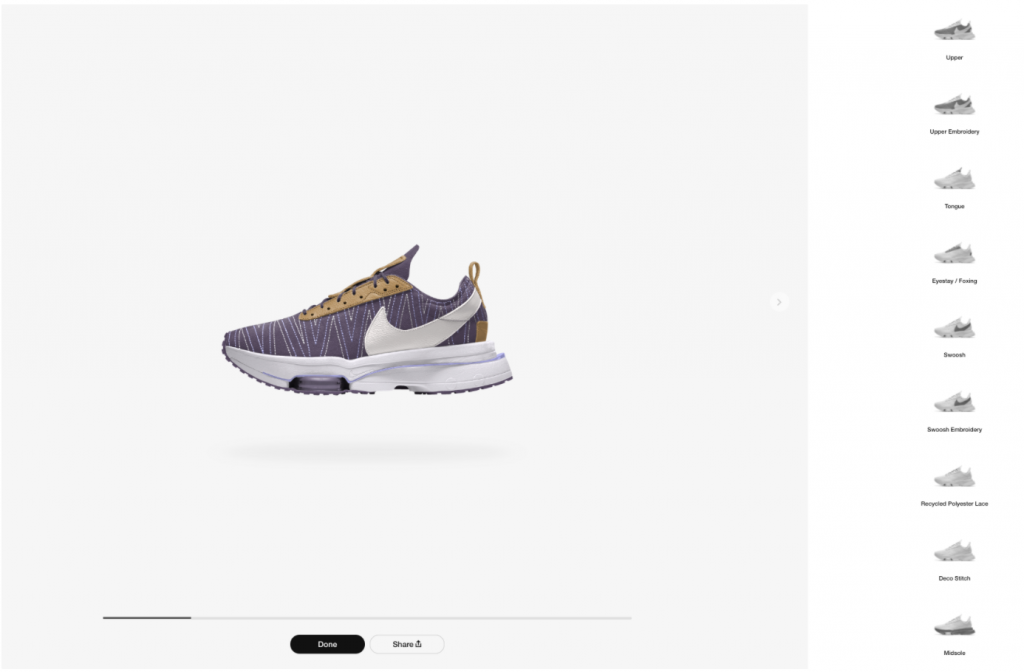
2. Nike.com
Users can click through the sections and customize the color of almost every detail on the shoe. The configurator works great, and the photo is very detailed. However, it might be difficult to understand the differences between the customizable elements based on some descriptions’ phrasing.
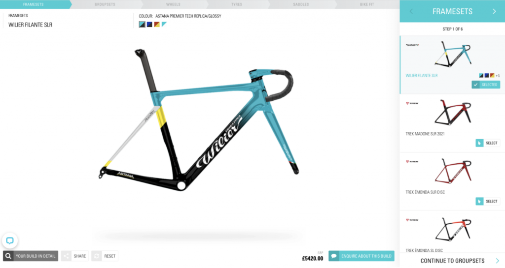
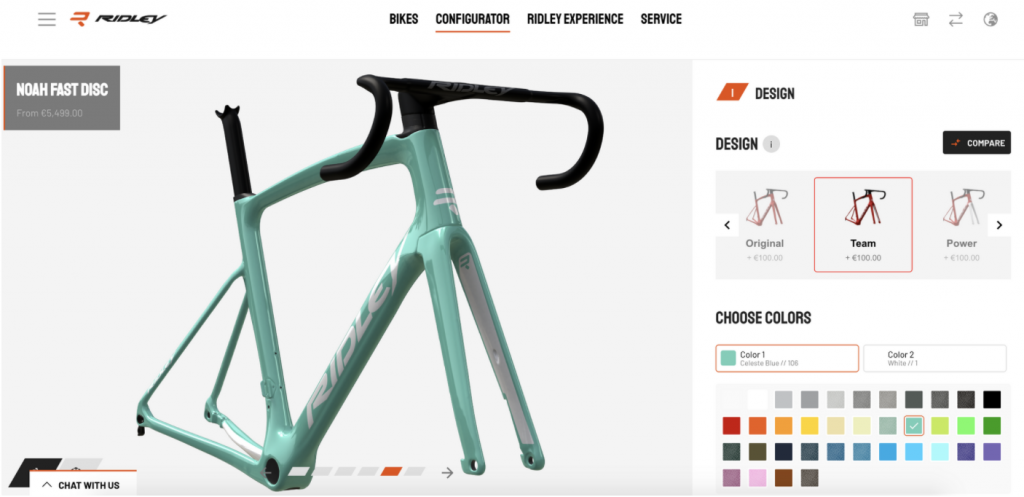
3. Bespoke Cycling and Ridley Bikes
Bespoke Cycling’s configurator shows each part of the bike as a separate step, and the user has to click through the steps to customize the bike. On the other hand, Ridley Bikes creates a smoother experience where each next step appears as the user configures. In the end, you can also select a background photo to really evaluate your new Ridley Bike – a cherry on top!
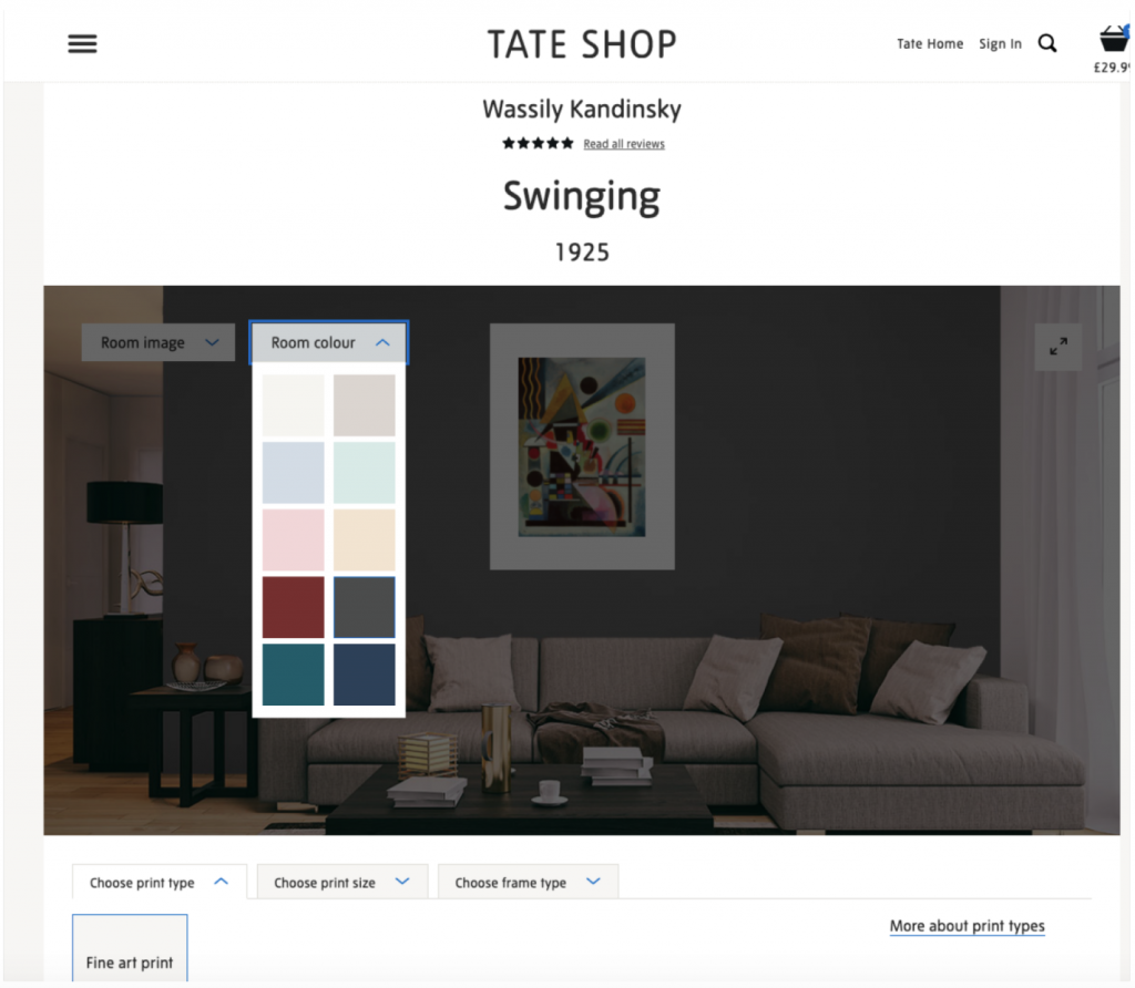
This is a great example of a website using the configurator to sell the product while helping users illustrate how the product would fit in their home interior. With this configurator, users can change the background color of the wall and see which print would suit their home best!
5. Ferrari.com
Ferrari’s configurator stood out immediately – users can choose how they want to experience it, either in 2D or 3D. The experience is impressive, and the tool details and image changes while configuring are really something.

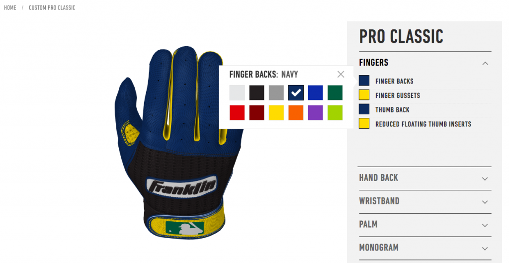
Their product configurator implemented on Magento 2 allows you to design your own custom glove by picking a color for every part of the glove of your choice, including the logo, and inside detailing to create the perfect design for any baseball team or enthusiast. All color changes are applied in an instant. You can also view the product in a 360 view and share the final design on your social media.
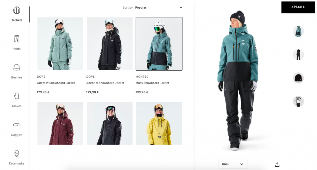
Dress for a ski adventure from head to toe with Ridestore’s product configurator that allows you to mix and match garments to create the exact outfit you want without having to try it on yourself. Depending on the items you choose, there is a total sum of the outfit displayed on the right. Scroll through the options for each category and try on as many combinations as you can think of!
While looking at all these eCommerce product configurator examples, it’s important to keep in mind the following:
- Use high-quality images to show how the product changes;
- Keep the loading times low;
- Be clear about the steps users have to take to configure the product fully;
- Have clear CTAs – users need to know what to do next.
Want to implement a product configurator on your website? If you have questions or problems with creating an eCommerce website that sells, we’ll be happy to help you! Click on the orange chat bubble to contact our project managers directly or email us for a free consultation.


Share on: