Earlier this year, our client (whom we worked with projects like View Sence) asked our designers to make a new brand identity that aims to make ViewStart more accessible and useful to their users.
ViewStart — the first platform that allows you to sell products within a video stream. ViewStart makes it easy to navigate long videos. You can split them into chapters and help your customers find what they are looking for with one click.

Steps of re-branding
Color blue and the rectangular shape with rounded corners were pretty self-explanatory for the logo choice hence the name and main functions of the platform. But for the logo of ground-breaking platform is clearly a weak point for the company.
The process of developing a new brand for ViewStart started with putting on the list what we would want to change and invest into new face of the project.
Our goal is to make ViewStart more accessible and useful to users around the world. The main and the most essential point is that it should be simple, yet revolutionary.

Sketching out our ideas, we used conventional play button shape for the base of the logo, since it directly connects to online video platforms.
After putting down the ideas and sketches on paper, we started working out the digital versions.
Logo version #1

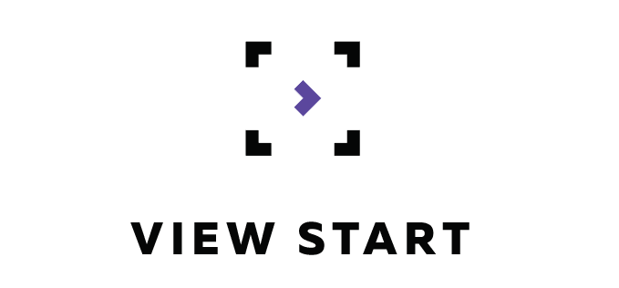
For our first version for ViewStart logo we decided to make in style of minimalism. Minimalism’s focus on simplicity and functionality has led to is adoption in many brands and design trends. That was the motto for the first version of the logo.
Black corners and violet play button in the same shape comes together balanced and well connected to each other. Not only the corners represent the “video format marks”, but also show that ViewStart works in broad ways.
Logo version #2
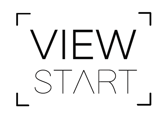
Second version design was made under “Consistent thickness of lines”.

Second version of ViewStart logo cones with same video marks, but with different type. The choice for such light font was the thought that thin lines convey an emotion of elegant yet strong company.
Lines provide emphasis and define shape. Lines are an essential building block in our visual vocabulary. Combined with shapes, color, value, space, and form they give us a visual grammar which we can use to communicate.
Such design choice is very popular for choosing “modern business” look. But in the end, that wasn’t our #1 choice due to it’s lack of revolutionary fact we mentioned earlier.


Final Logo version
After careful selection we finally made our closing decision for the logo. Here’s the result of our work.

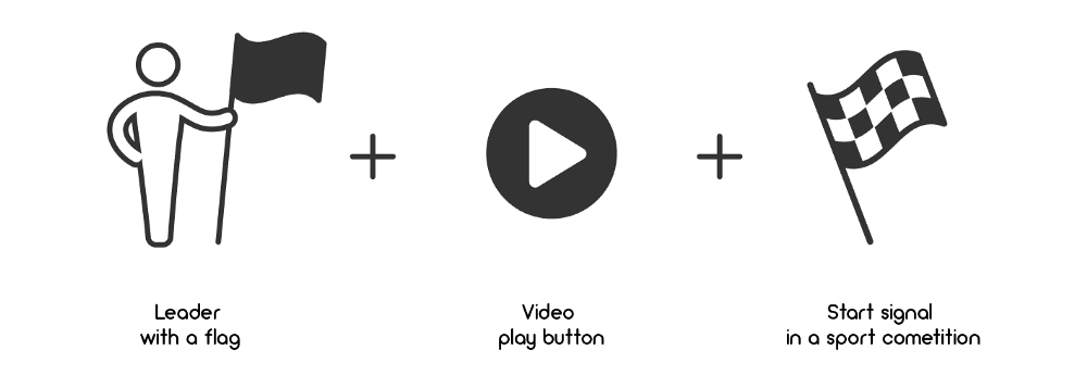
New ViewStart logo has a conventional play button symbol in it, which is in a form of a flag. As Buzz Aldrin put a flag on the moon, we put a flag in the revolutionary eCommerce video platform. This way, it symbolizes the “starting point”, since ViewStart project is innovative.

ViewStart — now it embeds leadership in bringing new technology, video nature of their market area, and actually starting a race, a race to merging of media and commerce.
Font’s choice — Arciform, goes along with the flag symbol part very well due to straight lines and smoothly rounded corners. The type is similar to ViewSence, “spin-off” project, this way we show that these projects are connected to each other.

Blue color is associated with success, trust and professionalism, while red stands for energy and power. Trustful, yet powerful logo is exactly the logo we were looking for.
Broader distribution
As the new branding evolved, final results of logo set a starting point for the ViewStart lading page design.


Share on: