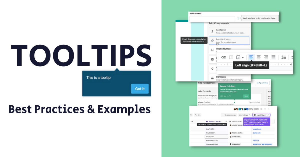
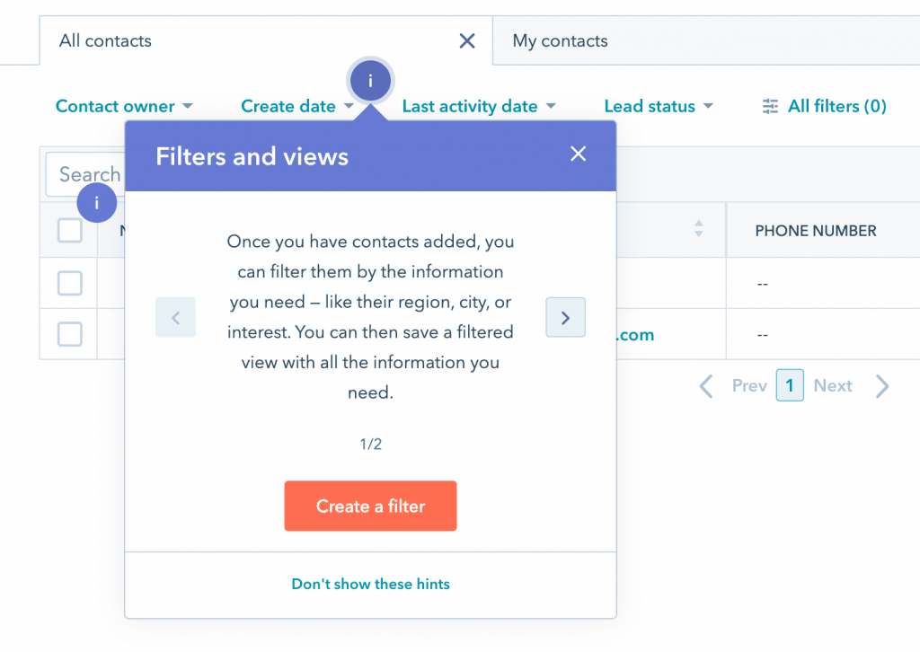
What is a tooltip?
A tooltip in a website is a user interface feature that displays additional information about a specific element when the user hovers over it with their cursor. This information is usually presented in a small pop-up box or bubble close to the targeted element and disappears when the cursor is moved away or with a click.
Websites commonly utilize tooltips to provide brief explanations, labels, or descriptions for interactive elements like buttons, icons, or links. By offering contextual information upon hover, tooltips enhance the user experience, eliminating the need for users to navigate to other pages or sections to find relevant details.
Tooltip best practices
Tooltips have been around for a long time but still tend to be misused. Follow these best practices to increase engagement on your site by helping its visitors.
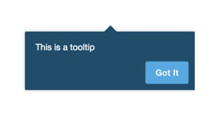
1. Add contextual, not required information
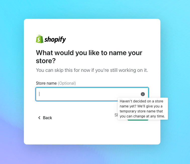
Utilize tooltips to show users additional helpful information, not required information. Information like requirements for a new password should be put in a more prominent place.
❌ Don’t:
✅ Do:
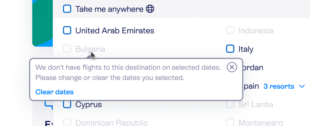
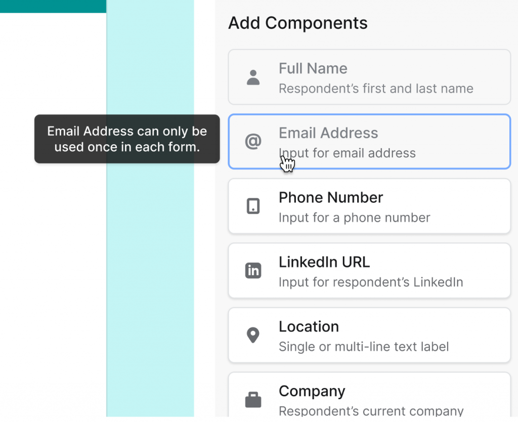
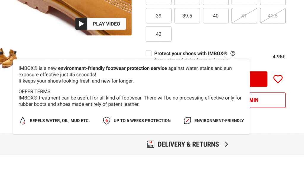
2. Make sure it doesn’t block important elements
When choosing the place to display the tooltip, ensure you don’t cover essential parts of the rest of the page with tooltips.
❌ Don’t:
✅ Do:
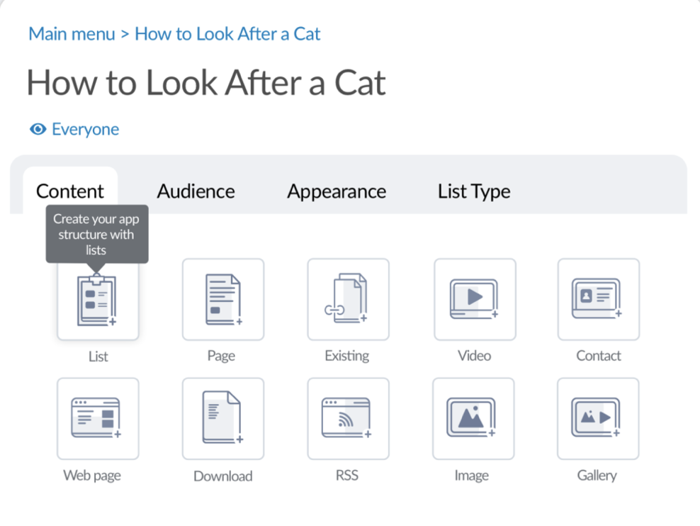
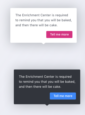
3. Make tooltips stand out
Don’t be afraid to incorporate contrasting colors in the tooltip design to enhance visibility for users.
❌ Don’t:
✅ Do:
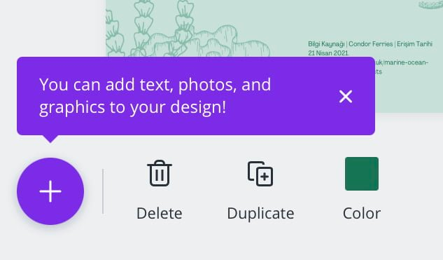
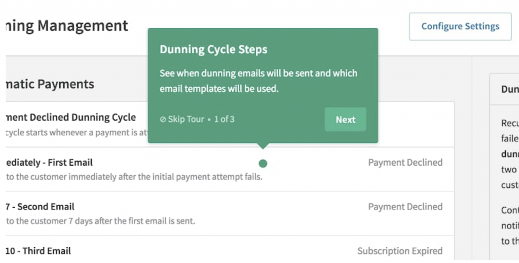
4. Allow to confirm or exit
Always ensure some navigation component within the tooltip so that users can confirm or exit and the tooltip doesn’t remain covering parts of the task flow.
❌ Don’t:
✅ Do:
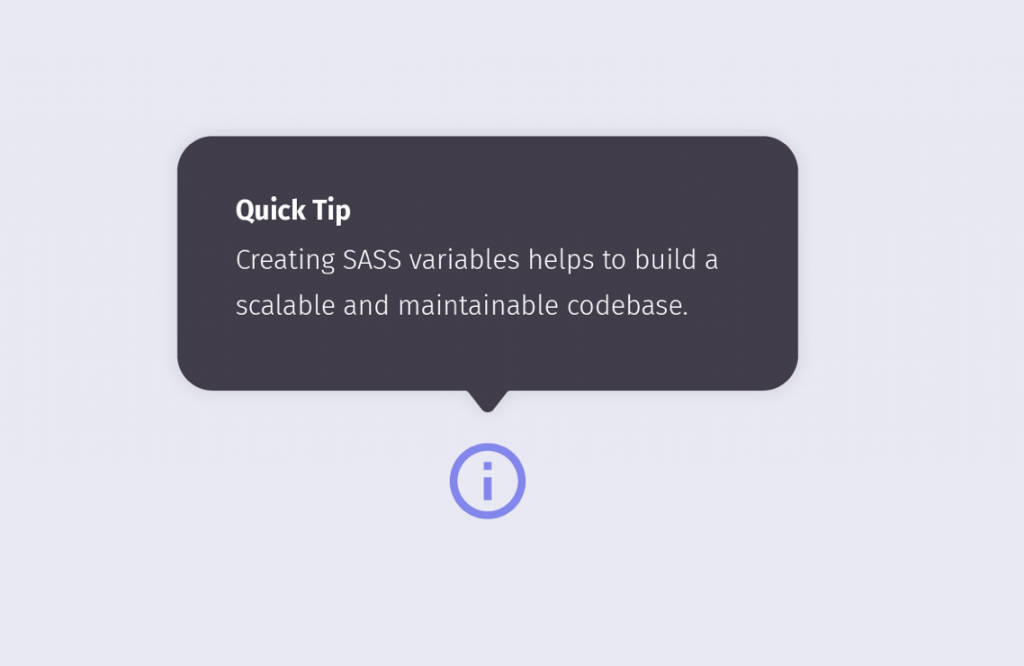
5. Avoid repeating the copy
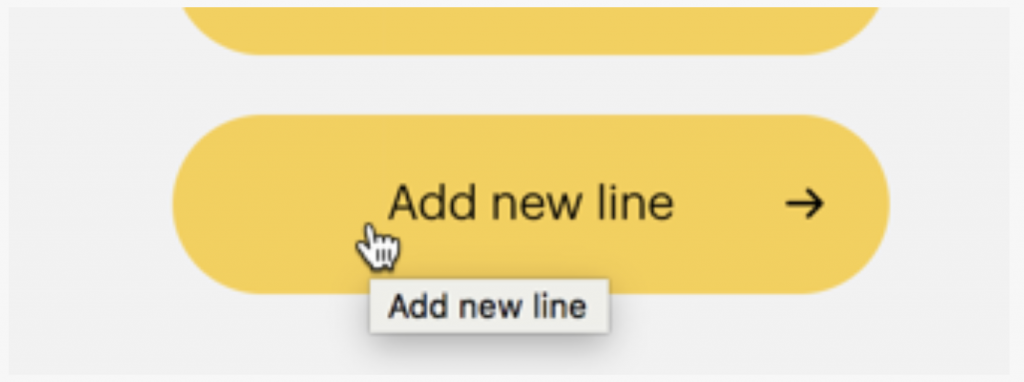
In the tooltip, provide additional and helpful information. Make sure you don’t repeat already visible text.
❌ Don’t:
✅ Do:
Bonus tooltip suggestions
- Tooltips should be consistent in style and design to train users to be more responsive to them
❌ Don’t:
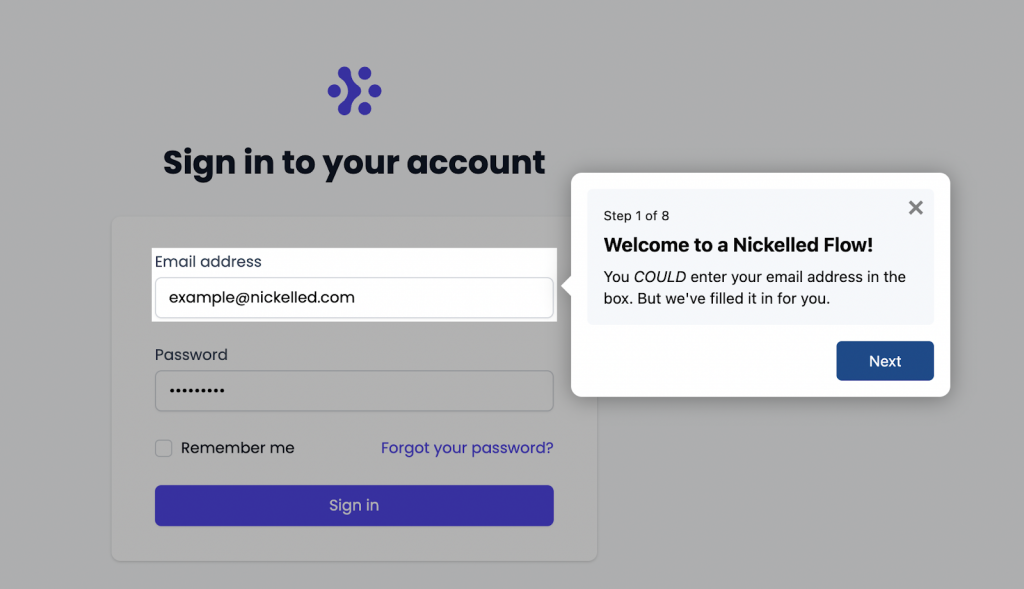
- When multiple tooltips are used in a sequence (e.g., introducing a new feature), there should be a progress bar indicating how many tooltips will be displayed, and users should be able to skip them at any time
✅ Do:
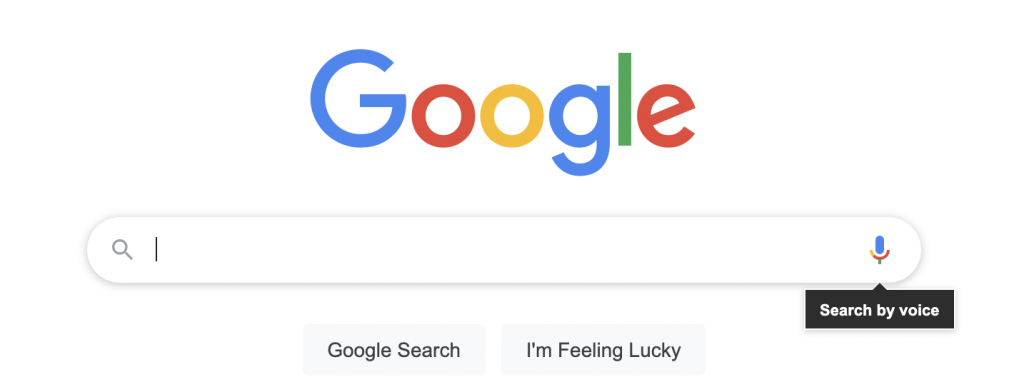
- When introducing new features, you can use eye-catching (but not too distracting) interactive elements to attract user attention
✅ Do:
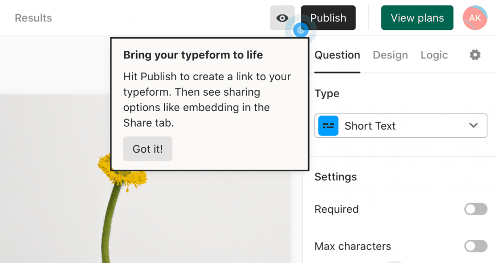
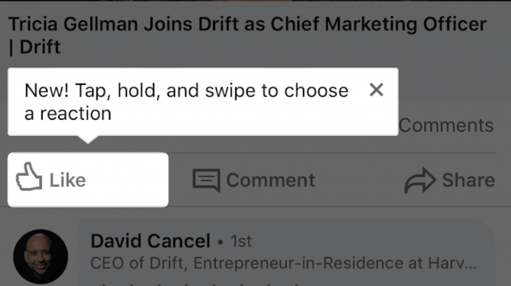
By the way, did you know you can introduce new features using tooltips? Check out these examples!
Have you found this useful? Need more tips to enhance user journey on your website? Drop us a line at [email protected] or browse our UX and CRO services!

Share on: