Nowadays when it comes to running a successful business and earning profit, it is all about conversion rates and finding out how to achieve the best possible ones. In this case study we’ll show the approach that you should take when doing CRO & A/B testing for B2B websites. From key factors to take in mind to data interpretation and statistical significance.
Initially we started off with redesigning the existing site and planning needed features requested by client. We had long meetings due to number of persons participating on the clients side and each of them added must have requirements from UI, SEO, Accounting, Sales … every point of view.
After the redesign was live we were excited to start our optimization of the website, since the design was a somewhat eclectic mix of options which each department noted as “must have”. We needed to introduce harmony between the components and see how the audience responds.
Team had dozens ideas what to test from many online whitepapers, books and last but not least Optimizely certification and knowledge center.
We started off with simple things. Since the website had a lousy slogan we tried to change it to see how it impacts overall performance. We were surprised when saw that few words on homepage can decrease bounce rate.
CRO: Checkout page optimization
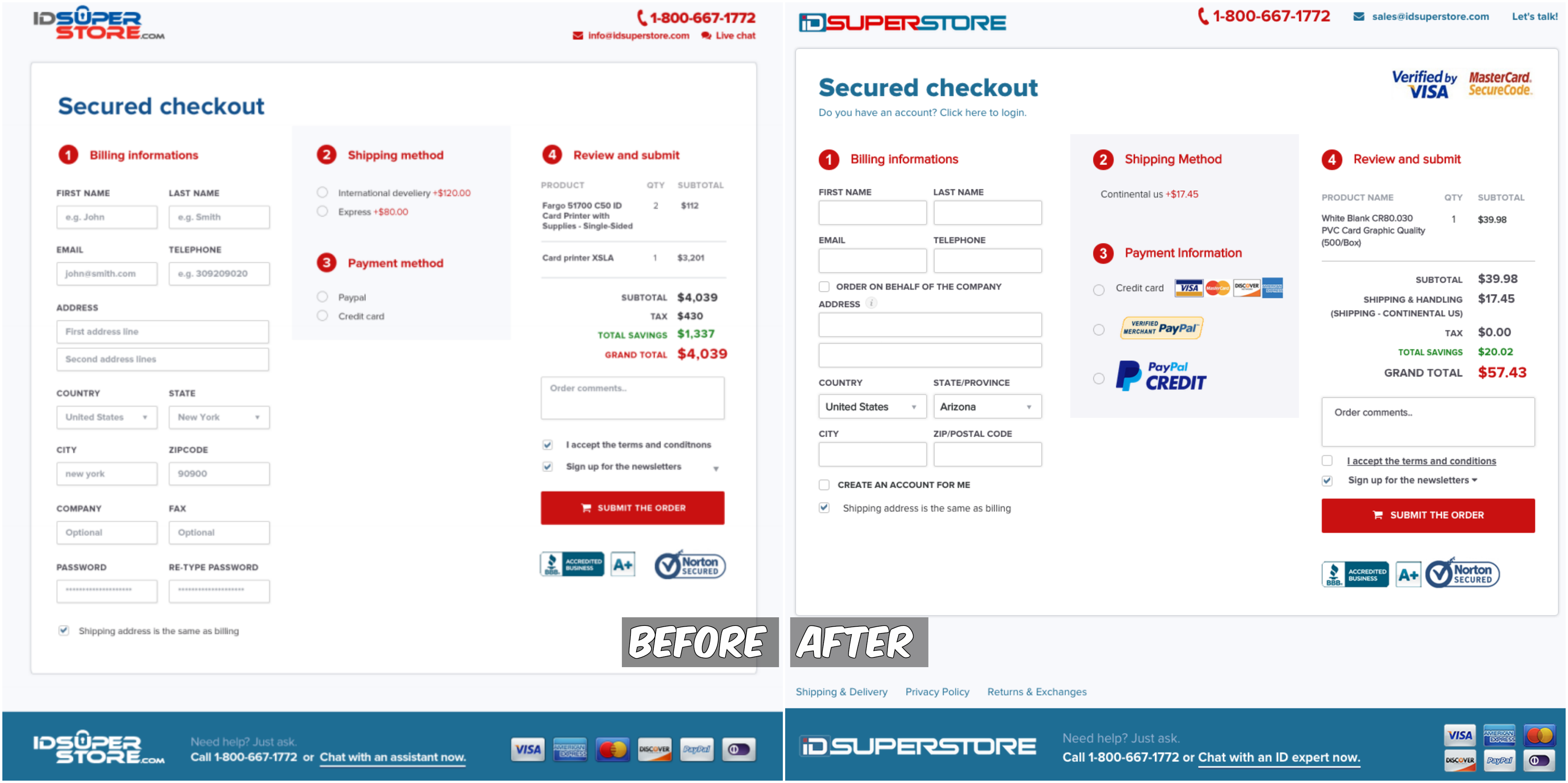
We started the main optimization from most important page in site — Checkout. Here are the things whose variations we tested against themselves in various tests:
- disabling mandatory registration
- removal of unnecessary fields (Country preselected, Company field hidden, Shipping method preselected, Password fields hidden, Fax removed)
- adding Google API address autocomplete
- adding of payment method logos
- adding Verified by Visa and Master secure to gain more credibility
- changing logo link in checkout from Homepage to Cart
- adding Shipping, Privacy Policy and Returns & Exchange links in footer (content displayed in pop up in order to avoid user abandon checkout in case if there are any questions)
- decreasing margin/padding in order to make all fields look less time consuming to fill
- removing placeholder text from input fields (while looking at data from HotJar we saw that for some users’ input fields looked pre-filled and there was a hard time to distinguish which field is filled and which one wasn’t)
And here are the changes, implemented to live:
CRO: Shopping Cart optimization
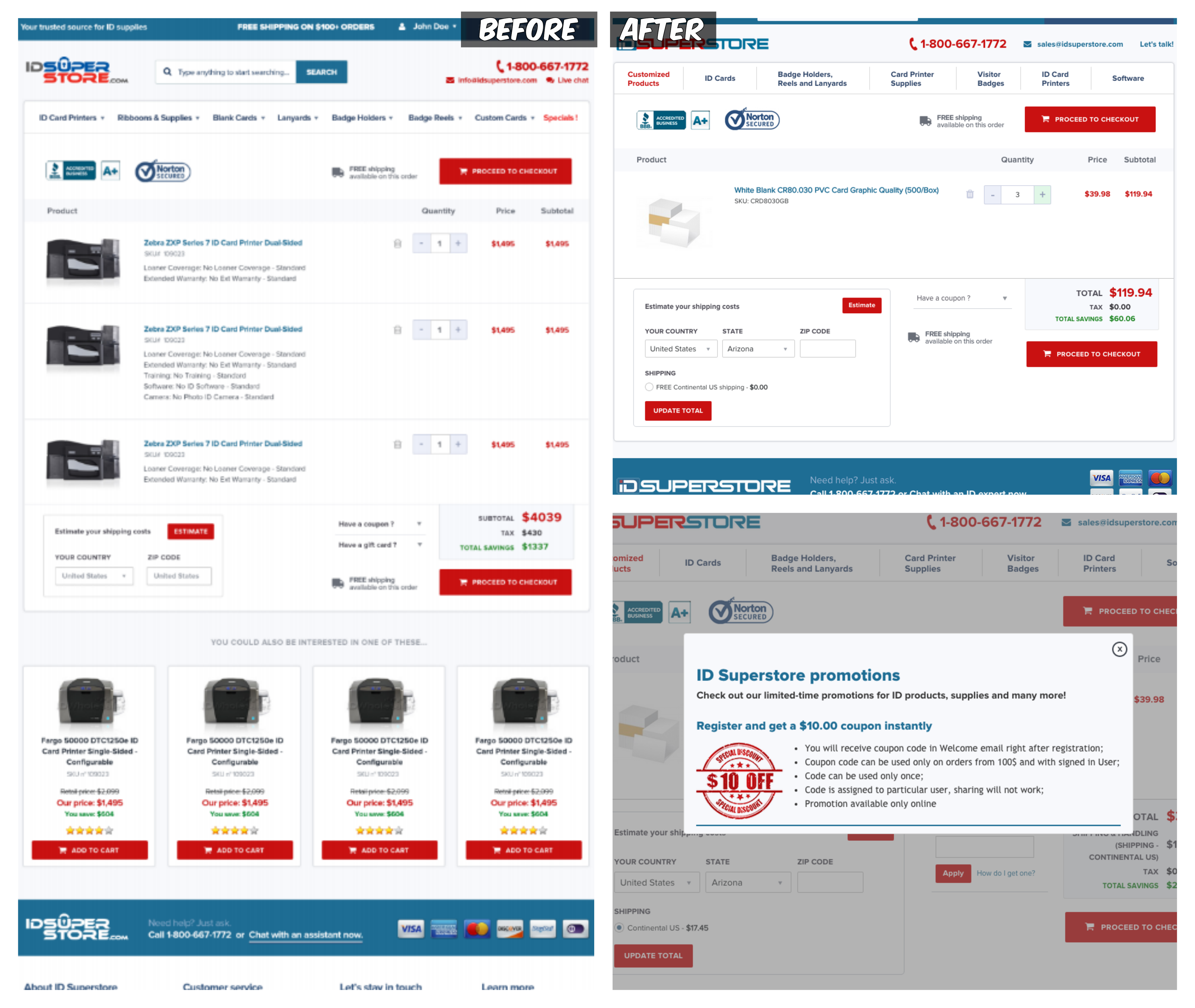
Here we did not have so many changes to test but few:
- “+” color change to greenish in order to encourage user to change quantity
- additional link “How do I get one” next to coupon code with pop up and latest coupon codes
- removal of suggested Cross selling products
- removal of gift cards input field
- changes in subtotal calculation (show total after discount is applied)
And here are the changes that customers approved and went live:
CRO: Product list optimization
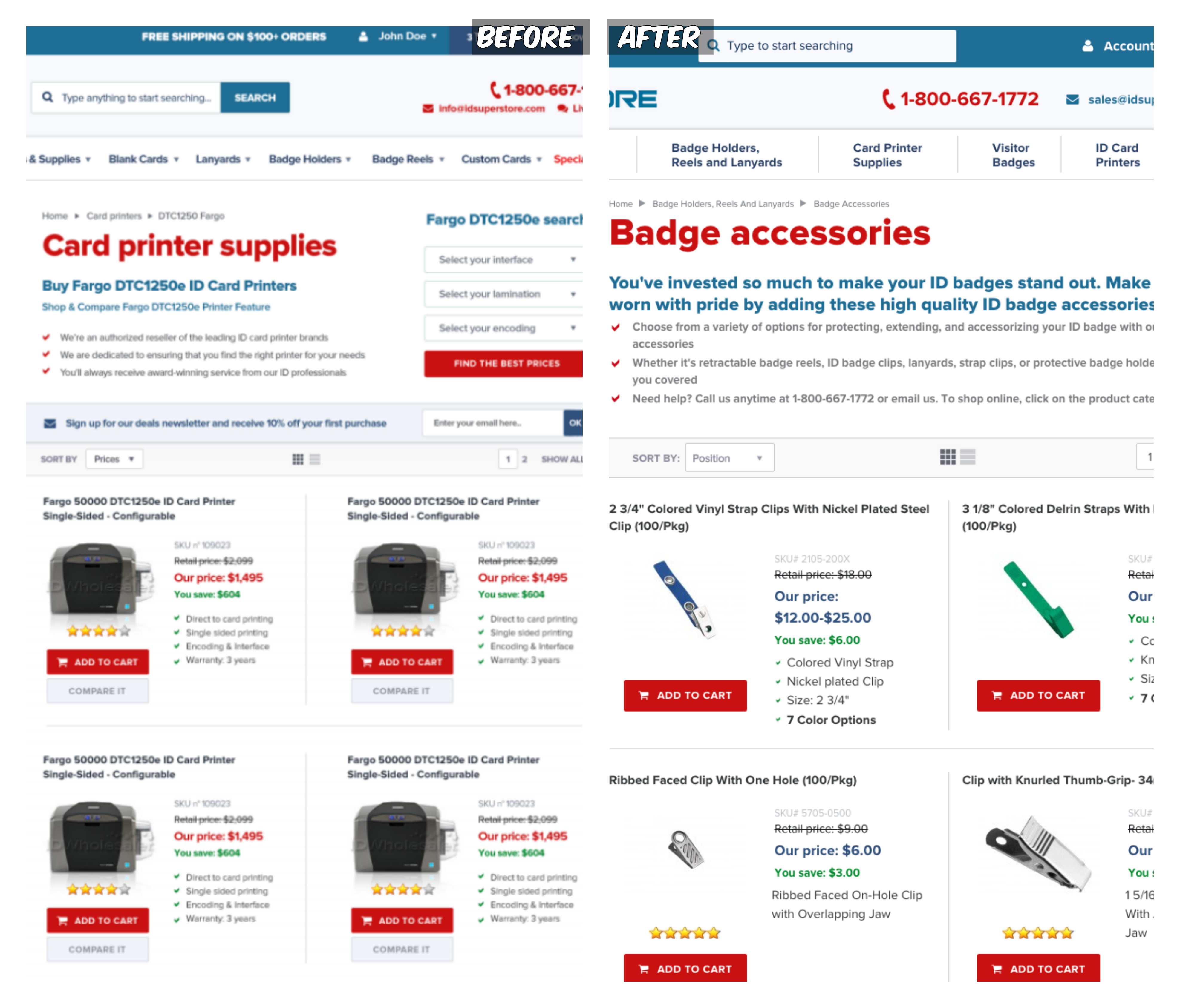
The product list saw some enhancements as well:
- products had longer names and skus than expected and were messing up the design. Same with category descriptions (!!!Always User real product data in design process)
- increased default product number in page
- products displayed based on report from ERP system ordered by frequently bought items
- removal of email subscription field on top of the page allowing to display products higher
- decreased margins/padding of product
While testing, we also found out that it’s nearly impossible to write a 4 point short description of each product, because we have ~6000 products and most of them are really similar. Gathered customer data also backed up the fact that it’s better to put some other, more meaningful info of the product instead of the same short description.
CRO: Homepage optimization
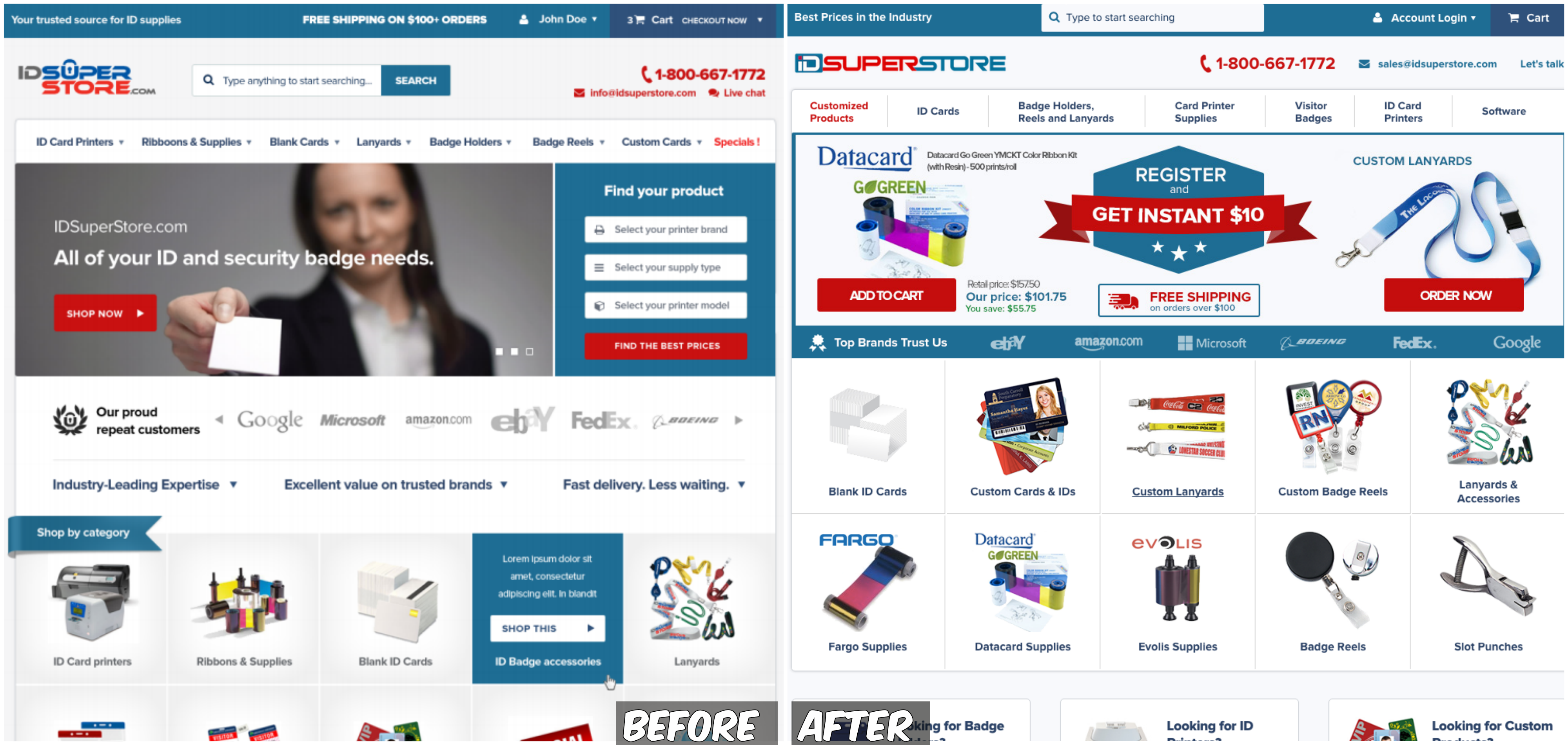
The homepage had one of the biggest number of changes planned. Design looked good in Photoshop but it did not work at all in reality. It had the biggest exit, abandoned rates and tedious animations.
Following enhancements were tested & introduced:
- more emphasis on best offers (free shipping, register and get $10, custom products)
- header vertical height was reduced rearranging some elements in order to display more product categories above fold line
- slider replacement with static images. Testing showed that static image works better than the slider we implemented.
- reduced space of our proud customers and removed slider
- as product categories we added best selling ones by ERP report
- tweaked design, padding, margin, colors.
CRO: A/B Testing results
Here are the before and final versions side by side:
One thing to mention before ending is that our site had steady but small user base. It was a B2B page and products sold were mostly used by particular niche companies. Daily visitor number was around 400–500.
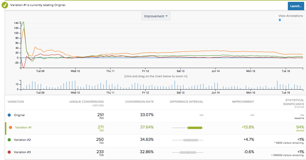
It meant that in order to achieve conclusive test results we needed a lot more daily visitors or had to leave tests on for months which was not good for the specific case. We discovered that we don’t have the needed user amount to have significant test results / accurate statistical conclusions. And in order to test very notable changes e.g. whole menu or page layout, we had to have significantly more users.
CRO: Statistical Significance
Let’s dive into the statistical significance a bit more. Imagine that the web site has around 10’000 monthly visitors with 5% conversion rate. We are going to find out how long it is going to take to achieve “conclusive” test (95% confidence).
Data presuppose all traffic being split 50/50 and two-tailed hypothesis.
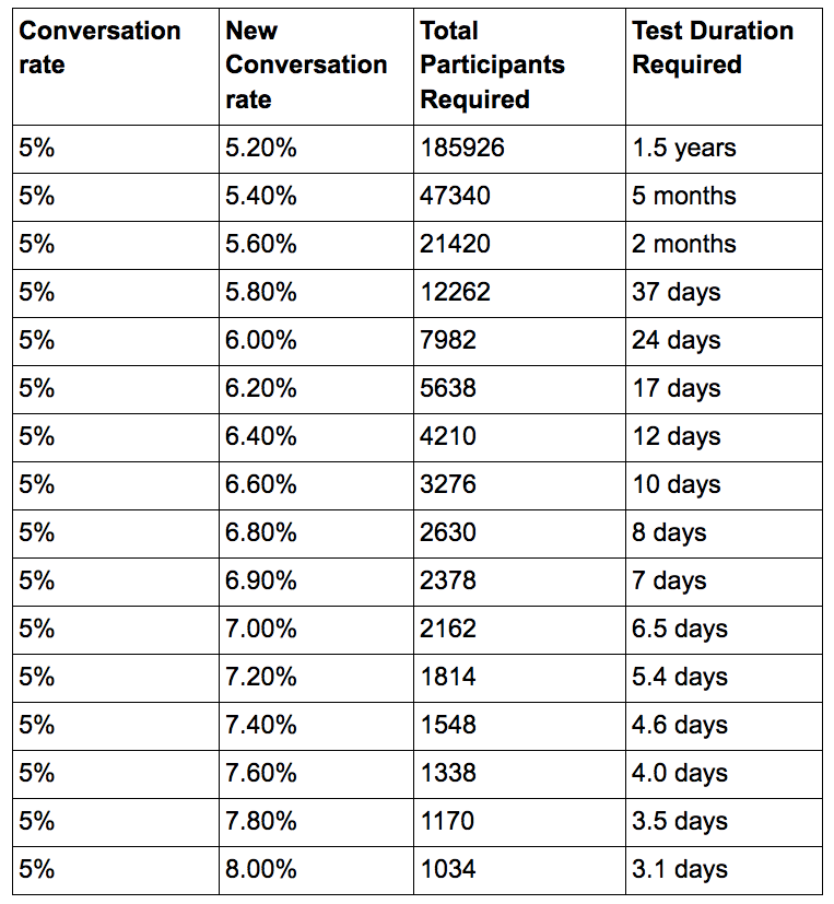
To be fair 5% conversion rate is great if you are ecommerce site selling consumables highly available anywhere. Our site did not have conversion rate as good as that. On top of it most likely you are going to want test results with few variations at the same time instead of just one — all in total it means even more visitors will be required to achieve “conclusive” tests.
If you want more info on CRO and A/B testing practices you’ve come to the right place. Scandiweb is the most certified Magento agency in the world with more than a hundred experienced coders, designers, CRO specialists, and more than a decade of experience under its belt. We’re here to help, so if you have any questions – drop us a line at [email protected] or check out our CRO services page.


Share on: