Have you ever been in a situation where Product Owner, Conversion Strategist, and Designer have 3 different opinions on how the certain element on the page should look like or functionality to work?
Well, I have been there now. Although each of the team members may think their solution is the right one, the truth is that the last word belongs to users. No matter how beautiful the page looks or how well-optimized you think it is for conversions and generating more revenue, it won’t matter if people with any level of technical knowledge are not able to use the site.
To avoid user frustration or worse, revenue loss, it is crucial to conduct user tests during the redesign process. When planning the redesign project, always leave some time for user testing and design adjustments that will appear afterwards. This way you will ensure that development time will not be spent on implementation of questionable solutions.
How you will conduct the user test will depend solely on the available resources. There are 2 main types of user testing:
- Moderated user testing: when the test facilitator and tester are in the same room during the test. Tester is completing a task while the test facilitator observes and makes notes about how the tester completes it.
- Unmoderated user testing: when the tester completes the user test remotely, without facilitator observing him. Tester records the session, commenting on any task they are completing. Afterward, the recording is sent to the test facilitator who watches it and makes conclusions.
Although both types of user testing have their pros and cons, I won’t go into detail about that today as it’s worth a separate blog post. Instead, I’d like to talk about moderated user testing and share how we conducted it during the booking flow redesign for one of the leading North-European airlines.
Step 1: Preparing testing scenarios
Before starting any testing you need to clearly understand what you want to test. For that, you need to have a clear hypothesis about certain functionality on your website. In our case, one of the hypotheses we had was that users may struggle to add baggage to the return flight.
Only after identifying the hypothesis you start preparing the testing scenario.
We always start by preparing a legend, to give the tester more information about the reason why they came to the website and for the test to feel more natural.
For our hypothesis we came up with the following legend:
Imagine you and your partner decided to go for a vacation to Croatia. You found a great deal for the flights and decided to book the tickets. For your trip you will need:
- One checked-in baggage with protection for an outbound flight for each passenger
- Two checked-in pieces of baggage w/o protection for a return flight for each passenger
Please complete the booking process based on the instructions above.
When legend and test tasks were ready we clearly new what screens we would need to replicate the ideal user journey solely by design. So we moved forward to step 2.
Step 2: Creating prototypes
For our user testing, we created interactive prototypes, where testers could scroll through the page and click different elements.
There are multiple tools out there that allow you to create such prototypes, some are more advanced than others. The more advanced the tool is the closest to the real website your prototype will look and feel, but it will also require more time to prepare.
For our prototypes, we used Invision, where we simply linked all our screens in build mode.
Step 3: Picking testers
Now, you have a testing scenario and prototypes, but the main element is still missing — users. For your user tests, you can invite your real customers by offering them a gift card in return for spending their time testing your design or if acquiring real customers is difficult, you can always look for testers among your colleagues, friends or family who would match your user persona and would be willing to help you out.
In our case, we asked our colleagues to participate in user testing as each of them matches one or another type of airline’s user persona. We tested our design on marketers, developers, project managers, accountants, and office managers, to have people with different technical backgrounds.
The most popular question related to user testing is: how many tests should I run? The answer is — it depends. The number of testers changes based on what you are testing, how you are testing, how much time you have to conduct the testing, etc.
According to a study by Nilsen Norman Group, 5 testers are usually enough to maximize benefit/cost ratio. As with each additional tester, the costs increase, yet the likelihood of uncovering new usability flow becomes smaller.
For this particular project, we had several hypotheses and 4 user scenarios, as user behavior changes based on the case. We can not compare the effort and time customer has to spend to book one-way tickets without checked-in baggage, with customers who are booking a round trip with an infant, with a different number of bags per bound.
Hence we had 5 users per each user case, which we split to 3 for desktop and 2 for mobile.
Step 4: Setting up user tests
The last step of the preparation is to plan how you will execute user testing — where you will run the tests? What software will you use to record the session? How will you document your findings?
There are a lot of tools out there that you can use. However, all you need is to make a session recording of your desktop and mobile screens together with the tester’s voice. All the emotions you can observe live and document right away.
For desktop, we used simple Quicktime Player screen recording functionality and for mobile build-in iOS and Android screen recordings.
When your technical setup is ready, it’s time to start testing!
Step 5: Running user tests
There are a few golden rules to follow when you are running user testing, which I highly recommend for you to follow.
- Make the tester feel comfortable — be kind and friendly when greeting them. Explain how the test will go, and emphasize that they shouldn’t worry about making a mistake and failing the task.
- Keep quiet — don’t answer any testers’ questions during the test. The goal of user testing is to identify if people can figure out how to complete the task themselves. You are there only to observe the tester, not to help them. There’s a useful user testing technique you can use to avoid helping the tester called Boomerang. In short, whenever a tester asks you a question you answer with the same question just changing the intonation of your voice emphasizing that the tester should answer it themselves.
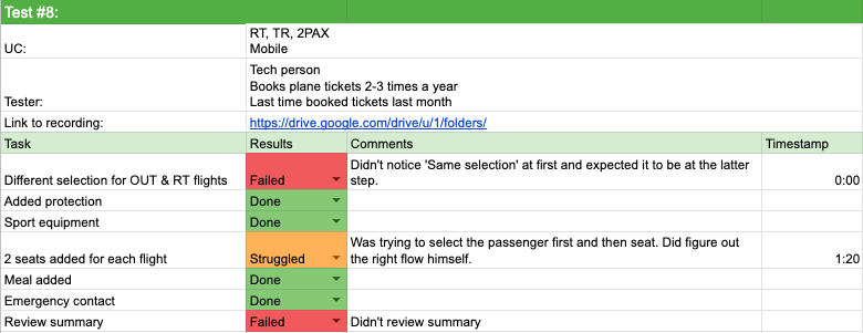
- Split all actions the tester has to complete on small tasks in your document and mark them Completed / Struggled / Failed during the test. It will make it easier for you to evaluate the outcomes of the test later on and will allow calculating how many people struggled at each task.
Step 6: Analysing results
Now it’s time to summarize all insights. I like to keep everything in one spreadsheet dedicating one sheet to one test and having one summary spreadsheet as well, where I summarize how many times each task was failed.
In the testers sheet, I list all the tasks, their status, add comments and timestamps to be able to quickly rewatch the fragment if needed.

Step 7: Iterating the design
After user testing results have been evaluated we have a team meeting to go over results and come up with solutions to fix identified issues.
When issues have been fixed I suggest running a few additional tests to verify that now users really are able to complete the tasks. Then you are free to pass designs to the development team, relax and wait until designs are implemented!
Interested in user testing or have any questions? Feel free to get in touch to book a free consultation or schedule a call!


Share on: