Welcome to the world of visual language—a realm where colors, shapes, and design elements come together to tell stories, convey emotions and create lasting impressions. In this post, we’ll explore the different components of visual language in eCommerce branding and illustrate the artistry behind creating a cohesive visual brand identity.
The power of visual language
Visual language serves as a brand’s visual presentation, an unspoken form of communication that conveys its unique personality, fostering recognition and setting it apart in today’s bustling market. Think of it as a brand’s silent ambassador, silently but powerfully delivering its message, like a well-chosen outfit that conveys your identity without saying a word.
11 Components of visual language
Visual language consists of 11 fundamental components, each playing a pivotal role in shaping a brand’s overall identity.
- Lightning
- Colors
- Contrast
- Texture
- Shape
- Grid
- Transitions
- Typeface
- Icons
- Images
- Videos
Like instruments in an orchestra, they harmonize to create a brand’s unique symphony. Lighting adds impact, colors set the tone, contrast creates drama, and textures add depth. Shapes and grids provide structure, transitions guide the viewer, typefaces convey a tone, while icons, images, and videos narrate stories. Together, they craft a compelling narrative that captures the essence of the brand.
Mapping visual language for eCommerce branding
What makes visual language fascinating is its adaptability and potential for personalization. Consider this: mapping these 11 design elements to a brand’s keywords. This exercise breathes life into a brand’s visual identity, infusing it with meaning and purpose. While this approach is commonly employed by a wide range of brands, it’s not a one-size-fits-all strategy. Instead, it’s a dynamic tool for crafting a brand’s unique visual story. In a world saturated with visual stimuli, mastering visual language can propel a brand beyond mere recognition, allowing it to genuinely connect with consumers and stand out amidst the market’s cacophony.
Brand keywords
Brand keywords are specific words or phrases that encapsulate the core values, personality, and identity of a brand. These keywords serve as a foundational element in brand development and marketing strategies. They help define and communicate what a brand represents, enabling it to connect with its target audience on a deeper level. Brand keywords are often chosen carefully to reflect the brand’s unique selling points, mission, and desired image.
Here are some examples of brand keywords that influence and guide a brand’s visual language, helping it convey its unique identity and resonate with its target audience.
Sustainable
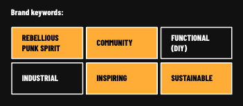
When sustainability is at the core of a brand’s visual language, you can expect earthy tones, natural textures, and visuals that shine a spotlight on environmentally responsible practices. It’s a visual commitment to preserving our planet.
Elegant
Brands aiming for an elegant visual language might incorporate elements like minimalist design, a refined color palette, and sleek typography to convey sophistication and class.
Playful
A brand looking to convey playfulness might use bright and vibrant colors, whimsical shapes, and cheerful imagery, all working together to create a sense of fun and lightheartedness.
Innovative
Visual elements associated with innovation could include futuristic design, cutting-edge technology imagery, and bold, unconventional shapes and colors to communicate forward-thinking creativity.
Inspiring
For brands aiming to inspire through their visual language, it’s all about using compelling imagery and design that evoke motivation and aspiration. This approach sparks the viewer’s imagination and stirs a desire to achieve greatness.
Community
When a brand puts “community” at the forefront of its visual language, it tells a story of belonging and togetherness. The imagery revolves around unity, forging a strong emotional connection among its audience.
Functional
Brands that prioritize functionality in their visual language opt for a streamlined and purpose-driven design. Their visuals communicate a sense of efficiency and user-friendliness, mirroring the brand’s commitment to practicality.
Industrial
Drawing inspiration from an industrial aesthetic, this visual language incorporates elements reminiscent of the rugged, hardworking spirit of the Industrial Revolution. Think of it as a visual homage to the age of innovation and machinery.
Rebellious punk spirit
In the context of visual language, a brand channeling a rebellious punk spirit would break free from the norm and corporate conventions. It thrives on edgy, unconventional design elements that dare to stand out.
This keyword is a distinct element tailored specifically for one of our clients, for whom we crafted a customized visual language playbook.
Design mapping: Aligning visual language with brand keywords
In this section, we illustrate the process of design mapping, showcasing how a brand’s visual language should seamlessly align with its carefully selected brand keywords, resulting in a cohesive and impactful brand identity. The following is based on the visual language playbook we created for a prominent climbing and outdoor sports brand.
Component 1: Lighting
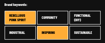
A dark-themed website unifies the page, weaving a cohesive narrative where block transitions artfully blend a subtle fade effect with gently scraped edges, evoking the sensation of turning the pages of a captivating scrapbook.
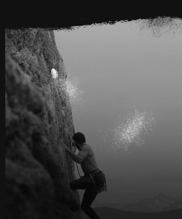
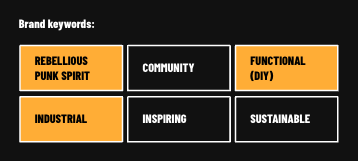
These dark hues serve as a backdrop, lending support to the rebellious punk spirit aesthetics, while the faded and scraped edges infuse inspiration, urging users to delve deeper into the story being told.
Component 2: Colors
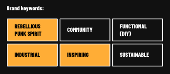
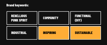
Here, orange takes center stage as the primary brand color, serving as a prominent representation while also fostering a feeling of community. The orange hue is also known for its ability to evoke inspiration and enthusiasm. Its vibrant and warm characteristics often inspire feelings of creativity, energy, and excitement.
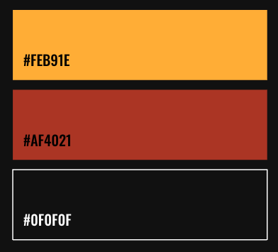
The deep burgundy red aligns with the “industrial” keyword, strategically used to highlight essential user actions.
Completing the visual palette, black plays a crucial role in reinforcing the brand’s rebellious punk spirit.
Component 3: Contrast
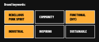
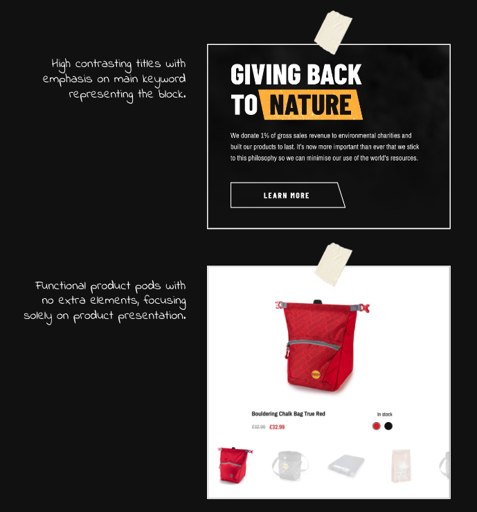
Amplifying contrast plays a vital role in translating the rebellious punk spirit into design, all while ensuring functional excellence through enhanced readability and distinct element clarity.
Component 4: Texture
The incorporation of a climbing chalk texture introduces an inspirational dimension to the design, allowing users to vividly imagine the training experience.
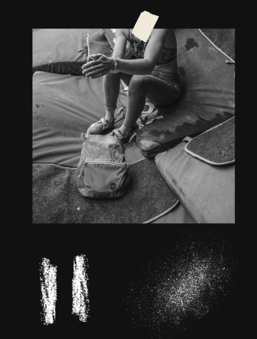
The subtle grain effect applied to photography reinforces the narrative of a long-standing community, spanning over three decades, while simultaneously underlining the brand’s commitment to sustainability and durable products.
A spray of chalk, reminiscent of graffiti, injects a touch of rebellious punk spirit into the visuals, infusing a sense of edginess and creative expression.
Component 5: Shapes
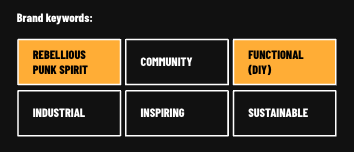
Using geometric shapes and sharp corners mimics the appearance of cliffs and climbing boards, embodying a rebellious spirit distinct from typical eCommerce design elements.
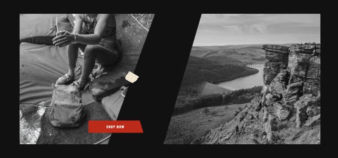
The oversized key elements enhance the website’s usability, ensuring a user-friendly and efficient initial interaction with the brand.
Component 6: Grid
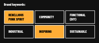
The deliberate distortion in the alignment of visual accents on the page embodies a sense of rebellion, defying conventional norms while also mirroring the unpredictable journey of a climber scaling towards their summit.
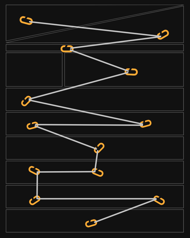
Component 7: Transitions
The smooth transitions on the site flow like nature and make climbing feel like a dance, keeping visitors interested and encouraging them to scroll down.
Component 8: Typeface
Big, bold headlines aim to engage visitors and convey messages directly, inspired by the style often seen in punk culture.
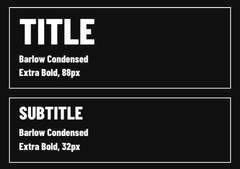
Short, informative text and bullet lists are designed for a clear and quick presentation of the message’s essence.
The typeface used takes inspiration from the fonts found in newspapers and magazines from the industrial era but has been updated for the digital world.
Component 9: Icons
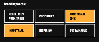
Simple and minimalistic, the icons replicate the style of assembly manuals, highlighting the functionality of the products.
Component 10: Images
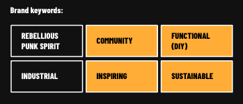
Clear, high-quality product images showcase functionality, durability, and sustainability.
Lifestyle images featuring athletes with a classic photo frame or slight texture create a sense of community, inspiring site visitors to excel in their pursuits.
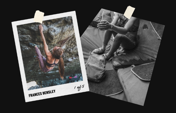
Component 11: Videos
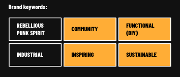
Background videos are powerful tools for storytelling, aiming to inspire a new generation of enthusiasts.
Short videos featuring athletes scaling cliffs, both on social media and across the site, underscore the sense of community associated with the brand while motivating visitors to embark on outdoor adventures.
Product videos on product pages play a crucial role in demonstrating the functionality and exceptional quality of the products, reinforcing the brand’s commitment to sustainability and creating products that will stand the test of time.
Wrapping up
In wrapping up our journey through visual language, keep in mind that it’s not just about colors and shapes. It’s the storyteller for brands—it’s about the feelings it stirs in users and the memories it leaves behind. Knowing how visual language works helps us make brands that are both captivating and unforgettable. So, dive into the world of visual language in eCommerce branding and let your brand’s story shine in the best possible way.
We hope you’ve found these insights on eCommerce branding inspiring. If you’re ready to transform your brand or start from scratch, scandiweb is here to help. Reach out to [email protected] or send us a message here for a free consultation.

Share on: