I’m sure that you have lately heard a lot about bots, how they are here to make our lives easier and to replace apps.
Indeed, today bots can help us to order food, shop for clothes, save money and find restaurants.
But what about human resource management and the idea to create virtual bots that‘d help to communicate with companies’ newcomers and make their lives easier? We tried to find out.
What Should a Technological Innovation Even Look Like?
Lucy is an internal bot that is integrated into Slack and helps HR specialists solve everyday problems.
Our task was to develop a new visual image and concept of the HR bot.
So we needed to make a nice brand that would look good with Slack, and have that own personality with a bright and easily recognizable style.
How should a bot look? What specific form should it have?
We asked these and many other questions to understand what kind of result to aim for.

There was a lot of different ideas and drafts before we found the most suitable solution.
And, finally, after some time…
Your Friendly Neighbourhood Tech Innovation.
Our logo shows the nature of Lucy, with it being simple, honest, friendly and… a slightly cheeky.

But this was not the end. We still had to explain how the bot works and prove that it would make lives of its users easier.
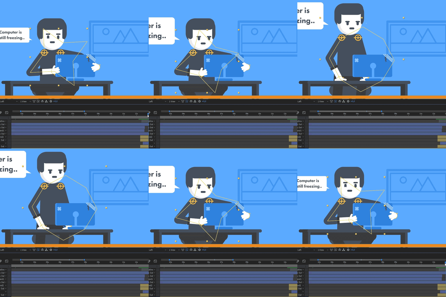
Therefore, our next step was to create nice animations that would show that Lucy is alive!
Time To Bring This Technological Innovation To LIFE!
First step – writing the bot script.
Simplicity and clarity are the primary factors to be considered when writing the script. Also, one should consider how they want their audience to feel after they watch the motion graphic.

Step number two, the storyboard.
This is where we first started to create visuals that corresponded to the script.
The storyboard helps to finalize the development of the storyline, and is an essential stage of the animation process. Usually we draw storyboards on paper, because drawing on paper is a good foundation for any artwork.

We think that colors and style are important in the creation of motion graphics. Simple choices make a huge impact on the audience. Therefore, these two elements need to be chosen wisely.
The color and style were chosen with respect to the overall design of Slack. Simple shapes and lines made animation easy and fun.

Now pieces start to come together.

When the full draft of the animation, including sound effects and music, were ready, we checked it all once again and applied some minor changes. After the animation was finalized, we could say the project was COMPLETED.
Now our Lucy the bot had an image that would stay in people’s heads.
Now it not only a bot, it is a real character.
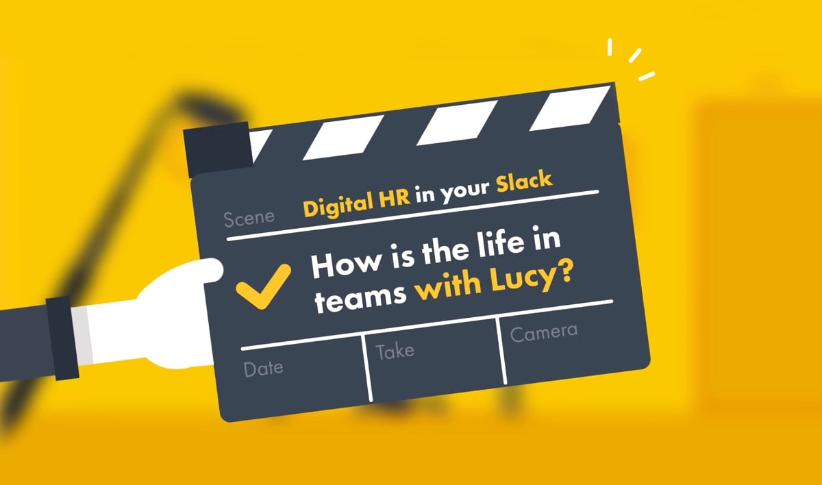
Let’s see the final result:
Let us help you:
Want your own lively HR bot? Have a larger technological innovation in mind? You’ve come to the right place! Scandiweb has quite a history of coming up and working with technological innovations! Check out our R&D Services page, Lucy Abbott’s page or just drop us a line to [email protected].


Share on: