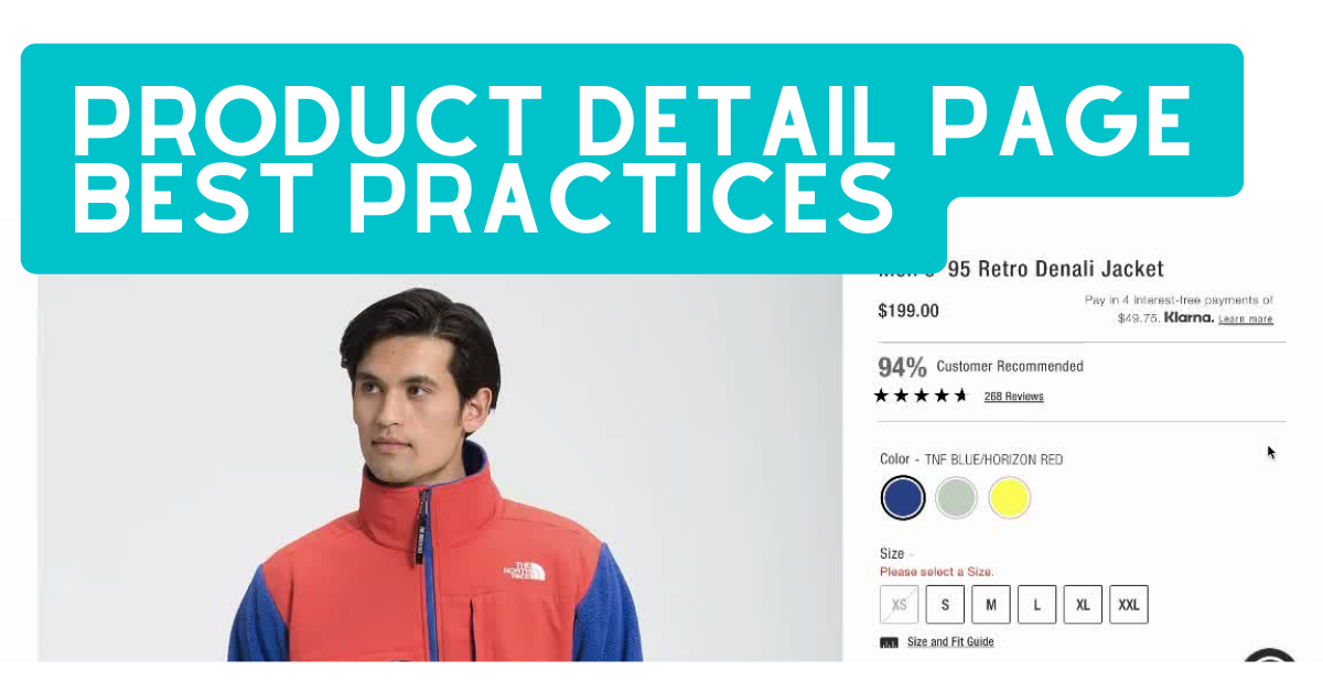
We just published a post on best practices for product listing pages. Now let’s take a step further in the shopping funnel and have a look at product detail pages (PDP).
The product detail page is where you provide details about a product. It usually includes several photos, a description, the price, and most importantly, a CTA (call to action) to add the product to the shopping bag. It sounds fairly simple to put together, yes. However, if best practices are not taken into account, the user experience on product details pages can quickly go wrong.
Today, PDPs also need to work for three audiences at once: the shopper, search engines, and AI shopping tools that increasingly surface product results directly. Getting the page right matters more than it used to.
So here are the best practices to follow on product detail pages.
How to create the best product detail page
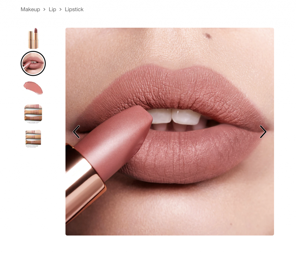
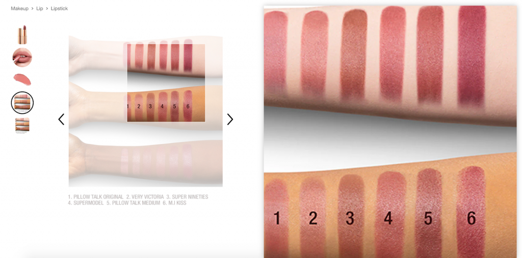
1. Add product photos that leave a good impression
Good product photos could be the key element that convinces a user to add a product to their shopping bag. If done right, product photos can inspire the user’s imagination and evoke positive emotions about the product. If done wrong, they either do nothing at all to add to the user experience or negatively impacts it in the worst case scenario. Here are the main things to remember when adding photos to the product detail page:
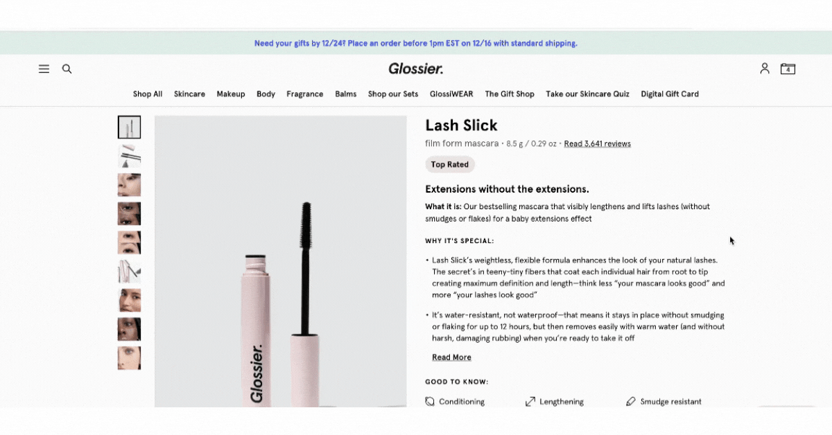
- There should be multiple photos and thumbnails that showcase each one of them
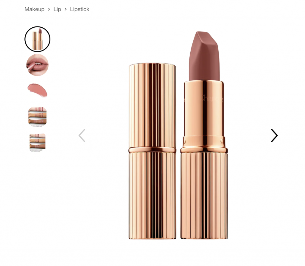
- At least one photo should show the product in use
- Zoom functionality should be available
- Short product videos — even 15 to 30 seconds — consistently outperform static images on mobile, where most shoppers now browse. If budget allows, this is one of the higher-return investments on a PDP
- 360-degree views work especially well for products where shape and detail matter: footwear, bags, electronics, furniture

- AR and virtual try-on have moved from novelty to expectation in categories like beauty, eyewear, and home decor. If your platform supports it and your category fits, it’s worth implementing
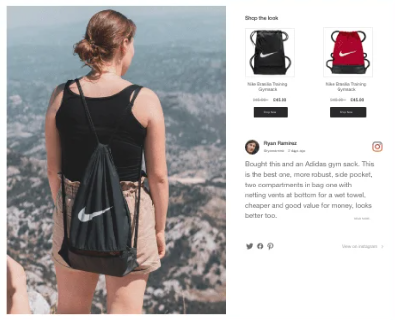
- UGC (customer-submitted photos) displayed on the PDP itself adds a layer of social proof that brand photography can’t replicate — shoppers trust other shoppers
2. Draw attention to your CTAs
It should be reiterated that the CTA is the most important element on the product detail page. It is what takes the user to the next step of the shopping journey, moving them closer to conversion. Here’s what you need to keep in mind when working with CTAs:
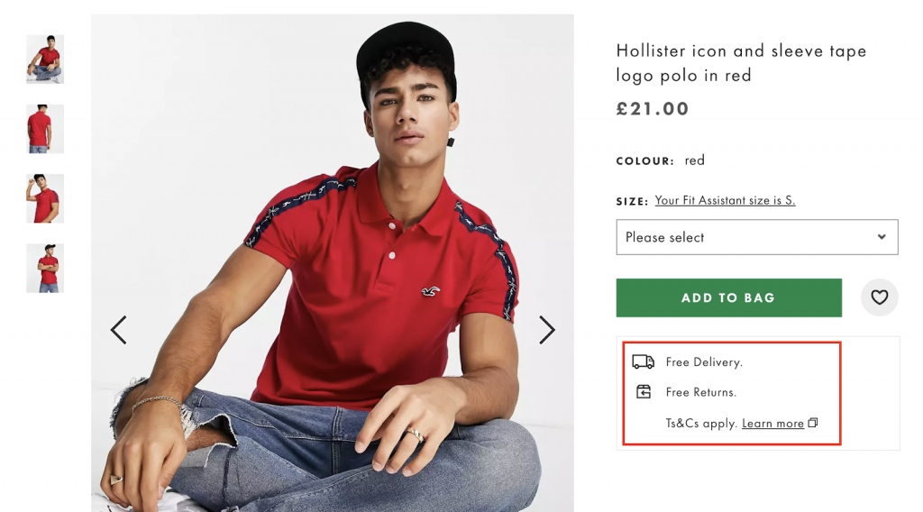
- The primary CTA should stand out in terms of visual hierarchy
- Alternative CTAs should be available (e.g., Wishlist, Compare)
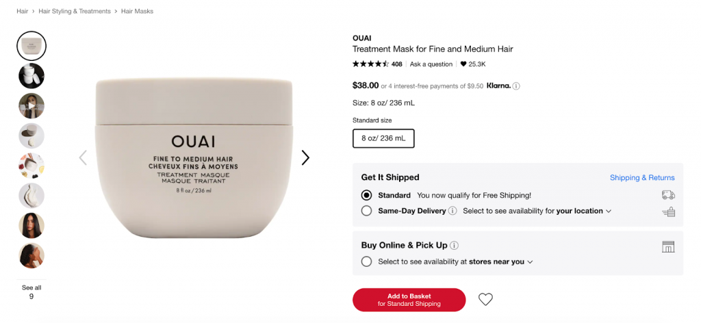
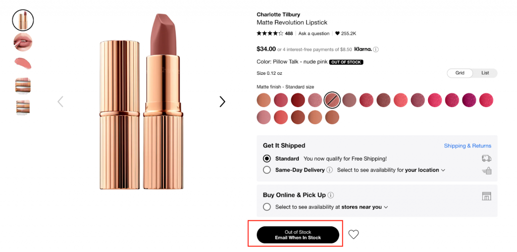
- An option to receive an email notification when an out-of-stock item becomes available again should be offered
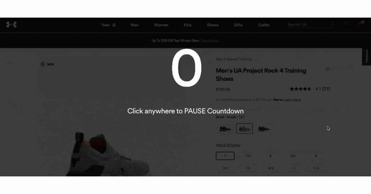
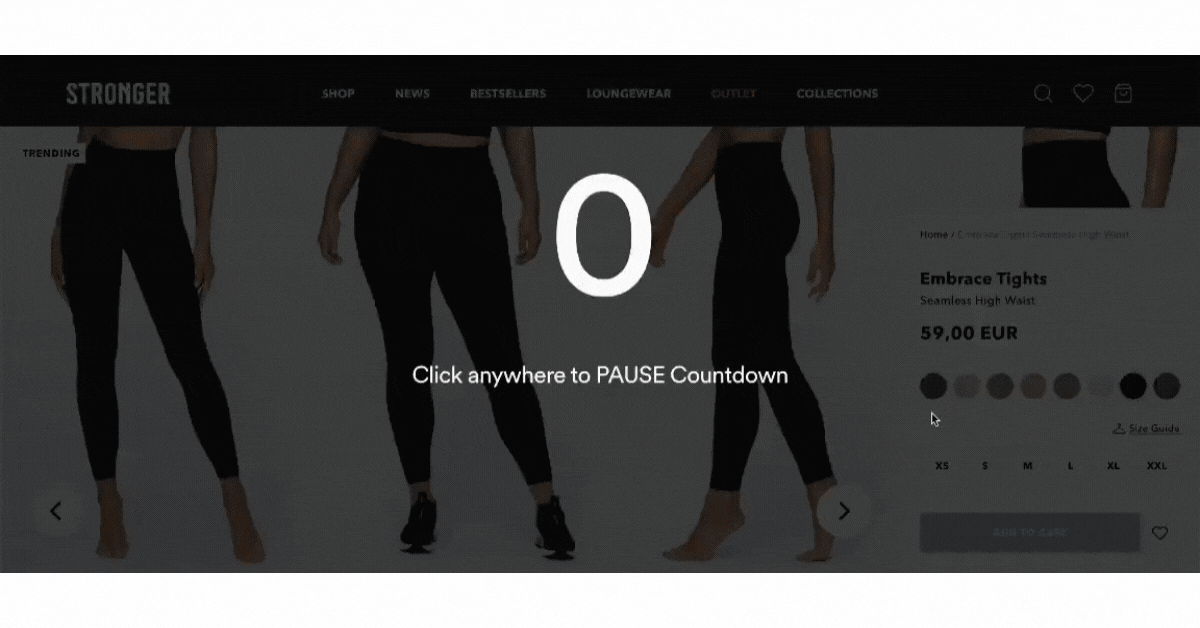
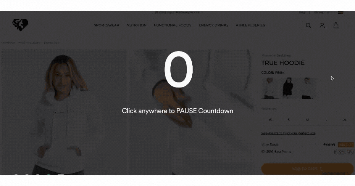
- If the product detail page is long (3 – 4 folds), the add-to-cart button should be a sticky
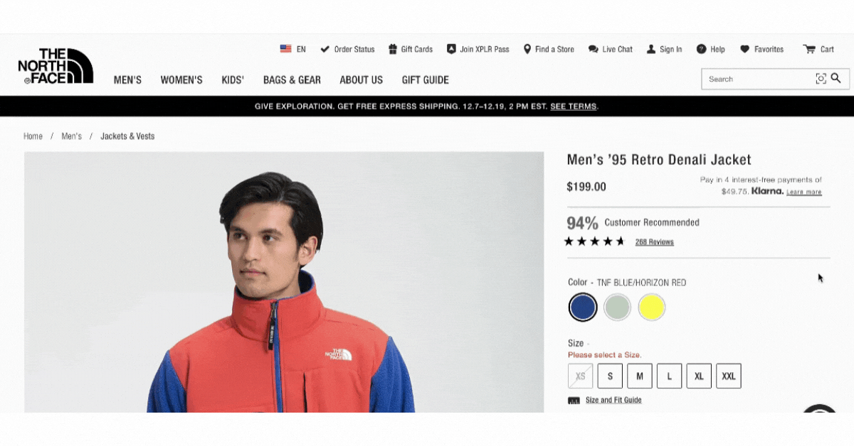
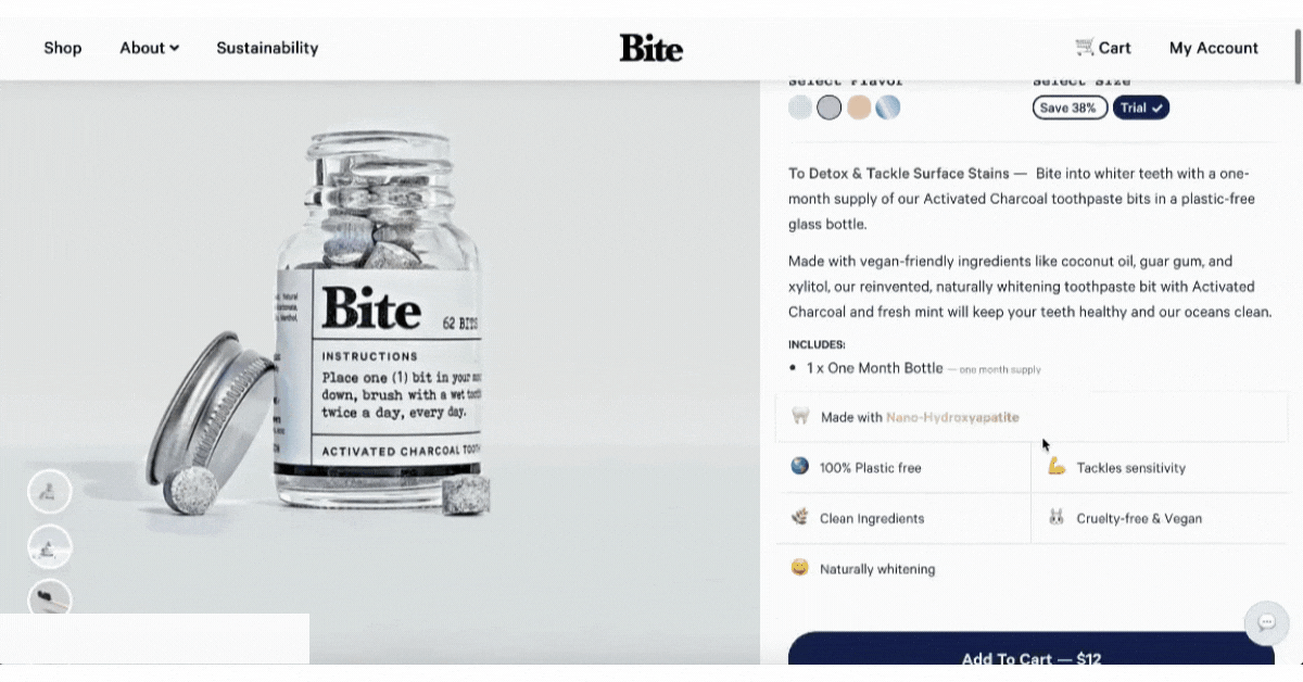
See how the CTA becomes sticky below the fold and notice that it changes to CHOOSE YOUR SIZE. Once users click it, they are taken directly to size selection and only then can they add the product to the bag. Smooth experience!
Also a small but effective pattern worth adopting: place a benefit-driven line directly above the CTA — something like “Free returns · Ships in 24h · 4.8 stars from 2,400 reviews.” It answers the last-second doubt without requiring the user to scroll anywhere.
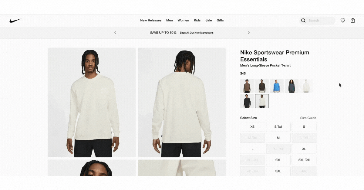
3. Handle variant selection clearly
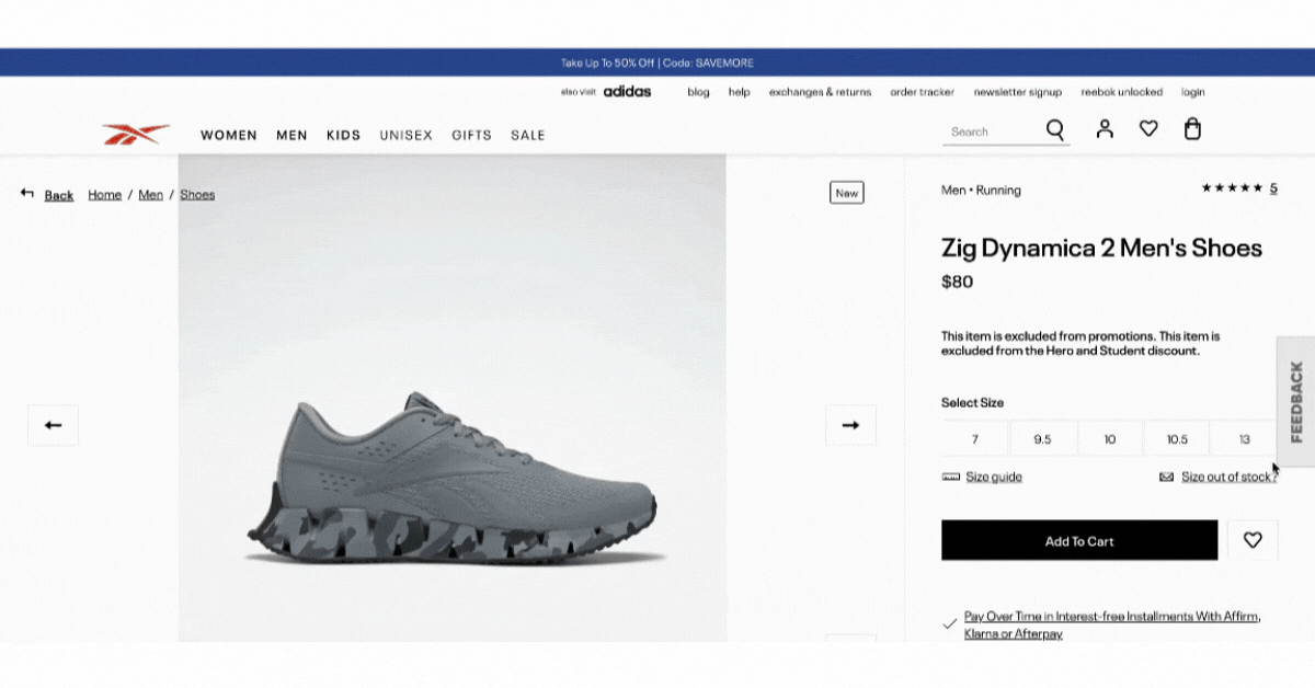
Variant selectors — size, color, material — are one of the most friction-prone parts of any PDP. A few things that consistently help:
- Use color swatches instead of dropdown menus where possible. Swatches are faster to scan and more visual
- Update the product image automatically when a variant is selected — users should see exactly what they’re buying
- If a variant is out of stock, show it as greyed out rather than hiding it. Hiding options creates confusion; greying them out manages expectations without frustrating the user
- For complex products, live configurators that update price and imagery in real time reduce back-and-forth and hesitation.
4. Be creative and informative in your write-up
Another major part of a good product detail page is the actual content of the page. Some users might depend solely on product photos and reviews; however, there are users who like to read and get into those details accurately. Here’s what’s important:
- Unique selling points are present
- A rich and creative product description is crafted
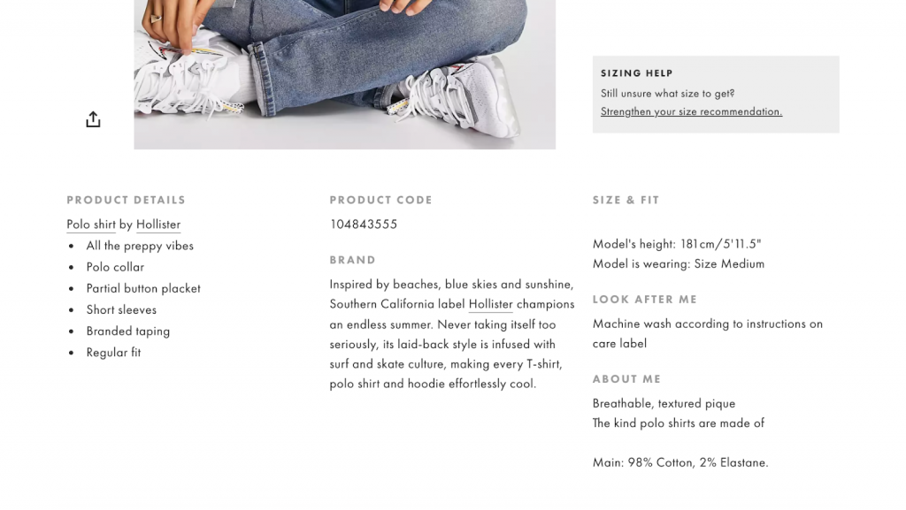
- Information about delivery and return is available
One practical consideration for larger catalogs: AI-assisted product descriptions have become a viable tool for maintaining quality at scale. The key is treating AI output as a first draft — the copy should still reflect the brand’s voice and include the specific details (materials, dimensions, use cases) that generic descriptions tend to miss.
5. Nudge users to buy
This is the part which users are often not aware of but is very important for conversion. The small nudges that you add to the product detail page can go a long way in encouraging more people to click on that “Add to cart” button!
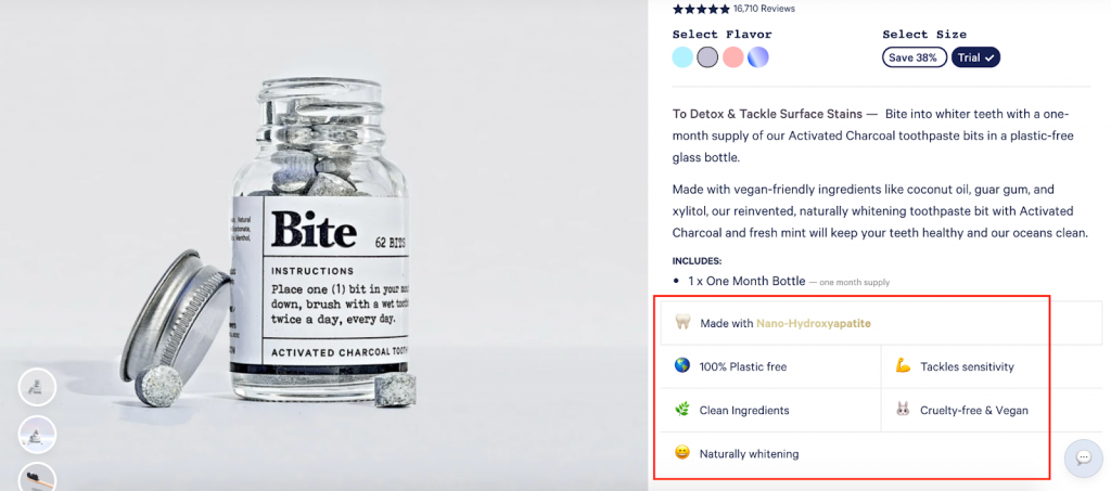
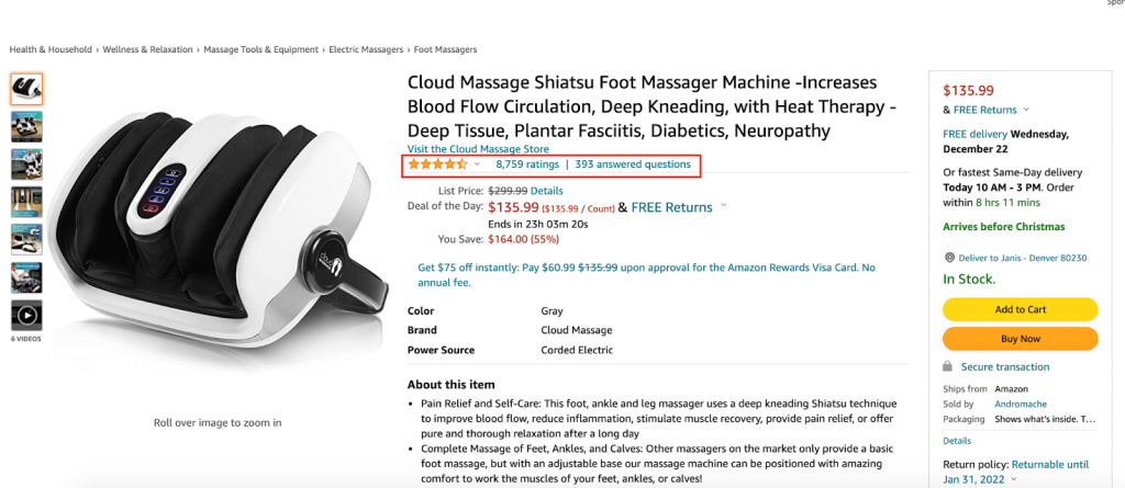
- Social proof is leveraged
Customer-submitted photos displayed on the PDP itself add a layer of social proof that brand photography can’t replicate. Shoppers trust other shoppers — seeing a product worn, used, or set up in a real home removes the uncertainty that polished studio shots leave behind.
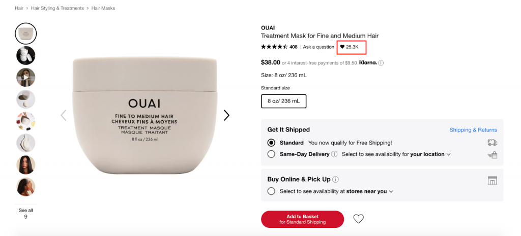
- Scarcity is used
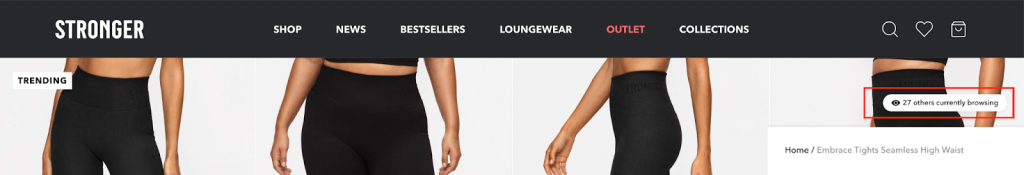
Best practice: Show how many other customers are interested in the same product.
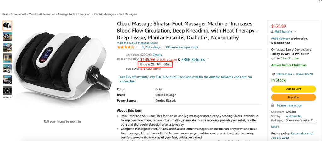
When stock is genuinely low, say so plainly. “Only 4 left” is more credible than vague urgency copy. Manufactured scarcity is easy for shoppers to spot, and it damages trust more than it helps conversion — so only use it when it’s true.
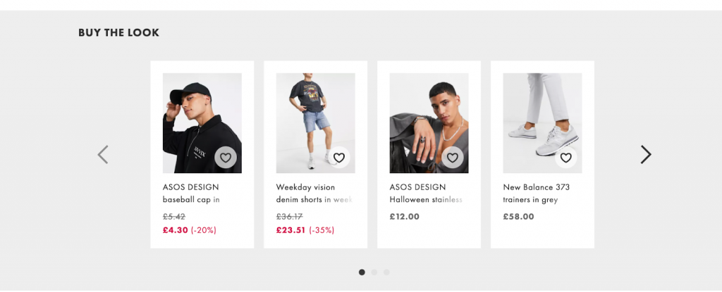
- Upsells / Cross-sells are offered
- Recently viewed items are visible
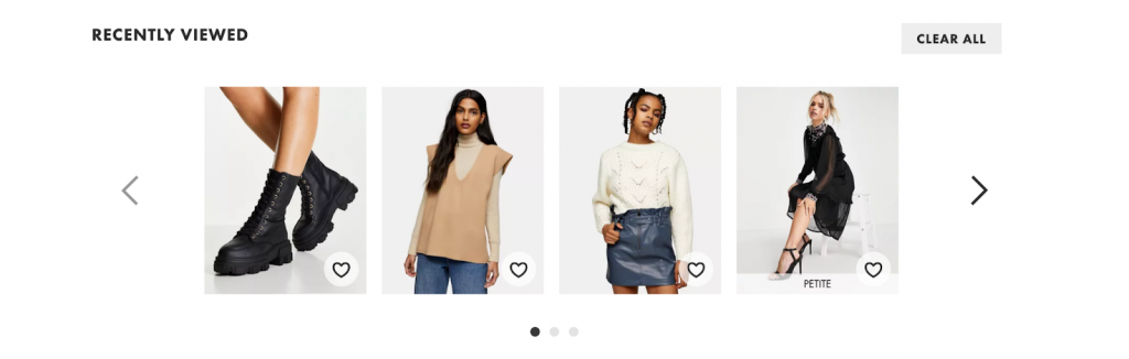
Static “you might also like” blocks are largely a legacy pattern. Today, AI-driven recommendations that pull from the user’s browsing behavior and current session context tend to perform better — because the suggestion feels relevant to that specific shopper, not like a generic afterthought served to everyone.
6. Make it accessible
Accessibility on PDPs is no longer optional — it affects a wide user segment, carries legal implications in several markets, and is a factor in search performance. The basics:
- Include descriptive alt text on all product images
- Ensure variant selectors and CTAs are keyboard-navigable
- Use readable font sizes on mobile — especially for product specs and fine print
- Check color contrast on CTA buttons, especially against light backgrounds
Great layout examples
Layout also plays a major role in great product detail pages. We want to highlight the different layout approaches we’ve seen in eCommerce stores out there that make UX interesting and more effective.
1. Sticky photos + scrollable product information
If the product is visual and the photos are its strong point, this is a great layout option. Users don’t lose sight of the photos while scrolling the rest of the page.
2. Sticky main info and CTA + scrollable photos and other info
This is the opposite of the first one. If you want users to focus on the main product description and have the CTA in front of them at all times, this is the perfect layout.
3. Photos and CTA in the first fold, other info down the page
This one is not common and actually quite unusual, but it works if emphasizing the photos and the CTA is your goal. In a way, it combines the first two practices—you have both the photos and main CTA at the top and all other info is below the fold.
4. Photo gallery full display
Another layout that focuses on the photos is where the gallery is on full display. There is no need to click on thumbnails to browse through the photos. Users can smoothly scroll through everything while viewing the main description and all of the other product details.
5. Out-of-the-box experiences
Lastly, there are layouts that just don’t follow any rules. There is so much happening that it truly creates a unique experience. However, one must wonder how good such layouts are for conversion as a lot of the page elements can be actually distracting for the users.
Final thoughts
When it comes to designing your product detail pages, you can follow no rules at all or create your own that others can model their practice after. There are really no strictly established rules. Nevertheless, there are certain practices that are proven to work and others that have been observed to bring about negative results. If you’re not yet familiar enough with what works and what doesn’t, we suggest you hold off breaking the rules and follow these best practices instead. But if you know the game you’re playing and willing to put in the effort to test out different approaches, being the innovative one in the industry can be good for your brand.
The stores that consistently convert well on PDPs tend to share a few things: their pages load fast, the visuals do the heavy lifting, and there’s nothing standing between the user and the buy button. Everything else is refinement on top of that.
If you want help improving your product detail pages, scandiweb’s team has delivered UX and CRO work across 2,100+ eCommerce projects — including global brands like Puma, Adidas, and Samsung. We’re the world’s #1 most certified Adobe Commerce agency, and our CRO program has delivered an average +48% conversion rate improvement across client stores.
Whether the issue is UX, technical implementation, or identifying where your PDPs are losing people, we can help. Get in touch for a free consultation and we’ll take a look at what’s actually happening on your pages.

Share on: