Although product listing pages (PLP) seem pretty intuitive—you simply ensure that all the products available in your catalog are included, right?—there are best practices that you ought to follow if you want the user experience to be as good as anywhere else in your eCommerce store. You want shoppers to find the perfect product for them and complete a purchase, not leave your site frustrated and annoyed by how difficult it is to get to what’s relevant to them.
If you already have filters for categories, product types, and price range, that’s a good start. But here’s what you can do to increase opportunities for conversion on your product listing pages.
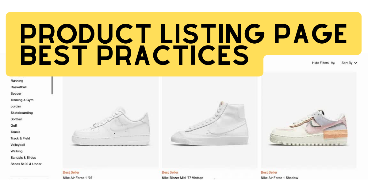
Here’s how to improve your product listing pages
1. Make filters prominent and sticky
Filters on product listing pages are extremely important as they can be the key for users to find the exact products they are looking for. Here are the most important best practices specifically for filters:
- Filters should be sorted by popularity – the most used filter attributes should be accessible to users first
- Filters should be sticky on scroll, especially on mobile devices
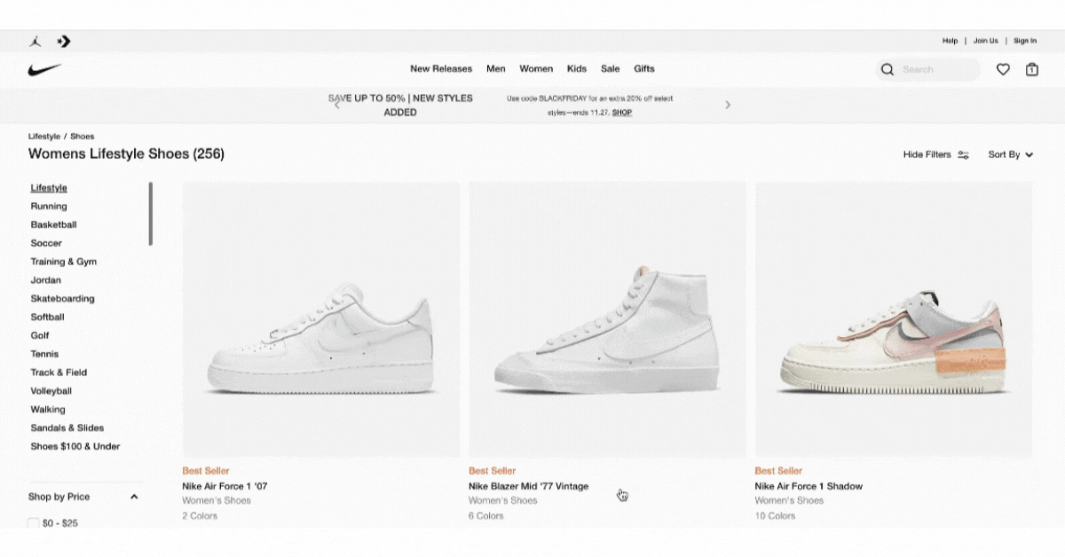
- Once filter attributes are selected, they should be prominent and remain sticky
- Filter attributes should show the number of corresponding products
- Users should be able to clear selected attributes all at once
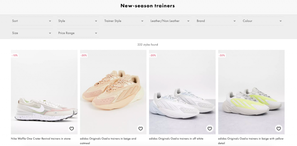
2. Design product pods thoughtfully
Another extremely important element on product listing pages is the product pod. As users browse through different product options, a well-planned and designed product pod can nudge users towards the decision to make a purchase. Let’s see what the best practices are for them:
- On desktop devices, secondary images should be available on hover
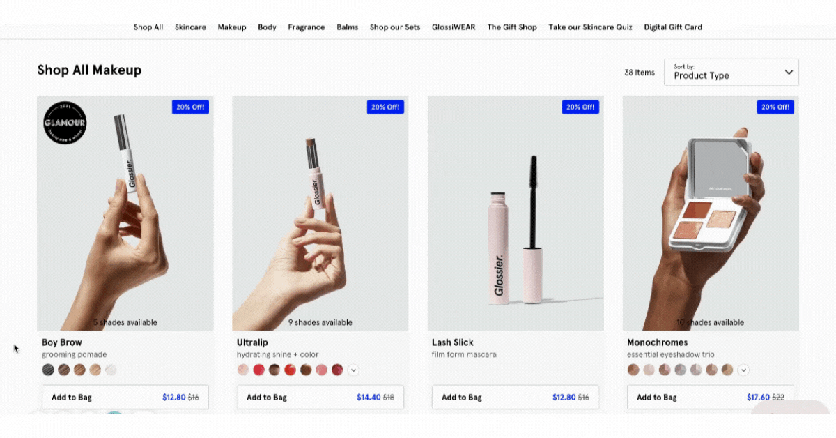
- Quick “Add to Cart” should be present
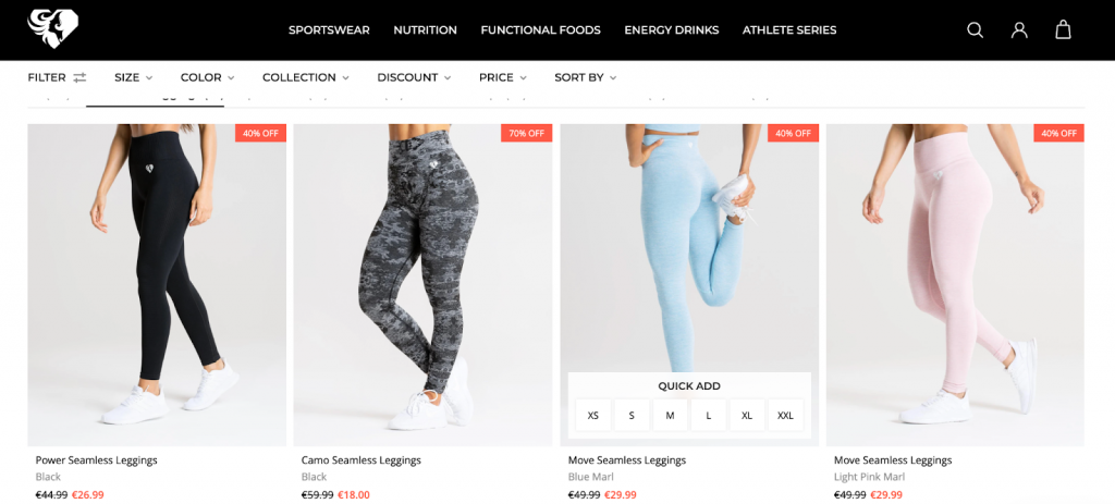
- Secondary CTAs should be available (e.g. Wishlist, Compare)
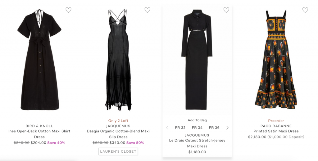
- Ratings should be displayed
- Discounted prices should be clearly emphasized
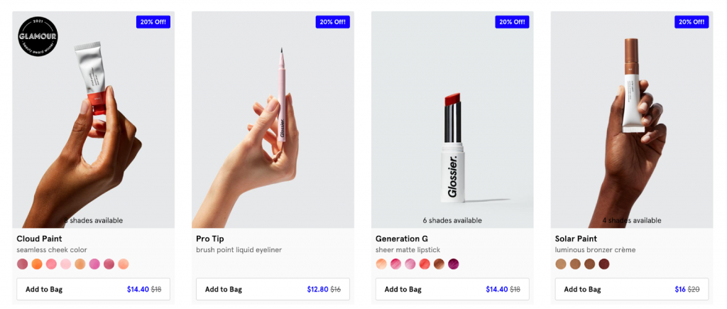
- Badges should be used for product separation
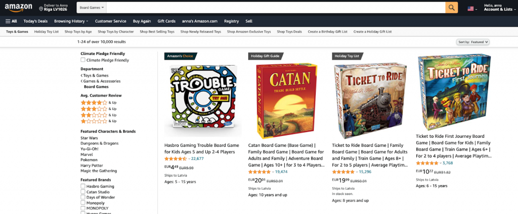
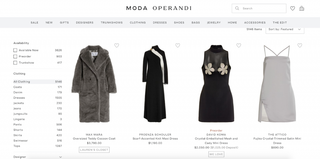
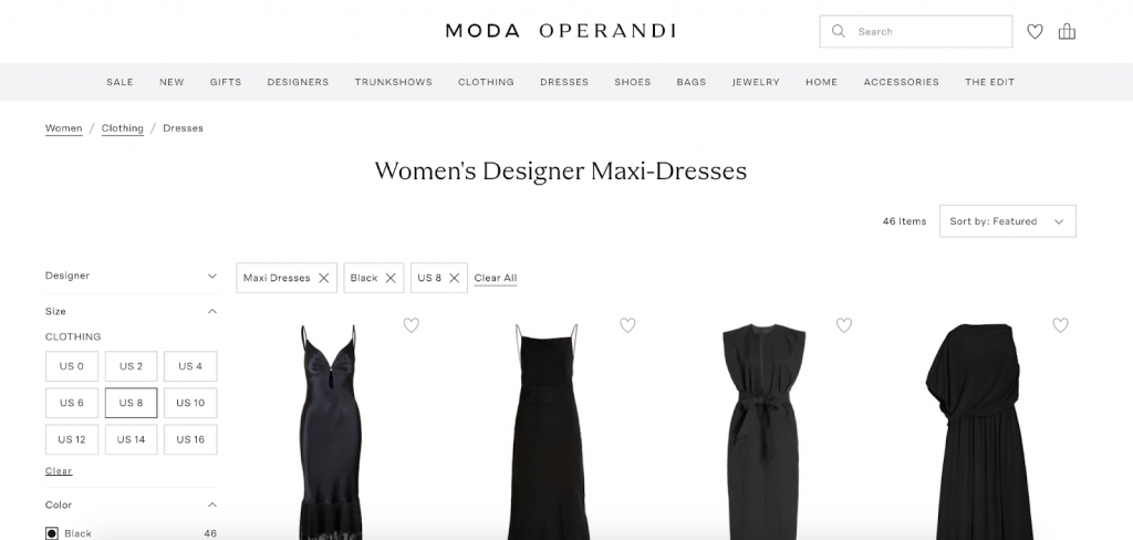
3. Keep UX and SEO in mind in your layout
These are the basic things to keep in mind when designing the layout of your product listing page:
- A title, breadcrumbs, and an additional product category description for SEO purposes should be present
- Pagination or “Load more” should be used at the end of the page
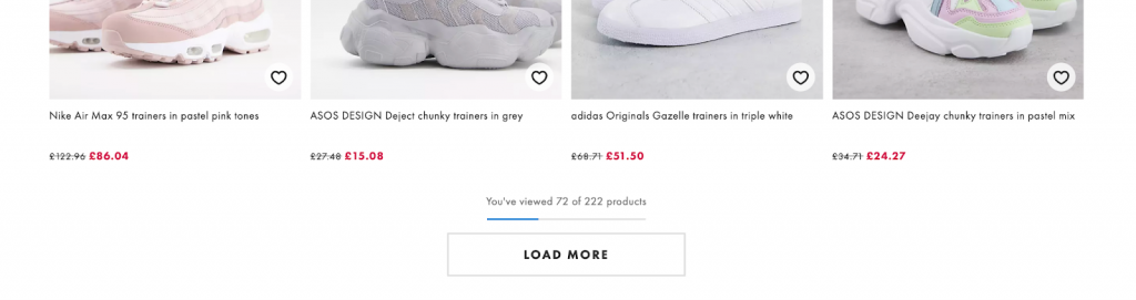
- The total number of products listed on the page should be prominently displayed on top
Product listing page current trends
Here are some new trends we’ve noticed in more and more brands’ product listing pages that create an even better and more unique user experience:
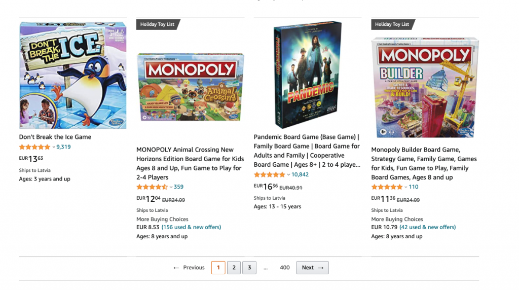
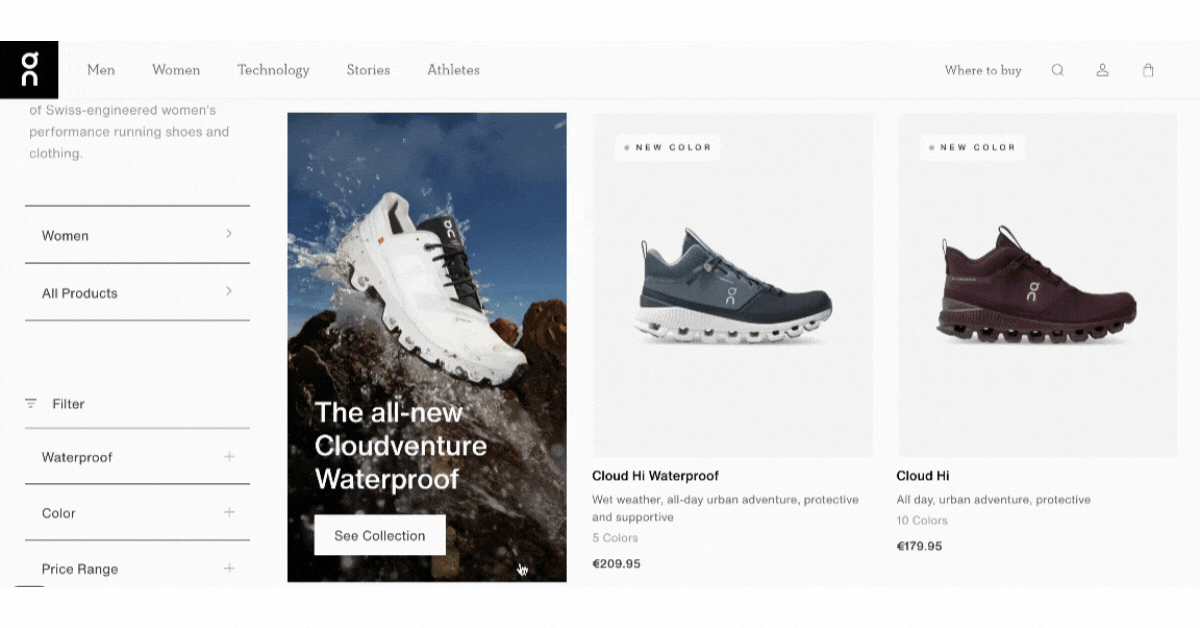
1. Faux product pods
These are “fake” product pods that are used to advertise other product categories, showcase a message, or give additional descriptions about the product category or type users are browsing:
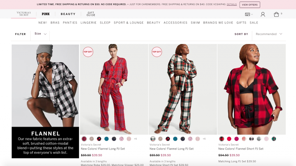
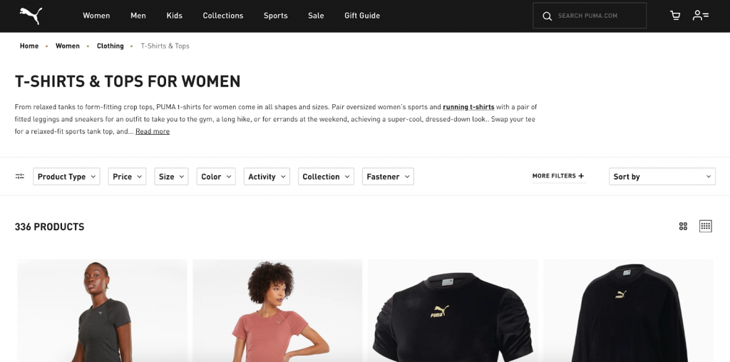
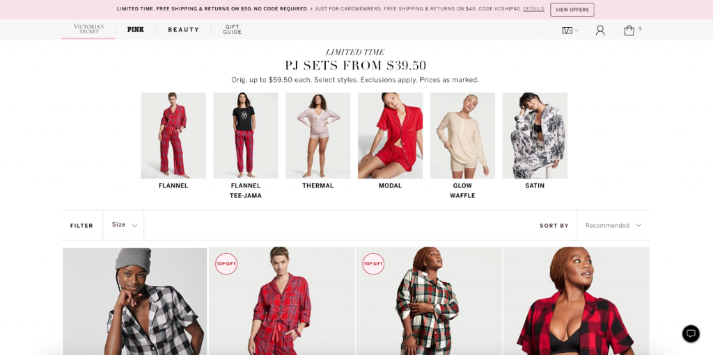
2. Product category boxes at the top of the page
We’ve noticed that several brands are starting to do this—visually showcasing different product categories or types in order to educate the users about product variations and help them visualize more possibilities:
3. Browsable product photos in product pods
So that users don’t have to go to product details pages to see all the product photos, then return and do the same several more times, brands have started to implement the option to browse all available product photos right on product listing pages through the product pods. It’s quick, convenient, and creates a better experience!
Final thoughts
You’ve probably noticed that even in the examples we’ve showcased, the websites don’t follow all of the aforementioned best practices. That is because no one magic formula fits all.
The practices we’ve shared also depend on the industry and target audience, among other things. For example, displaying product ratings in product pods might not be that relevant for apparel products; however, it could be crucial for products like computers, higher-priced items, or more complicated products. These are recommendations that work for many eCommerce stores across many industries.
Then again, business goals, your audience, and brand guidelines and design should all be taken into account when working on the product listing pages.
Need help with your product listing pages or merchandising in general? Sign up for a free consultation today or hit the orange chat bubble on the right to talk to one of our project managers.

Share on: