CHECKOUT OPTIMIZATION CASE STUDIES
Checkout is the most important part of the website. That’s where the money is. Hence, we need to make sure nothing stands in the way of placing an order.
We are tackling checkout optimization strategies that address checkout issues even established eCommerce stores worldwide encounter. We are looking at the challenges specific companies are confronted with and share what we do to resolve them.
Read our first case study on checkout optimization and gain insights on how you can improve the checkout experience in your own store. We want you to improve your own checkout so we are sharing ways of reducing friction that you can implement in your eCommerce store when you start your checkout optimization journey.
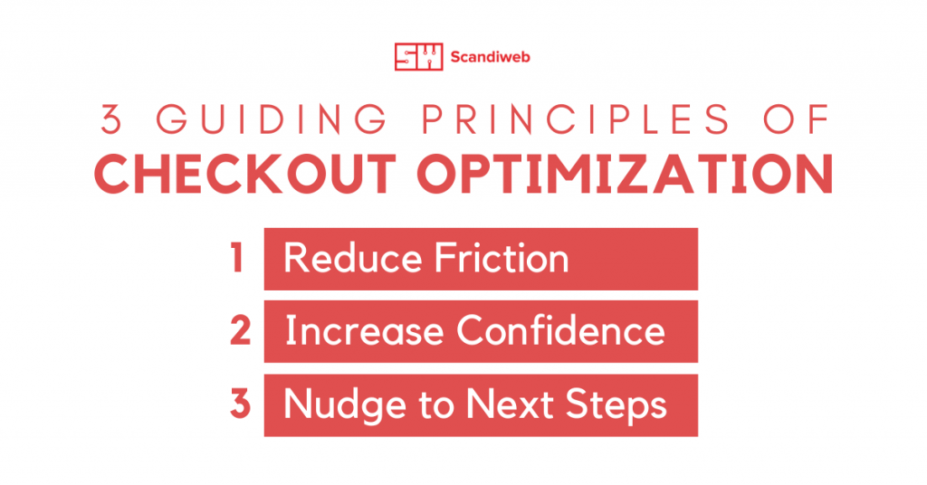
Remember, the goal is always to make the checkout process as simple and seamless as possible. And we do that by following these guiding principles of checkout optimization:
- Reduce friction
- Increase confidence
- Nudge to next steps
In this article, we are talking about reducing purchase friction and how to improve the checkout process overall.
What is friction in eCommerce?
Friction is anything that impedes the customer from achieving their goal, whatever that may be. eCommerce friction, also called purchase friction, is that which hinders the customer from making a purchase or reaching the end of the sales funnel.
eCommerce friction can be caused by many different factors, but these are the most common ones: complex checkout process, slow or unknown delivery times, limited payment options, and unexpected fees. All these factors can discourage customers from completing their purchase or lead them to abandon your store altogether.
How to reduce friction at checkout?
To reduce friction at checkout, we want to remove anything that may cause resistance on the part of the customer. Here are some quick recommendations for keeping your checkout process as smooth as possible:
- Keep the checkout steps short and simple. Keep checkout steps and form fields to a minimum. Do not introduce unnecessary steps and avoid other CTAs that will distract the customer from following the natural flow of the checkout process. Make sure the steps are intuitive and easy to follow so customers are not left wondering what to do next or how to execute a particular step.
- Be upfront with shipping costs, taxes, and all other fees. Customers don’t like being surprised with additional charges right when they’re about to enter their credit card details. Unexpected charges will not only discourage your customers from completing the purchase, they will also harm loyalty and trust.
- Offer flexible payment methods. Online shoppers like the convenience of using the payment method they are familiar with. Providing multiple payment options—credit/debit card, PayPal, installment plans, etc.—will make it easier for customers to complete their purchases.
Before we dive into the first case study, check out our Checkout Optimization webinar. The webinar covers principles and examples of сheckout optimization for eCommerce and shows how to audit your checkout.
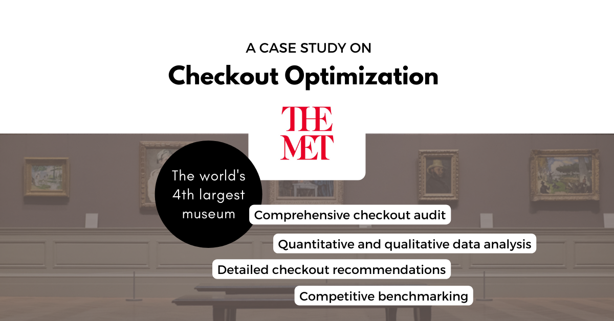
The MET Store checkout optimization program
The Metropolitan Museum of Art—The MET—is the largest art museum in the US (New York City) and 4th largest in the world. The MET showcases “over 5,000 years of art from around the world” and welcomes millions of visitors each year.
The MET Store is their official eCommerce site offering a wide variety of products inspired by the art collections they house at the museum, including apparel, jewelry, reproductions, and wall art, among others.
Scandiweb was already supporting The MET so they reached out to us when they were planning the update of the checkout at The MET Store.
The checkout optimization program for The MET Store included:
- Checkout tracing review & additional tracking setup
- UX audit and competitive benchmarking
- Quantitative and qualitative data analysis
- On-site polls
- User testing
- Wireframing and designs
There were several objectives for the new checkout for The MET Store and we employed various research methods to identify and address checkout issues. But in this article, our focus is on reducing purchase friction and improving checkout flow.
Reducing Friction: Addressing areas of user frustration
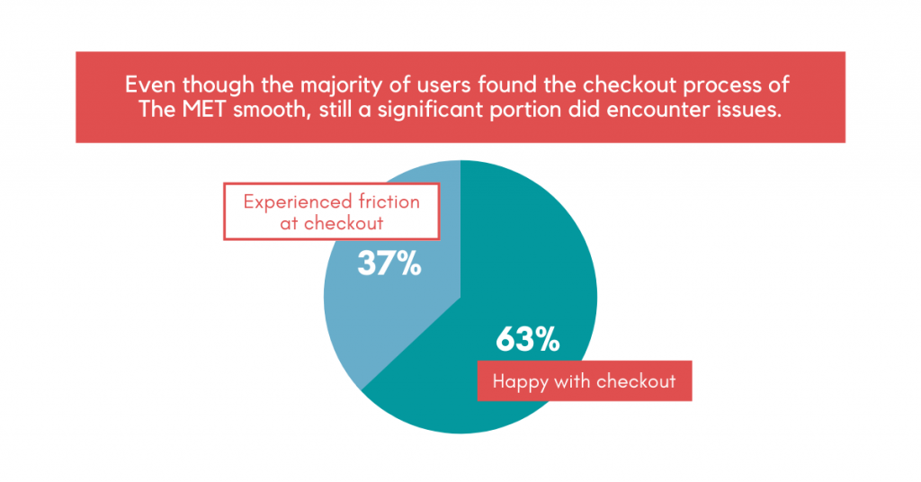
Data showed that customers were very likely to recommend The MET Store to others. Their NPS was 8.7 at the beginning of the project. However, a good chunk of their customers (37%) still did experience friction during checkout.
We will discuss the following areas of user frustration and provide a solution after each:
- Unintuitive shopping bag
- Complicated checkout process
- Gift message dilemma
- Unexpected delivery costs
- Limited payment options
Below you’ll see purchase friction examples and how to address them.
Unintuitive shopping bag
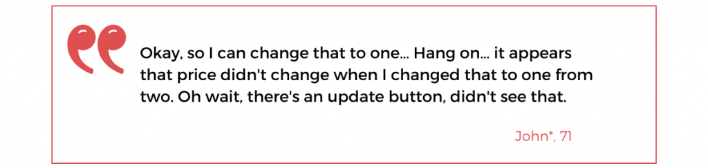
When a customer changes the quantity of their order, they need to click on the “Update” button for the cart to reflect it. They easily miss this button and are left thinking that there is an error on the website.
Meanwhile, the “Continue Shopping” button designating the shopping journey continuation actually leads users to the last page they visited regardless of the context. So if the second checkout step was initiated previously, clicking the button will take the customer back to that step. This is incongruous with user expectations.
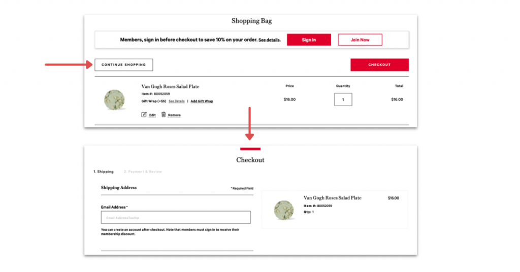
Reduce friction by making the shopping bag more intuitive
Simply fixing the “Continue Shopping” button so that it leads to an appropriate product listing or back to the homepage can tremendously improve the customer experience on the cart page already.
Adding a dropdown to the item quantity instead of requiring users to manually input a number and then clicking “Update” will make updating the cart faster and easier. If you are experiencing a similar issue in your eCommerce store, do this to reduce customer friction and you’ll see results in no time.
Complicated checkout process
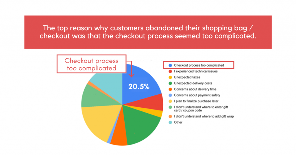
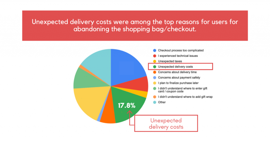
Based on the exit-intent survey we conducted, the number one reason for The Met Store customers abandoning checkout was that the checkout process seemed too complicated. We want to reduce customer friction so we want to make this process as straightforward as possible.
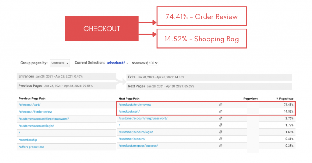
We reviewed the path customers took after viewing their carts and here’s what we found:
Of the pageviews related to where customers are to provide shipping information, the first step of the checkout process, a strong majority ended up on the order review page. However, a substantial portion of those pageviews still had the shopping cart as the succeeding page. This implies that users were not yet ready to convert or were discouraged by the appearance of the shipping form.
Recorded sessions showed users scrolling up and down a lot before making the decision to place the order. This indicates that it is hard for users to process all the information as it is currently displayed.
User tests also proved that in order to review their shopping cart, users might even consider exiting the checkout because they don’t see the cart summary on mobile and they don’t think of scrolling that much farther down:
Shipping step: Only approximately 20% of users scroll down till their shopping cart summary.
Billing step: Just about 13% of users scroll down to the very bottom of the page to see their cart summary.
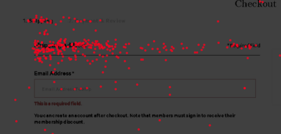
Studying heatmaps, we saw that the majority of users only filled in the mandatory fields in the shipping form and skipped the optional ones. A lot of “rage clicks” were also registered on “Shipping Address” and “Required field” at the top of the page, elements that are not clickable. These clicks could represent the users’ desire to verify their shipping information.
By this time, it’s very clear that there were a lot of steps involved in the checkout process that complicated it for the customers and distracted them from completing the purchase.
Reduce friction by simplifying the checkout process

The harder the Checkout process is, the more motivated prospects have to be to complete the purchase. Simplifying the Checkout and making it shorter will nudge more users towards finalizing the purchase.
To tackle the issues mentioned above, the following changes should be made:
- Make the checkout progress bar and order summary with the total cart price sticky.
- Remove unnecessary form fields to make the shipping form shorter, and thus easier to complete.
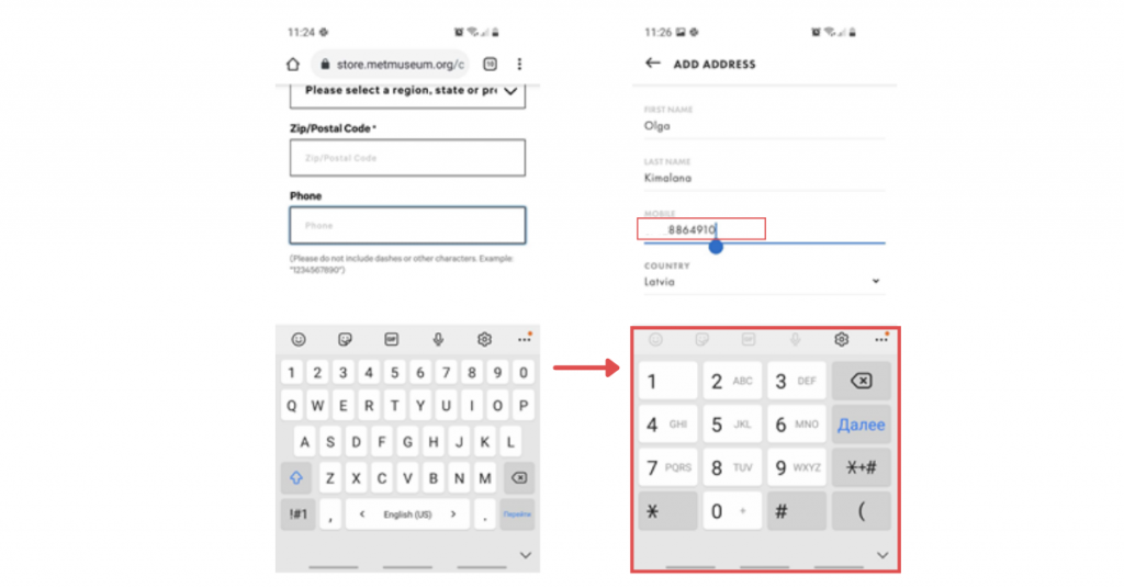
- Auto select the country code when phone number is asked.
- Optimize keyboard on mobile devices to match field type to help reduce errors and speed up the checkout process, e.g., show number pad when phone number field is selected or show @ symbol when an email address is required.
- Enable address autocomplete to allow users to fill out the form faster and help reduce errors.
- Move to the next logical field when the tab key is pressed on desktop or the enter key on mobile.
With the enhanced customer checkout steps, users will encounter less friction when shopping online.
Gift message dilemma
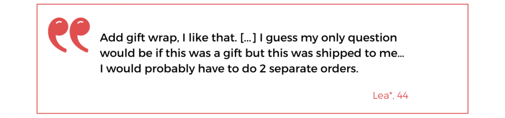
During user tests, all participants confirmed that they liked having the option to add gift-wrapping and a personalized message as part of their purchase. However, users also experienced some uncertainty—how to add a gift message to only one item in the cart?
In recorded sessions, we also spotted an issue with the gift message option: After entering a gift message, users got an error message about special characters.
Reduce friction by combining the gift wrapping and message options
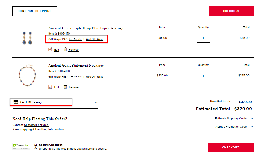
Looking at heatmaps, we saw that the gift-wrapping option caught user attention much better than the gift message option as it was closer to the product name and photo.
On desktop, Gift Message had 113 clicks while “Gift Wrap” had 656. On mobile, the pattern remained—the location of “Gift Wrap” on mobile also attracted more user interaction than Gift Message.
So how to add a gift message to only one item in the cart?

Combine the two elements into one clickable text: “Is this item a gift?” This way, users can add both gift wrapping and a unique message to each item in the cart.
To address the error encountered by users when entering a gift message, display a warning text to notify users that special characters are not accepted.
And finally, as the location of the Gift Wrap option was more noticeable to users, position the combined elements in the same place.

Unexpected delivery costs
When we looked at desktop heatmaps, we saw that the Estimated Shipping block was among the most clicked elements of the cart view page after the checkout CTAs. And in mobile, the second one, right after the checkout CTA.
There was a consensus: 10 out of 10 users appreciated knowing the shipping costs before checking out.
- Normally, users expect free shipping if they are spending a lot and would even go look for a promo code that covers shipping costs.
- Users want to know the shipping costs as early as possible because if there is the possibility to buy more products and not pay for shipping, they would choose that.
- If there was no free shipping option, knowing it right away will help them decide whether to add more products to the cart to make the shipping costs worth it.
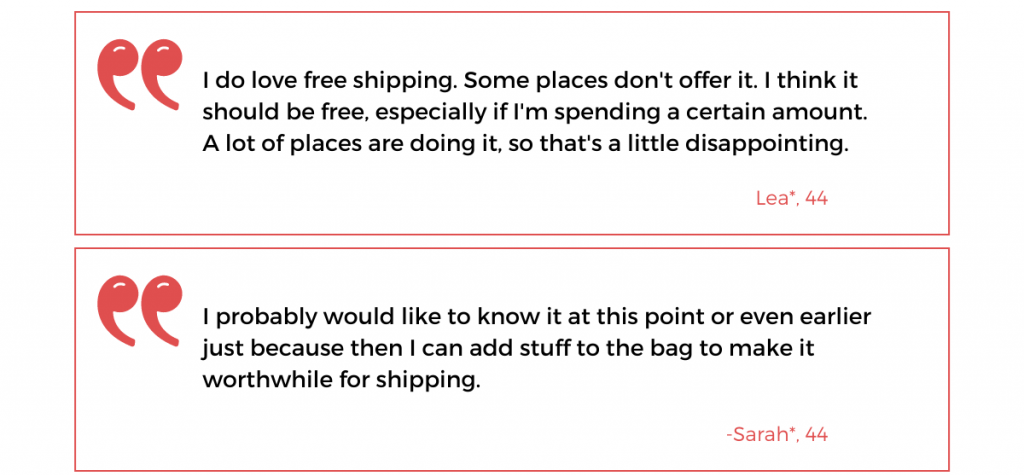
When we asked, customers who have made a purchase pointed at delivery terms and price as their top concern while shopping.
Reduce friction by providing shipping costs early and offering free shipping
Delivery fees are an important factor to consider in shopping cart optimization. As we’ve seen that shipping costs are an area of concern for customers, it’s best to always have shipping costs and relevant offers available to them. Estimated shipping costs should remain in the shopping cart view.
Introducing free shipping when a certain cart amount is reached will motivate customers to buy more to get this benefit, as opposed to getting discouraged by high shipping costs. Communicate the offer in the shopping cart to encourage users to spend more.
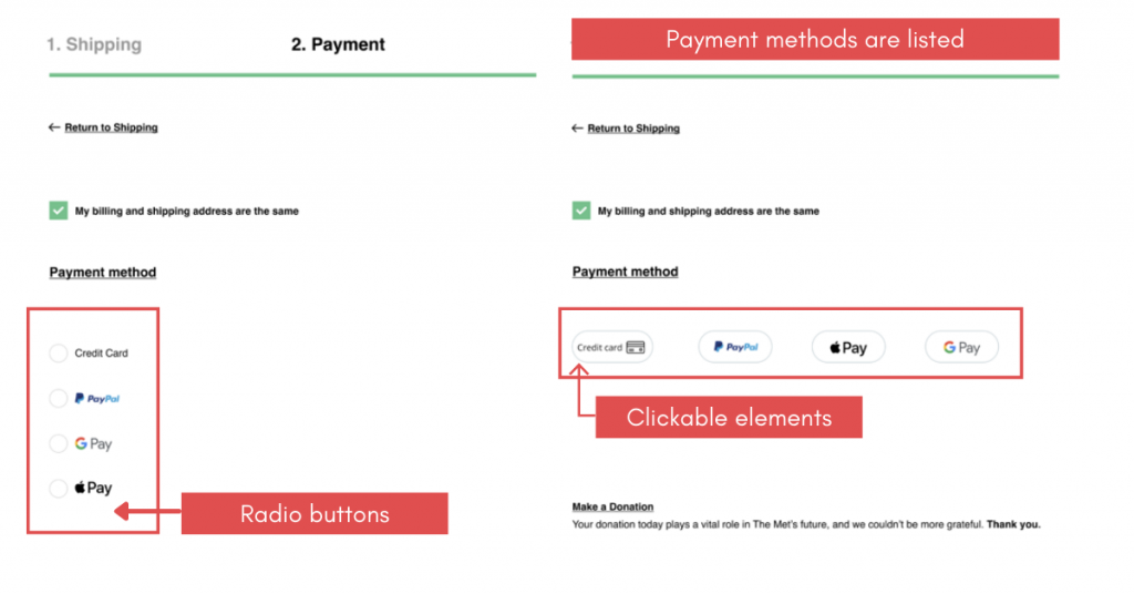
Limited payment options
10 out of 10 users confirmed that they would like additional payment methods.
And the most requested one was Paypal. Moreover, several users mentioned that paying with Paypal makes them feel more secure as they know that nothing bad can happen with the payment.
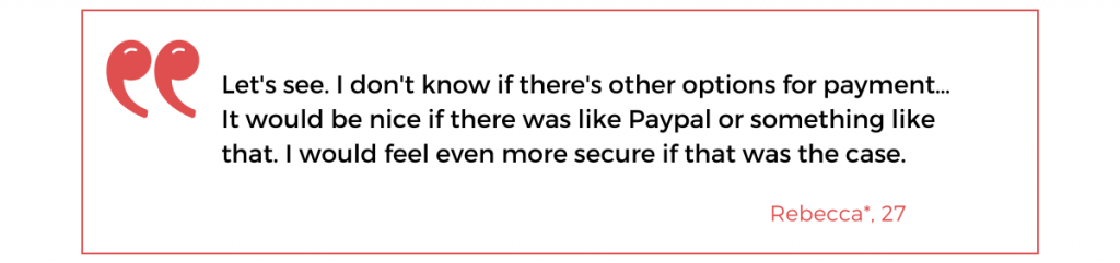
Reduce friction by adding more payment methods
The solution to this one is quite straightforward: add more payment methods!
Even better, also add express checkout at the beginning of checkout to make it easier for customers to complete the purchase.
The Scandiweb approach to checkout optimization
And that’s how we approach checkout optimization to help eCommerce businesses resolve issues that keep their visitors from converting at checkout.
With our tried and tested guiding principles of checkout optimization—reducing purchase friction, increasing user confidence, and nudging customers to the next steps—we successfully design checkout funnels that lead to increased conversion and lower cart abandonment rates.
Read about increasing user confidence at checkout next.
If your current checkout approach is not working for your eCommerce business, you could benefit from our Checkout Optimization Program. Tell us what your conversion goals are and we will create a data-informed growth strategy to help you achieve them. Get in touch with us for a free consultation.

Share on: