The checkout is one of the most sensitive areas of an eCommerce store. When 77.45% of people abandon their purchase during some stage of the checkout process, as was the case for Scandiweb’s client, it’s a clear indication that there’s friction and room for improvement. One solution that makes a lot of sense on paper and is most often heard from the side of clients is to implement a checkout that obviously works — think Amazon, eBay, and other eCommerce giants.
Take their checkout, modify it just enough to fit your site, implement it, and conversions should increase, right? Well, that’s not always the case. You often end up finding that it doesn’t quite suit your needs, modifying it and ending up with something that just doesn’t work.
In this case study, we’ll take you through the steps of how we went from adapting Amazon’s checkout to our client’s site, to demonstrating it won’t work, to research and iterative testing. Spoiler alert! Clients ended up opting for a functional and streamlined Scandiweb Design. Read on to find out how we got there!
How we did the checkout redesign
Google Analytics
Our marketing team performed in-depth Google Analytics research to discover the following numbers:
- 77.45% of people, who wanted to finish their purchase, didn’t and abandoned the checkout (respectively, only 22.55% of sessions with checkout end with a successful order)
- Shipping Info and Method Checkout step has the highest abandonment rate: 51% of the sessions that entered this step, abandoned the checkout
- Billing Info and Payment Method step has the second highest abandonment rate: 42% of the sessions that entered this step, abandoned the checkout
Heuristic Evaluation
Aiming to construct a wider picture, adding qualitative data to the quantitative, we performed a Jakob Nielsen heuristic evaluation, during which we review the site’s interface and compare it against accepted usability principles. In Scandiweb, we do the evaluation by multiple experts and aggregate their results to produce the most objective list of issues.
Stakeholder interview
After the interface is evaluated from the users’ perspective, we dive into the business details through an interview with the client. Questions about business limitations and current obstacles are raised.
The client’s answers matched up with the data we received from Google Analytics: the checkout logic was too complicated due to business processes — users struggle to understand it and quit in the face of excessive effort required on their part.
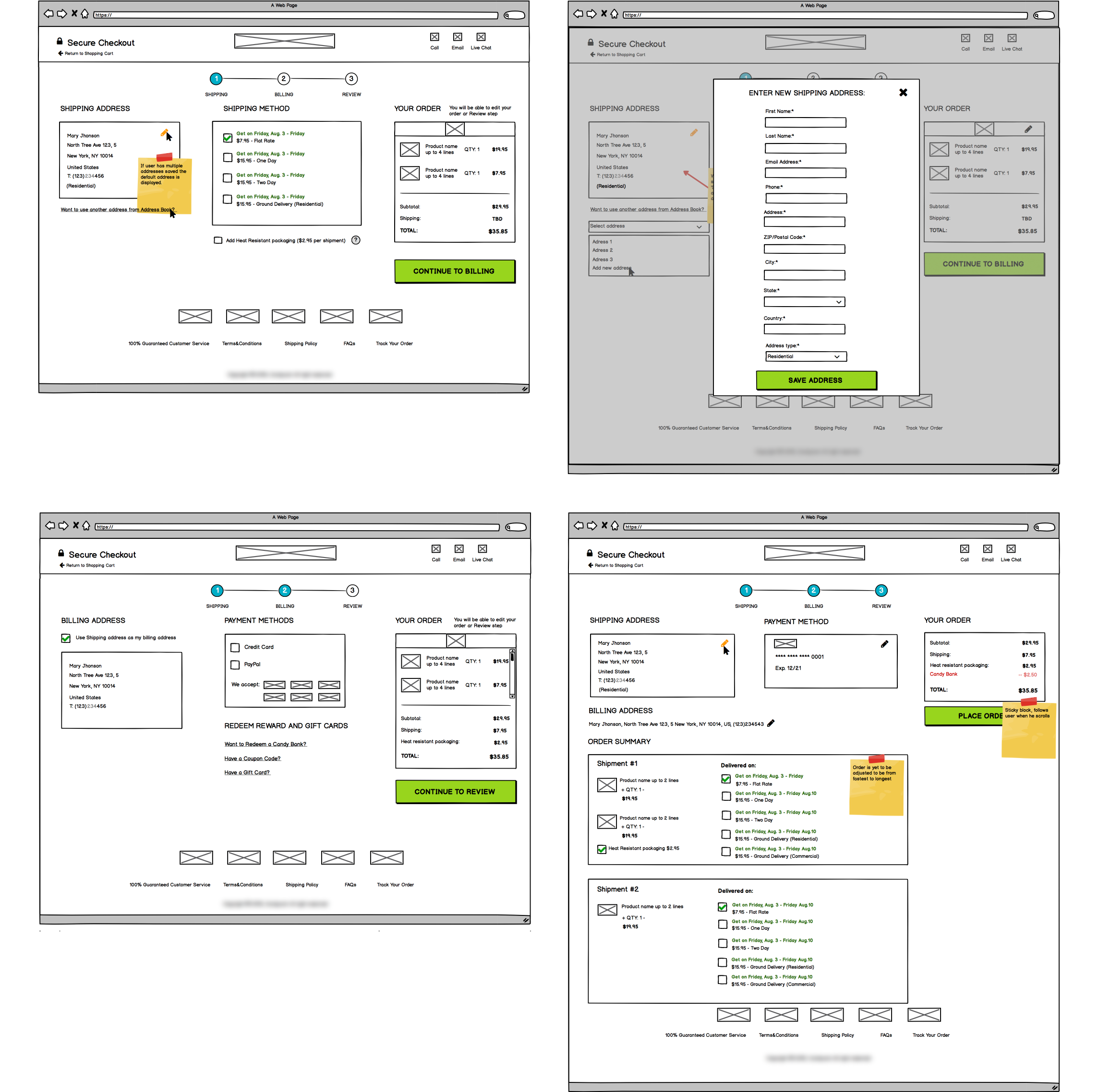
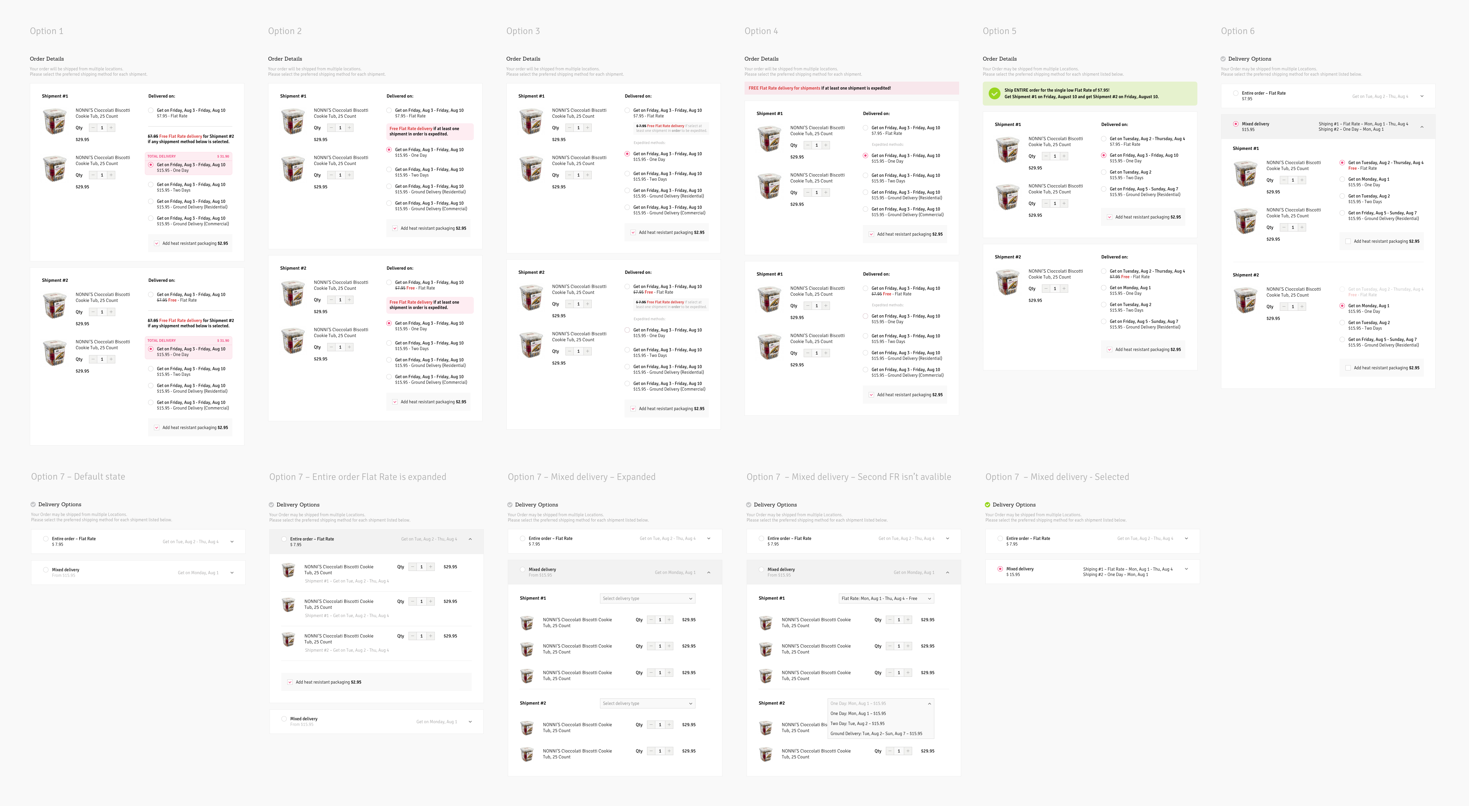
The most difficult part of the checkout is that the ordered items can be shipped from multiple locations. The users have to select the dates when they receive the parts of the order. Almost no other well-known checkout process has this, adding to the confusion. Here we overload the users with both cognitive and motor efforts. This could not be left as is.
Thus, we were faced with a challenge as old as eCommerce — how to make it easy for the customers and still respect business processes?
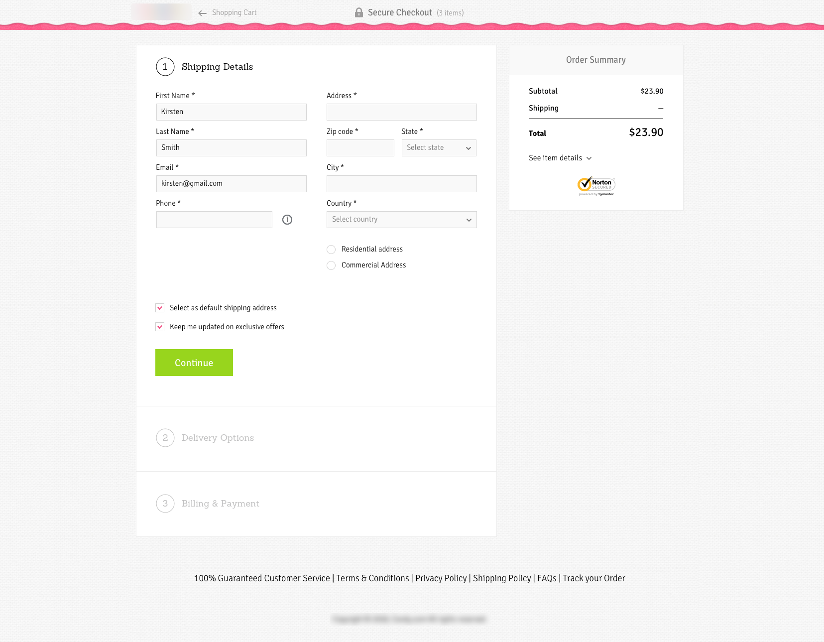
Wireframing
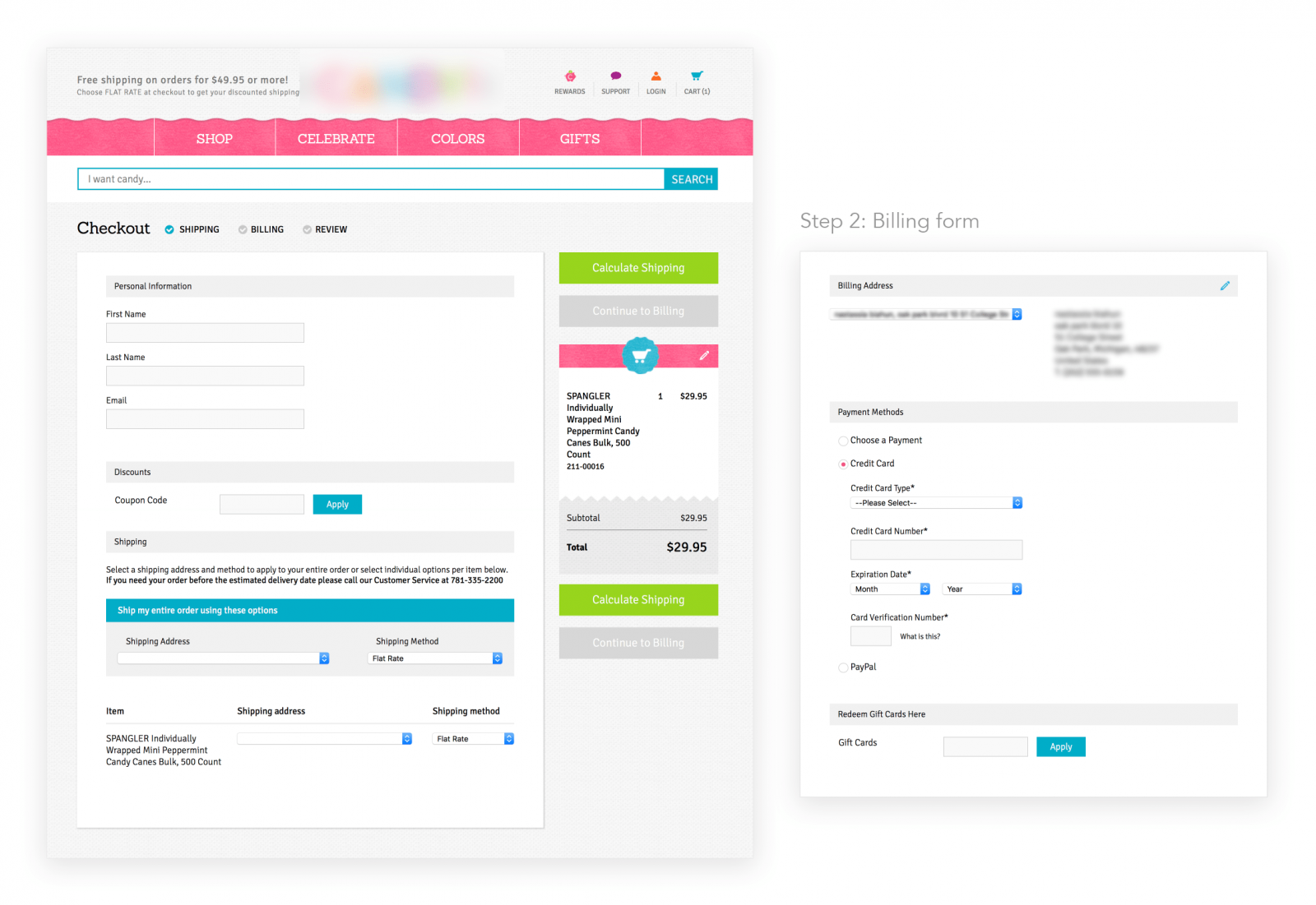
Here is what we came up with, focusing on the functionality of Amazon and the client’s requests. Some immediate heftiness of information is noticeable.
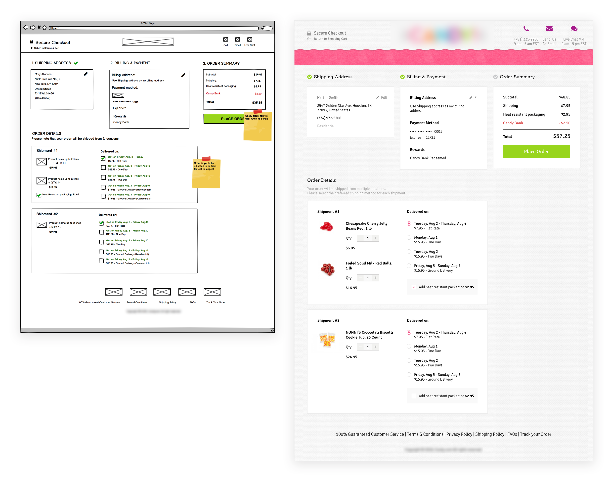
Due to the multiplicity of complex steps, a decision was made to switch to a 1-page checkout, with the idea of the customer immediately being aware of what’s required of them and not becoming increasingly frustrated when there are further complicated steps after they complete the first one. So the multi-step process transformed into the following editable version of the Review step, which was essentially a realization of the client’s vision:
Improving UX: Checkout solutions and API automatization
Naturally, we came across some UX problems — frictions, which, if removed, would help streamline the checkout experience. Regardless of design choices, these optimization issues needed to be addressed.
No more huge forms: skip exhausting manual input
Everybody hates filling in long forms. It is good if the users have a browser autocomplete, but what if they don’t? Then a lot of effort is required on the customers’ side, making the whole process unpleasant. Inputting the billing and shipping addresses and doing it every time you buy something on this site… it’s just irritating.
Based on analytics results, most users select the billing address to be the same as the shipping address. To resolve some inconveniences, we preselected all options that are more likely to be selected by the users.

Sometimes, it is not enough to just design the workflow to be fast. Pushing the user through the checkout process too swiftly can result in user errors, i.e. missing some field, or false input, which, in turn, could bring about customer dissatisfaction and logistic expenses.
To check if an entered address contains errors, we used a collection of tools, such as Smartystreets, Weather, Shipping Methods, InTransit times. These help with both cases: when the address does not exist and when the address contains an error. The users will be offered to select a correct address from the list suggested. Yes, this demands some more user focus, but this is exactly where we want them to be attentive.
No more melted chocolate!
Since our client’s business is sugar confectionaries, chocolate, and other sweets, there’s a peculiar problem that is faced — How about products that can melt? We can have the items arrive safe and sound if they are delivered in heat-resistant packaging. Since this could incur additional expenses, a smart approach to offering this is also necessary — we need to make sure we don’t offer them to a customer from, i.e. Alaska.
Extra information, cluttering the checkout can distract, increase time spent on the page and generally confuse the user, so removing it, where possible, is crucial. This is another case when the tools mentioned above come in handy
Iterating solutions until a winner is found
We completed several hallway usability tests on the design and discovered that although this design does offer some relief compared to the current confusing and cumbersome checkout process, it doesn’t address our overall need for a much nicer, streamlined approach to helping customers receive a first class experience at the checkout!
Since the shipping logic is the biggest issue in the checkout flow, we rethought how it is offered to the users, coming up with 7 different options for how to fix it.
With extensive research of eCommerce giants, such as Wallmart, Amazon, Sears, as well as competitor analysis and marketing research, with the help of Baymard Institute’s available resources and our own gathered insights, we came to the conclusion that the current one-page checkout is just too cluttered and it frustrates users, having multiple accents, too many buttons, too much information.
Scrapping the desire for a one-page checkout, incorporating the fruits of all of our research and in an attempt to tailor the system to our client’s concrete customers as much as possible, we ended up going for a more controversial solution — progressive disclosure.
Bulls-eye!
We achieved the goal of creating a functional and streamlined checkout! Our client loved this, we loved this, and, most importantly, data proved that customers love this as well. The outcome was completely different, to the original goal of creating a checkout similar to Amazon and having certain client-defined elements and colours in it. Ultimately, it was down to Scandiweb’s own research, UX solutions, user testing and design.
What’s more, we ran some user-testing on the final design and the results were very positive: the UX was streamlined, just as we wanted it. The users didn’t have any problems going through the checkout process, thus validating our hypothesis for the final design.
Copying the interface of an eCommerce giant for checkout redesign can be dangerous. There is different business logic, different users, different products. The result is likely to be a mismatch between what you think your users want vs what they actually want.
However, it is often the case that those in charge are looking for their idea to be realized, and this is not always the best idea. It is valuable to produce their idea and demonstrate directly what and where things do not work, rather than debate on a theoretical/imaginative level. When faced with their idea, certainty in its perfection dwindles, which is the perfect opportunity for digital marketing and design experts to offer a solution.
Iterative testing is the way to go for checkout redesign and will also be highly beneficial to your own team, unearthing various opportunities for improvement at various steps, resulting in the best possible outcome.
Explore our popular eCommerce services
Our team loves finding out how to optimize, check out our conversion optimization services here. Is your checkout struggling? High drop-off rates? Clunky UI? Write us at [email protected] and let us know — we’re here to help you solve your eCommerce store issues!

Share on: