The topic of payment methods seems straightforward without much to discuss. However, it plays a crucial role in eCommerce site’s UX. If not done well, it can cause serious friction for users.
Have you ever spent time reviewing tens or hundreds of products, reading reviews, finally making a decision of what to buy, then completing all steps of the checkout, only to in the end find out that your preferred payment method isn’t available? Painful!
We’ve made a list of 5 main things you need to keep in mind when displaying payment options on your eCommerce site.
Payment method best practices
1. Offer a lot of different options
Offering four different types of credit card payments isn’t enough. Usually, people have one type of card (sometimes two), and that’s only one payment method in the eyes of a user.
Users like options. They appreciate flexibility, therefore you want to offer as much as possible – credit cards, direct bank transfers, payment services like Paypal, Apple Pay, and even splitting costs services, like Klarna. Since those are international and well-known brands, offering such payment options will help users trust the website without any worries about the payment being secure.
Not only should users be able to choose from several different types of payment methods, but you also need to make local payment methods available, e.g., payments with local bank transfers.
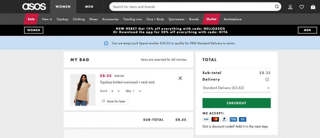
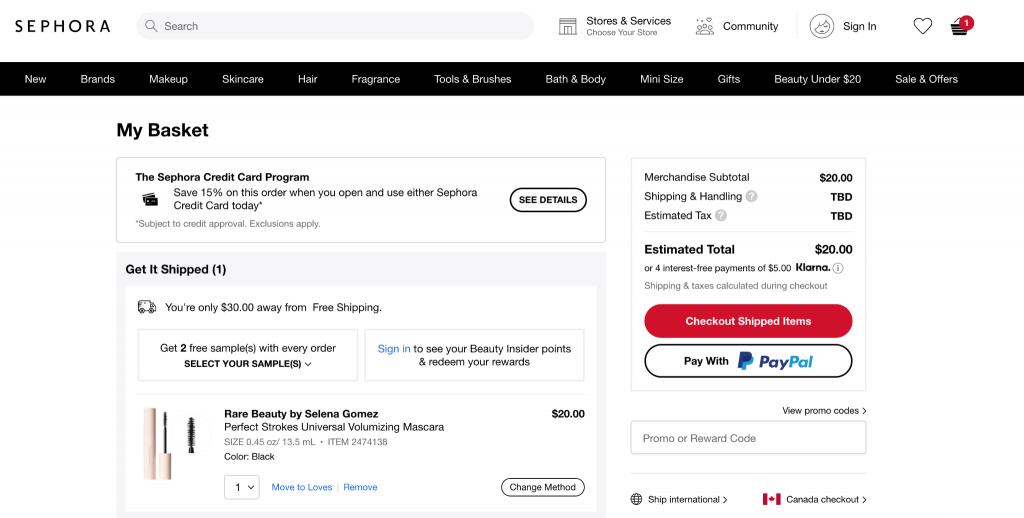
2. Payment methods should be visible before checkout
To avoid the previously described situation of users experiencing frustration at the end of checkout, you should communicate the accepted payment methods before the actual checkout process begins. You can do so by displaying accepted payment methods in the footer and the cart page.
See the examples below:
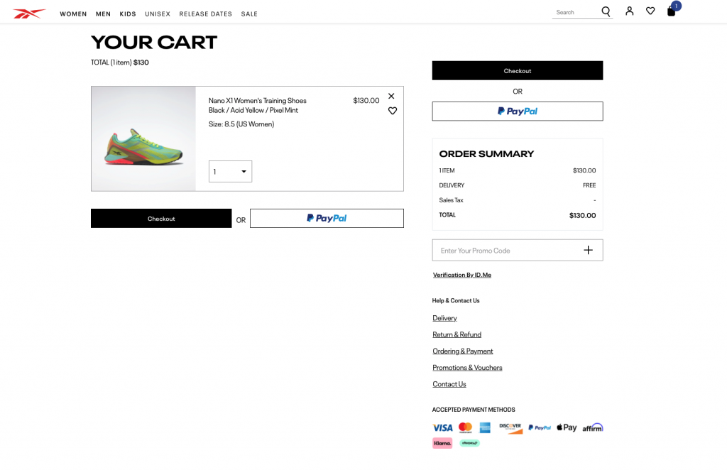
3. Express checkout positioning
To create the best experience, offer express checkout both on the cart page and at the beginning of checkout. This way, users who missed it on the cart page can still choose express checkout before completing the checkout:
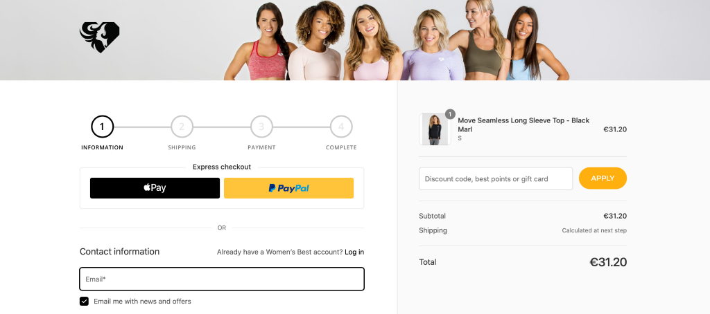
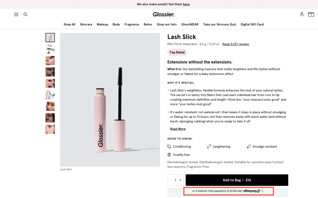
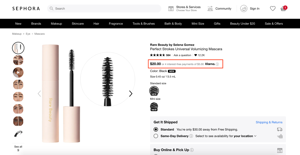
4. Communicate splitting costs services early
This service is particularly important for expensive items, but allowing users to split the cost can work in favour of the purchase even for more affordable items. And it’s important to communicate the offer early on.
The best position for this offer on the website is right next to the full price on product description pages:
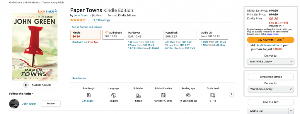
5. One-click checkout
With Amazon starting this trend, more and more eCommerce stores offer the so-called one-click checkout. Users can purchase a product straight from the product details page without going to the cart page or checkout. Just one click and users have made the purchase.
Here’s how Amazon does this:
Need help creating the best shopping experience for your store’s customers? Explore our conversion optimization services and reach out to our CRO strategists via [email protected] or the chat bubble to your right!

Share on: