We conducted two rounds of user testing to improve the performance of specific pages on the website of an international baby products company, and we want to share the results with you.
In this article, we want to show you the importance of user testing and how it can help improve the design and content of your website.
You will learn exactly:
- What questions we asked
- The methods we used
- The results of the improvements we implemented based on the first round of testing
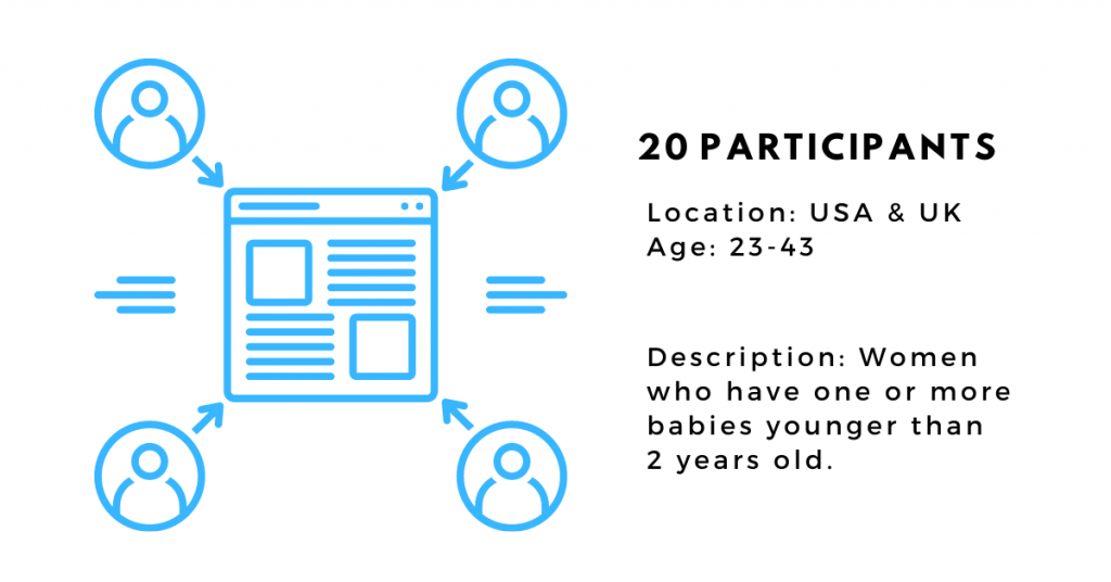
We had 20 participants join the first round of the study: 10 for the Collection page, and another 10 for the Product Description page.
The methods involved were:
- 5-Second Test
- First-Click Test
- User Survey + Heatmaps
5-Second Test: Collection Page
Five-second testing is a research methodology used in usability studies to gauge the impression users get within the first five seconds of seeing a page. Participants are quickly shown an image of a landing page or screen, and then asked a question about what they saw.
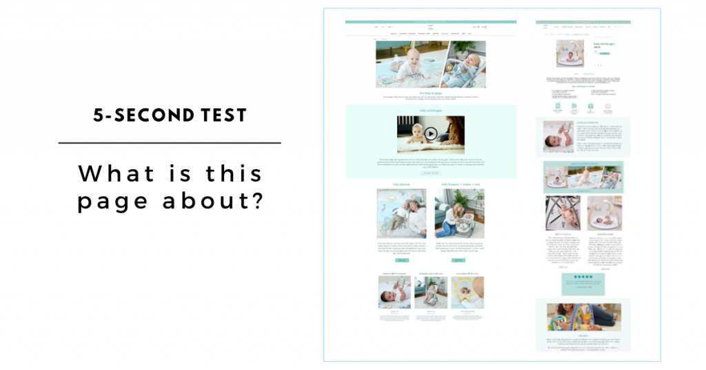
We showed the participants an image of the Collection page and—
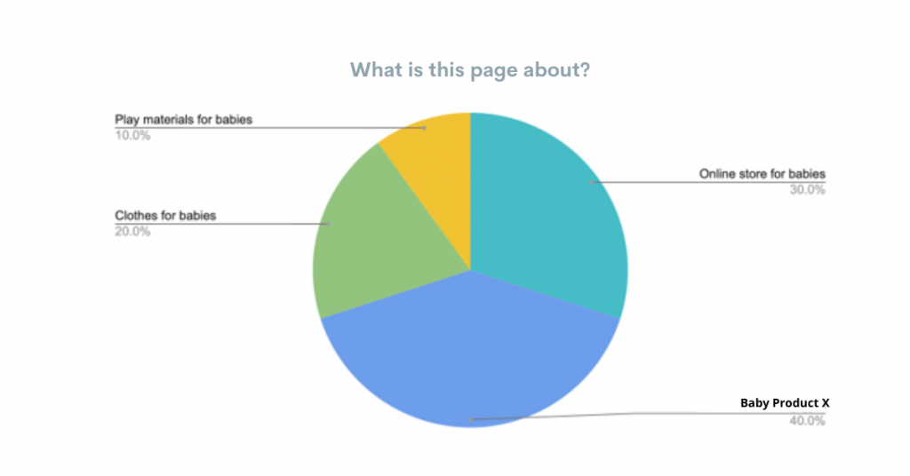
100% of the participants agreed that they would be interested in browsing the page further.
The top reasons being:
- They liked the colors and design of the page.
- The photos of the babies seemed cute and piqued their interest.
However, most of the participants didn’t understand right away what the page was about. Only 4 out of 10 users could specify that the page was about the Baby Collection A, owing to the fact that they mentioned relevant products.
Suggested improvement: Communicate the Collection title in the first fold
Include a prominent headline as well as a short value proposition in the first fold of the page so users can understand the gist of the page faster.
First-Click Test: Collection Page
First-click testing is conducted to identify where on the page users click first to find certain information.
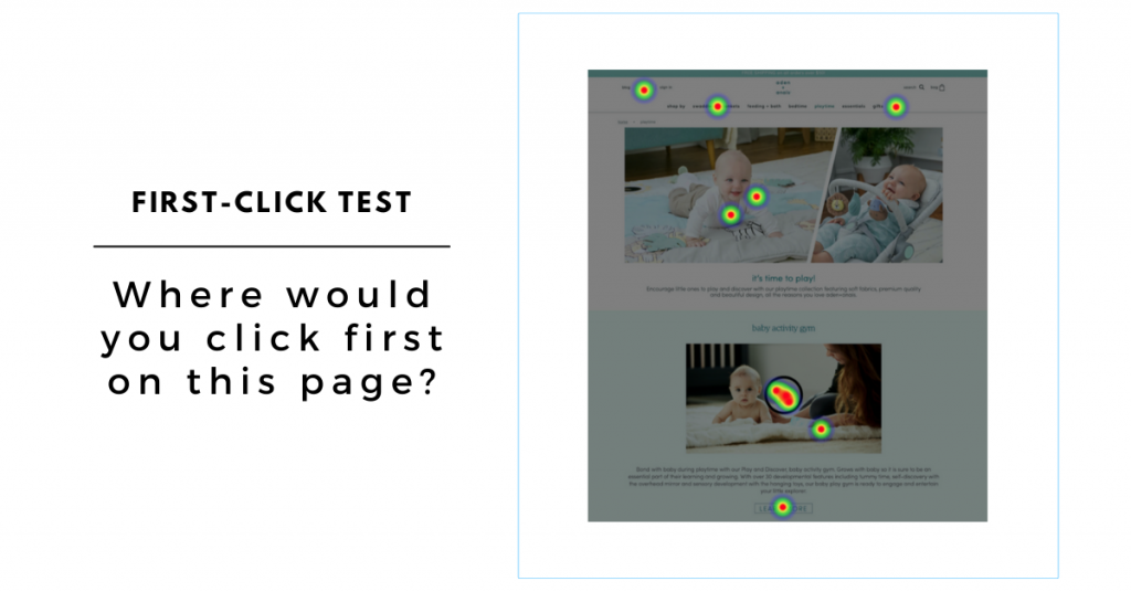
We monitored how the participants navigated the page and this is what we found:
- The majority of the participants (40%) clicked on the video, while 10% clicked on the Learn More button.
- 20% clicked on the header photos and the remaining 30% clicked on menu elements.
- Users who clicked on the video or Learn More button indicated that they wanted to find out more about the product, its features, and a “live demo.”
- Users who clicked on the header photos assumed that they would be shown more products.
- Users who clicked on the menu indicated that they wanted to find out more about the company or other products.
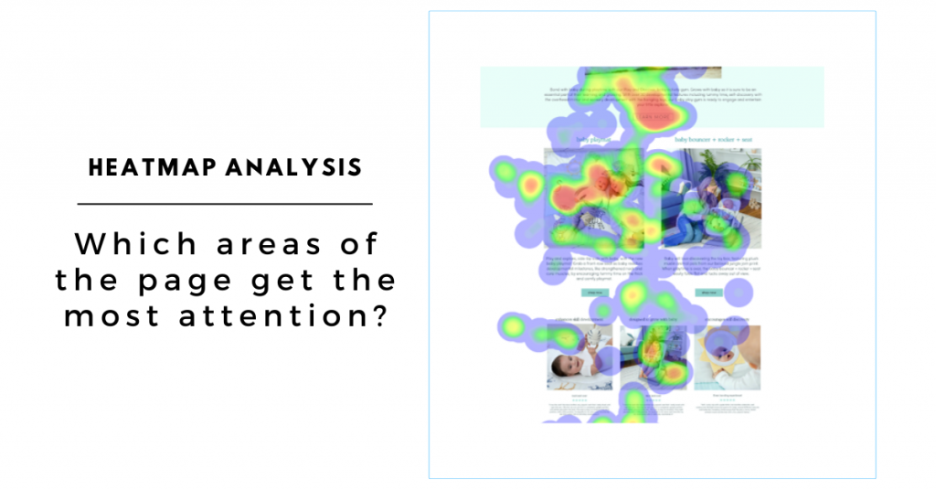
User Survey + Movement Heatmaps: Collection Page
Heatmap analysis is conducted to identify which parts of a page get the most attention by showing how users move their cursor around and explore the page.
We also asked the participants the following questions:
- What is included in Baby Product X?
- What are the benefits of Baby Product X?
- What other products are in Baby Collection A?
- Where would you click to find out more about Baby Product X?
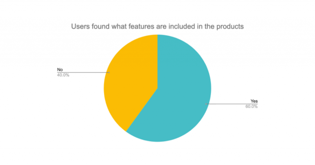
Insight 1: Users are not sure what is included in the Baby Product X
Even though 6 out of 10 users did find what was included in the product (based on the short description at the top), almost all commented that they were not completely sure and it was hard to find the information in the text.
Suggested improvement: Communicate the features in an easy-to-read way
Most users don’t want to spend time reading descriptions so the features of the Baby Product X should be presented in a way that’s easier to read. For example, use bullet points or icons to illustrate what is included in the product.
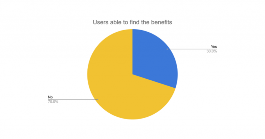
Insight 2: Users do not notice the benefits of Baby Product X at the bottom of the page
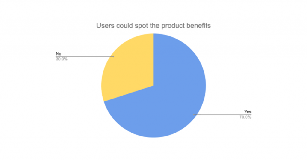
Only 3 out of 10 users could find the benefits of the Baby Product X listed at the bottom of the page. We also saw from the heatmap that users didn’t interact with the page that much further down.
Suggested improvement: Make the benefits more prominent
As users don’t like to scroll that much further down the page, bring the benefits up so that users see that it is related to Baby Product X. The other products in the collection can follow afterwards.
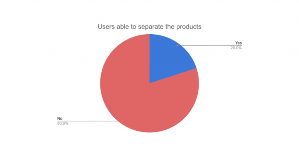
Insight 3: Users were not sure if Baby Products Y and Z were separate items or not
Only 2 out of 10 users understood that Baby Product Y and Baby Product Z were separate products in the same collection.
Suggested improvement: Communicate the collection with a title
After Baby Product X’s description, video, and benefits, separate the rest of the products with a title like “Also part of Baby Collection A” or “Other products in the Baby Collection A,” so that users understand that those are separate products.
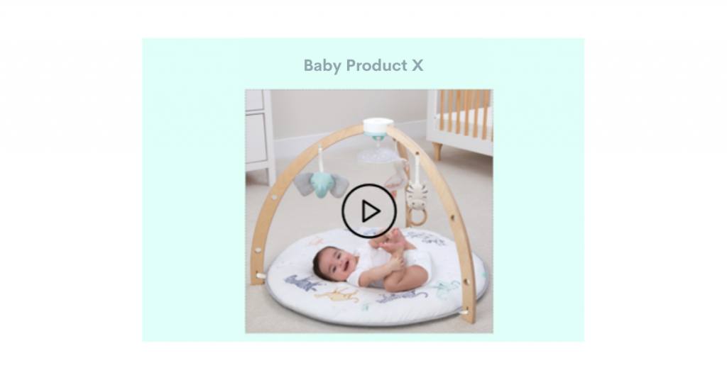
Insight 4: Users wanted to see the actual product
Currently, on the Collection page, Baby Product X’s photo is not shown and the video thumbnail shows a baby on a simple blanket.
Suggested improvement: Show the product on the Collection page as well
To help users understand what is included in the product and how it looks, show the actual product in the video thumbnail. That way, even those users who choose not to watch the video will see the product on the first screen (before clicking Play).
User Survey + Heatmaps: Product Description Page
We asked the participants the following questions:
- What is this page about?
- How do you understand Baby Product X? What is it?
- What is included in the product?
- What are some of the benefits of Baby Product X for babies?
- Which words do you think best describe the product? (list 3-5 adjectives)

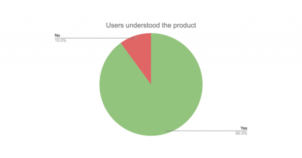
Insight 1: Users understood what the page was about and what was included in the product
9 out of 10 users understood that the page is specifically about Baby Product X and were also able to find the bullet points of what is included in this particular product.
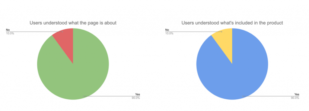
Insight 2: Users didn’t read the product description
Even though 9 out of 10 users could say what Baby Product X was, the majority of users provided the answer based on their own experience or got it from different parts of the page, not from the actual product description. We also saw that on the heatmap.
To further test this, users were also asked to describe Baby Product X using adjectives (which could be found in the product description), and none of the users went to look for the answers there.
Suggested improvement: Emphasize the product description more
To help users notice the product description, consider adding a more prominent title for the description, e.g., “About the Product.”
Insight 3: Benefits were not easy to find
7 out of 10 users were able to cite the benefits of Baby Product X, but fewer than that found the relevant question, “Is Baby Product X good for babies?” in the FAQ.
Suggested improvement: List benefits in the first fold
To emphasize the benefits, create a bullet list or use icons to separate the benefits from the rest of the content. This way, users won’t have to scroll down the page and will easily see why the product is good for their baby.
Summary of recommendations
For the Collection page, that the page is about a collection of products should be made more obvious. This will clear up the confusion about whether or not all the items that can be seen on the page are included in one product. The features and benefits of the featured product should be made prominent, appearing higher up on the page and closer to the product. And the rest of the products in the collection should be clearly labeled.
For the Product Description page, the description itself should be made more prominent. Adding a title, e.g., “About the Product,” should draw attention to this part of the page. The benefits should be easier to read and better emphasized. Presenting them in a bulleted list or with icons and moving them up in the first fold of the page should do the trick.
Additional comments from the participants provided even more insights for this study. For example, users wanted to know the age range for which the baby products were appropriate. They also wanted to be assured of the babies’ safety while using the products. From these comments we could recommend:
- adding on the main product photo a label indicating the target age range of that specific product, and
- emphasizing in the product descriptions that the products are very safe.
The results
After implementing the changes we deemed were necessary to improve the performance of the pages, based on the first round of testing, we conducted another round of tests. This time, we had 10 participants for both the Collection and Product Description pages.
And here are the results you’ve been waiting for—
It was clear to 100% of the participants which products were included in the Collection. And with the updated design, users understood the following better:
- Product inclusions
- Product benefits
- Product features
- Target age: newborns
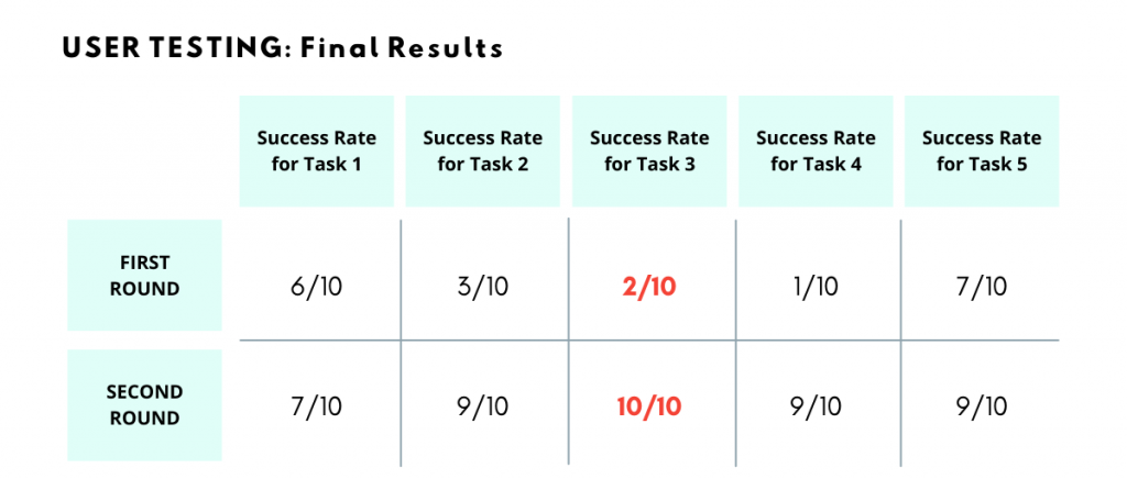
Task 1 – Users could understand Baby Product X features in the Collection page
Task 2 – Users could find benefits of Baby Product X in the Collection page
Task 3 – Users could understand which products are included in Collection A
Task 4 – Users found product details in the Product Description page
Task 5 – Users found product benefits in the Product Description page
And these are the results you can expect to get from running user tests before changing anything on your website. Remember that it is never simply about the design of a page, but always about how we want users to stay engaged when browsing our website and making it easy for them to find the information they want (and we want them to find).
Eager to get the same results? Our expert team of UX and CRO specialists is ready to help. Send us a message today and let us know about your goals so we can start finding a solution right away. Or click on that orange chat bubble to get one of our project managers to answer your questions.

Share on: