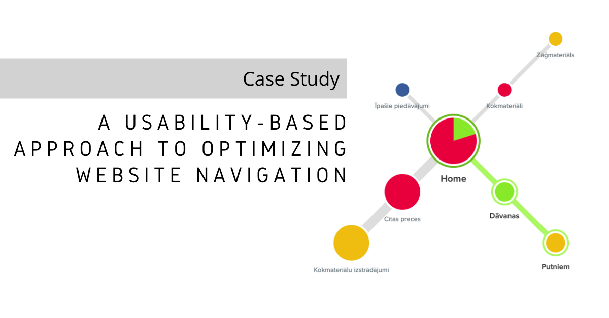
Not long ago, we published an article about navigation menu usability testing. Now, it’s time we looked at how it’s put into practice in navigation menu optimization.
We analyzed the navigation menu performance of a European online timber store in order to ensure an optimal navigation experience for its customers.
To be able to come up with recommendations on how to improve the store’s navigation menu, we tried out 8 hypotheses by conducting tests that show how users navigate the website. We had actual store customers participate in first click testing and tree testing to do this.
Here are the hypotheses we tested, how we proved them, and what implications they had on the existing navigation menu of the store. Learn the art and science of navigation menu optimization as we walk you through the steps and turns we took to give the best recommendations for this real-world client.
Hypothesis 1
First-level categories on the left-hand side menu are more convenient for website visitors.
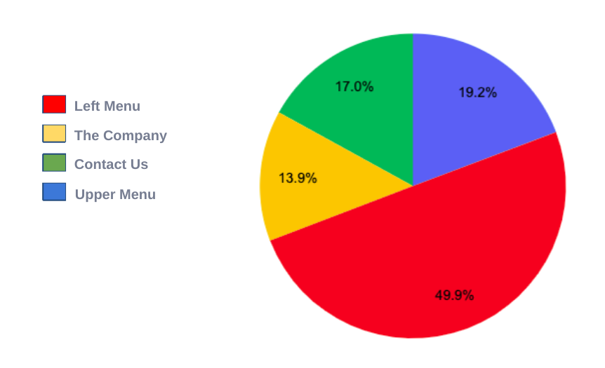
We analyzed the performance, based on page views, of the top 4 menu items/positions from the previous year and this is what we found:
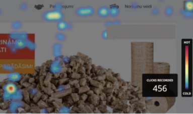
We also conducted heatmaps analysis in Hotjar to identify which part of the homepage gets the most number of clicks. The result?
Where users were asked to find products on the website, the left-hand side menu was used 7 out of 9 times.
So, what should we do with the upper menu?
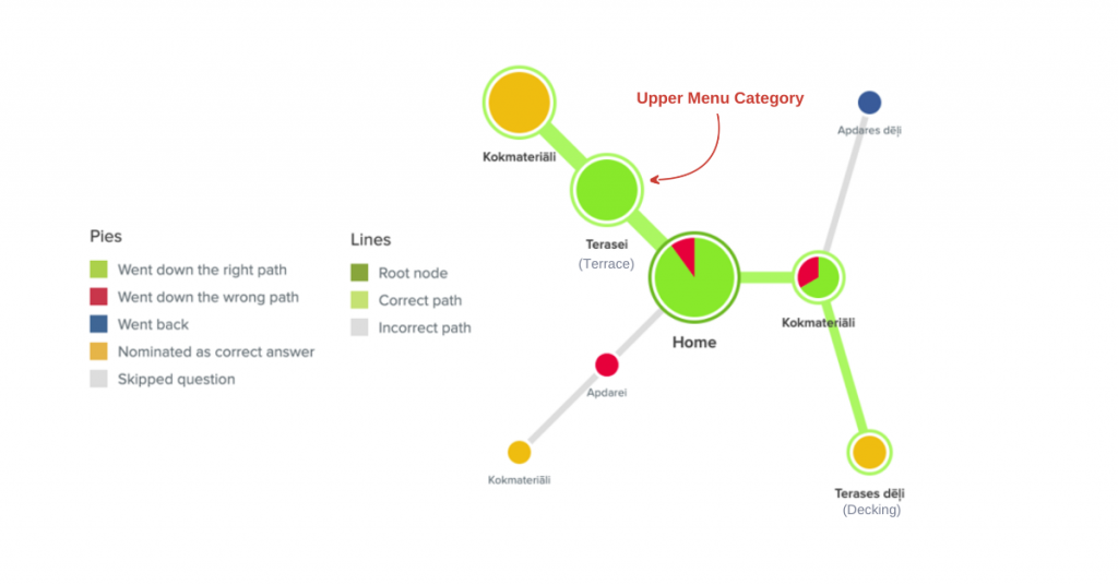
We asked users to look for decking and floor boards, and here’s how they found them:
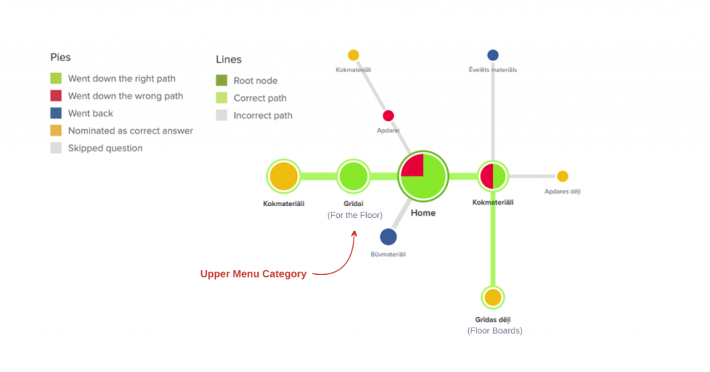
Only users who buy timber products from the store for personal use said they liked the upper menu items “Floor” and “Bathhouse”, and other similar ones, better than the left-hand menu categories. This suggests that such types of categories are useful for customers who are not very familiar with the products on the site.
From this we concluded that it’s better to add these categories to a filter. This way, they will be available to customers who might need them without displaying them for general customers who are more familiar with the products.

In order to showcase the upper menu categories, landing pages should be created for each. This could also attract more organic traffic if enough content is added. These pages should be linked to from the homepage.
Where should the main menu be located, then?
The top menu is still easier to navigate, and without the risk of accidentally closing the categories being viewed. Keeping the main menu on top frees up space on the homepage as well as the product listing page so there is room on the left-hand side for the filter.
Hypothesis 2
Information under “Delivery,” “Services,” and “Payment Methods” should be moved from the homepage to some other more appropriate location.
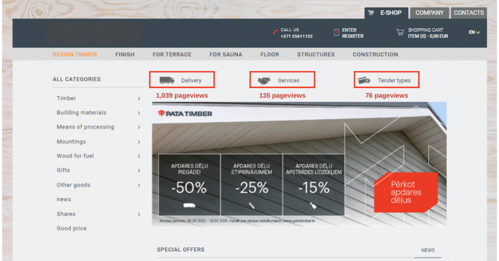
The number of pageviews for these icons indicate that customers are interested in the information related to them. But information about deliveries and types of payments is more relevant to customers who already have the intention of buying. Therefore, when customers are looking at a specific product, this information should be available there. It should also appear in the shopping cart summary—we’ve found that 3% of customers leave their shopping cart to view delivery terms.
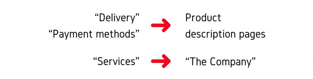
“Delivery” and “Payment methods” should be moved to product description pages. “Services” is also already displayed under “The Company,” which is where it should be.
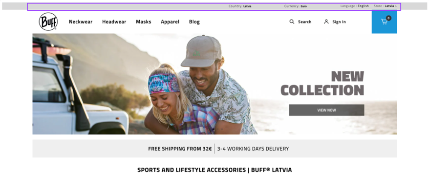
As delivery information is important to customers, it can also be added to the homepage in the form of a small banner, as in this example below:
Hypothesis 3
The search button should be transformed into a big search box at the top of the page.
We analyzed the activities and conversions on the store and found that in the last 6 months, 34% of all transactions were completed on mobile devices.
Two major things that stand out on mobile:
- The search box is at the top and very prominent.
- There is only one category list.
For test participants who used a mobile device to look for a product, the first instinct was to use the search box. Participants using a desktop struggled to locate the product via the navigation menu.

It is important to emphasize the search function because when customers come to the website with a clear idea of what they would like to purchase, it’s faster and more convenient for them to navigate to the product using the search box. It sends them directly to the product they’re looking for if there is an exact match or, at least, similar products. However, the search box is barely noticeable on the desktop version of most sites. The results of this test illustrate that it is easier for some users to use the search function so it makes sense to make the search box more prominent on the desktop version as well.
Hypothesis 4
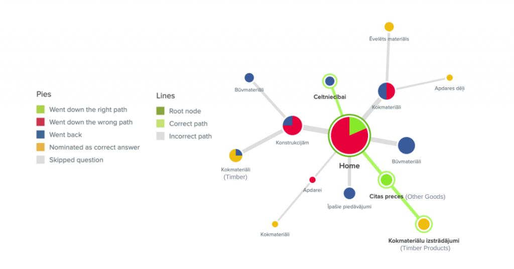
The product Stakes should be moved from “Building Materials” to another category.
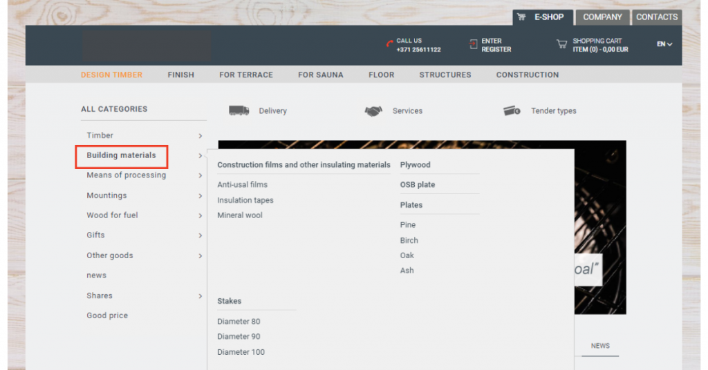
Deep within the “Building Materials” category on the homepage side menu, Stakes can be found.
We asked participants to look for stakes and this is what happened:
- Only 2 users found it under “Building Materials.”
- Users clicked on “Timber” 14 times in their attempt to find it.
It’s worthy to note that several users rightly mentioned that timber is also a building material.
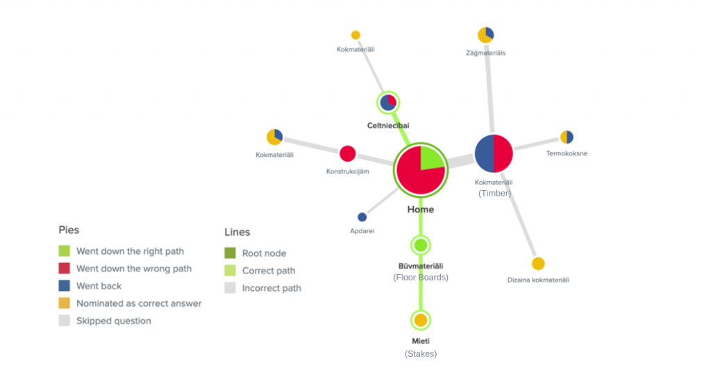
The tree testing results indicate that “Building Materials” is not the best category to put Stakes under.

For improved website navigation, the category “Timber” should have a new second-level category called “Timber Products” where customers can find stakes and other similar products.
Hypothesis 5
The categories “Special Offers,” “Promotions,” and “Good Price” should be combined as one category.
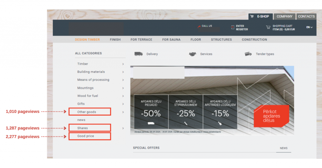
When participants were asked where they would look for items on sale, here’s what we observed:
- The categories “Promotions” and “Special Offers” were clicked an equal amount of times.
- The category “Good Price” was not clicked at all.
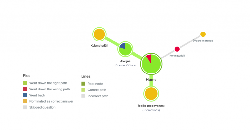
It makes sense to expect that people would click on a category that’s labeled “good price” because it suggests more attractive pricing for the items found there. Then again, it somehow implies that all the other products have “bad” pricing.
How should the categories be combined, then?

All the items under “Promotions” and “Good Price” should be moved under “Special Offers.” If there are different types of offers (price drop, buy 2 for 1, etc.), subcategories shall be added appropriately. This will greatly improve website navigation related to special offers.
Applicable conditions as well as brief descriptions of the offers should be added and made easily accessible to the customers. Adding product badges to emphasize products with good prices (discounted, price drop, etc.) is also a good idea.
Hypothesis 6
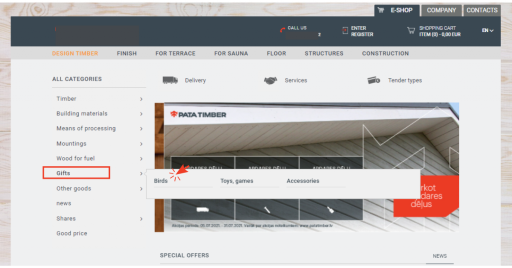
The Category “Gifts” should be called “Other Goods.”
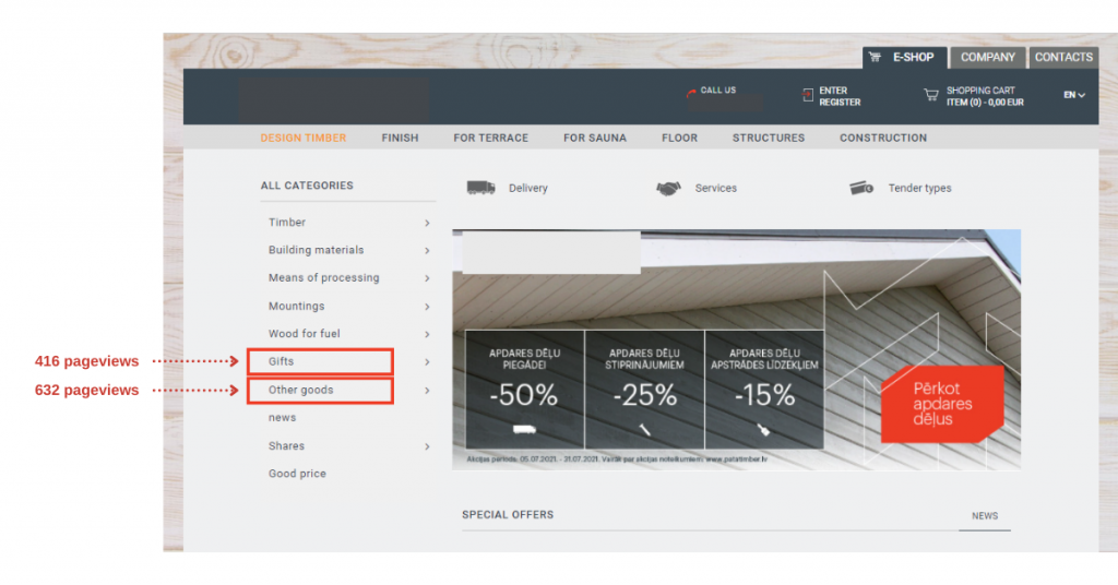
We asked participants to look for bird cage and this is how it went:
- “Other Goods” was clicked 7 times.
- Only 2 participants found the product under “Gifts.”
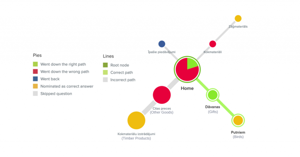
And tellingly, the users who found the product under “Gifts” mentioned that it was confusing that it should be under that category.
Hypothesis 7
The product Wooden Fence Shield and subcategory “Working Tools” should be moved to different categories.
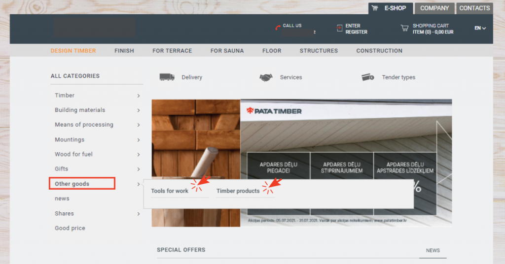
When we asked the participants to search for wooden fence shield, this is what we got:
- Only 3 users found the product.
- Participants went down 5 paths that were all related to the category “Timber.”
When we asked then to look for solvent brush, here’s how it turned out:
- Only 2 users found the product.
- 8 other participants chose paths related to the category “Treatment Agents.”
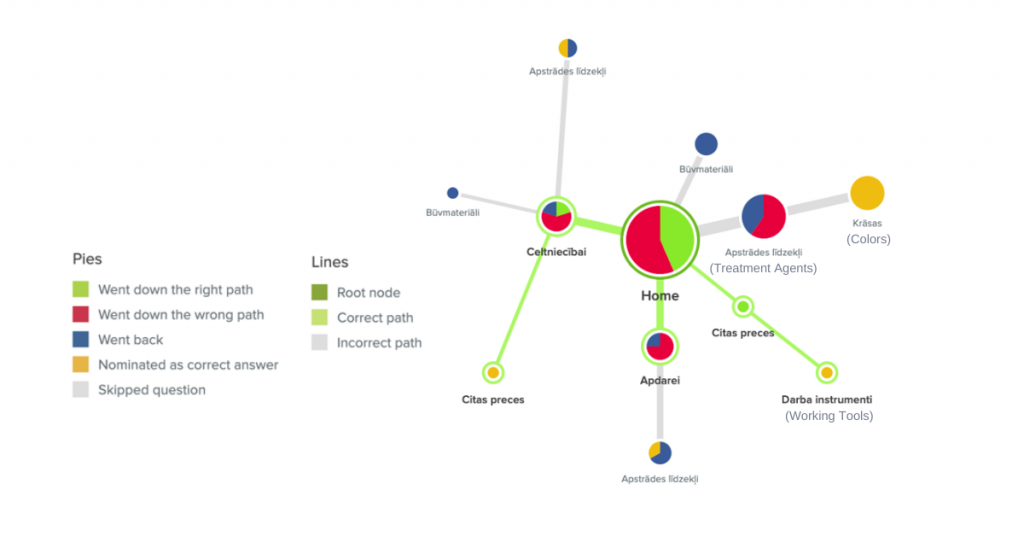
Both of the products we asked the participants to find were under the category “Other Goods,” and it was obvious that the category didn’t help because the majority of the users didn’t look there. By moving these items onto other categories, we’ll successfully eliminate one category and have the products discoverable under categories that are top-of-mind for the customers.
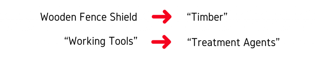
The wooden fence shield should be moved under the category “Timber” while the solvent brush, under “Treatment Agents.”
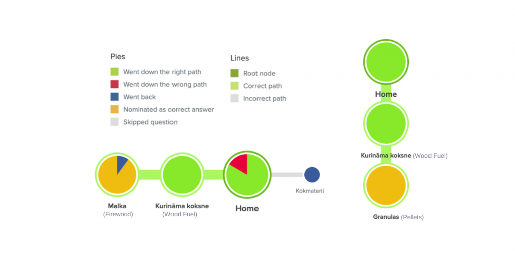
Hypothesis 8
Category “Wood Fuel” is understandable to website visitors.
We asked participants to find two products: wood pellets and firewood for heating. And the results were no surprise! All of them were able to find the items under “Wood Fuel.”
Final Recommendations
After testing the above hypotheses, we then came up with a set of recommendations for the new website layout and what to do with the categories in the navigation menu. Here’s a summary of what an optimized version of the website would look like:
- The left navigation is reduced from 11 categories to 8, and moved to the top of the page.
- Categories from the original upper menu are modified thus:
- Implemented as filter options to facilitate product search
- Displayed as category pages at the bottom of the page
- A search bar is prominently placed at the top of the page.
- A value proposition with a clear CTA is displayed on the hero banner.
- Unique selling points are displayed below the banner.
Overall, the website should look cleaner and become easier to navigate.
Want to get rid of navigation hurdles that hinder your visitors from converting into customers? Get in touch with our Optimization Team and we can start working on finding a solution in no time! Or click on that orange chat bubble to get one of our project managers to answer your questions.

Share on: