About
Byggmax is the leading supplier of building materials in the Nordics. They have over 190 brick-and-mortar stores, 4 Magento (Adobe Commerce) stores, and 55k+ products in their catalog. scandiweb has been a long-term partner to Byggmax, managing and improving their site and providing proactive 24/7 support. Recently, the scandiweb CRO & UX team has been researching, preparing, launching, and analyzing a multitude of A/B testing experiments for Byggmax to improve their user journey. Here are a few examples!
Examples of completed A/B tests
Test 1: Hero banner CTA color A/B test
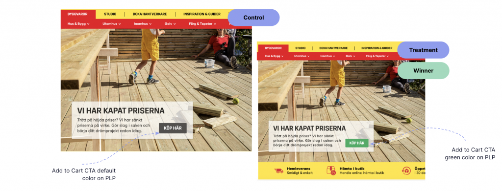
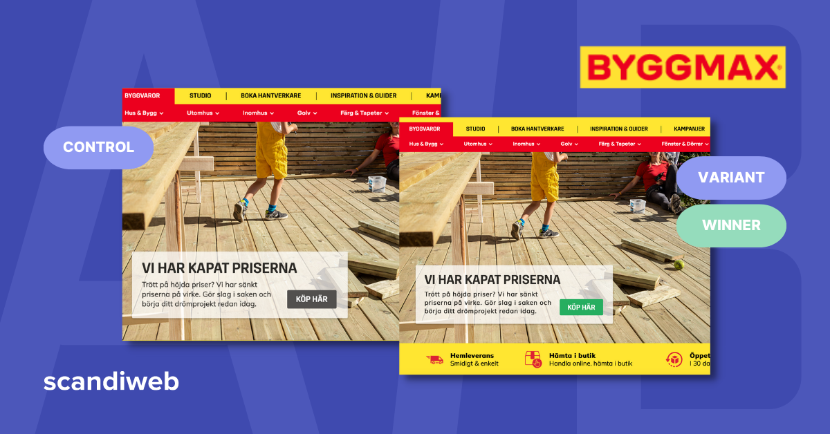
We started with a slight change on the Byggmax homepage hero banner by comparing the current grey CTA on the hero banner (control) vs. a green color CTA (variant).


For this test, we measured the following KPIs:
- Hero banner click-through rate (primary)
- PLP view rate (secondary)
- eCommerce conversion rate (secondary)
Analysis of primary and secondary KPIs was done for:
- All users to cover the overall results
- Mobile and desktop devices to see the main differences in performance

Winner: variant
The variant showed an increase in PLP view rate by 0.7% and a significant uptick with more than a 15% increase in revenue and an 11% increase in purchases. The chance to beat control with the variant in terms of this KPI equals 73%, meaning there are chances for PLP views to increase after implementing this feature. Purchases per user increased by more than 10%, and is considered a positive impact of the variant.
The experiment results suggest a green CTA on the hero banner can significantly increase user engagement and draw greater attention to the button. This will likely result in more PDP and PLP views and increase the likelihood of a completed transaction.
Test 2: Cart icon A/B test
Next, we tested a white cart icon (control) vs. a green cart icon (variant).


For this test, we measured the following KPIs:
- Rate of sessions with checkout (primary)
- eCommerce conversion rate per user (secondary)
- Clicks on the cart with products added
We added Device Segment analysis for both primary and secondary KPIs.

Winner: variant
The variant showed a significant increase in cart icon clicks by more than 18%. The chance to beat control for the green counter in terms of this KPI was equal to 92%, which signifies a high probability of clicks on the cart icon increasing after implementing this feature.
The test results suggest that the green counter design effectively drew user attention to the cart on desktop. However, the decision to proceed further down the funnel could have been influenced by factors such as the mini-cart popup design or overall readiness to buy. This suggests potential benefits in experimenting with optimizing further steps of the funnel.
Test 3: CTA color (PLPs) A/B test
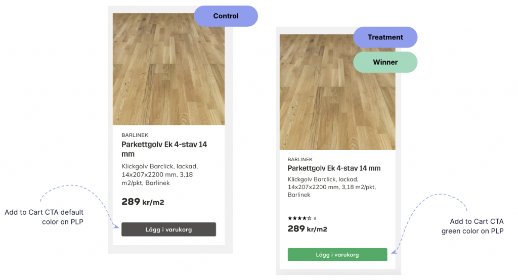
Next, we compared the current grey add-to-cart CTAs on PLPs (control) vs. green color CTAs on PLPs (variant).


For this test, we measured the following KPIs:
- PDP view rate (primary)
- Add-to-cart rate from PLP (secondary)
- eCommerce conversion rate (secondary)
Analysis of primary and secondary KPIs was done for:
- All users to cover the overall results
- Mobile and desktop devices to see the main differences in performance

Winner: variant
The variant showed an increase in add-to-cart from PLPs by 5% and a higher than 3% improvement in average order value (AOV), with the effect for mobile devices being more pronounced.
Based on the experiment outcomes, implementing the green CTA on PLPs has excellent potential to affect user interest in attracting more attention to the button, leading to more product additions to the cart from PLPs.
In the upcoming months, the scandiweb CRO & UX strategists plan to continue testing different areas of the Byggmax website, with multiple tests already in the pipeline for pages along the funnel.
Are you looking to increase your website’s conversions through A/B testing? Let us help you! Browse around for more information about our conversion optimization services, and feel free to get in touch with us directly at [email protected]!


Share on: