
After extensive CRO research, we revamped the navigation menu on BUFF® eCommerce stores and got very positive results. We want to share the changes we made here and what the UX research that led to the optimized navigation looked like.
Initial Observations
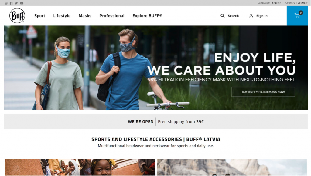
We found that most users proceeded to view the categories after landing on the homepage. However, the homepage focused on highlighting selected products and news items instead of serving navigational purposes. The homepage did not show top categories or products. Hence, a new user might find it difficult to understand what products were offered on the website.
The homepage is the most visited landing page, so it is the best place to showcase the store’s assortment of products. More category and best-seller blocks would serve this function.
To find out which products interested site visitors the most, we analyzed the top 5,000 search queries made on BUFF eCommerce stores. And unfortunately, 3 of the top 5 search terms were neither present on the homepage nor in the navigation menu. And although the other two were present on the homepage, they were not included in the menu.
Our Approach
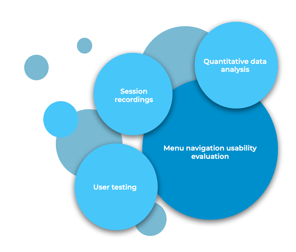
Quantitative Data Analysis
We analyzed Product Lists data from two BUFF stores to find the most frequently viewed and bought items. Then we also discovered that users preferred looking for products based on product type over activity type. For example, users searched more for neckwear, hats, and caps than for skiing, cycling, etc.
User Testing
We gave 8 participants tasks that involved looking for a specific product on the website without using the search bar—they could only use the navigation menu and categories available on the page.
The participants were aged 20 – 32 and with varying shopping habits and inclinations to do sports. There were 9 rounds of testing.
Some participants encountered issues while trying to accomplish the tasks, such as not finding the collection, not noticing the filters, and incorrectly identifying the relevant first-level category. But in general, the participants were all able to understand the menu and find the products they were tasked to navigate to.
Then again, when asked about what they thought the difference was between the “lifestyle” and “sport” categories—activity-based categories on the top menu—everyone had different answers. This lack of consensus indicated that they navigated through the menu purely based on their intuition and personal perception.
Session Recordings
Session recordings are an important part of optimization research because they help us understand how visitors behave on your website, discover issues users encounter while trying to find specific products, and get actionable insights based on what we find.
Of all of the session recordings we analyzed for BUFF, 5 showed that users had difficulty with menu navigation. Here are brief descriptions of 3 of the issues we observed:
- One user navigated to the collection page through the category landing page because the said collection wasn’t available in the menu.
- After clicking on the first-level menu category “Sport,” one user couldn’t understand why the product-based categories suddenly disappeared.
- It confused a user when they clicked on a menu item, and it didn’t load (because of a loading speed issue).
Such issues that visitors experienced while navigating the store would otherwise be quite difficult to discover if not for the session recordings. But now that they were brought to the surface, they could be addressed.
Menu Navigation Usability Evaluation
Here are some of the main issues we identified and improvements we proposed alongside them:
- Since the difference between “Sport” and “Lifestyle” was perceived differently by the users, additional user tests would be in order.
- Slow page loading speed confused the users about how the navigation menu works, resulting in additional clicks. Site speed should be optimized.
- Restructure the menu and add categories that users are frequently searching for so that it is easier to use and fulfills its purpose of helping the users navigate through the website.
New and Optimized Navigation Menu
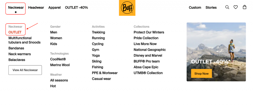
Acting on all the insights we gathered from the data analysis, user testing, and session recordings, we updated the navigation menu of BUFF eCommerce stores to have 4 product-based main categories in place of the old mix of activity- and collection-based ones.
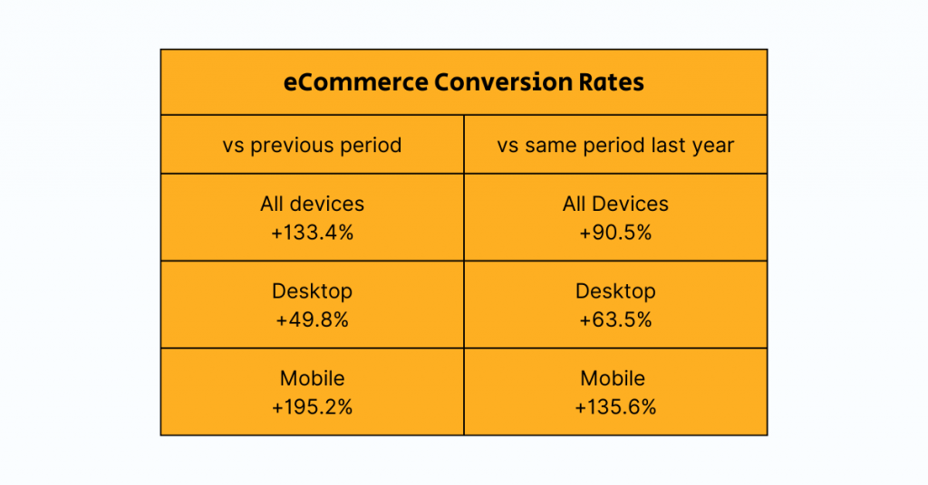
Comparing the first month of data after optimization with the previous period, we saw significant growth in eCommerce conversion rates for both desktop and mobile, +49.8% and +195.2%, respectively. The bounce rate also decreased by 10%, which could indicate that the new menu was more convenient for users.
Comparing the new data with that of the same period last year, we could likewise see that other KPIs have significantly increased:
- +69.9% in the number of visitors
- +176.1% in revenue
We also looked at Site Search activities to see how the search behavior of site visitors has changed. Searches still occurred mostly on the homepage (for different store views), but also more users were searching from specific product pages—indicating that the new menu is easier to navigate and they didn’t need to search from the homepage as much as before.
For example, for the most popular search term “X,” the total number of unique searches decreased by 73.5% after menu optimization, while transactions even increased. This further suggested that with the new menu, it was much easier for users to find the products they were looking for.
On the navigation menu, looking at user interaction split by first-level navigation, we saw that Neckwear got the majority of clicks, almost 40%, followed closely by Headwear, 37.6%.
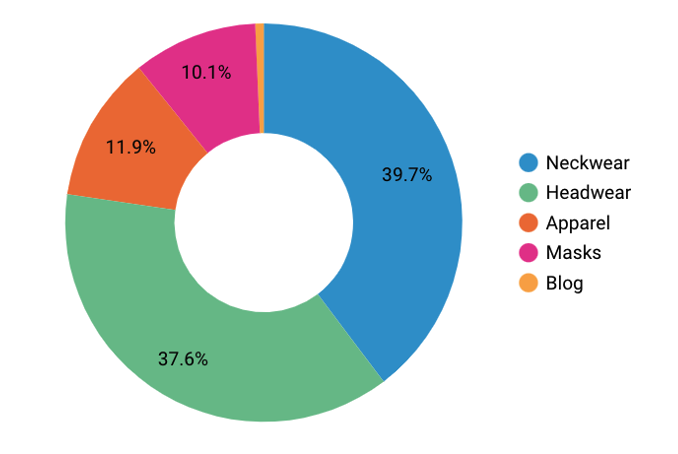
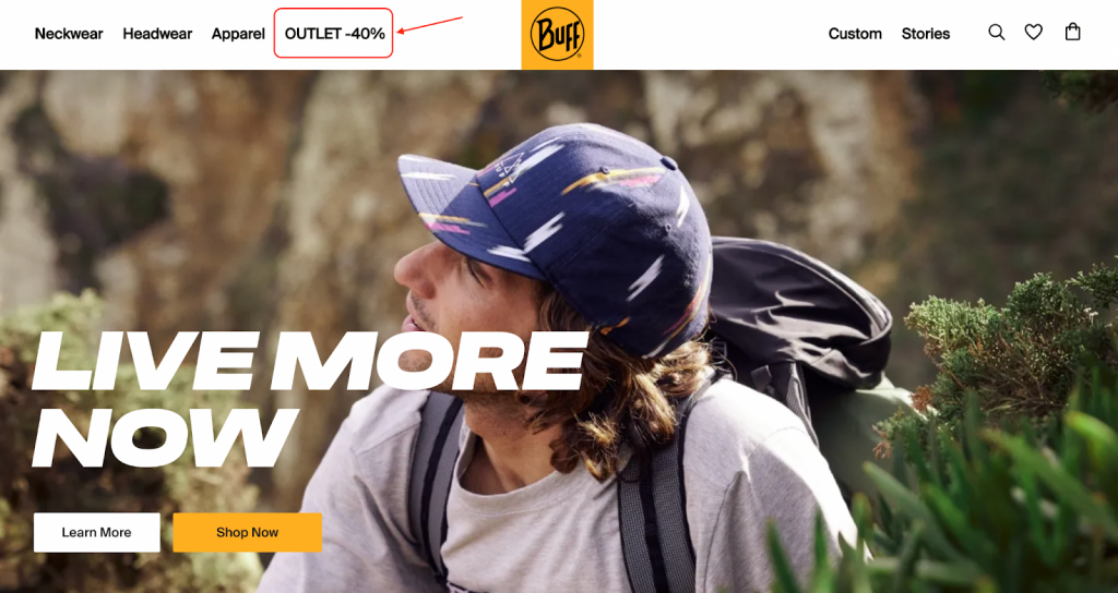
For both Neckwear and Headwear, we saw that Outlet was the leading second-level category. So we made further improvements to the menu—Outlet is now emphasized on both the first- and second-level navigation.
We restructured the menu to add categories that users frequently searched for based on the data we gathered. And the positive results we’ve seen—measurable improvements in KPIs—suggest that we are on the right track to making it easier for visitors to navigate through the products in the store.
Read more about navigation menu optimization—Case Study: Usability-Based Navigation Menu Optimization
Want to see the same positive results in your conversion rates? Let’s talk about navigation menu optimization and other conversion rate optimization strategies we can implement in your eCommerce store. Book a free consultation with our Growth Team today.

Share on: