Ebates is one of the largest savings programs in the USA founded back in 1998. Dosh, on the contrary, is a newcomer to the cash-back industry (launched in 2017). Ebates has a website, browser extensions and mobile app available. Dosh is available only in the form of a mobile app but managed to very quickly become beloved savings service for many users.
We decided to analyze which offers the best user experience when it comes to mobile application.
Overview of Dosh and Ebates apps
Before we dig into details lets have a quick overview of what functionality is offered by both applications.
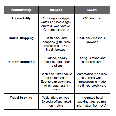 Comparision of functionality of Dosh and Ebates
The biggest bonus of Dosh in terms of functionality is an automatic Cash Back for offline shopping. Once you link your bank card you can shop as usual, Cash Back is assigned to you automatically. There is also a wide offering of dining places within Dosh.
Ebates, on the contrary, has incorporated a wider functionality in terms of online shopping — not only Cash Back but also coupons. In-store shopping has more frictions than Dosh as you need to validate the offer each time you want to receive Cash Back.
However, within this analysis, we will focus only on the evaluation of the online shopping experience.
User sign up
Overall sign up experience in both applications was pretty much flawless. It’s important that both apps let you skip creating an account and see actual Cash Back offers available. So you can evaluate what you will gain in return for sharing your data with another one online service.
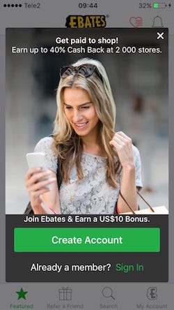 Pop-up. Create account (Ebates)
Despite the nice and trendy design, we had an issue with the Dosh sign up process, simply because there is no sign-up link or button on the first screen. That’s pretty confusing for users who want to sign up for the service.
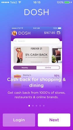 Welcome screen. Where is the sign-up button? (Dosh)
Results: Due to lack of sign up option in Dosh, it’s a thumbs up for Ebates
Offers from Dosh and Ebates
Now when we have an account we can see how offers work in both apps
Ebates offers
It’s possible to click on deals from the slider on top of the screen. Also, there is an offer list of Hot deals and 2x Cash Back (doubled amount of Cash Back) with around 70 deals.
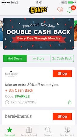 Hot deals (Ebates)
It is also possible to add beloved stores to Favourites and access them later. We don’t know how many users actually use this functionality but it seems pretty convenient as Ebates claims to have more than 2000 merchants in the system.
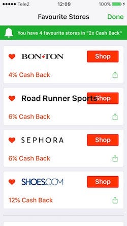 Favourite stores screen with a bit annoying design bug (Ebates)
For users who already know which store they are interested in, there is Search available. In iOS version of the app users can search amongst stores.
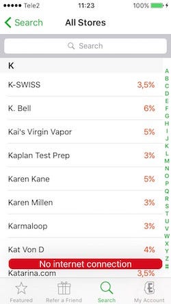 Search (Ebates iOS version)
Android version has a way more enhanced search functionality. It’s possible to search for specific products, e.g., “dress”, “dog” etc., and there are coupons and Cash Back available for specific products.
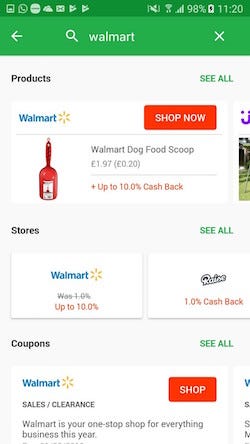 Search results when searching for Walmart (Ebates Android version)
Dosh offers
There are no any categories of offers developed so the user can either simply scroll and click on interesting offers or type a brand name in the search. There are promo banners on the top of the screen however they are not clickable. Users see the highlighted offers and that can only scroll down the screen to find the actual merchant.
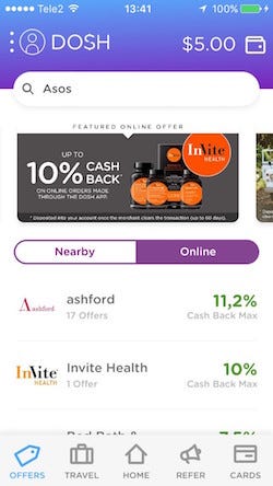 Online offers (Dosh)
Ebates is good for both those who already are looking for a specific store and those who would like to choose shop based best deals. Dosh seems to be more convenient for those who already know specifically which store is interesting for them. So there is no clear winner. But Dosh has one serious UX issue — not clickable banners definitely is not the best solution.
Results: Once again Ebates shows more attention to the details.
Online Shopping Experience
Both services provide online shopping experience via built-in browsers. It means that when the user finds an appealing Cash Back offer and clicks Shop he/she continues the shopping experience without leaving the specific app.
Shop button which leads to websites of stores (Ebates)
Before the user is navigated to a third party website there is displayed loading screen which indicates the amount of Cash Back user will receive.
 Built-in browser loading screen (Ebates)
 Built-in browser loading screen (Dosh)
There are a lot of complaints from users who haven’t received promised Cash Back from one or another service. And it’s probably one of the biggest fears users of Cash Back apps have — to pay full price and never receive money they felt like already owning.
Such loading screens Dosh and Ebates have is a great way to address worries of customers and one more time assure that, hey, your Cash Back is activated, feel free to shop. Obviously, it’s crucial to actually deliver the promise afterward, but it’s another topic.
Built-in browsers. Unfortunately, both Dosh and Ebates built-in browsers are not fully user-friendly yet — they are considerably slower (sometimes even annoyingly slow) comparing to default browsers.
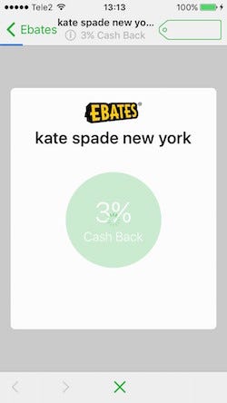
 kate spade website via built-in browser (Ebates)
Within Ebates built-in browser it’s possible to reload the page, return to Ebates or check all deals available on the website by clicking on “10 deals”.
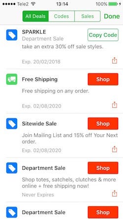 Screen 10 deals available
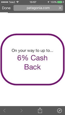
Comparing to Ebates Dosh built-in browser experience is poorer. For example. Ebates app always indicates the amount of Cash Back in the inbuilt browser during all time users navigates the store. In the case of Dosh users don’t have visual confirmation that their purchase actually will be recorded.
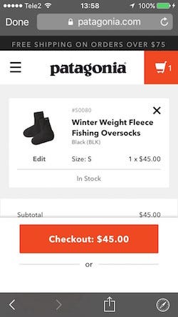 Patagonia website. Checkout via built-in browser (Dosh)
After the product is purchased user can continue to navigate within the page or press “ Done” and return to Dosh app. If the purchase is successful in up to 60 days the user will receive the Cash Back earned.
Results: Both apps have issues with built-in browsers. Definitely, there is room for improvement. So there is no obvious winner.
Summary
Although Ebates mobile app may be a bit less trendy in terms of design it has several advantages compared with Dosh.
When it comes to finances, cash-back, savings, etc. money-related services there should be a lot of effort put into building the trust and making the user feel secure and confident about the service. Although Dosh has mainly minor UX issues altogether they might influence the overall feeling of the service in a negative way.
Check out conversion rate optimization possibilities for mobile apps here!


Share on: