
Every January we analyze how our decisions have affected our current position, revise what’s been done in the previous year and set goals to achieve in the next one. A similar process takes place in eCommerce businesses. Before defining objectives for the next year, the first step is to evaluate the performance of the store in the previous one.
Annual reporting might be a time consuming and complex process for many. However, with a proper Google Analytics set-up and connecting it with Google Data Studio it takes just a few clicks to create an insightful report. Follow the case study shared in the next paragraphs and create your annual report.
Case Study: Annual report in Google Data Studio by using data from GA
Step 1: Clarify the purpose of the report and the reader
In 2019 Scandiweb Growth team started work with a client—one of the biggest kitchenware suppliers in Sweden. That year we performed a lot of A/B tests that resulted in different changes within the website. At the beginning of 2020, we wanted to showcase the client how the eCommerce store performance has changed since our cooperation.
Who will read the report: a client that wants to see if and how the agency has changed the KPIs of his business. Also, a client that doesn’t have much time to spend on analyzing the report.
Since we know who will read the report, it’s clear how detailed information needs to be. As the client won’t investigate any data point in-depth, the conclusions about the performance will be built by numbers that don’t take a lot of effort to perceive. E.g., if a dashboard will have a scorecard with an overall eCommerce conversion rate and a table with conversion rate and other metrics by device type, the client will remember the scorecard.
What is the purpose of the report: to clarify how KPIs of the store have changed since the start of cooperation. It means that we should not show a detailed analysis of all the tasks done. Instead, the data should describe the overall changes or trends in user behavior in a specific period.
Step 2: Build the report and create dashboards
By the complexity of the report, it is clear that visualizations should answer the following questions:
- How did the overall KPIs change, compared to 2018?
- Are there any changes in the performance of traffic acquisition channels?
- Have the changes affected the KPIs of returning and new visitors?
- Does the mobile version perform better than a year ago? How about desktop and tablet users?
- Has the product CTR improved? How has it affected the average order quantity?
- Which were the most bought items in 2019? Are they the same as in 2018?
- Which categories have attracted the biggest user attention?
These are broad questions that require more than 1 describing chart. Because of that, we decided to build a separate dashboard for each topic. Therefore the report consists of 7 dashboards.
We used 5 types of visualizations in the report: scorecards, timeline charts, bar charts, pie charts, and tables. As the main goal was to create a report that can show the main insights with a glance, we put a lot of effort into building a strong visual hierarchy. E.g., the scorecards should be the first noticed element while the tables—the last one. In case someone is interested in analyzing the trends by segments, filters are added in the header.
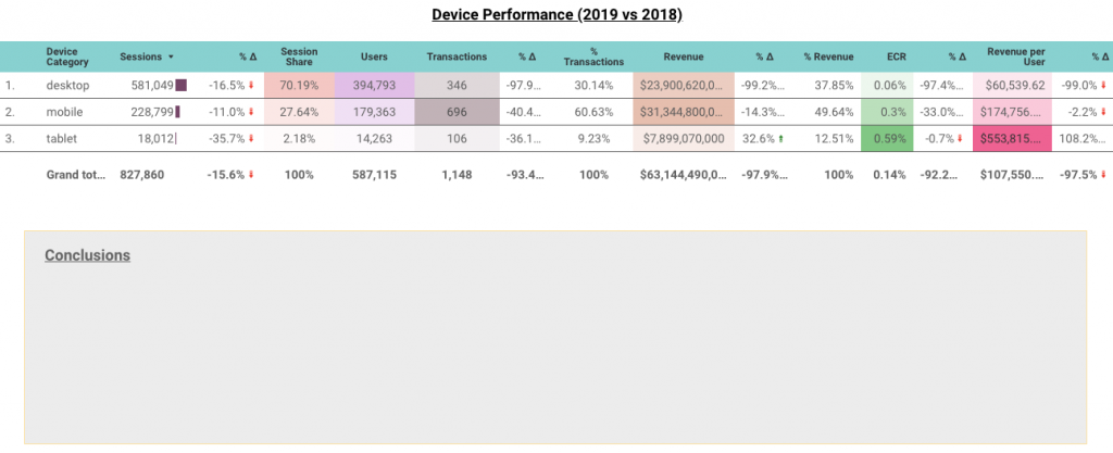
After the visual part of the report is completed, we add a summary of the main conclusions below charts. The report itself and the conclusions are short and describe overall trends, for example, the TOP 3 traffic channels, sorted by sessions. That’s it—the report is ready.
Annual report in a few clicks? Use our template!
We mentioned that you can make such a report in a few clicks. That won’t be the case with the first report. However, with every next report, you’ll need to only change the data source and formatting (optional).

For you to not spend so much time on creating the first report, we have prepared A TEMPLATE to use. Right now the report is based on Google Analytics Sample data. To insert your data, make a copy and apply the needed source.
Need additional help with creating Google Data Studio reports? Shoot us a message at [email protected] or find out more about our data analytics services here!

Share on: