If you’ve had any experience in conversion rate optimization, you’ll know just how important the navigation menu is when it comes to the conversion funnel. But how do you evaluate its performance?
Instead of wild guesses and “guesstimates”, let us show you some practical steps in tweaking your eCommerce site’s navigation to perfection. To back our claims, we’ll look at a case study of our experience with a high-fashion clothing seller for women.
First, let’s set some ground rules. These are:
- Web users look for familiarity in navigation. Thus, you should not deviate from the market standard too much
- You should limit the number of menu items for the 1st level categories to optimize the sales funnel
- Having many sub-levels, delving as deep as 4 or 5 category levels, can cause frustration, resulting in increased exit rates and sales funnel abandonment
- Categories and subcategories should be routinely checked to see which are not performing well and be replaced or removed
So, let’s get down to the case. During preliminary heuristic website analysis and heatmap analysis, it became obvious that there was a problem with the navigation menu interaction. Looking at the initial data, we put forward a hypothesis:
Existing navigation path is not optimal and can be confusing for new customers.
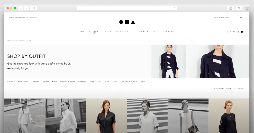
Here’s an image of what the menu looked like before the changes:
Analyzing the Existing Menu
Scandiweb’s vision on the navigation menu is quite simple — it should reduce the number of clicks it takes to get from any page to the product that the customer desires. Our hypothesis says that the website menu should be simplified as much as possible to make the customer arrive at the checkout as soon as possible.
Our approach can be separated into the following steps:
- Heuristic research and real users testing with eye-tracking lab
- Users sessions playback and heatmaps analysis, setting the hypothesis
- Data insights analysis for the existing navigation path
- New menu structure mockup development
- New menu design visuals development
- A/B testing the changes and technical implementation
Everything needed to conduct this research is Google Analytics data and heatmaps snapshots from LuckyOrange, as well as snapshots from our eye-tracking sessions.
Our Findings
Here’s what we discovered about the menu:
- The menu includes ~240 menu items, while on average other fashion stores have 50+ items
- Only 33% of users interact with the menu, compared to a rough average of 60% on other websites.
- The menu consists of 4 levels, while eCommerce usually stores have 1–3 category levels max
- 4th level menu items are almost unused (0.03% of all users visit it)
- The homepage has a 52% bounce rate, which may indicate that users do not see where to click.
- Several 3rd level menu items do not bring any conversions at all
And here are the key problems:
- 4th level menu items are not being used (0.03% of all users visit it), still, if they are, 23.67% of users make an order (probably, loyal customers who used to navigate to the specific category)
- It’s clearly visible in Analytics that user visits to the menu items are decreasing with each step
So our initial hypothesis checks out. Without a doubt.
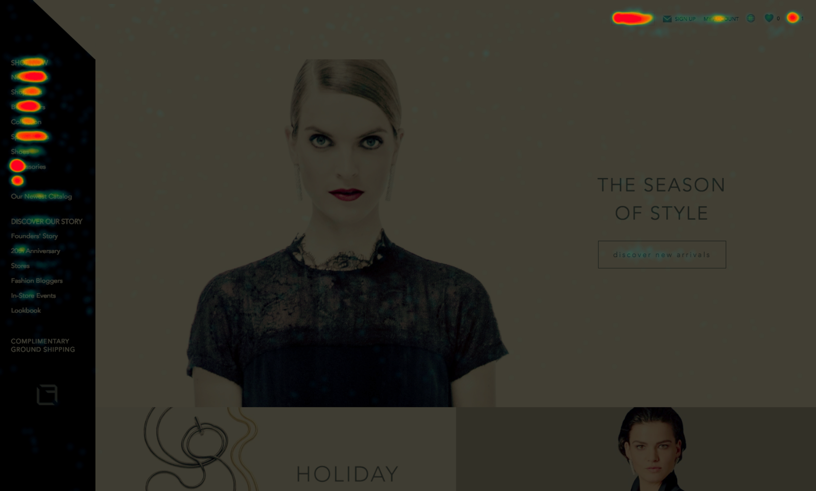
As you can see from the heatmaps image, some elements of the menu were almost never used by visitors.
Fixing it
Based on the facts pinpointed above, we advised to:
- Abandon 4th level menu and introduce some extra filtering on category pages (e.g. per child-category which are not in the menu) is introduced
- Power up access to the 3rd level menu items by implementing horizontal navigation
- Remove items without any direct eCommerce value from the header (like e-mail signups)
- Optimize category structure reworking it to a maximum of 100 menu items
- A/B test the changes, constantly track progress along the way and choose the winning option
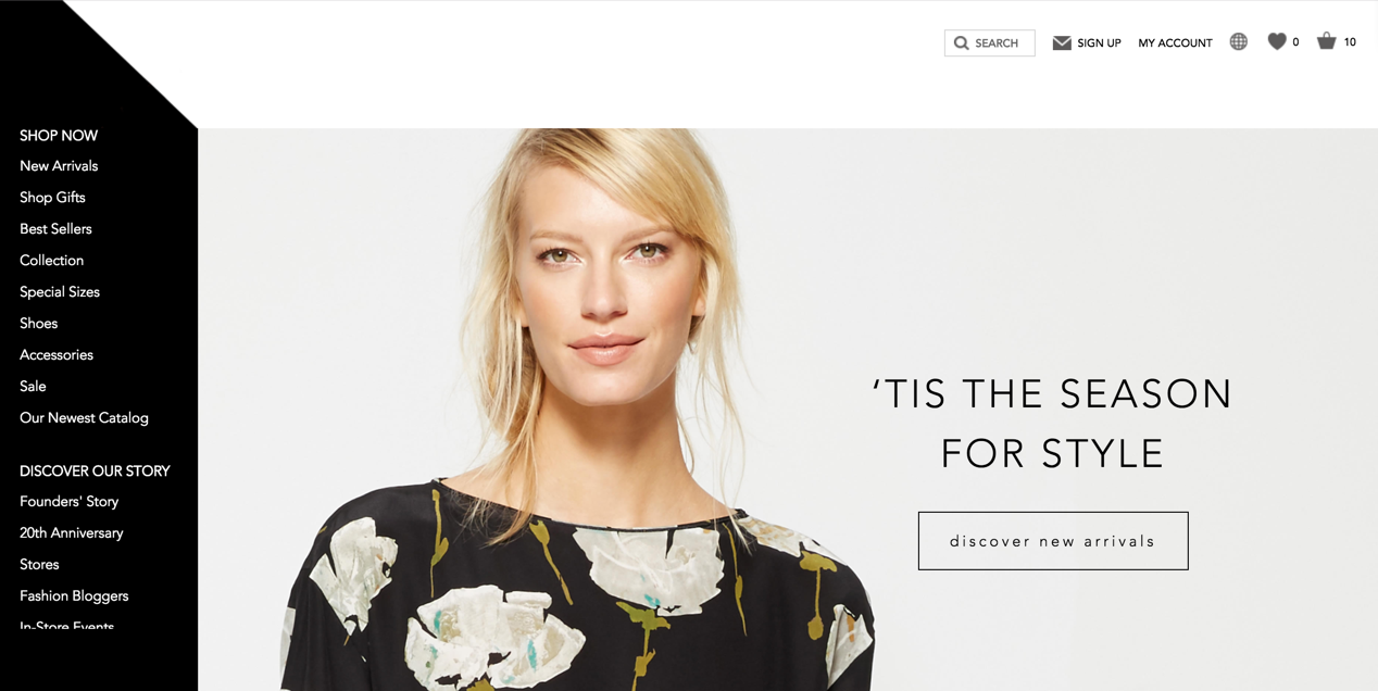
Here’s a preview of what the new horizontal 3-level menu looked like:
Additional changes include:
- The newsletter sign-up moved from header to footer, as we saw that very few people actually clicked on it
- “Discover our story” has been moved to the footer, for the same reasons
The search bar has a longer description, as Analytics showed that there were many conversions coming from search results - International website selection was moved to the footer, as it was rarely used by users
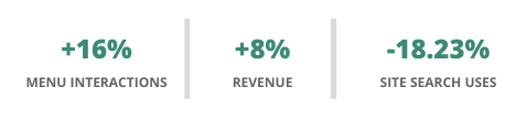
Did it help?
Yes! Looking at the data since the menu navigation redesign, compared to previous periods, we see that:
- Site search is used less by 18.23%, as a result of visitors being able to find products much more easily, without the search
- Menu interactions have risen by ~16%
- Overall revenue has increased by ~8%!
The ground rules we set made for a reasonable framework to work with. Not only did we manage to improve user interaction with the site, but we achieved the very tangible result of increasing the site’s overall revenue by 8%.
If you want Scandiweb to have a look at your site and suggest changes for conversion rate optimization, drop us a line at [email protected]!


Share on: