Finding what and where to optimize can be tricky. Although quantitative data analysis helps you discover places where your website is leaking money, it does not explain why it happens. To understand the reasons behind high drop off rates, you need to empathize with your users and carefully examine the user journey you offer them on your website.
A great way to do so is to create a user journey map — a visual representation of users’ desired and real interactions with your website.
User Journey Case Study:
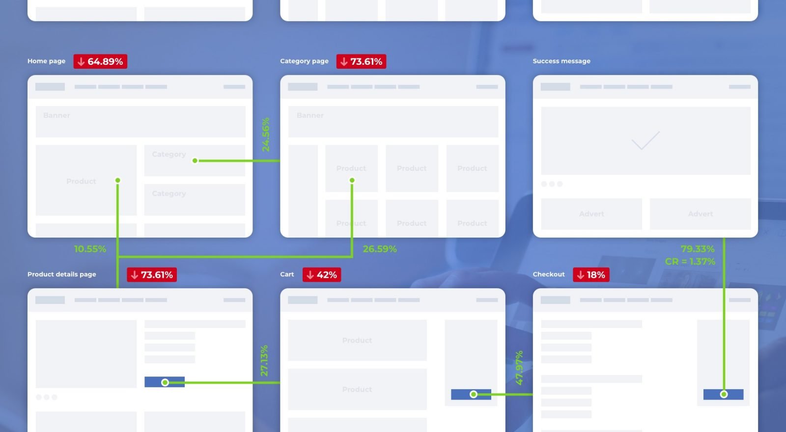
Recently Scandiweb’s CRO & Analytics Department was performing conversion research for an eCommerce store that sells yoga mats. During the research, our team discovered that 67.71% of the website’s visitors are New Visitors and ~48.4% of them are yoga beginners (PPC, Organic Search Queries, Referrals). We also found out that 73.61% of new visitors exit the website from the Product Listing Page without visiting the Product Details Page.
We concluded that users have a hard time finding the product that they are looking for, and as most of them are yoga beginners, it is very likely that they do not really know what kind of mat they need.
To decrease such high drop off rates we decided to completely change the user journey. So now:
- The Homepage informs visitors about products instead of immediately asking to buy.
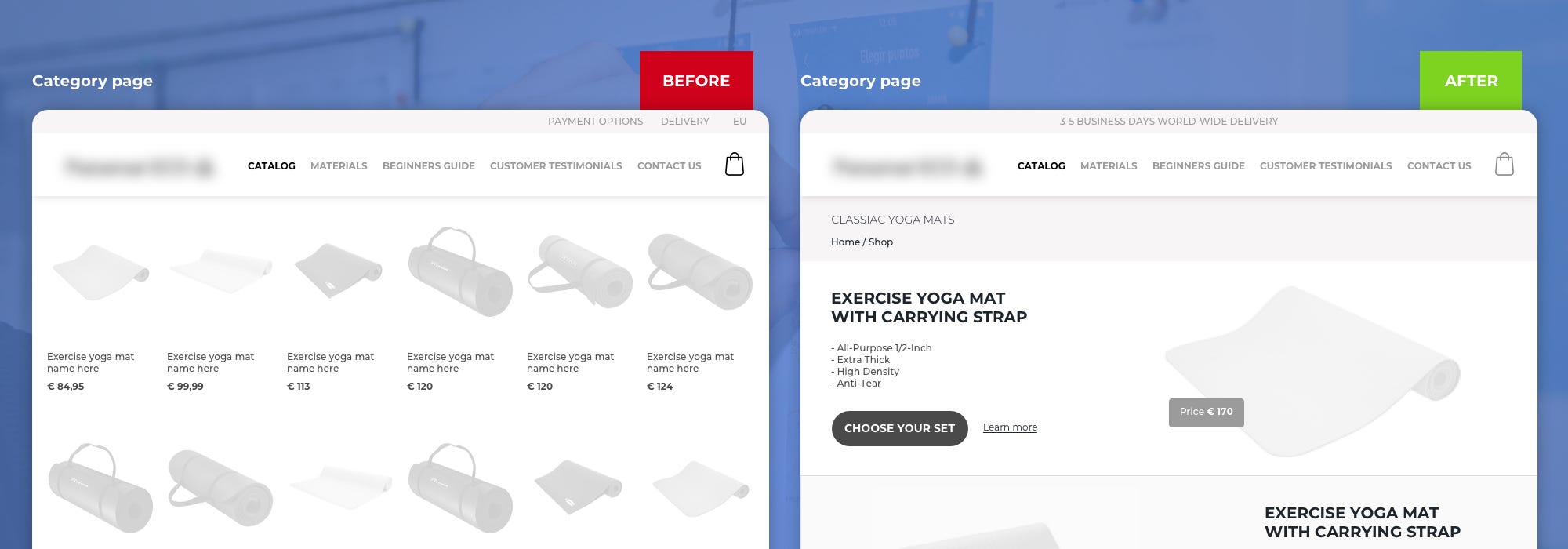
- There is no Paradox of choice on the Category Page. It has 3 main products instead of 6 variations of each product.
- The Product page is configurable, so the user is able to assemble the exact product he wants on one page, instead of browsing through 32 different pages.
- The Website tells a story about the product during the whole user journey, starting from how it was made to how it could be used while listing all its advantages.
 Wireframe of redesigned Category Page
Here is how we did it:
User Journey Optimisation Step 1: Collecting & Analyzing data
To have a full picture about a user’s behavior on the website we analyzed multiple Google Analytics reports starting from the build in reports, such as All pages, Source / Medium, New vs. Returning, User Flow, etc. and ending with multiple custom reports and segments.
Google Analytics data led us to the conclusion that users, who have visited at least one of the CMS pages, such as Materials, Beginners Guide or Customer Testimonials were 52.53% more likely to convert in comparison to those who did not visit any of those pages.
 Data from Google Analytics comparing the performance of sessions with and without CMS page view
During heuristic analysis, our team noticed a lot of repetitive and non-structured content. It made us think that users might feel lost and confused when browsing the website and this could be one of the reasons they drop off. To test whether our hypothesis was right we performed a user test where we tested how easily users can find the required content and navigate through the website. It turned out we were right. Not one of the testers could complete the task and find the required content.
Based on these conclusions we decided that the best user flow would be Homepage -> Content Page -> Category Page -> Product Page -> Checkout. We also distributed information about the product across all pages to gradually build trust towards the brand and product. This way before seeing a relatively high price the user will learn why the product is special and expensive.
User Journey Optimisation Step 2: Defining user expectations
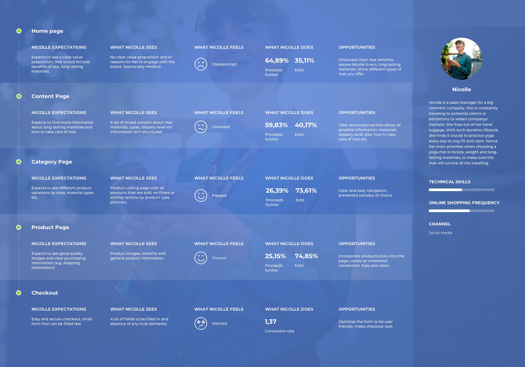
In order to understand what exactly should be changed on the current website, we mapped out user expectations for each page in the desired flow based on previously created user personas.

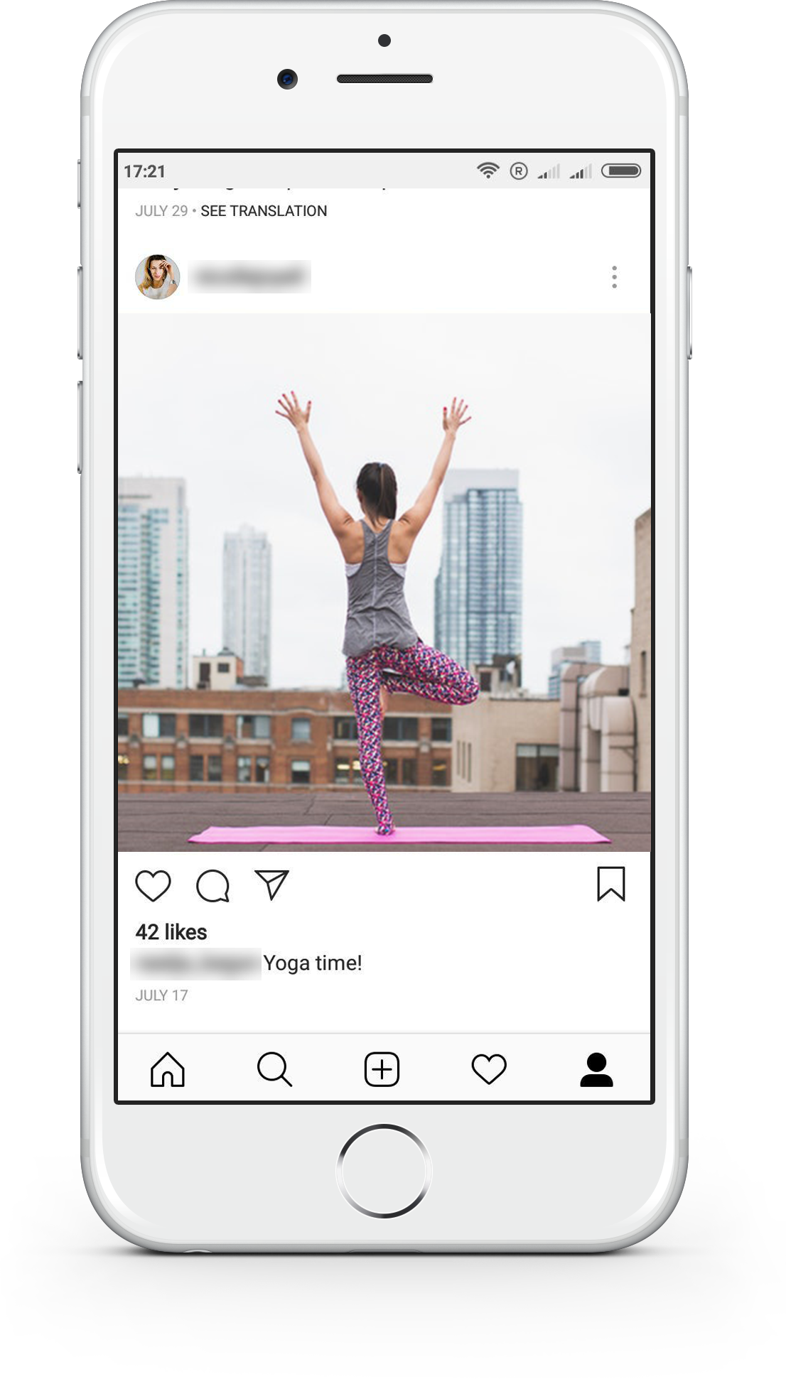
As an example let’s take Nicolle. She practices yoga every day to stay fit and calm. Her main priorities when choosing a yoga mat are its size, weight and long-lasting materials, to make sure the mat will survive constant traveling. She came to the website from social media after seeing a pretty picture and an exciting post about the product. She was expecting to see what the product is for, its main advantages, see how it can benefit her yoga training. Unfortunately, she did not find any of that on the homepage, instead, she saw a homepage that seems very medical with a barely noticeable section about yoga, that constantly asks her to buy the product.
Nicolle feels a little bit confused, but does not give up and proceeds to the category page as all CTAs ask her to. She hopes to get inspired thereby seeing pretty images and product features. Again, her expectations were not met. She saw many rows of what seems to be the same and expensive product. Nicolle is not sure she needs a new mat anymore, therefore with a chance of 73.61% she leaves.
However, Nicolle is not the only user of the website. There are many more and each one is different from the other, hence their needs and expectations also differ. Therefore we created multiple user journeys that would fit all 3 groups of users that were detected during the creation of user personas.
User Journey Optimisation Step 3: Discovering opportunities
After the differences between user expectations and reality were identified, it was time to figure out what the website should have to meet Nicolle’s expectations. Since Nicolle is passionate about yoga, to attract her the website should:
- Represent energy and health;
- Assure Nicolle that her yoga training will benefit from using the mat;
- Explain why the product is relatively expensive;
- Prevent any frustrations regarding the mat’s size and weight;
- Persuade her that it would be a great investment in her well being.
In order for Nicolle to convert and not leave the website, each hesitation that she has should be answered exactly at the same moment it appears. Therefore we added an opportunities section to the user journey map, describing what should be changed on each page to meet Nicolle’s expectations.
To summarise and visualize all of the steps above we created a user journey map.

Want to optimize the user journey for your eCommerce store? We can help! Find out more about our user design services here! Scandiweb can help you map a user journey for your website that converts. Get in touch with us at [email protected]!


Share on: