If you are watching new users sign up and then disappear before the product ever clicks for them, you already know onboarding is where the leak is. People do not churn because your product is bad. They churn because they never reached the moment it became useful, and onboarding is the path to that moment.
This applies just as much to an eCommerce account or a checkout flow as it does to a mobile app: the first session decides whether someone comes back. Below are nine onboarding best practices that hold up in 2026, each with a real example and the principle underneath it, so you can apply them to a web app, a mobile app, or a store account flow.
Overview
- The job of onboarding is one thing: get a new user to first value as fast as possible. Everything else serves that.
- The numbers are unforgiving. Around 77% of users stop using an app within three days, and in Q2 2025 only about 8.4% of users completed onboarding within 30 days.
- Good onboarding can lift retention by up to 50%, which is why it is one of the highest-return fixes a product or store team can make.
? Quick takeaway
Onboarding is not a tutorial. It is the shortest path to the moment your product becomes obviously useful. Shorten that path and retention follows.
What is user onboarding?
User onboarding is the guided first experience that takes someone from “just signed up” to “actively getting value.” It covers the welcome, any setup, and the first meaningful action, the point where the user understands what the product does for them. Good onboarding is not about showing every feature. It is about getting the user to one clear win quickly.
Why does user onboarding matter?
Because most people leave fast, and onboarding is the one lever that changes that. Around 77% of users abandon an app within three days of downloading it, and retention keeps falling from there: 2025 benchmarks put average day-7 retention near 6.9% on iOS and 5.2% on Android, dropping to roughly 3% by day 30. The longer since install, the fewer users remain active.
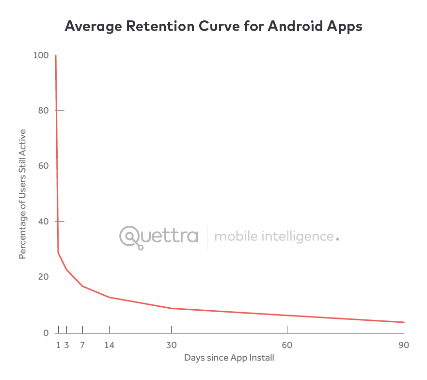
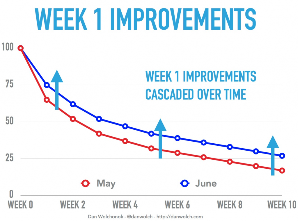
The cause is rarely the product itself. It is that users never saw the value clearly enough to come back. Fix the onboarding and the curve bends: studies have found proper onboarding can increase retention by up to 50%, and product teams that reworked their first-run experience have moved week-1 retention from 60% to 75% and week-10 from 10% to 25%.
? Quick takeaway
Most churn is a value-communication failure, not a product failure. Onboarding is where you fix it, and it can return up to a 50% retention lift.
How long should user onboarding take?
As short as it can be while still delivering the first win. Survey data has long shown most users expect to finish onboarding in under a minute, and that expectation has not softened. With completion rates as low as 8.4% within 30 days, every extra step is a place to lose people. Aim for the shortest sequence that reaches first value, and let everything else be learned in context later.
The 9 user onboarding best practices
1. Get users to first value in under a minute
Do not turn onboarding into an essay. Keep it short and pointed at the first win. The longer the sequence, the more people drop before they ever reach it. If your setup genuinely needs more steps, defer the optional ones and front-load only what is required to reach value.
? Quick takeaway
Every onboarding step is a place to lose a user. Keep only the steps that stand between sign-up and first value.
2. Always let users skip
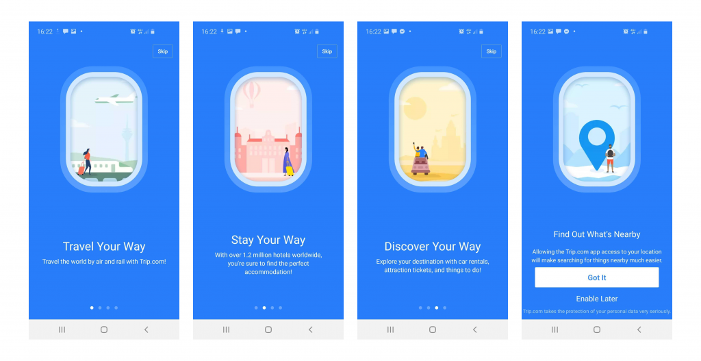
A real share of users prefer to explore on their own, by trial and error. Do not trap them. Let them skip onboarding at any step. Trip.com does this cleanly, with a skip option in the top corner of every screen, so confident users get out of the way and into the product.
3. Show what users can do, not what the product offers
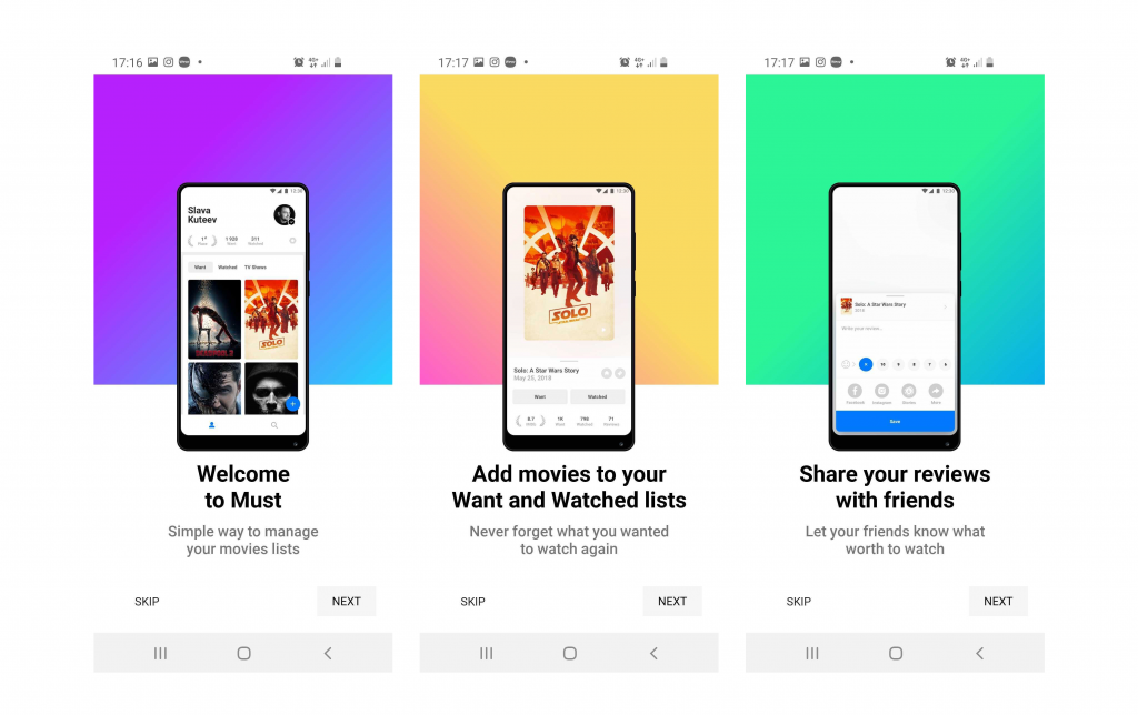
Onboarding copy shapes how people perceive the product before they have used it. Keep it user-centered, not product-centered. Write about what the user can accomplish, not what the company built. The MUST app (for building movie libraries) does this well, framing onboarding around you creating your collection rather than around its feature list.
4. Lead with the value, fast
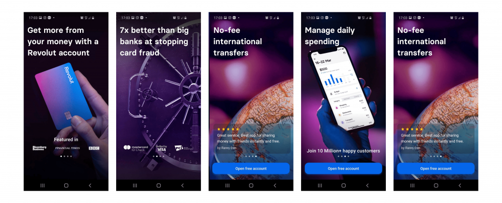
Use onboarding to make the value obvious, not to bury it under instructions. Show what the user can accomplish and why it is worth their time. Revolut’s onboarding is a strong example: it lists clear benefits, uses social proof, and keeps a visible call to action, so by the end you want to explore the app rather than escape it.
5. Engineer the “aha” moment
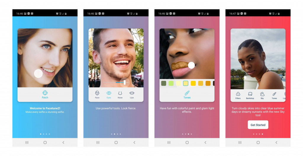
The aha moment is when the user first feels the product’s value for themselves. Design onboarding to reach it deliberately, not by accident. Identify the single action that makes your value click, then build the first session around getting users to it. Facetune does this by letting users feel how quickly they can edit a photo, the value lands before any commitment is asked.
? Quick takeaway
Name the one action that makes your value obvious, then design the entire first session around reaching it. That action is your aha moment.
6. Onboard progressively, not all at once
You do not need to teach everything in the first session. Progressive onboarding reveals features when they become relevant, instead of front-loading a carousel nobody remembers. Teach the first action now, surface the next capability the moment the user is ready for it, and let the product teach itself in context. This keeps the first run short while still helping users go deeper over time.
7. Reduce sign-up friction before you optimize the flow
The fastest onboarding is the one with fewer obstacles in front of it. Offer social or single sign-on, ask for only the data you truly need up front, and let people experience value before forcing account creation where you can. For eCommerce, this is the same logic as guest checkout: every required field before the first win is a reason to leave. Collect the rest progressively, once the user has a reason to stay.
? Quick takeaway
Cutting one required field or one forced sign-up step often does more for completion than redesigning the whole flow.
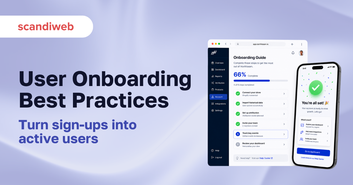
8. Show progress with checklists and indicators
People finish what they can see themselves finishing. A short setup checklist or a progress bar turns an abstract process into a goal with a visible end, which pulls users through it. Keep the list short, order it by value, and celebrate completion. This works as well for a store account or a B2B portal setup as it does for a SaaS product.
9. Measure activation and keep iterating
Onboarding is never done. Define your activation metric, the specific first action that predicts retention, and track how many new users reach it. Then test changes against that number. This is where onboarding meets conversion rate optimization: the same discipline of measuring, hypothesizing, and testing that improves a checkout improves a first-run flow. Our A/B testing framework is a practical way to run those tests without guessing.
? Quick takeaway
If you cannot name your activation metric, you cannot improve onboarding. Pick the first action that predicts retention, then test your way toward it.
Onboarding beyond the app: web and eCommerce
These principles are not mobile-only. An eCommerce account flow, a first purchase, or a B2B portal setup is onboarding too, and it follows the same rules: reach first value fast, reduce friction, show progress, and measure activation. The “aha” moment for a store might be the first successful order or the first saved cart, and the same first-session design that retains app users retains shoppers. If you want the experience studied end to end, that is what a structured UX design and CX audit process is for.
FAQ
What is user onboarding?
User onboarding is the guided first experience that takes a new user from sign-up to actively getting value from a product. It covers the welcome, any necessary setup, and the first meaningful action, and its goal is to reach that first win as quickly as possible.
What makes onboarding effective?
Effective onboarding reaches first value fast, lets users skip, leads with what the user can do rather than a feature list, engineers an early “aha” moment, and is measured against an activation metric. It removes friction instead of adding instructions.
How long should user onboarding take?
As short as possible while still delivering the first win. Most users expect to finish in under a minute, and with onboarding completion rates near 8.4% within 30 days, every extra step costs you users.
Why do users abandon apps so quickly?
Around 77% of users stop using an app within three days, usually because they never saw its value clearly, not because the product is poor. Onboarding that communicates value early is the main lever for changing that.
Does onboarding apply to eCommerce and not just apps?
Yes. A store account flow, a first purchase, or a B2B portal setup is onboarding too. The same principles apply: reach first value fast, reduce sign-up friction, show progress, and measure activation.
How do you measure onboarding success?
Define an activation metric, the first action that predicts a user will stay, and track the share of new users who reach it. Then test onboarding changes against that metric using a structured A/B testing process.
If your activation rate has stalled and you are not sure which onboarding step is losing people, that is a measurable problem, not a mystery. Book a UX working session and we will map your first-run flow, find where users drop, and test the fixes that move retention.

Share on: