Nielsen Norman Group’s research puts the moment of aesthetic judgment at 50 milliseconds – a hundredth of the time a 5-second usability test gives a participant. Five seconds is already generous. The question isn’t whether the window is long enough. It’s whether you’re asking the right questions of it. A 5-second usability test (also called a 5-second test, five second test, or first impression test) is the cheapest signal you can get on whether your homepage, PDP, or landing page communicates what you intended – before a paid traffic spend or a redesign sprint.
Overview
- A 5-second usability test exposes participants to one screen for five seconds, then asks recall and impression questions to measure what your design actually communicates.
- It works because aesthetic judgments form in 50ms (Nielsen Norman Group) and 55% of visitors leave in under 15 seconds (Maze, 2025) – a 5-second window is already representative of real behavior.
- It is not a substitute for moderated, tree, or A/B testing – it’s the fastest filter for “is the message clear?” before deeper research.
🚀 Quick takeaway
A 5-second usability test is the fastest way to find out whether your homepage, PDP, or landing page communicates what you intended. Run it on Lyssna, Maze, Useberry, or UXtweak with 5 to 10 participants. Use it before deep research, not instead of it.
A 5-second test sits inside a broader CRO research program – see our usability testing methods overview for where it fits alongside tree, first-click, eye-tracking, and moderated tests.
What is a 5-second usability test?
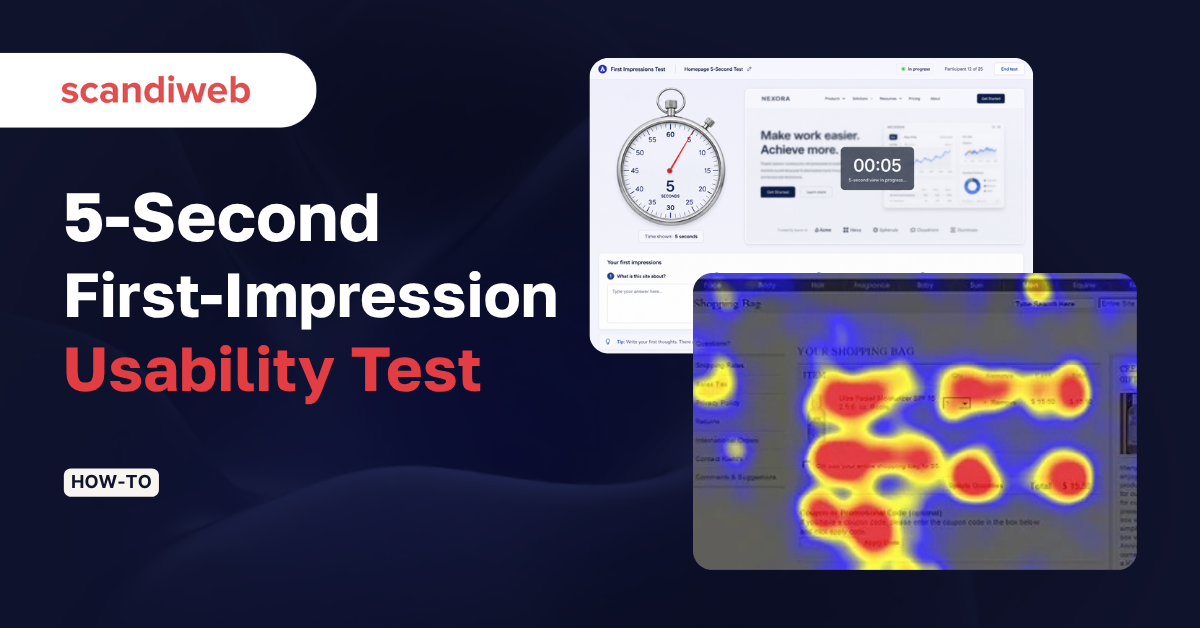
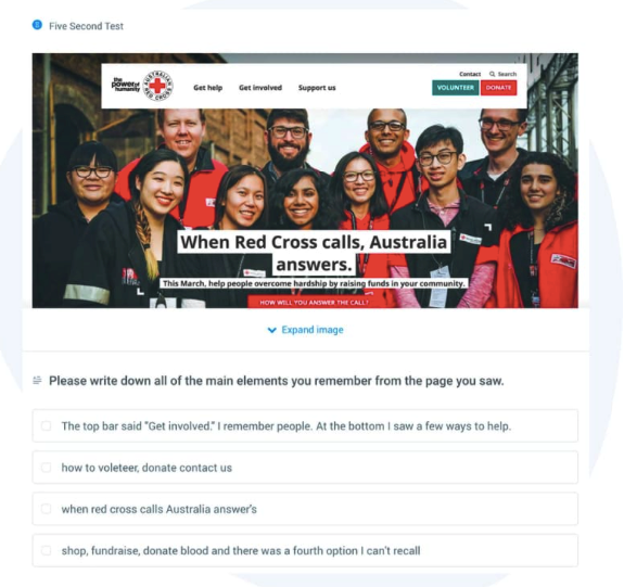
A 5-second usability test is a quantitative-leaning method in which a participant is shown a single screen – homepage, landing page, PDP, mockup, or hero – for five seconds, then answers a short set of recall and impression questions. UserTesting defines it as the test that measures “what they can remember.”
It is not moderated usability testing. Nobody walks through tasks. You’re measuring whether the page’s central message lands – brand register, CTA visibility, and whether the intended audience feels addressed.
When to use it – and when not to
5-second tests are best on screens with one job: a homepage above the fold, a landing page hero, a paid social ad, a category header, a checkout confirmation. Anywhere the design has to do its work fast or not at all.
They are a poor fit for information-dense screens (spec sheets, comparison tables, SaaS pricing with five tiers), accessibility-first audits, flow testing (use first-click or tree testing), or post-purchase behavioral work. Smashing Magazine’s 2023 case study flags one nuance: on complex stimuli, 10 seconds outperforms five. Use five seconds as the default and stretch only when the screen genuinely demands more.
When is a 5-second test the right call?
Use a 5-second usability test when you need to validate a single screen’s first impression – brand register, message clarity, CTA visibility, or audience fit. It’s the fastest filter before deeper research and the cheapest reality check before paid traffic.
The methodology: sample size, the question library, success bars
One screen, one set of questions, five seconds – but every setup decision affects what comes out.
Sample size. Lyssna’s guidance is 5 to 10 participants for a recall-style test. Past 15, diminishing returns. Below 5, individual variance dominates. For an eCommerce homepage with multiple audience segments, run two cohorts of 8–10 rather than one of 20.
One screen, one question theme. Every test is one image, with the battery themed around one decision: did the page communicate X? Three things to test means three separate tests.
The question library. 5 to 8 questions, leading with impression and ending with recall:
- What do you think this page is about?
- Who is this page for?
- What three words describe what you saw?
- What did the brand feel like – upscale, friendly, technical, generic?
- What action does the page want you to take?
- What was the most visible element?
- What product or service was offered?
- Where would you click next?
Avoid open-ended “what would you improve?” questions – the participant only saw the page for five seconds. Smashing’s 2023 study confirms attitudes crystallize faster than five seconds, but reasoning does not.
Success bar. Lyssna recommends an 80% comprehension benchmark on the central message. Decide it before launch, or you’ll second-guess any result in the middle.
🚀 Quick takeaway
Three commitments: one screen per test, 5 to 10 participants, and a comprehension success bar (Lyssna suggests ~80%) decided before launch. Questions stay impression and recall – not analysis.
The same hypothesis discipline runs in moderated work – our user test moderation playbook covers the DOs and DON’Ts when participants are live.
Why five seconds is enough (and when it isn’t)
The cognitive evidence is unambiguous. Nielsen Norman Group places the aesthetic decision at 50 milliseconds. Sherwin’s NN/G synthesis: “A decision on aesthetics is made as early as 50 milliseconds into visiting a site, and rarely changes if you give people more time.”
Maze’s 2025 guide notes 55% of visitors leave a website in under 15 seconds. If your page can’t establish purpose, audience, and CTA in five seconds, it almost certainly cannot in fifteen.
Where five isn’t enough: Smashing’s 2023 study found that on complex designs, participants with lower working memory recalled less in a 5-second window – but the gap closed at 10 seconds. Don’t abandon five seconds. Adjust the window to the stimulus. A clean hero stays at five. A dense pricing page stretches to ten. Beyond ten is a different test entirely.
The 50ms figure aligns with the user-journey friction work we surface in eCommerce audits – the homepage is where it pays back most.
What does the data actually say about first impressions?
Aesthetic judgments form in 50 milliseconds, message attitudes crystallize faster than five seconds, and 55% of visitors leave inside 15 seconds. A 5-second test sits comfortably inside all three benchmarks – it captures what the user actually decides, not what they would say after reflection.
What a 5-second test actually reveals
Across 5,000+ optimizations our 700+ team has run, five categories of insight recur:
- Brand register mismatch. Recall adjectives cluster away from the brief – “discount,” “outdated,” “corporate” when the brand was meant to read “luxury,” “modern,” “playful.”
- Audience misfire. When asked who the page is for, participants describe a demographic that isn’t the target. The most common finding in our luxury and B2B audits.
- CTA invisibility. “Where would you click next?” returns “don’t know” or scattered single-vote answers. A clear CTA returns one answer 60%+ of the time.
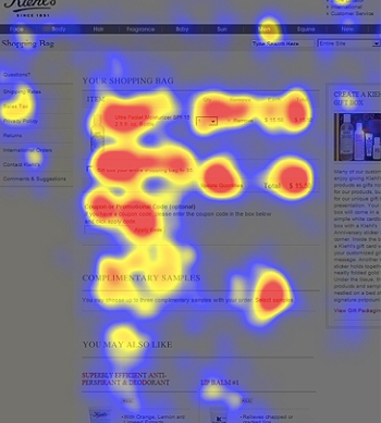
- Information hierarchy collapse. Recall lists everything equally, or recalls a peripheral element (a model’s outfit, a promo ribbon) instead of the central product or value proposition.
- Product-language vs imagination-language gap. Concrete product names (“Sweaters,” “Sneakers,” “Headphones”) recall consistently. Brand-language collection names (“The Atelier Edit,” “Capsule No. 4”) do not. Participants remember the noun, not the metaphor.
🚀 Quick takeaway
A 5-second test typically surfaces brand mismatch, audience misfire, CTA invisibility, hierarchy collapse, or the product-vs-imagination-language gap. Pattern-match these five categories first – if the result fits none, your question battery is the issue.

5-second test tools in 2026
Five tools handle most professional 5-second testing today. Lyssna is the rebrand of the original fivesecondtest.com (later UsabilityHub) – the domain changed in 2023, but the tool is the direct lineage of the category’s first.
| Tool | Adjustable window | Participant panel | AI summary | Free tier |
|---|---|---|---|---|
| Lyssna (formerly UsabilityHub / fivesecondtest.com) | 5–20 seconds | Yes (160K+ panel) | Yes | Free + paid |
| Maze | 5–30 seconds | Via integration | Yes | Free + paid |
| UsabilityHub | Now Lyssna – same product | |||
| Useberry | Configurable | Via integration | Yes | Free + paid |
| UXtweak | Configurable | Yes (155+ countries) | Limited | Free for academic + paid |
Lyssna and Maze are the two we use most often – Lyssna for fast recall-only tests, Maze when the test feeds a longer flow with clicks and prototypes. Useberry and UXtweak win on Figma/XD integrations or international panels.
Whichever tool you pick, the diagnostic pattern is the same – see our Byggmax navigation usability case study for how a 5-second pre-pass fed into deeper moderated testing.
Which 5-second test tool should you use?
Pick Lyssna for fast recall-only tests, Maze when the test is the first step in a longer flow with clicks and prototypes, Useberry or UXtweak when integrations or international panels matter. All five support adjustable viewing windows and AI-assisted recall summarization.
Running a 5-second test on your own site
Six tips from running 5-second tests inside CRO programs at scale:
- Define the decision first. Write if the test returns X, we will Y before you pick a screen. If you can’t finish it, you’re collecting data without a hypothesis.
- Pick questions a participant can answer from 5 seconds of memory. Impression and recall work. Analytical questions don’t. Lead with the most decision-relevant question – attention drops across the set.
- Watch for “don’t know” answers. If they dominate, the question is wrong, not the participant. Rephrase or move it earlier.
- Try the test yourself first. Take three 5-second tests on someone else’s site before launching your own.
- Use word clouds as a signal, not a deliverable. Diagnostic value sits in individual answers – cluster them by audience segment.
- Set a success bar before launch. Lyssna recommends ~80% comprehension on the central message. Decide the threshold first, otherwise you’ll re-interpret the result to whatever conclusion is convenient.
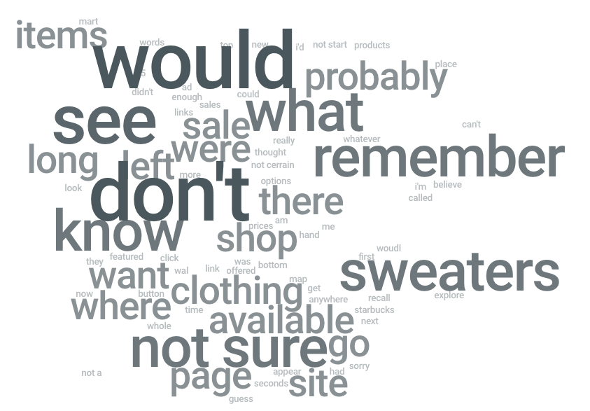
Case study: luxury apparel homepage redesign
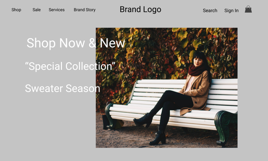
A US luxury apparel client launched a radical homepage redesign – lifting the visual register from traditional eCommerce to high-end and aiming acquisition younger (revenue was concentrated in women aged 60+). We ran a 5-second test on the new hero across 12 participants from a recruiter panel matched on shopping behavior.
What the test surfaced:
- Brand register: pass. 11 of 12 participants described the page in luxury-aligned adjectives – “elegant,” “premium,” “modern.” The visual brief had landed.
- Audience: mismatch (intended). 9 of 12 participants placed the audience between 20 and 40 years old. The redesign succeeded at re-aiming visual language younger – but the business case hadn’t validated a marketing pivot from the 60+ revenue base. A strategic decision was needed before further changes shipped.
- CTA: invisibility confirmed. Asked where they would click next, the modal answer was “don’t know.” The hero featured three competing taglines – “Shop Now,” a “Special Collection” name, and “Sweaters” – with no visual hierarchy. No single answer broke 30%.
- Product-vs-imagination-language gap. “Sweaters” surfaced repeatedly in recall, including in answers unrelated to category. The concrete noun was sticking. The collection name was not.
Our recommendation: consolidate the hero to one dominant CTA, lift the product noun above the collection name, and run a follow-up moderated session before locking the redesign. The 5-second test isolated three diagnostic findings in 90 minutes of setup and 24 hours of fielding.
Common pitfalls
Five mistakes recur often enough to call out:
- Mixing recall and analysis. “What would you change?” inside a 5-second test wastes time. Save analysis for moderated work.
- Testing screens that don’t work in isolation. A category page header out of context tests poorly. Test the whole screen the user would land on.
- Skipping the success bar. Without a pre-launch threshold, every result becomes interpretable both ways.
- Treating word clouds as conclusions. The cloud is a visualization, not analysis. Cluster individual answers by audience segment first.
- Running a 5-second test on a screen that needed a tree test. If the user’s job is navigation, deep navigation systems usually need tree testing or first-click work before a 5-second test makes sense.
FAQ
What is a 5-second usability test?
A 5-second usability test shows a participant a single screen for five seconds, then asks recall and impression questions to measure what the design communicates. It’s the fastest test for first-impression clarity, brand register, audience fit, and CTA visibility.
How long should a 5-second test run?
Five seconds is the default, calibrated to research showing aesthetic judgments form in 50 milliseconds and most visitors leave inside 15 seconds. Smashing Magazine’s 2023 study found 10 seconds closes the working-memory gap on complex screens. Past 10 seconds, it’s a different test.
How many participants do I need for a 5-second test?
Five to ten participants are typically sufficient for a recall-focused test, per Lyssna. For multiple audience segments, run separate cohorts of 8 to 10 rather than one pooled cohort.
What questions do you ask in a 5-second test?
Lead with impression and end with recall: what is this page about, who is it for, three words to describe what you saw, what action does it want, where would you click next. Avoid open-ended improvement or analysis questions.
When should you NOT use a 5-second test?
Skip it for information-dense screens, spec sheets, deep SaaS pricing pages, accessibility-first audits, post-purchase behavioral analysis, or anything where the user’s job is navigation. Use tree testing, first-click testing, or moderated research instead.
Is a 5-second test the same as a first-impression test?
Functionally yes – both measure what a participant decides on first exposure. The 5-second test is the most-named methodology in the first-impression-test family, alongside variants using shorter or longer viewing windows depending on stimulus complexity.
What’s next after a 5-second test?
A 5-second test points to which screens or elements need a closer look. Common next steps include moderated testing for the why, first-click testing for navigation hypotheses, and A/B testing the change once a clear hypothesis exists.
If first-impression clarity is the gap, the next move is a focused review of the home and PDP screens where it costs you the most. book a UX review with our CRO team – we’ll run the 5-second pass alongside heuristic and behavioral analysis and come back with the specific fixes that move clarity and conversion.

Share on: