
What does a merchant actually want when they ask for a homepage banner they can edit themselves? Where should that content live so marketing can change the copy without a developer? How do you make a banner reusable across the homepage, a campaign landing page, and a category page at the same time? Should it render through the standard Magento frontend or a headless one? And what is the difference between the block that holds the content and the thing that decides where it shows up?
The answer to almost all of those questions in Magento (Adobe Commerce) is a widget. A widget lets you build a piece of content once, expose a handful of editable fields to the admin, and drop it onto any CMS page, block, or layout position without touching code again. This guide walks through building one end to end, with tested code you can adapt for your own store.
🚀 Quick takeaway
A Magento widget separates content from placement. You define editable fields once, a store admin fills them in, and the same widget can be reused on any page. Build it correctly and your marketing team stops filing developer tickets for banner edits.
Overview
- A Magento widget is reusable code that places editable content at a chosen position in your store, configured entirely from the admin.
- You declare the widget in
widget.xml, back it with a block class, and render it through a PHTML template, the official path described in Adobe’s Create a Custom Widget tutorial. - The same widget works for the standard Luma or Hyva frontend and for a headless setup, so build it once and reuse it everywhere.
What is a Magento widget?
A Magento widget is a snippet of code that places a range of content at specific block reference positions in a store, configured from the admin without further development. The block holds the content and its logic, and the widget controls where that content appears, per Adobe’s widgets documentation.
In practice, that means a store admin can add a promotional banner, a recently viewed products carousel, or a custom call to action to a CMS page or layout position through the admin interface. The developer builds the widget once and defines which fields are editable. Everyone else reuses it.
What is the difference between a widget and a block?
A block is the content and the rendering logic. A widget is the configuration layer that controls where that block appears and exposes editable fields to the admin. The block answers what is shown, the widget answers where it shows up and who can change it.
Concretely, in this guide the ExampleBanner block class extends Template and implements BlockInterface. That block is the content. The widget.xml declaration wraps it, names the editable parameters, and lets a store admin drop it onto a CMS page. Same banner, many placements, zero extra code.
🚀 Quick takeaway
If you only remember one distinction: the block is the content, the widget is the placement plus the editable fields. A block without a widget is developer-only. A widget makes it admin-manageable.
Planning the widget before you write code
Before any code, decide which parts of the banner a store admin needs to control and which can stay fixed. Getting this list right up front avoids reworking the widget definition later, and it keeps the admin form clean instead of overloaded with options nobody touches.
For the banner in this guide, here is what the basis designs looked like.
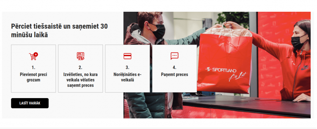
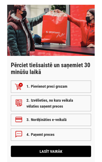
What data is required to be manageable?
These are the fields a store admin should be able to edit from the widget configuration. Everything else can be hardcoded in the template.
- Banner image
- Steps text and steps numbers can be hardcoded
- Button text
- Button link
The step icons are not in the list of manageable fields.
If your widget needs to surface store entity data such as products or categories, those values come from Magento’s underlying data model rather than static parameters. For the structure behind that data, see our explainer on the EAV model.
Is a widget preview in the admin required?
If a preview is required, use the Magento PHTML rendering approach. If it is not, the frontend component rendering approach works well for headless setups. This guide shows both, so you can pick the one that fits your store.
🚀 Quick takeaway
Decide two things before coding: which fields the admin edits, and whether the widget needs an admin preview. Those two answers determine your parameter list and your rendering method.
How do you create a custom widget in Magento 2?
You create a custom widget by declaring it in etc/widget.xml, adding a Magento_Widget sequence in etc/module.xml, building a block class that extends Template and implements BlockInterface, and rendering it through a PHTML template. After that, clean the cache and the widget appears in the admin. The steps below walk through each file.
The examples here were implemented and tested with the Luma frontend and a ScandiPWA theme, and the same approach holds on the current Magento Open Source / Adobe Commerce 2.4.x line. For a demo widget you can use as a starting point, see Demo Widget ScandiPWA Extension. You should already be familiar with adding a widget to the Magento CMS system.
To start, prepare media content for the tutorial: 4 icons and one banner image.
Steps to implementing a widget in Magento 2
This is the core of the build. Work through the nine steps in order. Each step lists the exact file path and the code to add, all of it tested rather than illustrative.
1. Create a new module
Create any missing folders and add the files. Adjust file content to suit your needs. If you have not scaffolded a module before, follow our walkthrough on how to create a Magento 2 module first.
project_root/app/code/ExampleVendor/ExampleModule/etc/module.xml
<?xml version="1.0"?>
<!--
/**
 * ExampleVendor_ExampleModule
 *
 * @category ExampleVendor
 * @package  ExampleVendor_ExampleModule
 * @author   Firstname Lastname <[email protected]>
 */
-->

<config xmlns:xsi="http://www.w3.org/2001/XMLSchema-instance"
        xsi:noNamespaceSchemaLocation="urn:magento:framework:Module/etc/module.xsd">
    <module name="ExampleVendor_ExampleModule">
        <sequence>
            <module name="Magento_Widget"/>
        </sequence>
    </module>
</config>
project_root/app/code/ExampleVendor/ExampleModule/registration.php
<?php
/**
 * ExampleVendor_ExampleModule
 *
 * @category ExampleVendor
 * @package  ExampleVendor_ExampleModule
 * @author   Firstname Lastname <[email protected]>
 */

declare(strict_types=1);

use Magento\Framework\Component\ComponentRegistrar;

ComponentRegistrar::register(
    ComponentRegistrar::MODULE,
    'ExampleVendor_ExampleModule',
__DIR__
);
Enable the module
From project_root, run the following command:
php bin/magento setup:upgradeRun the command from the command line. See Available commands for more info on CMA setups. The module ExampleVendor_ExampleModule should appear in project_root/app/etc/config.php.
2. Add widget.xml
Please use snake case for parameter names, for example banner_title. To get data from this parameter, use $block->getBannerTitle(), the magic Magento function that gets the data from the parameter name banner_title.
project_root/app/code/ExampleVendor/ExampleModule/etc/widget.xml
<?xml version="1.0"?>
<!--
/**
 * ExampleVendor_ExampleModule
 *
 * @category ExampleVendor
 * @package  ExampleVendor_ExampleModule
 * @author   Firstname Lastname <[email protected]>
 */
-->

<widgets xmlns:xsi="http://www.w3.org/2001/XMLSchema-instance"
         xsi:noNamespaceSchemaLocation="urn:magento:module:Magento_Widget:etc/widget.xsd">
    <widget class="ExampleVendor\ExampleModule\Block\Widget\ExampleBanner" id="example_banner" placeholder_image="ExampleVendor_ExampleModule::example_banner_icon.png">
        <label>Example Banner</label>
        <description>scandiweb Widget Tutorial</description>
        <parameters>
            <parameter name="banner_title" xsi:type="text" required="true" visible="true" sort_order="10">
                <label>Heading text</label>
                <value>Test</value>
            </parameter>
            <parameter name="step_1_text" xsi:type="text" required="true" visible="true" sort_order="30">
                <label>Step 1 Text</label>
            </parameter>
            <parameter name="step_2_text" xsi:type="text" required="true" visible="true" sort_order="50">
                <label>Step 2 Text</label>
            </parameter>
            <parameter name="step_3_text" xsi:type="text" required="true" visible="true" sort_order="70">
                <label>Step 3 Text</label>
            </parameter>
            <parameter name="step_4_text" xsi:type="text" required="true" visible="true" sort_order="90">
                <label>Step 4 Text</label>
            </parameter>
            <parameter name="button_text" xsi:type="text" required="true" visible="true" sort_order="100">
                <label>Button Text</label>
            </parameter>
            <parameter name="button_url" xsi:type="text" required="true" visible="true" sort_order="110">
                <label>Button URL</label>
                <description>Redirect URL on click</description>
            </parameter>
            <parameter name="banner_image" xsi:type="block" required="true" visible="true" sort_order="120">
                <label>Banner Image</label>
                <block class="ExampleVendor\ExampleModule\Block\Adminhtml\Widget\ImageChooser">
                    <data>
                        <item name="button" xsi:type="array">
                            <item name="open" xsi:type="string">Choose Image...</item>
                        </item>
                    </data>
                </block>
            </parameter>
        </parameters>
    </widget>
</widgets>
3. Add widget class
project_root/app/code/ExampleVendor/ExampleModule/Block/Widget/ExampleBanner.php
<?php
/**
 * ExampleVendor_ExampleModule
 *
 * @category ExampleVendor
 * @package  ExampleVendor_ExampleModule
 * @author   Firstname Lastname <[email protected]>
 */

declare(strict_types=1);

namespace ExampleVendor\ExampleModule\Block\Widget;

use Magento\Framework\View\Element\Template;
use Magento\Widget\Block\BlockInterface;

class ExampleBanner extends Template implements BlockInterface
{
    protected $_template = 'widget/example_banner.phtml';
}
4. Add widget placeholder image
Add a placeholder image to distinguish your widget from others in the admin.
The placeholder image is defined by this section placeholder_image="ExampleVendor_ExampleModule::example_banner_icon.png" in widget.xml, so place at least a 40×40 pixels large image in project_root/app/code/ExampleVendor/ExampleModule/view/adminhtml/web/example_banner_icon.png.
5. Add banner image chooser class
project_root/app/code/ExampleVendor/ExampleModule/Block/Adminhtml/Widget/ImageChooser.php
<?php
/**
 * ExampleVendor_ExampleModule
 *
 * @category ExampleVendor
 * @package  ExampleVendor_ExampleModule
 * @author   Firstname Lastname <[email protected]>
 */

declare(strict_types=1);

namespace ExampleVendor\ExampleModule\Block\Adminhtml\Widget;

use Magento\Framework\Data\Form\Element\AbstractElement;
use Magento\Framework\Data\Form\Element\Factory as ElementFactory;
use Magento\Backend\Block\Template;
use Magento\Backend\Block\Widget\Button;
use Magento\Backend\Block\Template\Context;
use Magento\Framework\Data\Form\Element\Text;
use Magento\Framework\Exception\LocalizedException;

class ImageChooser extends Template
{
    /**
     * @var ElementFactory
     */
    protected $elementFactory;

    /**
     * @param Context $context
     * @param ElementFactory $elementFactory
     * @param array $data
     */
    public function __construct(
        Context $context,
        ElementFactory $elementFactory,
        array $data = []
    ) {
        parent::__construct($context, $data);
        $this->elementFactory = $elementFactory;
    }

    /**
     * Prepare chooser element HTML
     *
     * @param AbstractElement $element
     *
     * @return AbstractElement
     * @throws LocalizedException
     */
    public function prepareElementHtml(AbstractElement $element)
    {
        $config = $this->_getData('config');
        $sourceUrl = $this->getUrl(
            'cms/wysiwyg_images/index',
            ['target_element_id' => $element->getId(), 'type' => 'file']
        );

        /** @var Button $chooser */
        $chooser = $this->getLayout()->createBlock(Button::class)
            ->setType('button')
            ->setClass('btn-chooser')
            ->setLabel($config['button']['open'])
            ->setOnClick('MediabrowserUtility.openDialog(\'' . $sourceUrl . '\', 0, 0, "MediaBrowser", {})')
            ->setDisabled($element->getReadonly());

        /** @var Text $input */
        $input = $this->elementFactory->create('text', ['data' => $element->getData()]);
        $input->setId($element->getId());
        $input->setForm($element->getForm());
        $input->setClass('widget-option input-text admin__control-text');
        if ($element->getRequired()) {
            $input->addClass('required-entry');
        }

        $element->setData('after_element_html', $input->getElementHtml() . $chooser->toHtml()
            . "<script>require(['mage/adminhtml/browser']);</script>");

        return $element;
    }
}
6. Add font and banner icons to the media directory
In this example, add icons manually to the project_root/pub/media/wysiwyg/example_banner directory and RobotoCondensed-Bold.woff2 font to the project_root/pub/media/font directory.
In most cases, you should migrate media content via migration scripts.
🚀 Quick takeaway
The image chooser class is what makes the banner image admin-friendly. Without it, an editor would paste raw paths. With it, they pick a file from the media browser, the same flow they already know.
7. Render content
You can use translation functions __('Some Text') in both rendering methods to make your widgets more flexible and easier to use. The two approaches below cover a headless frontend and the standard Magento backend render.
Frontend component rendering for headless and PWA
This is the approach to use when your storefront is headless. The example uses ScandiPWA, and the same pattern applies to other React-based frontends. Today, Hyva theme is the common modern frontend for non-headless Magento stores, so if you are on Hyva use the backend PHTML render in the next section instead. Create a new component with a container via the ScandiPWA CLI utility or manually.
project_root/app/code/ExampleVendor/ExampleModule/etc/graphql/di.xml
<?xml version="1.0"?>
<!--
/**
 * ExampleVendor_ExampleModule
 *
 * @category ExampleVendor
 * @package  ExampleVendor_ExampleModule
 * @author   Firstname Lastname <[email protected]>
 */
-->

<config xmlns:xsi="http://www.w3.org/2001/XMLSchema-instance"
        xsi:noNamespaceSchemaLocation="urn:magento:framework:ObjectManager/etc/config.xsd">
    <virtualType name="ScandiPWA\CmsGraphQl\Model\Template\VirtualFilter"
                 type="ScandiPWA\CmsGraphQl\Model\Template\Filter">
        <arguments>
            <argument name="availableFilters" xsi:type="array">
                <item name="ExampleBanner" xsi:type="string">ExampleVendor\ExampleModule\Block\Widget\ExampleBanner</item>
            </argument>
        </arguments>
    </virtualType>
</config>
project_root/app/code/ExampleVendor/ExampleModule/view/frontend/templates/widget/example_banner.phtml
Pay attention to how the ScandiPWA .phtml template differs from the Magento 2 example. In the ScandiPWA case the widget tag is used to pass block class data as tag parameters to the React component.
<?php
/**
 * ExampleVendor_ExampleModule
 *
 * @category    ExampleVendor
 * @package     ExampleVendor_ExampleModule
 * @author      Firstname Lastname <[email protected]>
 */

/** @var $block ExampleVendor\ExampleModule\Block\Widget\ExampleBanner */
/** @var $escaper Magento\Framework\Escaper */
?>

<widget type="ExampleBanner"
        data-banner-image="<?= $escaper->escapeHtml($block->getBannerImage()) ?>"
        data-banner-title="<?= $escaper->escapeHtml($block->getBannerTitle()) ?>"
        data-step-1-text="<?= $escaper->escapeHtml($block->getStep1Text()) ?>"
        data-step-2-text="<?= $escaper->escapeHtml($block->getStep2Text()) ?>"
        data-step-3-text="<?= $escaper->escapeHtml($block->getStep3Text()) ?>"
        data-step-4-text="<?= $escaper->escapeHtml($block->getStep4Text()) ?>"
        data-button-url="<?= $escaper->escapeHtml($block->getButtonUrl()) ?>"
        data-button-text="<?= $escaper->escapeHtml($block->getButtonText()) ?>"
/>
project_root/pwa/src/component/ExampleBannerWidget/ExampleBannerWidget.container.js
In this example, the ScandiPWA theme folder is named pwa. If your theme folder is named differently, change the namespace first path part to your theme folder name with uppercase. Otherwise, the theme will not build.
/* eslint-disable no-magic-numbers */
import PropTypes from 'prop-types';
import { PureComponent } from 'react';
import { connect } from 'react-redux';

import ExampleBannerWidget from './ExampleBannerWidget.component';

/** @namespace Pwa/Component/ExampleBannerWidget/Container/mapStateToProps */
export const mapStateToProps = () => ({});

/** @namespace Pwa/Component/ExampleBannerWidget/Container/mapDispatchToProps */
export const mapDispatchToProps = () => ({});

/** @namespace Pwa/Component/ExampleBannerWidget/Container */
export class ExampleBannerWidgetContainer extends PureComponent {
    static propTypes = {
        'data-banner-image': PropTypes.string.isRequired,
        'data-banner-title': PropTypes.string.isRequired,
        'data-step-1-text': PropTypes.string.isRequired,
        'data-step-2-text': PropTypes.string.isRequired,
        'data-step-3-text': PropTypes.string.isRequired,
        'data-step-4-text': PropTypes.string.isRequired,
        'data-button-url': PropTypes.string.isRequired,
        'data-button-text': PropTypes.string.isRequired
    };

    descriptionSteps = [
        {
            text: '',
            icon: '/media/wysiwyg/example_banner/add-to-cart-icon.png'
        },
        {
            text: '',
            icon: '/media/wysiwyg/example_banner/select-store-icon.png'
        },
        {
            text: '',
            icon: '/media/wysiwyg/example_banner/pay-icon.png'
        },
        {
            text: '',
            icon: '/media/wysiwyg/example_banner/sms-icon.png'
        }
    ];

    __construct(props) {
        super.__construct(props);

        const {
            'data-step-1-text': step1Text,
            'data-step-2-text': step2Text,
            'data-step-3-text': step3Text,
            'data-step-4-text': step4Text
        } = this.props;

        this.descriptionSteps[0].text = step1Text;
        this.descriptionSteps[1].text = step2Text;
        this.descriptionSteps[2].text = step3Text;
        this.descriptionSteps[3].text = step4Text;
    }

    render() {
        const {
            'data-banner-image': bannerImage,
            'data-banner-title': bannerTitle,
            'data-button-url': buttonUrl,
            'data-button-text': buttonText
        } = this.props;

        return (
            <ExampleBannerWidget
              bannerImage={ bannerImage }
              bannerTitle={ bannerTitle }
              buttonUrl={ buttonUrl }
              buttonText={ buttonText }
              descriptionSteps={ this.descriptionSteps }
            />
        );
    }
}

export default connect(mapStateToProps, mapDispatchToProps)(ExampleBannerWidgetContainer);
project_root/pwa/src/component/ExampleBannerWidget/ExampleBannerWidget.component.js
In this example, the ScandiPWA theme folder is named pwa. If your theme folder is named differently, change the namespace first path part to your theme folder name with uppercase. Otherwise, the theme will not build.
import PropTypes from 'prop-types';
import { PureComponent } from 'react';

import Link from 'Component/Link';

import './ExampleBannerWidget.style';

/** @namespace Pwa/Component/ExampleBannerWidget/Component */
export class ExampleBannerWidgetComponent extends PureComponent {
    static propTypes = {
        bannerImage: PropTypes.string.isRequired,
        bannerTitle: PropTypes.string.isRequired,
        buttonUrl: PropTypes.string.isRequired,
        buttonText: PropTypes.string.isRequired,
        descriptionSteps: PropTypes.arrayOf(
            PropTypes.shape({
                text: PropTypes.string.isRequired,
                icon: PropTypes.string.isRequired
            }).isRequired
        ).isRequired
    };

    renderBannerImage() {
        const {
            bannerImage
        } = this.props;

        return (
            <div block="ExampleBanner" elem="BannerImage">
                <img src={ bannerImage } alt={ bannerImage } />
            </div>
        );
    }

    renderDescriptionTitle() {
        const {
            bannerTitle
        } = this.props;

        return (
            <div block="ExampleBanner" elem="DescriptionTitle">
                <span>{ bannerTitle }</span>
            </div>
        );
    }

    renderDescriptionSteps() {
        const {
            descriptionSteps
        } = this.props;

        return (
            <div block="ExampleBanner" elem="DescriptionSteps">
                { descriptionSteps.map(({ text, icon }, index) => {
                    const stepNumberText = `${ index + 1 }.`;

                    return (
                        <div block="ExampleBanner" elem="DescriptionStepWrapper" key={ stepNumberText }>
                            <div block="ExampleBanner" elem="DescriptionStepContent">
                                <span block="ExampleBanner" elem="Icon">
                                    <img src={ icon } alt={ icon } />
                                </span>
                                <span block="ExampleBanner" elem="DescriptionStepText">
                                    <span block="ExampleBanner" elem="DescriptionStepText" mods={ { number: true } }>
                                        { stepNumberText }
                                    </span>
                                    <span>{ text }</span>
                                </span>
                            </div>
                        </div>
                    );
                }) }
            </div>
        );
    }

    renderDescriptionActions() {
        const {
            buttonUrl,
            buttonText
        } = this.props;

        return (
            <div block="ExampleBanner" elem="DescriptionActions">
                <Link to={ buttonUrl } block="Button">
                    <span>{ buttonText }</span>
                </Link>
            </div>
        );
    }

    renderBannerDescription() {
        return (
            <div block="ExampleBanner" elem="Description">
                { this.renderDescriptionTitle() }
                { this.renderDescriptionSteps() }
                { this.renderDescriptionActions() }
            </div>
        );
    }

    render() {
        return (
            <div block="ExampleBanner">
                { this.renderBannerImage() }
                { this.renderBannerDescription() }
            </div>
        );
    }
}

export default ExampleBannerWidgetComponent;
project_root/pwa/src/component/ExampleBannerWidget/index.js
export { default } from './ExampleBannerWidget.container';project_root/pwa/src/component/ExampleBannerWidget/ExampleBannerWidget.style.scss
@font-face {
    font-family: 'RobotoCondensed';
    font-weight: bold;
    font-display: fallback;
    src: local("RobotoCondensed Bold"), local("RobotoCondensed-Bold"), url('/../../pub/media/font/RobotoCondensed-Bold.woff2') format("woff2");
}

:root {
    --max-example-banner-width: 1380px;
}

a {
    &:active, &:focus, &:visited {
        color: inherit;
    }
}

.ExampleBanner {
    display: flex;
    -webkit-flex-direction: column;
    flex-direction: column;
    overflow: hidden;
    max-width: var(--max-example-banner-width);
    margin: 40px 15px;
    background-color: #f9f9f9;
    position: relative;

    span {
        font-family: RobotoCondensed, sans-serif;
    }

    &-Description {
        padding: 20px 10px;

        &Title {
            font-family: RobotoCondensed, sans-serif;
            font-size: 24px;
            font-weight: 700;
            line-height: 1;
        }

        &Steps {
            display: flex;
            margin: 15px 0;
            width: 100%;
            -webkit-flex-direction: column;
            flex-direction: column;
            z-index: 2;
            position: relative;
        }

        &StepWrapper {
            margin: 5px 0;
            display: flex;
            -webkit-align-items: center;
            align-items: center;
        }

        &StepContent {
            display: flex;
            -webkit-align-content: center;
            align-content: center;
            -webkit-align-items: center;
            align-items: center;
            background: #f9f9f9;
            border: 1px solid #a6a6a6;
            width: 100%;
        }

        &StepText {
            margin: 7px 5px 7px 0;
            font-family: RobotoCondensed, sans-serif;
            font-weight: 700;
            font-size: 16px;
            line-height: 24px;
        }

        &Actions {
            .Button {
                text-decoration: none;
                display: inline-block;
                border-radius: 3px;
                font-weight: 700;
                text-align: center;
                text-transform: uppercase;
                color: #fff;
                transition-property: background-color,color,border;
                will-change: background-color,color,border;
                transition-timing-function: ease-out;
                transition-duration: .25s;
                cursor: pointer;
                border: 1px solid #000;
                background: #000;
                padding: 12px 0;
                font-size: 16px;
                font-family: RobotoCondensed, sans-serif;
                width: 100%;

                &:hover {
                    text-decoration: none;
                    color: #fff;
                    border-color: #c70000;
                    background-color: #c70000;
                }
            }
        }
    }

    &-Icon {
        padding: 6px 15px;

        img {
            width: 32px;
            height: 32px;
            max-width: none;
        }
    }

    &-BannerImage {
        max-height: 300px;
        overflow: hidden;
        object-fit: cover;
        z-index: 1;
    }
}

@media (min-width: 1024px) {
    .ExampleBanner {
        background-color: initial;
        -webkit-flex-direction: row-reverse;
        flex-direction: row-reverse;
        margin: 40px auto;

        &-Description {
            background-color: #f9f9f9;
            padding: 45px 40px;
            width: 100%;

            &Title {
                padding-block-end: 10px;
                max-width: 38%;
                font-size: 32px;
            }

            &Steps {
                -webkit-flex-direction: row;
                flex-direction: row;
            }

            &StepWrapper {
                margin: 0 5px;
                text-align: center;

                &:first-child {
                    margin-inline-start: 0;
                }

                span {
                    display: block;
                }
            }

            &StepContent {
                width: 198px;
                height: 100%;
                -webkit-flex-direction: column;
                flex-direction: column;
                padding: 15px 0 25px;
            }

            &StepText {
                margin: 0;
                padding: 0 15px;
                font-size: 20px;

                &_number {
                    margin: 0 0 7px;
                }
            }

            &Actions {
                padding-block-start: 20px;

                .Button {
                    width: auto;
                    padding: 12px 36px;
                    border-radius: 6px;

                    &:hover {
                        padding: 12px 36px;
                        border-radius: 6px;
                    }
                }
            }
        }

        &-Icon {
            padding: 15px;

            img {
                width: 40px;
                height: 40px;
            }
        }

        &-BannerImage {
            margin: 0 15px;
            position: absolute;
            max-height: none;
            width: 60%;
            height: 100%;
            padding: 0;
            background-color: initial;
        }
    }
}
project_root/pwa/src/plugin/WidgetFactory.plugin.js
This plugin is required to pass widget attributes to the Widget component. If your ScandiPWA version does not support the plugin system, override the Widget component.
/* eslint-disable @scandipwa/scandipwa-guidelines/jsx-no-props-destruction */
import ExampleBannerWidget from 'Component/ExampleBannerWidget/ExampleBannerWidget.container';
import RenderWhenVisible from 'Component/RenderWhenVisible';

const renderMap = (member) => ({
    ...member,
    ExampleBanner: {
        component: ExampleBannerWidget
    }
});

const renderContent = (args, callback, instance) => {
    const { type } = instance.props;

    const {
        component: Widget,
        fallback
    } = instance.renderMap[type] || {};

    if (Widget !== undefined) {
        return (
            <RenderWhenVisible fallback={ fallback }>
                <Widget { ...instance.props } />
            </RenderWhenVisible>
        );
    }

    return null;
};

export default {
    'Component/WidgetFactory/Component': {
        'member-function': {
            renderContent
        },
        'member-property': {
            renderMap
        }
    }
};
Make sure that the theme is rebuilt.
Magento 2 example with rendering via backend
Use this approach if you need to preview the widget in the admin panel, or styles should be loaded on demand. Otherwise, see the frontend component example. This is also the path to use on a Hyva or Luma store.
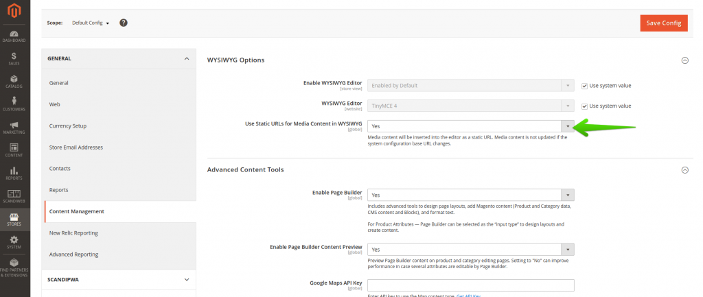
To render media directives that will be used in the widget to display the banner, enable the following configuration: Admin -> Stores -> Configuration -> General -> Content Management -> WYSIWYG Options -> Use Static URLs for Media Content in WYSIWYG.
project_root/app/code/ExampleVendor/ExampleModule/view/frontend/templates/widget/example_banner.phtml
<?php
/**
 * ExampleVendor_ExampleModule
 *
 * @category    ExampleVendor
 * @package     ExampleVendor_ExampleModule
 * @author      Firstname Lastname <[email protected]>
 */

/** @var $block ExampleVendor\ExampleModule\Block\Widget\ExampleBanner */
/** @var $escaper Magento\Framework\Escaper */
?>

<style>
    @font-face {
        font-family: 'RobotoCondensed';
        font-weight: bold;
        font-display: fallback;
        src: local('RobotoCondensed Bold'), local('RobotoCondensed-Bold'), url('media/font/RobotoCondensed-Bold.woff2') format('woff2');
    }

    :root {
        --max-example-banner-width: 1380px;
    }

    a:active, a:focus, a:visited {
        color: inherit;
    }

    .ExampleBanner {
        display: flex;
        -webkit-flex-direction: column;
        flex-direction: column;
        overflow: hidden;
        max-width: var(--max-example-banner-width);
        margin: 40px 15px;
        background-color: #f9f9f9;
        position: relative;
    }

    .ExampleBanner span {
        font-family: RobotoCondensed, sans-serif !important;
    }

    @media (min-width: 1024px) {
        .ExampleBanner {
            background-color: initial;
            -webkit-flex-direction: row-reverse;
            flex-direction: row-reverse;
            margin: 40px auto;
        }
    }

    .ExampleBanner-Description {
        padding: 20px 10px;
    }

    @media (min-width: 1024px) {
        .ExampleBanner-Description {
            background-color: #f9f9f9;
            padding: 45px 40px;
        }
    }

    .ExampleBanner-DescriptionTitle {
        font-family: RobotoCondensed, sans-serif;
        font-size: 24px;
        font-weight: 700;
        line-height: 1;
    }

    @media (min-width: 1024px) {
        .ExampleBanner-DescriptionTitle {
            padding-bottom: 10px;
            max-width: 38%;
            font-size: 32px;
        }
    }

    .ExampleBanner-DescriptionSteps {
        display: flex;
        margin: 15px 0;
        width: 100%;
        -webkit-flex-direction: column;
        flex-direction: column;
        z-index: 2;
        position: relative;
    }

    @media (min-width: 1024px) {
        .ExampleBanner-DescriptionSteps {
            -webkit-flex-direction: row;
            flex-direction: row;
        }
    }

    .ExampleBanner-DescriptionStepWrapper {
        margin: 5px 0;
        display: flex;
        -webkit-align-items: center;
        align-items: center;
    }

    @media (min-width: 1024px) {
        .ExampleBanner-DescriptionStepWrapper {
            margin: 0 5px;
            text-align: center;
        }

        .ExampleBanner-DescriptionStepWrapper:first-child {
            margin-left: 0;
        }

        .ExampleBanner-DescriptionStepWrapper span {
            display: block;
        }
    }

    .ExampleBanner-DescriptionStepContent {
        display: flex;
        -webkit-align-content: center;
        align-content: center;
        -webkit-align-items: center;
        align-items: center;
        background: #f9f9f9;
        border: 1px solid #a6a6a6;
        width: 100%;
    }

    @media (min-width: 1024px) {
        .ExampleBanner-DescriptionStepContent {
            width: 198px;
            height: 100%;
            -webkit-flex-direction: column;
            flex-direction: column;
            padding: 15px 0 5px;
        }
    }

    .ExampleBanner-DescriptionStepText {
        margin: 7px 20px 7px 0;
        font-family: RobotoCondensed, sans-serif;
        font-weight: 700;
        font-size: 16px;
        line-height: 24px;
    }

    @media (min-width: 1024px) {
        .ExampleBanner-DescriptionStepText_number {
            margin: 0 0 7px;
        }
    }

    @media (min-width: 1024px) {
        .ExampleBanner-DescriptionStepText {
            margin: 0;
            padding: 0 15px;
            font-size: 20px;
        }
    }

    .ExampleBanner-DescriptionActions .Button {
        text-decoration: none;
        display: inline-block;
        border-radius: 3px;
        font-weight: 700;
        text-align: center;
        text-transform: uppercase;
        color: #fff;
        transition-property: background-color,color,border;
        will-change: background-color,color,border;
        transition-timing-function: ease-out;
        transition-duration: .25s;
        cursor: pointer;
        border: 1px solid #000;
        background: #000;
        padding: 12px 0;
        font-size: 16px;
        font-family: RobotoCondensed, sans-serif;
        width: 100%;
    }

    .ExampleBanner-DescriptionActions .Button:hover {
        text-decoration: none;
        color: #fff;
        border-color: #c70000;
        background-color: #c70000;
    }

    @media (min-width: 1024px) {
        .ExampleBanner-DescriptionActions .Button {
            width: auto;
            padding: 12px 36px;
            border-radius: 6px;
        }

        .ExampleBanner-DescriptionActions .Button:hover {
            padding: 12px 36px;
            border-radius: 6px;
        }
    }

    @media (min-width: 1024px) {
        .ExampleBanner-DescriptionActions {
            padding-top: 20px;
        }
    }

    @media (min-width: 1024px) {
        .ExampleBanner-Description {
            width: 100%;
        }
    }

    .ExampleBanner-Icon {
        padding: 6px 15px;
    }

    .ExampleBanner-Icon img {
        width: 32px;
        height: 32px;
        max-width: none;
    }

    @media (min-width: 1024px) {
        .ExampleBanner-Icon img {
            width: 40px;
            height: 40px;
        }
    }

    @media (min-width: 1024px) {
        .ExampleBanner-Icon {
            padding: 15px;
        }
    }

    .ExampleBanner-BannerImage {
        max-height: 300px;
        overflow: hidden;
        object-fit: cover;
        z-index: 1;
    }

    @media (min-width: 1024px) {
        .ExampleBanner-BannerImage {
            margin: 0 15px;
            position: absolute;
            max-height: none;
            width: 60%;
            height: 100%;
            padding: 0;
            background-color: initial;
        }
    }
</style>
<div class="ExampleBanner">
    <div class="ExampleBanner-BannerImage">
        <img src="<?= $escaper->escapeHtml($block->getBannerImage()) ?>" />
    </div>
    <div class="ExampleBanner-Description">
        <div class="ExampleBanner-DescriptionTitle">
            <span><?= $escaper->escapeHtml($block->getBannerTitle()) ?></span>
        </div>
        <div class="ExampleBanner-DescriptionSteps">
            <div class="ExampleBanner-DescriptionStepWrapper">
                <div class="ExampleBanner-DescriptionStepContent">
                    <span class="ExampleBanner-Icon">
                        <img src="/media/wysiwyg/example_banner/add-to-cart-icon.png">
                    </span>
                    <span class="ExampleBanner-DescriptionStepText">
                        <span class="ExampleBanner-DescriptionStepText_number">1.</span>
                        <span><?= $escaper->escapeHtml($block->getStep1Text()) ?></span>
                    </span>
                </div>
            </div>
            <div class="ExampleBanner-DescriptionStepWrapper">
                <div class="ExampleBanner-DescriptionStepContent">
                    <span class="ExampleBanner-Icon">
                        <img src="/media/wysiwyg/example_banner/select-store-icon.png">
                    </span>
                    <span class="ExampleBanner-DescriptionStepText">
                        <span class="ExampleBanner-DescriptionStepText_number">2.</span>
                        <span><?= $escaper->escapeHtml($block->getStep2Text()) ?></span>
                    </span>
                </div>
            </div>
            <div class="ExampleBanner-DescriptionStepWrapper">
                <div class="ExampleBanner-DescriptionStepContent">
                    <span class="ExampleBanner-Icon">
                        <img src="/media/wysiwyg/example_banner/pay-icon.png">
                    </span>
                    <span class="ExampleBanner-DescriptionStepText">
                        <span class="ExampleBanner-DescriptionStepText_number">3.</span>
                        <span><?= $escaper->escapeHtml($block->getStep3Text()) ?></span>
                    </span>
                </div>
            </div>
            <div class="ExampleBanner-DescriptionStepWrapper">
                <div class="ExampleBanner-DescriptionStepContent">
                    <span class="ExampleBanner-Icon">
                        <img src="/media/wysiwyg/example_banner/sms-icon.png">
                    </span>
                    <span class="ExampleBanner-DescriptionStepText">
                        <span class="ExampleBanner-DescriptionStepText_number">4.</span>
                        <span><?= $escaper->escapeHtml($block->getStep4Text()) ?></span>
                    </span>
                </div>
            </div>
        </div>
        <div class="ExampleBanner-DescriptionActions">
            <a href="<?= $escaper->escapeHtml($block->getButtonUrl()) ?>" class="Button">
                <span><?= $escaper->escapeHtml($block->getButtonText()) ?></span>
            </a>
        </div>
    </div>
</div>
Clean the Magento cache after adding the code with
bin/magento cache:clean.
8. Add the widget to a CMS page
Create the CMS page and drag the Text element to the page. If you are updating an existing page, you need to add a row element first. The same drag-and-drop pattern applies when you place widgets in Magento categories or other layout positions.
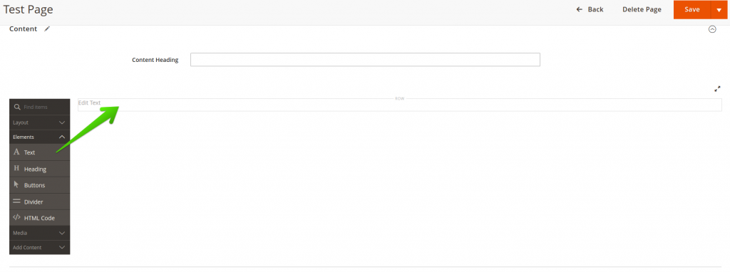
Click on the added element on the page, and click on the Insert Widget button.
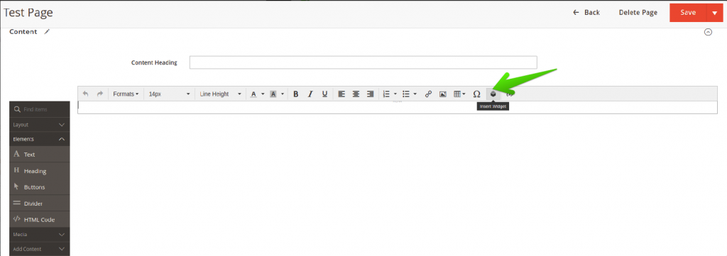
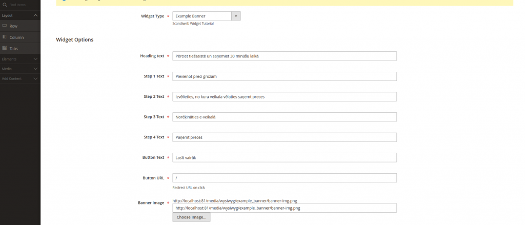
Configure the widget.
Save the widget configurations and the page.
🚀 Quick takeaway
Step 8 is where the payoff lands. Once the widget is built, a store admin places and configures it from the CMS page editor with no developer involved. That is the whole point of building it as a widget rather than a one-off block.
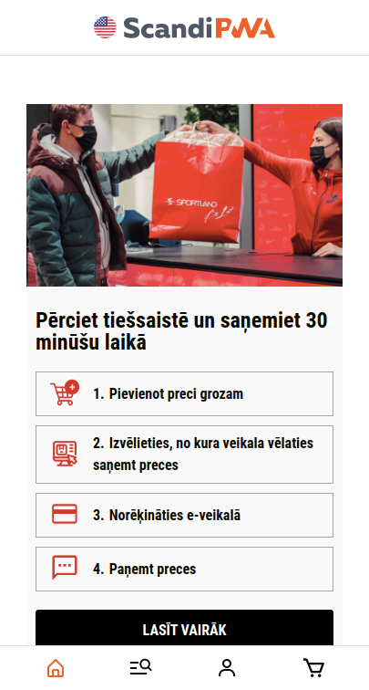
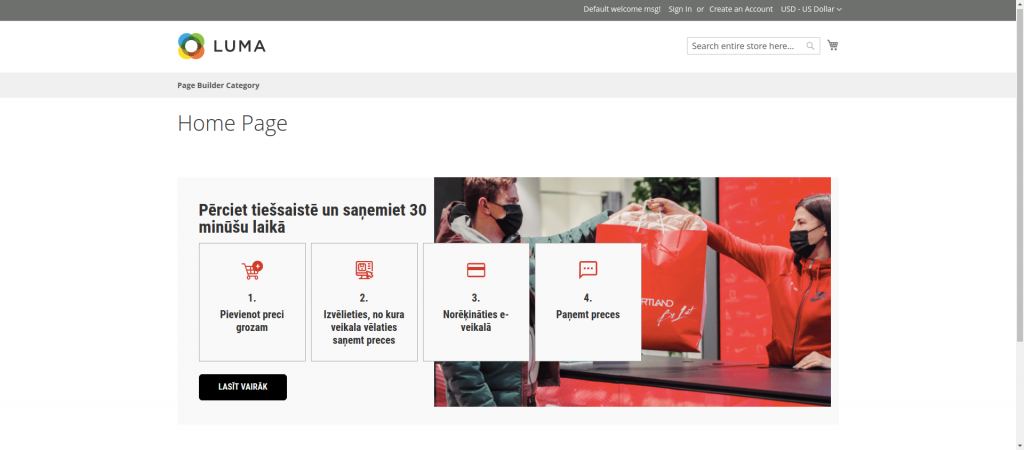
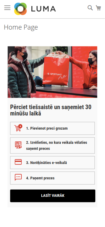
9. Test the CMS page on the frontend
Open your CMS page, and see the widget rendered on the CMS page. The screenshots below show the same widget through a headless frontend and through the standard Magento backend render.
Frontend component render
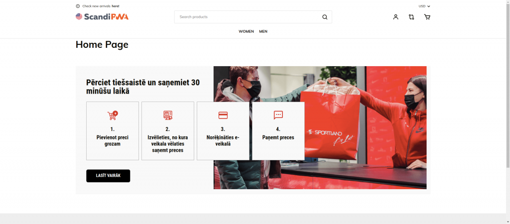
Magento 2 backend render
Building widgets on current Magento versions
The code in this guide holds on the current Magento Open Source and Adobe Commerce 2.4.x line. Version 2.4.8 was released on April 8, 2025 as a long-term-support release supported through April 2028, requiring PHP 8.3 as a minimum and supporting PHP 8.4, MariaDB 11.4, and MySQL 8.4 (Adobe Experience League release notes). A later 2.4.9 release followed. The widget APIs used here, BlockInterface, widget.xml, and PHTML rendering, are stable across these versions.
A widget that injects a heavy banner on every page can still slow a store down, so test render weight before you go live. If a build adds noticeable load, our Magento performance work covers the audit and the fixes.
From January 2026, Adobe moved to a new release cadence: monthly isolated security patches as needed, one major version per year released in May, and aggregated security patches twice a year in May and November (Adobe Commerce release versions documentation). If you are weighing whether the platform is still a sound long-term choice, our take on whether Magento is dying covers the roadmap and adoption picture in detail.
🚀 Quick takeaway
Widget APIs have stayed stable across the 2.4.x line, so a widget you build today should keep working through future patches. Pin your environment to PHP 8.3 or 8.4 and test against the LTS release before you ship to production.
Frequently asked questions
What is a Magento widget?
A Magento widget is a snippet of code that places editable content at a chosen block reference position in a store. A store admin configures it from the admin without further development, while the underlying block holds the content and rendering logic. Banners, carousels, and calls to action are common widget use cases.
What is the difference between a widget and a block in Magento?
A block is the content and its rendering logic. A widget is the configuration layer that controls where the block appears and which fields an admin can edit. The block answers what is shown. The widget answers where it shows up and who can change it without code.
How do you create a custom widget in Magento 2?
Declare the widget in etc/widget.xml, add a Magento_Widget sequence in etc/module.xml, build a block class that extends Template and implements BlockInterface with a $_template property, create a PHTML template, then run bin/magento cache:clean. This matches the official path in Adobe’s Create a Custom Widget tutorial.
Does a Magento widget work with a headless or Hyva frontend?
Yes. The same widget definition works for the standard Luma or Hyva frontend through PHTML rendering, and for a headless React frontend by passing block data to a component. Hyva is the common modern non-headless frontend today, in which case you use the backend PHTML render shown in this guide.
Do I need a widget preview in the Magento admin?
Only if your editors want to see the widget before publishing. If a preview is required, use the Magento PHTML rendering approach so the widget renders in the admin. If it is not required, the frontend component approach is lighter and fits headless setups well.
Does anyone still use Magento?
Yes. Magento Open Source and Adobe Commerce remain in active use, with version 2.4.8 released in April 2025 under long-term support through April 2028 and a yearly major-release cadence from 2026. scandiweb runs one of the largest certified Magento developer teams, with 600+ experts and 894+ Adobe Commerce and Analytics certifications.
Build a Magento widget once and reuse it everywhere across your store. If you want help to design, build, and ship reusable components your marketing team can manage on their own, extend your store with our certified Magento developers.

Share on: