The add-to-cart moment is no longer just a functional step in the buying journey — it’s a critical decision point where intent can either be reinforced or lost.
In 2026, users move fast, shop across devices, and expect immediate, clear feedback when they take action. Adding a product to the cart should feel unmistakable, reassuring, and momentum-building. When that moment is unclear, delayed, or easy to miss, even high-intent shoppers can lose confidence, get distracted, or abandon the purchase altogether.
That’s why add-to-cart UX has evolved from simple confirmation patterns into a powerful conversion lever. When done right, it reassures users, reduces friction, and subtly nudges them toward checkout — without feeling pushy.
Below, we’ll break down modern add-to-cart best practices that help turn buying intent into completed purchases in 2026.
1. Emphasize the cart icon
It isn’t enough to just add a small number to the cart icon to indicate how many products have been added to the cart. Once products are added, the cart icon should also change in color—making it more prominent—so it catches the user’s attention more.
The add-to-cart button itself should reflect its state clearly too: a loading indicator while the item is being processed, a brief success state once it’s confirmed, and a disabled state if something is out of stock. These micro-interactions remove doubt, so users shouldn’t have to wonder if their click registered.
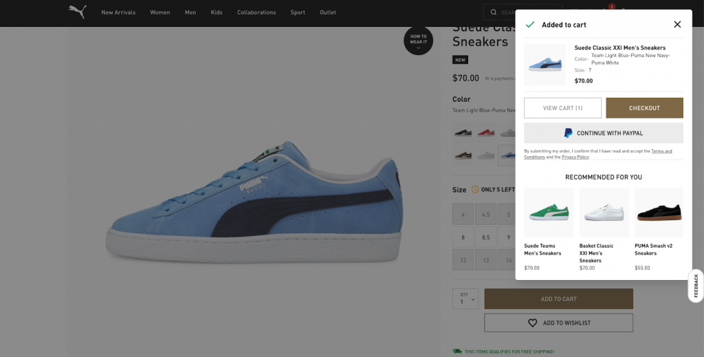
2. Show a mini cart or a cart pop-up
In addition to an emphasized cart icon, there should be a prominent event on the page when the user adds a product to the cart. And the add-to-cart moment can be highlighted by displaying a mini cart or a cart pop-up.
A mini cart can appear in different ways, but here are two examples:
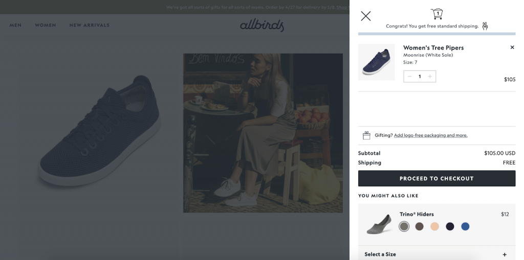
- As a notification box originating from the cart icon. The box usually shows which product was added to the cart (photo + title), item quantity, order subtotal, and CTAs to Checkout or View Cart
- As a slide-out mini cart. As users add products to the cart, an animated cart slides out, usually from the right side of the screen. It shows the same information as above but works especially well as the animated movement on the page is very prominent. Even better, the rest of the screen is grayed out until the mini cart is closed—so the add-to-cart event cannot be missed.
An alternative to the mini cart is the cart pop-up. Instead of sliding out from either the cart icon or one side of the screen, the cart pops up in the middle of the screen. Of course, it shows the main cart information and the CTAs, too. And it’s hard to imagine how a user can miss it when they have to close the pop-up first before they can continue shopping or take any other step.
This might be considered as an additional step between adding a product to the cart and the checkout; then again, it guarantees that the user doesn’t miss whatever is added to their cart.
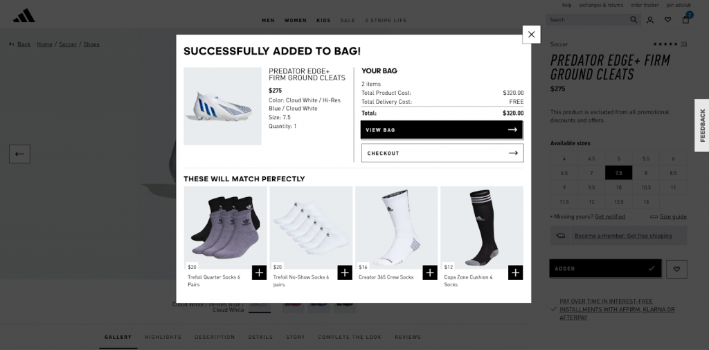
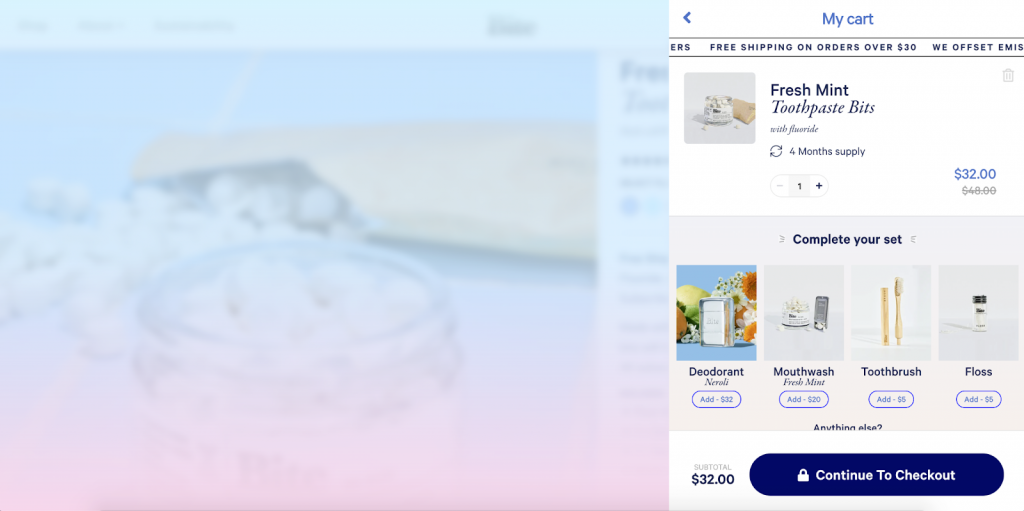
3. Upsell and cross-sell
The primary goal of the mini cart is to communicate to the user what is added to their cart and the cart subtotal. Nevertheless, the mini cart is also a great opportunity to use upsell and cross-sell techniques and nudge the user to spend more.
The trick is to make this additional shopping experience as smooth as possible—users should be able to add more items to the cart with just one click.
For 2026, AI-powered recommendation engines have largely replaced static “frequently bought together” blocks. Suggestions based on the user’s browsing history and current cart composition tend to convert better, because they’re relevant to that specific shopper, not generic across the board.
4. Communicate benefits
To encourage users to finish the purchase, it works to communicate to them the additional benefits they are getting. For example:
- If the user qualifies for free shipping, let them know.
- If users will get free samples or other gifts when they meet certain conditions, they should be clearly informed about it so they can have more motivation to move along the user journey.
- If the products have great reviews or extended guarantees, they can be communicated as reassurance for users that they won’t regret their purchase.
- If the company accepts returns, emphasizing it will help users who still have doubts about a purchase feel more comfortable proceeding with the order.
5. Add express checkout options
If express checkout options are available, they should be communicated right in the mini cart or cart pop-up. It makes it more convenient for users to complete the checkout, thus providing a better shopping experience for them. Instead of going through the checkout page, they can proceed to complete their purchase right from whichever page they are currently.
Buy now, pay later options (Klarna, Afterpay, Affirm) are worth surfacing here too. For higher-ticket items especially, seeing a BNPL option in the mini cart can be the deciding factor. Many shoppers won’t make it to the checkout page to discover you offer it.
6. Reinforce intent with smart, contextual feedback
In 2026, static confirmations are no longer enough. Users respond better to contextual, real-time feedback that reflects their situation.
This can include:
- Messaging that adapts based on cart value (e.g. progress toward free shipping)
- Dynamic reassurance such as delivery estimates or stock availability
- Personalized recommendations based on browsing or cart history
The goal isn’t more information, it’s relevant information that reinforces the decision the user just made.
7. Optimize add-to-cart for mobile-first behavior
Most add-to-cart interactions now happen on mobile, where attention spans are shorter and screen space is limited.
Effective mobile add-to-cart UX should:
- Keep feedback within the thumb zone
- Use sticky or persistent add-to-cart elements on long product pages
- Avoid full-screen interruptions unless they clearly add value
If users have to hunt for confirmation or struggle to reach the next step, friction creeps in fast.
8. Reduce friction with persistent and cross-device carts
Shoppers rarely complete purchases in one session or on one device. Losing cart state means losing momentum.
Best-in-class add-to-cart experiences in 2026:
- Persist carts across sessions and devices
- Restore cart contents instantly when users return
- Clearly communicate that items have been saved
This continuity reassures users and removes the mental load of “starting over.”
9. Show loyalty points at the cart stage
If your store runs a loyalty or rewards program, the mini cart is one of the best places to surface it. Showing users how many points they’ll earn on their current order — right at the moment they’ve just added something — gives them a reason to complete the purchase that goes beyond the product itself.
“You’ll earn 240 points with this order” is a small line of text that can meaningfully affect follow-through, especially for returning customers. Most stores only surface loyalty information post-purchase or in account dashboards. Moving it to the cart stage, where the decision is still being made, is a simple change with a real impact on conversion and repeat purchase behavior.
10. Use scarcity signals — but only when they’re real
“Only 3 left in stock” or “12 people are viewing this” shown in the mini cart at the moment of adding can reinforce the timing of a purchase decision. The key word is real — manufactured urgency is easy for shoppers to spot, and it damages trust more than it helps conversion.
When stock levels are genuinely low or demand is high, saying so clearly and matter-of-factly is one of the more effective nudges available at this stage. It’s not about creating panic — it’s about giving the user accurate information that happens to support the decision they’re already leaning toward.
Wrapping Up
In 2026, great add-to-cart UX is all about reinforcing intent at exactly the right moment.
From clear visual feedback and mini carts to smart personalization, mobile-first design, and frictionless checkout paths, every add-to-cart interaction should move the user forward with confidence. Small improvements at this stage can have an outsized impact on conversion rates and average order value.
When the add-to-cart experience is clear, fast, and reassuring, users don’t just add items — they finish what they started. And that’s where consistent, scalable growth really begins.
If you need help implementing these improvements in your eCommerce store, get in touch with Scandiweb’s Growth Team today. Book a free consultation to learn about our conversion optimization program and how we can help you achieve your conversion goals.

Share on: