The experience you provide on your site can either make or break your relationship with customers.
With stakes this high, relying on intuition alone to guide website enhancements can be risky. This is where A/B testing, a scientific approach to website optimization, proves its worth.
A/B testing any changes helps you ensure that the ones causing a drastic KPI decrease will not be implemented on an ongoing basis. You also gain knowledge about user behavior on your website and how visitors react to certain design elements, visual content copy, and functionality. A/B testing allows you to safely test even the craziest ideas and let the data determine the strategy.
Here’s how we do it for one of our clients.
About the project
Since last November, we have embarked on a comprehensive CX (customer experience) optimization program for a major wine distributor in the US market. From February onwards, we have been actively running A/B tests across five of their websites.
This client wanted to identify CX bottlenecks on multiple websites and validate the improvements with A/B testing using Adobe Target—a tool that fits their current ecosystem.
Project goals
- Improve conversion rate for all client’s brands
- Drive personalization efforts for various user segments
- Decrease abandoned cart and abandoned checkout rates
- Turn one-off purchases into active subscriptions
- Increase the average order value
- Get more insights into customer behavior
Our hands-on experimentation has grown to 8-10 tests per month. Early challenges to optimize our testing processes were quickly turned into opportunities for learning and improvement. A few months in, more than half of our tests have resulted in the new variant outperforming the control, with 70% of all tests identifying a winning variation.
Approach
A/B testing enables us to refine and optimize web experiences and test new features, page layouts, visual design, and content to identify a version that works best for a targeted group of users. Next, we’ll detail our approach to A/B testing and share highlights from this optimization program.
A/B testing program
For this client, our journey began with an in-depth discovery session, bringing together key business stakeholders from the client’s side to learn about the business and align our testing objectives with their strategic goals and vision.
We then conducted a quantitative analysis to uncover key drop-off areas on the website by looking at:
- User demographics and behavior patterns
- Device and technology performance
- eCommerce dynamics—product & category performance, shopping, and checkout funnels
- Content effectiveness and site search performance
- User interactions and custom events.
Given the variation in styling across the client’s multiple websites targeting different markets, our approach involved conducting in-depth expert analyses customized to each market’s specifics.
To complement our data-driven approach, we gathered real-time feedback directly from site visitors with on-site polls and targeted surveys.
Once the roadmap was confirmed, we proceeded to prepare designs with clear instructions for the developer regarding the required input.
Setting up and running the test
Depending on the test’s complexity, a dedicated A/B test developer is responsible for setting up tests from the A/B testing tool’s visual editor and backend.
Each experiment is closely monitored via a live, interactive dashboard, allowing us to track performance in real-time. The tests are designed to run until they achieve:
- A duration of at least two weeks
- Over 300 conversions for each primary segment of the variant
- Statistically significant results.
A/B test analysis
To ensure the reliability and validity of the results, we perform manual and segmented analysis, looking at experiment performance split by device types and using Frequentist and Bayesian statistical methods. Then, a detailed report with findings and strategic recommendations is delivered to the client.
Let’s take a look at some highlights of the A/B tests we’ve already conducted and analyzed for our client.
Main CTA prominence on the PDPs
The prominence of the “Add to Cart” button on PDPs (product detail pages) plays a critical role in the purchasing process. The better users see it, the easier it is for them to interact with it, simplifying the path to purchase.

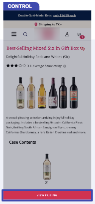
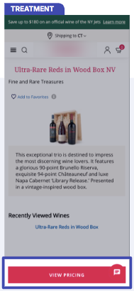
Results
- +16% view pricing CTR
- +7% add-to-cart rate
Free gift threshold in shopping cart
A free gift threshold in the shopping cart page is a compelling incentive for customers to complete their purchases, motivating them to add more items to their cart to qualify for the gift therefore increasing the AOV (average order value).

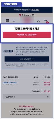
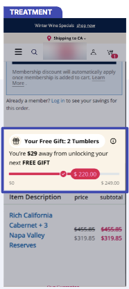
Results
- +25% average order value (website A)
- +46% items per order (website A)
- +31% average order value (website B)
- +34% items per order (website B)
New design for customer marketing landing pages
The previous CMLP (customer marketing landing page) design appeared outdated and lacked the ability to effectively guide customers toward making a purchase.

Results
- +20% total purchases (website A)
- +66% user engagement rate (website A)
- +102% purchases (website B)
- +111% user engagement rate (website B)
- For website B, the control landing page drove 48 sign-ups vs the treatment, which drove 100 wine club sign-ups in the same time period.
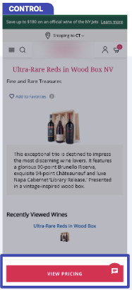
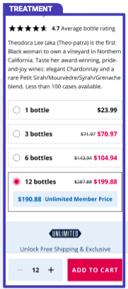
Exposing pricing panel on product pages
Building on the enhancements to the add-to-cart button on single-bottle PDPs, we wanted to test a new styling option for the pricing panel, making the pricing information more user-friendly and accessible.

Results
- +56% add-to-cart rate (website A)
- +64% purchase revenue (website A)
- +55% add-to-cart rate (website B)
- +40% purchase revenue (website B)
Results
Over the course of our collaboration, we have conducted 23 (and counting) A/B tests using Adobe Target, with a 70% winning test ratio. Considering the substantial size of the business group and their annual revenue predominantly from eCommerce, these successful tests represent a significant potential impact on revenue.
Strategic A/B testing has facilitated an additional potential annual revenue gain of $4.2 million per year, given that the client implements winning variants and the user behavior remains the same.
This project is a great example of the value of proper UX research and A/B testing strategy. While many initially view A/B testing as a tool for securing quick wins, our ongoing approach illustrates the benefits of a lengthened and thorough experimentation program.
Explore our popular eCommerce services
Are you ready to explore what data-driven A/B testing can do for your business? Send us a message and uncover new growth opportunities with a tailored experimentation program!

Share on: