Over the years we had far too many cases where eCommerce stores do a revolutionary redesign of their website, without any proper research prior to that. The result is the same in almost every case – the main store KPIs go down by ~40%, sometimes even more. Even with adequately researched redesigns, a decrease in KPIs is pretty much guaranteed – people dislike change, and the bigger the change, the bigger the revolt.
So, how do you redesign your website to retain new customers, keep loyal visitors happy and increase revenue?
The answer is simple, you follow the evolutionary redesign approach. To put it plainly, you research:
- what works on the current website & what your customers like – you leave it as it is;
- what causes friction in the customer journey – you improve or remove it;
Whenever possible we follow an evolutionary redesign approach, as we’ve seen it helps to improve user experience, user flow on the website and overall store growth.
It works and here’s a case study to prove it. Scandiweb applied the evolutionary redesign approach for a leading Scandinavian accessories and jewellery eCommerce store.
Evolutionary Redesign Case Study
We received a request from the client asking to help in updating their website: make it look more modern, smoothen customer flow, and of course improve the performance.
We jumped on the project right away starting with research, which consisted of 3 big parts: data analysis, heuristic evaluation, and user tests.
RESEARCH:
1. Data Analysis:
First, we conducted quantitative data analysis to make sure all forthcoming design decisions are data-driven, evidence-based and exclude biased opinions. Here are some numbers we discovered:
- 38.38% of sessions, where a product was added to cart proceed to Checkout (61.62% cart abandonment rate).
- Sessions, when search is used (~8% of all sessions on desktop), have a 0.9x higher likelihood of conversion (CR of 3.4% vs. 1.8%).
- 11.22% of users who visited the Product details page added the product to their cart.
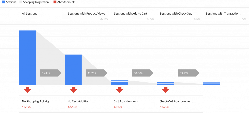
Therefore, as the main areas ripe for improvement, we marked the following:
- Product-to-cart rates
- Cart-to-checkout rates
- Sessions with search increase
2. Heuristic evaluation
Data analysis was followed by Heuristic evaluation, which is a website walkthrough to identify reasons behind low KPIs, uncover usability issues, and spot ‘low-hanging fruits’. Here’s what we discovered:
- Users did not receive any confirmation that their selected product was successfully added to the cart, therefore they were not nudged to proceed to the cart from the product page, hence the high product-to-cart drop off rates.
- Brand and product advantages were not leveraged, therefore prospects were not convinced that it is safe to invest in the brand.
- Search did not stand out in the visual hierarchy, therefore many users might have not noticed it.
- The homepage did not have any value proposition and did not show the range of sold products.
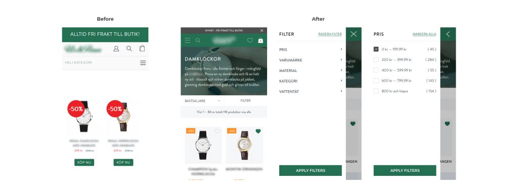
- Filters were missing on mobile category pages, hence users struggled to easily find a product that would meet their needs.
3. User tests
After data analysis and heuristic evaluation were completed we decided to evaluate our hypotheses by conducting remote user tests. For that, we used the online tool Try My UI, where anonymous users that represent our client’s target audience were given certain tasks and instructions to test the website. User tests included a 5-second usability test and 4 main tasks to:
- Explore the Homepage and tell what is the brand’s value proposition
- Find a specific product based on provided criteria
- Check product availability in a physical shop
- Proceed to checkout and evaluate it
Here are a few insights from customer tests for each of the tasks:
Exploring homepage:
…No, so it’s not immediately clear what website sells, it’s not clear from the main two pictures. Images do not show watches or jewellery, they show people…
[User 1 – desktop]
Looking for a specific product:
…Honestly, I really have a good laptop, a good screen, but it’s very hard to read, people with older laptop or screen are pretty lost with those filters…
[User 2 – desktop]…It takes some time to find the product based on the attributes in the task, as the only way I could find it was to scroll the page and look at each product whether it is the one…
[User 3 -mobile]
Product availability in store:
…It is quite comfortable, I choose a store and see if the product is available, it is in stock, and here is availability for the closest store. It is quite easy to find, honestly. Very convenient, I have to say, not all the websites do it that conveniently. I like it …
[User 2 – desktop]
User tests confirmed our hypotheses that there is a need to rework the value proposition on the Homepage, change fonts and its size, as well as implement mobile filters as soon as possible.
In the meantime, we saw that users like the “Product availability in store” functionality, so we decided to slightly adjust the styling, while keeping the functionality logic unchanged, thus saving development time and resources.
Wireframing:
With the research complete, we had a clear idea of what needs to change and what needs to remain untouched. We started the prototyping process to assemble the user journey, content, existing & new functionalities.
The result was 52 desktop and 68 mobile wireframes ensuring that the entire user flow was thoroughly thought through. After discussions with the client, the final wireframe versions were adjusted and passed to designers to create the new evolutionary designs.


Iterative design approach:
Designers created website designs delivering several versions for each page to do quick usability tests in order to determine which variant performs best.
Here are the before and after of the main redesign areas highlighted above:

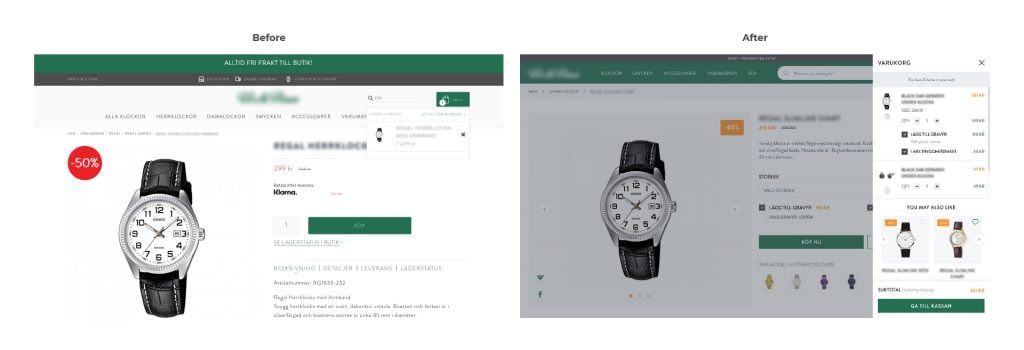
1. Cart Dropdown
The previously barely noticeable popup turned into a prominent cart slider with upsells and replaced the separate cart page to speed up the flow.
2. Search Bar
The header was completely reworked to make the search bar prominent and noticeable. Thus encouraging use.

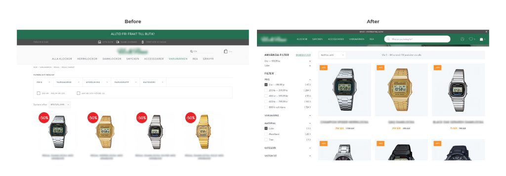
3. Filters on desktop
The filter was changed to be more user-friendly, allowing customers to review & edit chosen attributes at any part of the page.
4. Filters on mobile
Implemented filters on mobile.
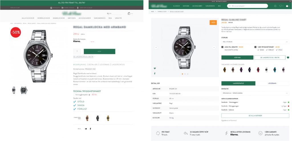
5. Product details page
Upsells were placed above the “Add to Cart”; a secondary CTA was added to make product availability in the store more noticeable; brand values and advantages were added to convince users that they can trust the brand.
Conclusion
An evolutionary redesign can be more beneficial to your business then a revolutionary one. It has multiple advantages, such as:
- It keeps everything your customers like and use
- It is more cost efficient
- It avoids a steep learning curve (time users need to adapt and learn how to use completely new system)
- It is targeted at your site’s weak points and fixes those with laser-precision.
Results
After 4 weeks of new designs going live, we’ll be able to evaluate the results of our work. That’s 2 weeks from now so stay tuned for the nail-biting finale!
Are you thinking about updating your site/store design? Get in touch with Scandiweb’s marketing department at [email protected] and let’s follow an evolutionary redesign approach together! Visit cro.scandiweb.com for more information.
Related articles
How to do Heuristic Evaluation to Increase Your Revenue
Case Study: User Personas building for a luxury clothing company


Share on: