According to Oracle research, 86% of buyers would pay more for a better brand experience. At the same time, according to Salesforce, only 36% of buyers feel like retailers know them. So, the main question is how to increase the number of users who find the website made for them, hence increasing their willingness to spend more.
Our answer is to do user research and create user personas that reveal the main opportunities. Since examples help us understand the process better, in this article, you can read about our experience building user personas for a luxury clothing store in the USA.
What are user personas?
Before we dive into the case study with examples of user personas, you might be wondering what user personas are.
User personas are detailed profiles that represent typical product or service users. They are created from actual data and research to encompass demographics, behaviors, goals, motivations, and challenges, helping businesses understand and empathize with their target audience and guiding decisions in marketing, product development, and user experience design. Companies can tailor their strategies to meet their customers’ distinct needs and preferences if focused on specific user personas.
Case Study
Phase 1—Demographics
When we started the CRO research for building user personas, we didn’t know much about the website’s target audience since the description of “luxury clothing company from the USA” can include many important details. The first step was to understand the basics and nothing is more basic than demographics.
By using Google Analytics data, we found that the main transaction makers were men from the USA. However, more interesting data was found when analyzing the age of customers—about 65% of all transactions and more than 60% of revenue were made by gentlemen in the age group of 55–65+, which points to a different website using and purchase behavior when compared with a younger audience, i.e., in terms of knowledge of how to use specific functionalities.

Phase 2—Purchase Behaviour
The next step was to find as much as possible related to purchase behavior. So, we started with a customer survey to understand where customers look for ideas and inspiration before making a purchase.
Again, we were surprised that when the respondents were able to choose more than one option, the most popular choices were “Catalogs” and “Fashion Magazines.” At the same time, only 6% of respondents made purchases on a catalogue released by the client, while the majority of respondents made purchases on the website we did the research for.
Another valuable finding from the customer survey was that more than half of respondents make purchases on the website multiple times per month. Therefore, special attention should be paid to emphasizing “New” collections or items, and users should be able to find specific items and overlook categories without extra effort.
Finally, we wanted to understand how users consume products provided by the brand. The data of online orders showed that the top three most bought products were shirts (1), jackets (2), and pants (3), which made up almost 70% of all orders. Because of the high purchase data, these categories can be used when planning monthly promotions, seasonal campaigns, or deciding on category blocks on the homepage.
Phase 3—Motivation and Concerns
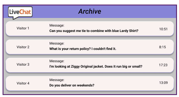
After understanding the main characteristics of the website users and their interests, we wanted to find out more about the reasons why they are buying clothes exactly at this store and what are the main pain points that distract users from making a purchase. At this point, we read LiveChat transcripts and SurveyMonkey post-purchase surveys, analyzed User Interviews and Heatmaps, watched a lot of user session recordings, and talked with Customer Service.
Our summary of findings revealed that there are 3 main reasons why customers prefer this store:
- They appreciate the style of clothes—they look professional and fashionable, and the items are high-quality but still feel comfortable.
- The website allows users to easily find matching items and create a set, hence customers can look good without spending too much time finding the perfect outfit.
- Many customers appreciate the ability to have a chat with fashion consultants to create personalized clothing or adjust items according to their sizes.
When analyzing the complaints and questions, we discovered three main pain points:
- The first one concerns the fit of the item. Unlike in a real-life clothing store, users can’t touch the item, try it on, or evaluate details, e.g., color, in an eCommerce store.
- Users are worried about delivery times. During user interviews, one participant said, “I want to buy the item NOW.” Hence, the delivery policy should be clearly explained.
- Potential customers are worried about the price-quality relationship. As this is a luxury store, the price level is high. Because of that users are worried if they’ll have any options to return an item and get their hard-earned money back. This means that any information regarding the return policy should be easy to find.

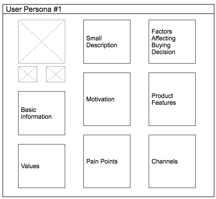
Thanks to this information, we were able to divide two customer types to focus on when planning a user journey. Here are specific user personas examples.
User Persona #1 who:
- cares about high-quality items
- pays attention to small details
- wants to wear an item today
- visits fashion consultants.
User Persona #2 who:
- is looking for sale items
- before making a purchase on the client’s website, will check other websites and department stores to find the best deal
- does not want to spend extra money on additional services.
Phase 4—Other factors
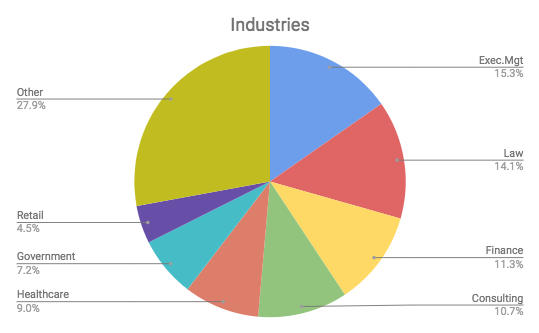
In this phase, we prepared a summary of other factors that might affect purchase decisions but are not crucial when planning conversion rate improvements—what professions users have (customer survey), how they spend their free time (customer survey), how seasonality affects purchase behavior (Google Analytics) and what customer characteristics can be found in social media (Instagram), e.g., how customers feel when they are wearing the brand and if there is a social proof that might affect buying decision.

Final outcome—User Personas
The final step is to summarize all the insights. After user research, we had a clear understanding of the website’s main target audience, what users expect from the store, what motivates them, and what stops them—a lot of helpful information to consider when planning website improvements. The next step was to plan the user journey, but this is already a different case study.

Lessons learned
- Usually, when thinking about Data Collection and Storage Services, the main task is to create a fictional character with many details that would describe an actual customer. Therefore, sometimes marketers might focus on finding as much information as possible instead of discovering the most important user journey-changing details. That leads to distraction from actual motivation to play with or pain points to solve.
- Another detail to keep in mind is that fictional characters should be built only because it is a way how to structure the findings in an easy-to-perceive manner. It does not describe an actual persona or customer. What’s more, when planning further activities marketers should not limit themselves to one type without taking into account that there might be exceptions or situations when the personas will overlap.
If you have other tips and tricks for building user personas, share them with us by writing to [email protected]!


Share on: