
Already back in 1986 in a study sponsored by 3M, it was found that presenters who used visuals are 43% more effective in persuading the audience.
Together with an increase of available data, the importance of its visual presentation has massively enlarged. To meet the demand from data enthusiasts, Google developed a powerful solution for data visualisation — Google Data Studio, which allows its users to create convincing and visually appealing reports like one below.
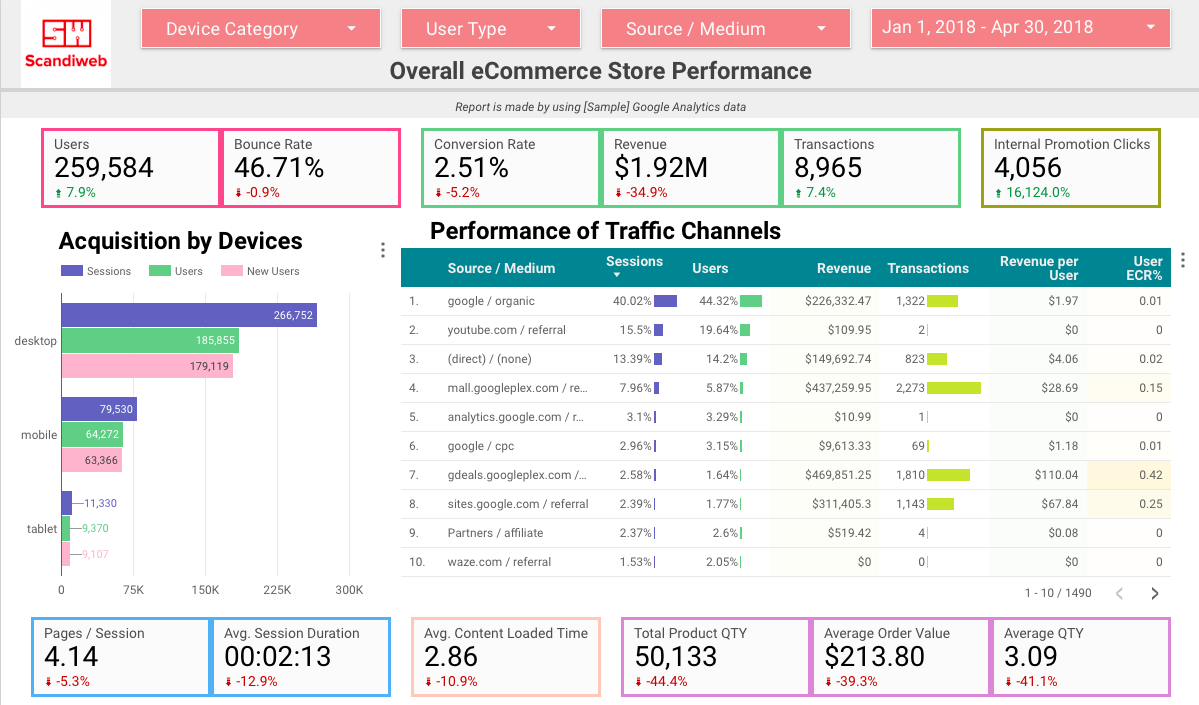 eCommerce Store Performance by [Sample] Google Analytics data
Why use Google Data Studio for Data Analytics?
- Broad data visualization options — there is a wide variety of data visualization options, which makes data analysis easier than in Google Analytics interface.
- Dynamic updates — the dashboards are linked to the Google Analytics (GA) data, so all data is updated automatically by pulling data from the GA database.
- Multiple sources — custom report can be built and visualized by linking different data sources and combining various dimensions and metrics.
- Easy to share access — visualized data can be shared with different parties without granting access to the specific data sources e.g. GA
If I convinced you to create your first report, follow the steps described in the next paragraphs.
How to create a good data analytics report in Google Data Studio?
1. Understand the purpose of the report —
why are you making it, what data you want to include, and what will you do with results.
At first, you might be surprised by how much information you can include in one report and what unexpected combinations of dimensions and metrics you can create. Doesn’t this sound amazing?
Now imagine a report with dozens of pages, full-filled tables with small numbers, overloaded line-charts where lines are so small that you can’t see the difference between them and dual-axis charts that have no sense. Not so amazing anymore. To avoid ending up with a report like this, start with planning and find answers to questions like these:
- What is the main reason for making the report?
- What kind of information do you want to visualize — basic or specific?
- Who will read the report and what is the knowledge base of the reader about the topic?
- What will you do with the results of the analysis?
2. Create a report in Google Data Studio
When you have an overall impression of what information report should include, create a new report or make a copy of the existing one if a few improvements need to be done. There are plenty of good how-to articles about creating a report or even templates to copy, therefore I won’t focus on this.
However, I do suggest you to check the articles and examples even if you don’t need them — you can find some interesting and creative ideas of how to visualize information e.g. how to build a shopping behavior funnel or which color scheme to use, or which filters to place in a header. Inspiration never hurts, right?
Now you should choose which data will have the biggest impact on your next actions and will be easy to understand at the same time. In the toolbar, you can find 11 data types to use. Think big and don’t stop with metrics or dimensions you see in a list — you can use segments, filters or create custom metrics and dimensions by custom formulas. Try not only different combinations but also different ways how to visualize data — e.g. maybe combined bar & line chart will be easier to read than a table.

At the same time, always remember about the eye-hurting view you visualized at the beginning of reading this article — don’t do this to yourself and other report readers as well. In order to create an easy to read report follow two simple rules:
1. All combinations and visualizations should make sense. Despite how the magical data combination you have created looks impressive, it should give clear and true insights of what to do next. Otherwise, the beautiful traffic acquisition chart might be guilty of profit lost in next quarter.
2. Less is more — don’t make one page overloaded with too many data. The report should be easy to read — that is why you made it in Google Data Studio and not in a spreadsheet. If one page will be stuffed with a lot of information reader won’t understand where to look and to what pay attention. Better create two pages with the same topic and surround data with spaces around.
3. Make your report visually appealing
So you have added the most appropriate data and the job should be done. No, you are only in the middle. Making report visually appealing is as important as adding correct data. Look at this step as your chance to create a story based on data — you can structurize elements in the order which would share surprising details, you can emphasize specific elements e.g. only 2 bars from the whole 10-piece bar chart, you can add colors that sometimes will explain more than words and so on.
Remember that reports in Google Data Studio are easier to understand than spreadsheets or Google Analytics Custom reports because you can change data format from boring tables to at least tables with different color heat maps in them. Think creative and change colors, sizes, fonts, add pictures.
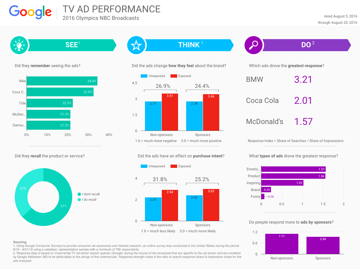 Google Data Studio template – TV Ad Performance report
4. Make sure the data in the Google Data Studio report is correct
Data visualizations should motivate the report’s reader to listen to you more. However, you risk losing someone’s trust without checking added data. If you’ll provide false data, followed actions will not give expected results or might even make them worse.
To avoid this, compare the data you added in the report with e.g GA data — some metrics will be easier to compare (like sessions, users, transactions) and some might need a custom report. Even though it takes time, it is necessary in order to make trustworthy statements and suggestions.
Also, share the report with a colleague and ask him to evaluate the report. It will take some time until you’ll finish the report and you’ll be focused on something specific. Because of that, there might be details you didn’t think of e.g. data combinations. What’s more, a colleague will look at the report with a fresh eye and might point to combinations that do not make sense or are not necessary.
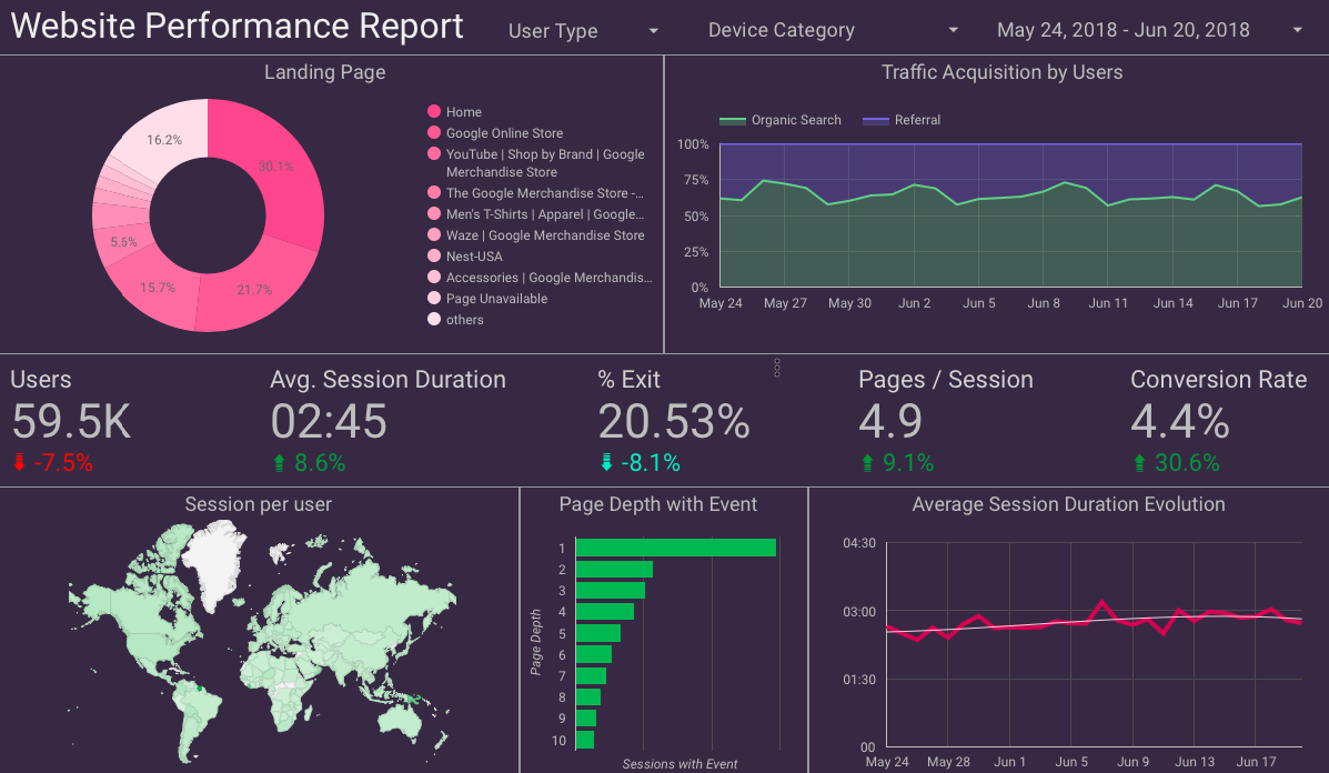 Website Performance Report by [Sample] Google Analytics data
Congratulations, the report is done! Hopefully, the suggestions above helped you to find not only a way of how to get 43% more persuasive but also how to find insights that will improve business you work on.
Need any help with creating Google Data Studio reports? Or data analytics services? Shoot us a message at [email protected] or find out more about our data analytics services here!

Share on: