A hero banner is a large image that is prominently displayed at the top of a website, usually spanning the full width of the page. It is also sometimes referred to as a hero header or hero image.
The hero banner is used to communicate the most important content of the page and should have a clear call to action (CTA).
Why are hero banners so important?
Similar to how physical stores in the pre-Covid world tried to create different types of unforgettable in-store experiences, eCommerce companies use the hero banner to help provide a meaningful experience for their online patrons.
The hero banner is usually the first thing a user will notice on a website, so it plays a major role in setting the right mood for your visitors. If you want your customers to be mesmerized by your brand and products, inspiring them to take action, you should make good use of your hero banner.
There are so many things we want the hero banner to accomplish, but users really only spend milliseconds to take it all in. So keep that in mind when planning your own hero banner.
Good examples of hero banners
1. Product-based hero banners
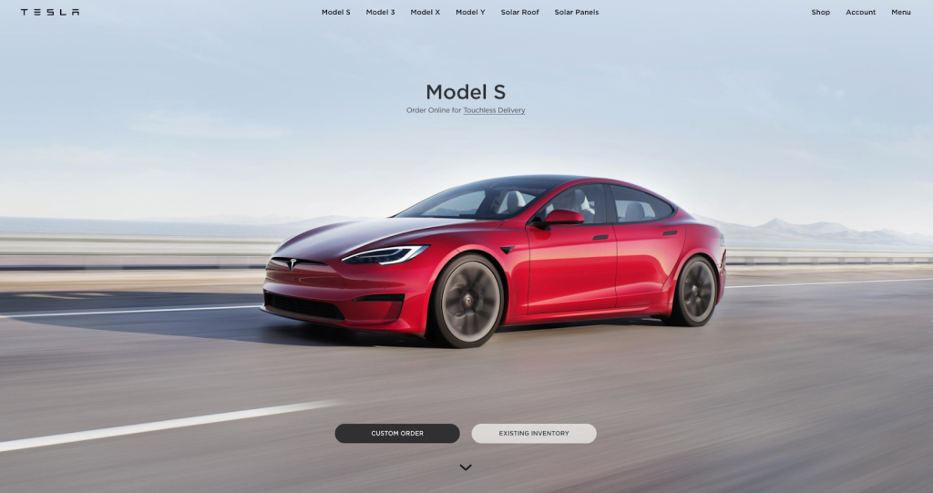
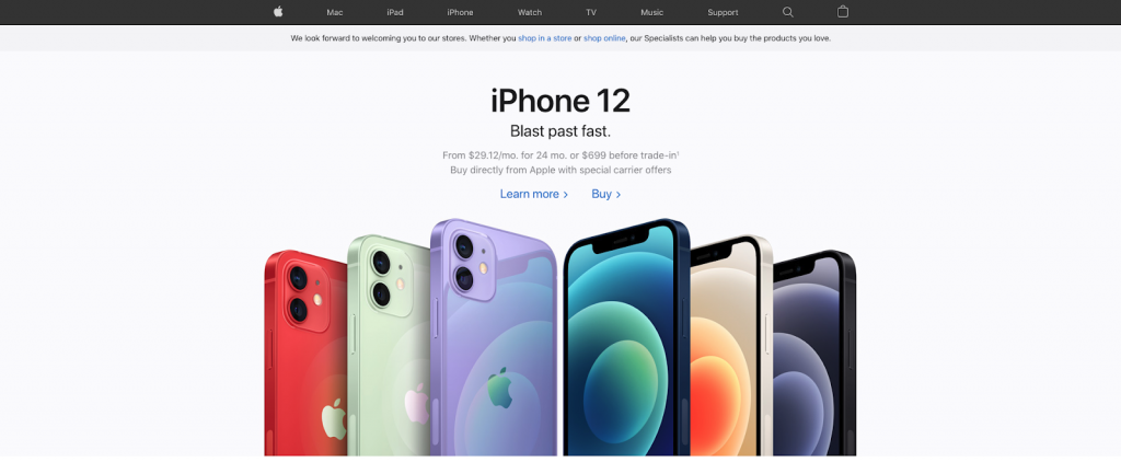
Companies with physical products have the advantage of showcasing their products in the hero banner. An impressive photo with the product in the center immediately catches the user’s attention. It’s a great way to put new releases in the spotlight or create excitement for products yet to be launched or “coming soon.”
Tesla
Apple
2. Photo hero banners
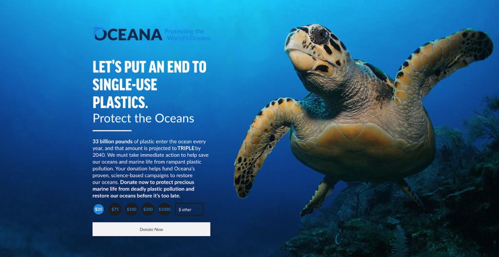
Sometimes companies don’t want to focus on their product but on the message they want to deliver instead. The images used usually try to play with the user’s emotions.
Oceana
3. Graphic hero banners
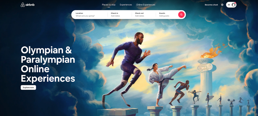
Graphic hero banners that use creative illustrations are a type of art. Such hero banners are a creative way to deliver your brand’s message that allows you to be completely original and unique while still being in line with your company’s design identity.
Patagonia

Graphic hero banners also makes it possible for you to quickly adapt to current events and hot trends, like this Airbnb hero banner:
4. Carousel hero banners
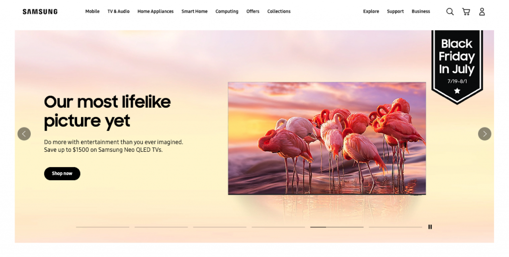
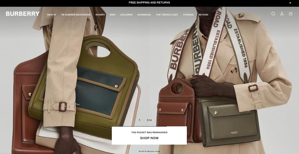
Quite popular are the carousel hero banners that create space for brands to deliver several different messages above the fold. There are usually sliders or banner controls that users can use to pause or easily navigate the different banners in the carousel.
Samsung
Burberry
5. GIF hero banners
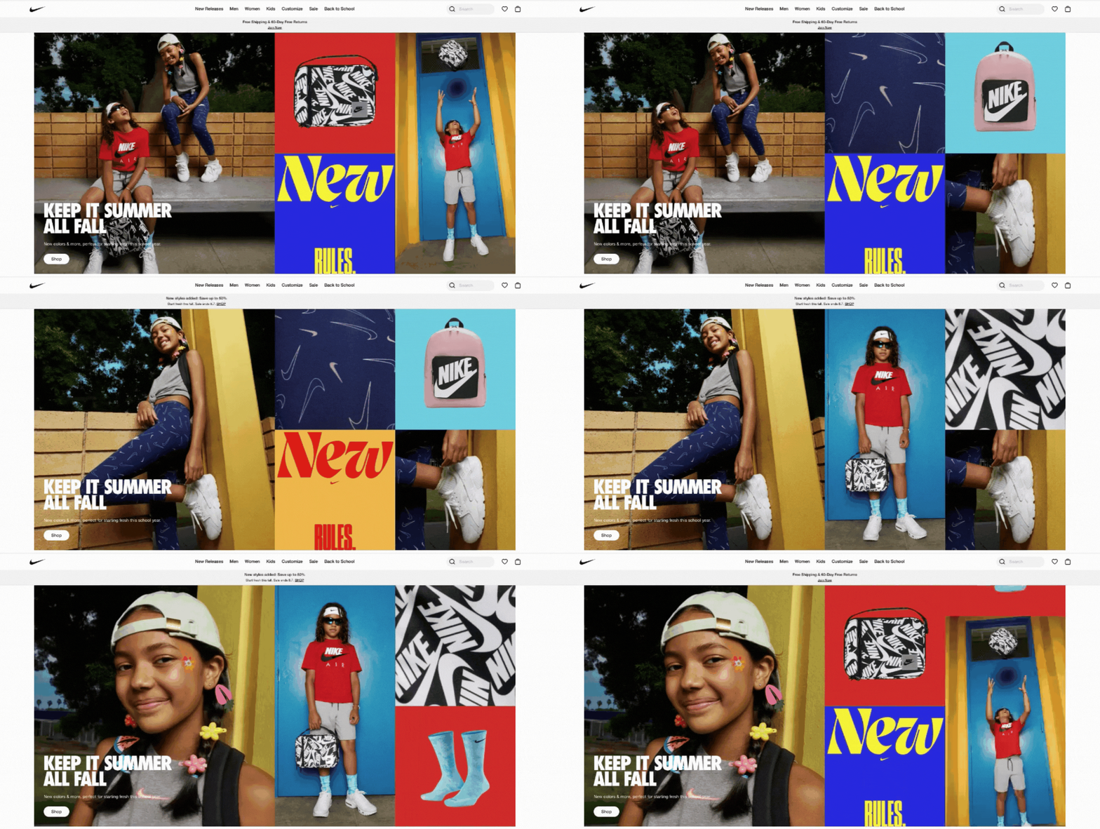
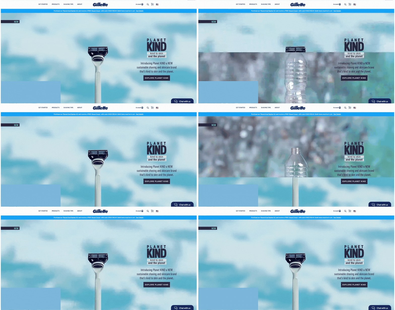
Another creative way to catch the user’s attention is to create the hero banner as GIF. It lets you combine several different images and display them the way you want. GIF banners are guaranteed to stop the user for a second to see what’s going to happen next.
Nike
Gillette
6. Video hero banners
Last but not least is the hero banner that uses a video instead of images to call the user’s attention. Think of it like an exciting movie trailer that teases the viewers—everyone wants to see more! These video banners are usually so captivating that they take the viewers away from reality for a moment and nudge them to indulge their imagination. Now, try picturing yourself lounging on that white sand beach while sipping your margarita. Feels good, right? That’s why it works!
Burj Al Arab
Stronger
How to create an effective hero banner
Here’s a list of things to keep in mind for creating an effective hero banner:
- Use only the highest quality images and videos. There can’t be anything worse than a low pixel photo on a high resolution screen.
- Make sure your loading time is quick and make no room for disruptions. Just a few seconds of frozen video will cost you your viewers.
- If you opt for a video or carousel banner, add a pause button and banner controls as some users will want to pause at some point or quickly go through all the banners at once.
- Make sure that your banner is in keeping with your brand identity overall. Get the message and visuals aligned with your brand and add a clear value proposition. This is the most important bit.
If you liked this post and would like to know more about other eCommerce strategies you can apply to your business, shoot us an email at [email protected] and we’ll be happy to tell you more. Our Growth Team can help you match your goals with the best strategies that are proven to work.


Share on: