If there’s a gap between traffic and conversion, it is almost always a homepage problem, and it is the most common reason a good-looking Magento store still underperforms.
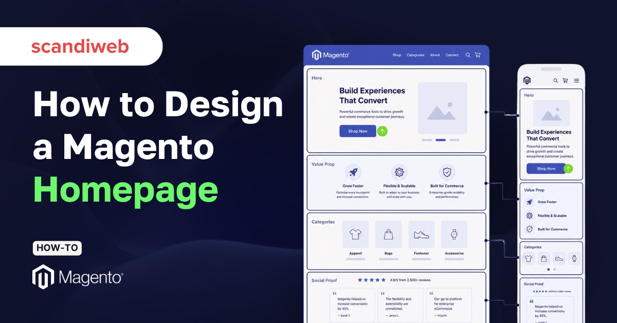
Magento (Adobe Commerce), gives you near-total control over the homepage through Page Builder, custom themes, and frameworks like Hyvä. That freedom is exactly why so many homepages drift into decoration instead of conversion. Let’s walk through Magento homepage design section by section, with the conversion principle behind each one.
🚀 Quick takeaway
A high-converting Magento homepage answers three questions above the fold: what you sell, why it is worth buying, and where to go next.
What makes a Magento homepage convert?
A Magento homepage converts when every section moves a visitor one step closer to a product, a category, or a reason to trust you. The page is like a junction that routes different visitors toward the path that fits them.
Most first-time visitors do not know your catalog, sizing, or your reputation. The homepage has to establish all three quickly, then get out of the way.
It also helps to anchor your design in proof rather than taste. If you want a reference set before you start wireframing, our roundup of the best Magento websites shows how leading brands handle the same sections covered below.
How to design a Magento homepage, section by section
Work top to bottom, and treat each section as a conversion zone with one job. The order below reflects how a visitor reads the page and where attention drops off.
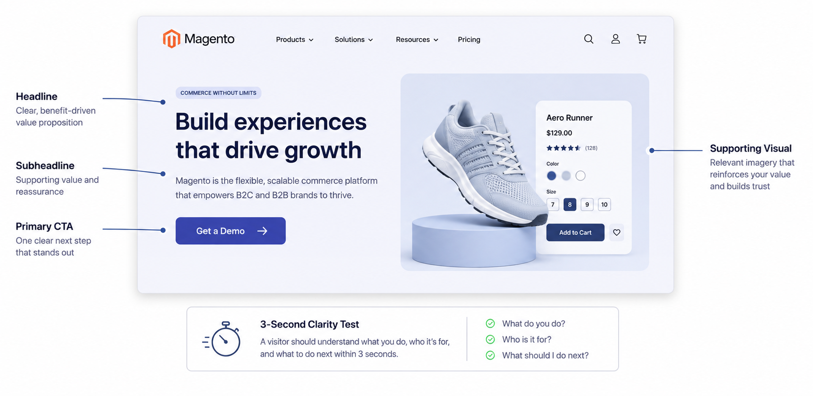
1. Start with the hero that passes the three-second test
The hero is the band of content a visitor sees before scrolling. Its only job is to answer, within roughly three seconds, what you sell and why it matters. A vague lifestyle image with no words fails that test, no matter how beautiful it looks.
A strong Magento hero carries four elements:
- A clear headline naming the category or promise
- Short subheadline that adds proof or specificity
- One primary call-to-action button (keep the button text concrete, such as “Shop the range” rather than “Discover”)
- A supporting visual that shows the product in context.
In Page Builder, you can build this with a banner row and a button block. With a Hyvä theme, the hero is usually a templated section your developer wires to a CMS block so marketing can swap it without a deploy.
2. State your value proposition right under the fold
Directly below the hero, give visitors a reason to choose you over the alternative one click away. This is usually a short strip of three or four benefits: free returns, fast delivery, a guarantee, or a differentiator only you can claim.
Keep each point to a few words paired with a simple icon. The goal is quick reassurance. It reduces the perceived risk of buying from a brand the visitor may not know yet.
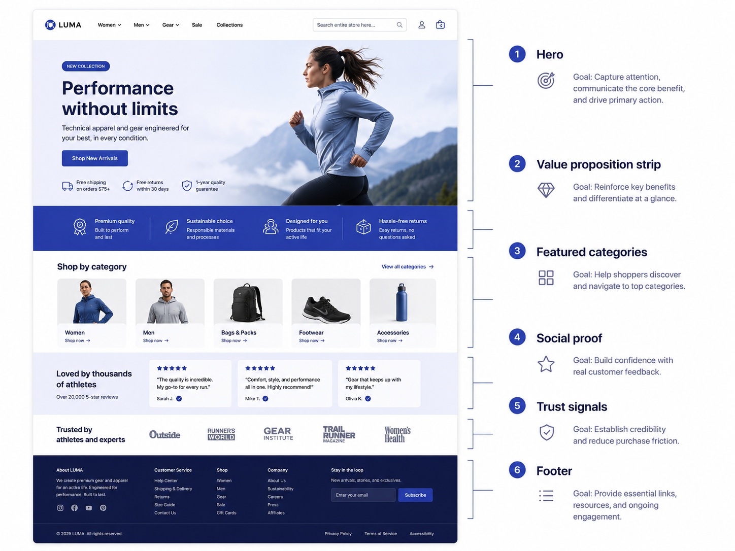
3. Route shoppers with featured categories
Featured categories beat featured products on most homepages, because a first-time visitor rarely wants the one item you chose to spotlight. They want a fast route into the part of the catalog that fits them.
Show three to six category tiles with clear labels and representative imagery. For stores with seasonal or campaign priorities, this is where you steer demand. Reserve a featured-products block for genuine bestsellers or new arrivals, and pull it dynamically so it stays fresh without manual edits.
4. Earn trust with social proof
Social proof tells a hesitant visitor that other people have already bought and were happy. On the homepage, that means review scores, customer counts, recognizable brand or press logos, and short testimonials placed where the eye naturally lands after the category section.
Baymard Institute usability research finds that surfacing the right reassurances on a page measurably reduces hesitation. Pages carrying one to three signal types outperform those that pile on badges. More is not better; focus beats clutter.
5. Reinforce confidence with trust signals near decisions
Trust signals are the practical reassurances that remove friction: secure payment badges, accepted payment methods, a clear returns promise, and visible contact options. Place them near the points where doubt creeps in, such as just above the footer and inside the header utility bar.
Baymard reports that 18% of cart abandonments trace directly to concerns about payment security. A homepage that signals legitimacy early prevents that doubt from forming in the first place.
6. Make navigation and search do the heavy lifting
For large Magento catalogs, navigation is a conversion tool. A well-structured mega-menu lets visitors jump straight to intent, and a prominent, fast search bar serves the high-intent shoppers who already know what they want.
Keep the top-level menu short and scannable, group categories the way customers think rather than the way your ERP does, and make search visible by default on mobile, don’t hide it behind an icon. These visitors convert at well above site average, so do not make them hunt.
7. Close with a focused footer and a single conversion offer
The footer is where motivated visitors look for shipping terms, support, and account links, so keep it organized and complete. Add one clear conversion offer above or within it, usually a newsletter signup with a concrete reason to subscribe, such as early access or a first-order incentive. One offer, clearly stated, outperforms three competing ones.
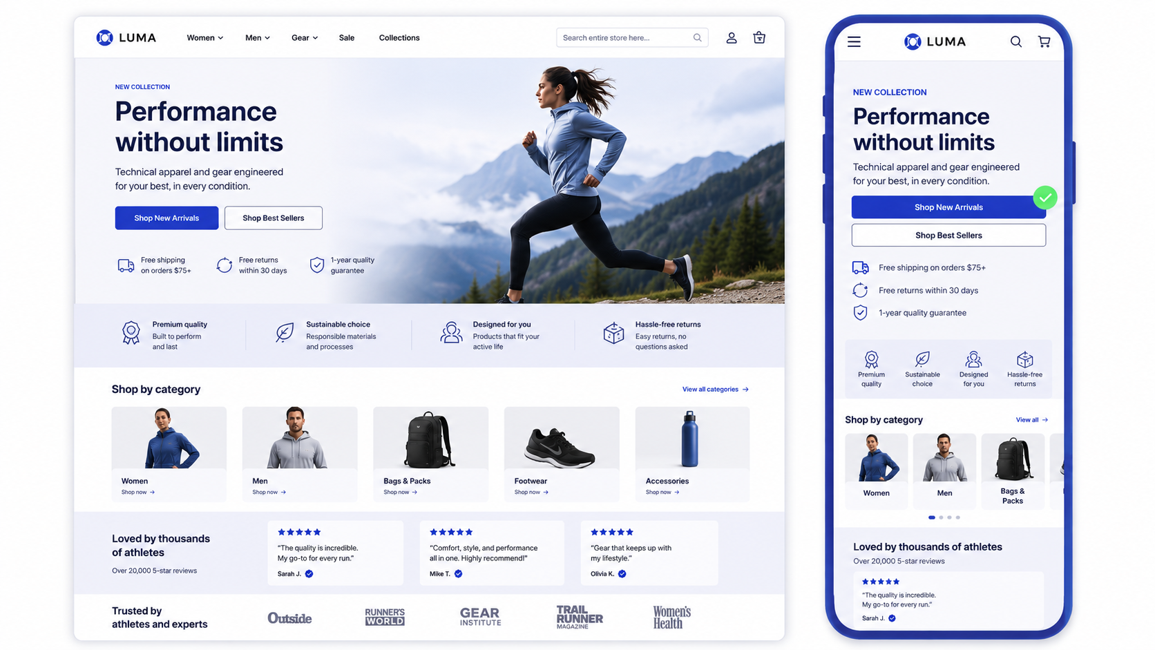
Design the homepage mobile-first
Most of your traffic is on a phone, so the single-column mobile layout is the real homepage, and the desktop version is the variant. Designing desktop first and squeezing it down is how stores end up with buried search bars and CTAs that fall below three scrolls.
Roughly 73% of eCommerce traffic now comes from mobile devices, and 53% of mobile users abandon a page that takes longer than three seconds to load, according to widely cited Google mobile research. Design the stack so the hero message, the primary CTA, and search are all reachable by thumb without hunting.
Why does homepage speed matter so much for conversion?
Speed matters because every fraction of a second between the click and a usable page is a fraction of your audience deciding to leave. A beautiful homepage that loads slowly converts worse than a plain one that loads fast.
The numbers are stark. A Deloitte and Google study, “Milliseconds Make Millions,” found that a 0.1-second improvement in mobile load time increased retail conversions by 8.4% and average order value by 9.2%. On the homepage specifically, heavy hero images, third-party scripts, and stacked sliders are the usual culprits.
This is one reason many merchants moving off heavy legacy themes choose Hyvä themes, which strip Magento’s frontend down for speed.
Magento homepage section priorities
| Section | Primary job | What to get right |
|---|---|---|
| Hero | Answer what and why in 3 seconds | Clear headline, one CTA, no carousel |
| Value proposition | Reduce perceived risk | 3-4 benefits, icons, few words each |
| Featured categories | Route shoppers into the catalog | 3-6 tiles, intent-based labels |
| Social proof | Show others bought and were happy | 1-3 signal types, real reviews |
| Trust signals | Remove payment and returns doubt | Secure badges, returns promise |
| Navigation and search | Serve high-intent visitors | Mega-menu, visible mobile search |
| Footer offer | Capture motivated visitors | One newsletter offer, clear reason |
A pre-launch checklist for your Magento homepage
Before you push a redesigned homepage live, run it against this short list to catch the issues that quietly cost conversions:
- A first-time visitor can state what you sell within three seconds
- There is exactly one primary call to action above the fold
- The mobile single-column layout keeps the CTA and search reachable by thumb
- The value proposition strip names concrete benefits
- Featured categories route to real demand, refreshed without manual edits
- One to three trust signal types appear
- Largest Contentful Paint stays under 2.5 seconds on a mid-range phone
- Every section maps to a job, with nothing left as pure decoration.
When to bring in a design partner
You can build and iterate the homepage in-house when you have a designer who understands conversion, a developer comfortable in Page Builder or Hyvä, and analytics to test changes against. Bring in a partner when the redesign touches the theme architecture, when speed problems are structural, or when the homepage is part of a wider replatform.
If you reach that point, our guide to choosing a design agency covers how to evaluate Magento-specialist teams without overpaying for a generic web shop.
Frequently asked questions
How do I edit my homepage in Magento?
In the Magento admin, go to Content, then Pages, open the page set as your home page, and edit it with Page Builder or the CMS editor. You assign which page acts as the homepage under Stores, Configuration, General, Web, Default Pages.
What should a Magento homepage include?
At minimum: a clear hero, a value proposition strip, featured categories, social proof, trust signals, strong navigation and search, and a footer with one focused conversion offer. Each section should map to a single job in the buying path.
Should I use Page Builder or Hyva for homepage design?
Page Builder gives marketers drag-and-drop control without code, which suits frequent campaign changes. Hyva is a lighter frontend framework that favors speed and is usually managed by developers. Many stores combine a Hyva theme with CMS blocks marketers can edit.
How long should a Magento homepage be?
Long enough to cover the core conversion zones and no longer. Most effective homepages run five to seven stacked sections, ending before the content turns into filler that visitors scroll past without reading.
Do homepage carousels or sliders help conversion?
Usually not. Rotating banners dilute the main message and most visitors never engage past the first slide. A single, focused hero almost always outperforms a carousel.
How many trust signals should the homepage show?
Baymard Institute research suggests one to three signal types convert best. Pages crowded with seven or more badges actually performed worse, so prioritize the proof that matters most to your buyers.
Want a homepage built to convert? Talk to our team and rethink your homepage around the buying path your shoppers actually follow.

Share on: