Byggmax is a supplier of building materials in the Nordic region, with more than 190 brick-and-mortar stores, 4 Magento stores, and 55k+ products in their catalog—and a long-time client of scandiweb. After internally preparing new navigation menu designs, they came to us to get the designs tested for usability before getting implemented in their eCommerce stores. They wanted the answer to this question and more: Should the menu work on hover or click?

Challenge
We needed to identify and tackle usability flaws in the navigation menu designs and have data to support our findings. A design could be pleasing to the eyes and perfectly comply with all the brand guidelines but fall well short of serving its purpose. The point of testing was to avoid having a beautifully designed navigation menu that fails to guide users with navigation, which is its primary purpose. To ensure that all aspects of the menu were tested, it was important that the right methodologies were used to identify specific issues.
Also read:
Top 3 Navigation Menu Usability Tests to Perform to Win Customers
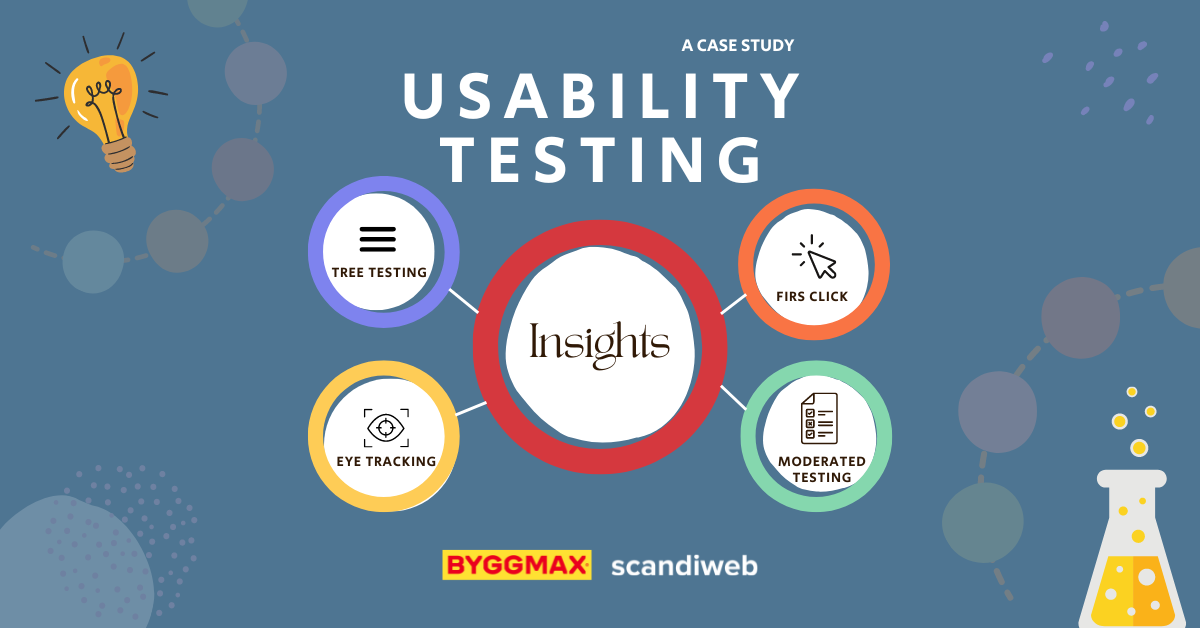
Our approach
We used the following methodologies to identify the usability issues in the navigation menu designs:
- Tree testing
- First click test
- Eye tracking
- Moderated usability testing
Tree testing
Tree testing was done to identify whether the new category tree was intuitive for customers. Test participants were asked to locate products in the menu, and data on whether they succeeded in doing so were recorded. Since the client’s website was available in English and Swedish, we conducted the test in both languages.
A step further in doing this test is to review data from Google Analytics and identify the most popular categories and/or product lists, then test those.
First Click Test
The goal of the first click test was to see how users would initiate navigation on the site. Knowing where on the site users click first when looking for certain information will guide us on where to make such information available on the site. The test will also reveal whether or not certain navigation elements are doing their job—whether users notice and use them or not at all.
Eye tracking
Eye tracking was done to evaluate the visual hierarchy in the design. Users were asked to locate different elements on the website. Were the various elements (visuals, text, colors, etc.) present on the page distracting the users from what we wanted them to notice, or did they guide them in finding what they were tasked to look for?
Moderated usability testing
One of the key areas the client wanted to find out was whether the menu should work on hover or on click. Moderated usability testing was conducted to address this uncertainty and more:
- Do users prefer searching for products by using the top categories in the header or the hamburger menu?
- Do users find it useful to have product categories on the hamburger menu?
- What improvements to the menu could possibly be made?
Users were given several tasks to perform on the website, and their actions were recorded; their feedback was also solicited.
Also read:
Case Study: BUFF® Navigation Menu Optimization
Case Study: Usability-Based Navigation Menu Optimization
Case Study: Improving the Usability Success Rate of a Landing Page from 2/10 to 10/10
In addition, we sat down with Byggmax at the Meet Magento Baltics 2022 conference. Oskar Röös, CIO at Byggmax, discusses the challenge of bringing offline and online together. Watch it here!
Results
Here are some of the insights we derived from the usability testing we conducted for Byggmax:
- Some products need to appear in a different category or in more than one category
- Specific navigation elements should be made bigger and made more noticeable by changing their color
- CTAs should be made to stand out more by improving the way they are presented, e.g., using vibrant colors and making the design eye-catching
- The login icon needs to be repositioned
- USPs should be placed above the header on desktop and mobile
And 100% of the participants preferred to use the menu on hover to search for product categories—so it’s settled.
Conducting usability tests will inform design decisions on your eCommerce site. It’s about understanding how users experience your site so you can improve that experience for them.
Does your site navigation work for or against your users? We can help you find the answer and guide you through improving the user experience on your eCommerce store. Drop us a line at [email protected] or leave a message here.

Share on: