Sometimes little things can make a drastic difference, especially when it comes to revenue in eCommerce stores. In this article, we’ll explore how heuristic evaluation can more than double your revenue. Get a glimpse of the process a professional team goes through, what criteria you should look at, and why heuristic analysis can be so crucial to conversion rate optimization.
As part of CRO research, our team always performs a heuristic website evaluation. During it, our team reviews the website, following a detailed research methodology to identify problems that users might face. It helps uncover usability issues and spot low-hanging fruits that distract users from moving toward a purchase in the shopping funnel.
Read our Checkout Optimization case study series:
- Checkout Optimization: Reducing Purchase Friction for The MET Store
- Checkout Optimization: Driving 33% Revenue Increase for BUFF®
The main objective of such evaluation is to ensure that all elements of the optimization funnel are in place, which includes:
- Functionality—all website elements work as expected, and the website does not have any functional issues or bugs
- Accessibility—users have all needed information and help accessible and can easily find help at any stage of the shopping funnel
- Usability—users, regardless of their level of technical knowledge, can easily use and navigate the website
- Intuitiveness—all website elements are intuitive; users do not have to think about how to perform desired actions; it matches their expectations and fits their needs
- Persuasiveness—the website is designed following CRO best practices, which include visual hierarchy, scarcity, social proof, and trust principles
We always start with functionality checks as they have proven to be the fastest to fix and bring significant ROI. Therefore, the following case study explores how our team discovered a functional issue, the fixing of which took only one day and resulted in the conversion rate increase and our client’s revenue going up by 148% in just four weeks.
Heuristic evaluation case study
1. Identifying issues with data
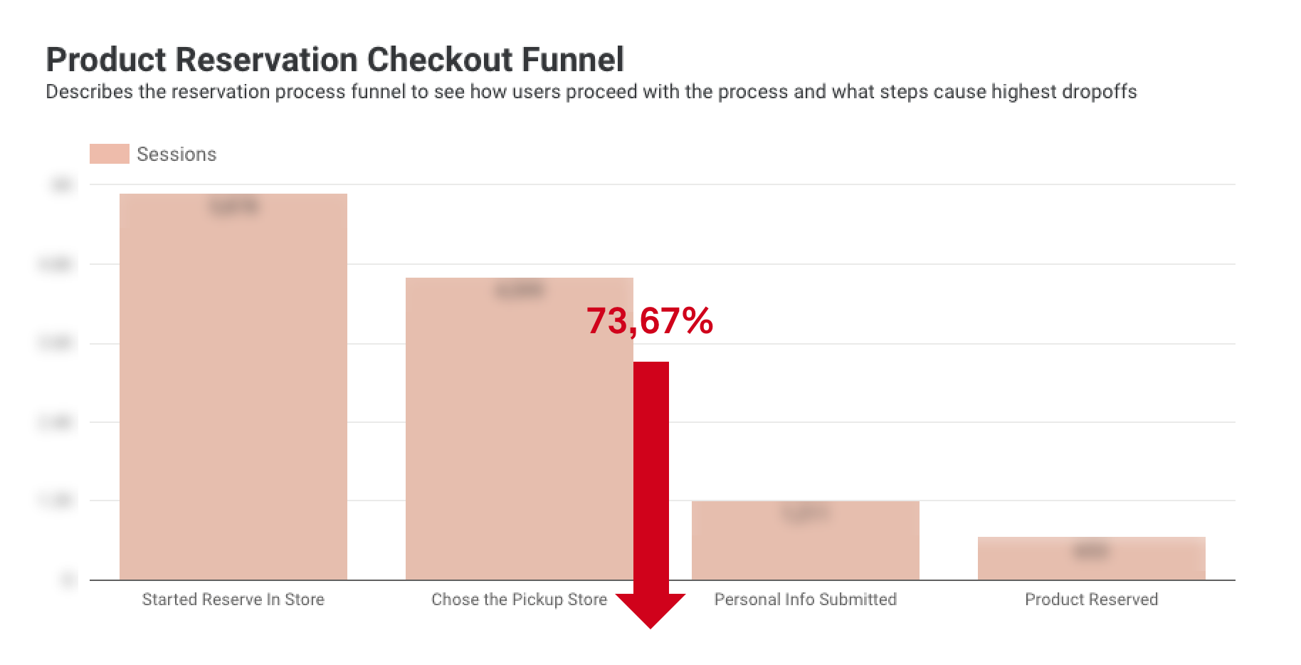
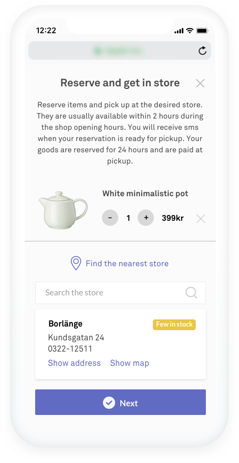
During the quantitative data analysis, we noticed a high drop-off rate for the “choose a store to submit personal info” step in the product reservation process on mobile devices. We started digging deeper into data and checking it in different segments until we found the highest drop-off rate on iPhone devices—73.67%. That caught our eye. Usually, iPhones tend to perform better than other devices, so we decided to test the functionality.

2. Functionality tests on real devices
To ensure we thoroughly tested the functionality and did not miss anything, three of our team members tested the reservation process on three iPhone models.
We quickly spotted the issue. The button to proceed to fill in personal info was not working in vertical/portrait view. Users had to turn their iPhones to a horizontal view to proceed to the next step. Here it was, the bug not allowing users to make a reservation.

3. Solving the problem
Right after discovering the issue, we created a ticket for developers to fix it. The problem was solved within one day. What was left was to monitor the reservation process funnel to see if the drop-off rate decreased.
4. Checking the data after the fix
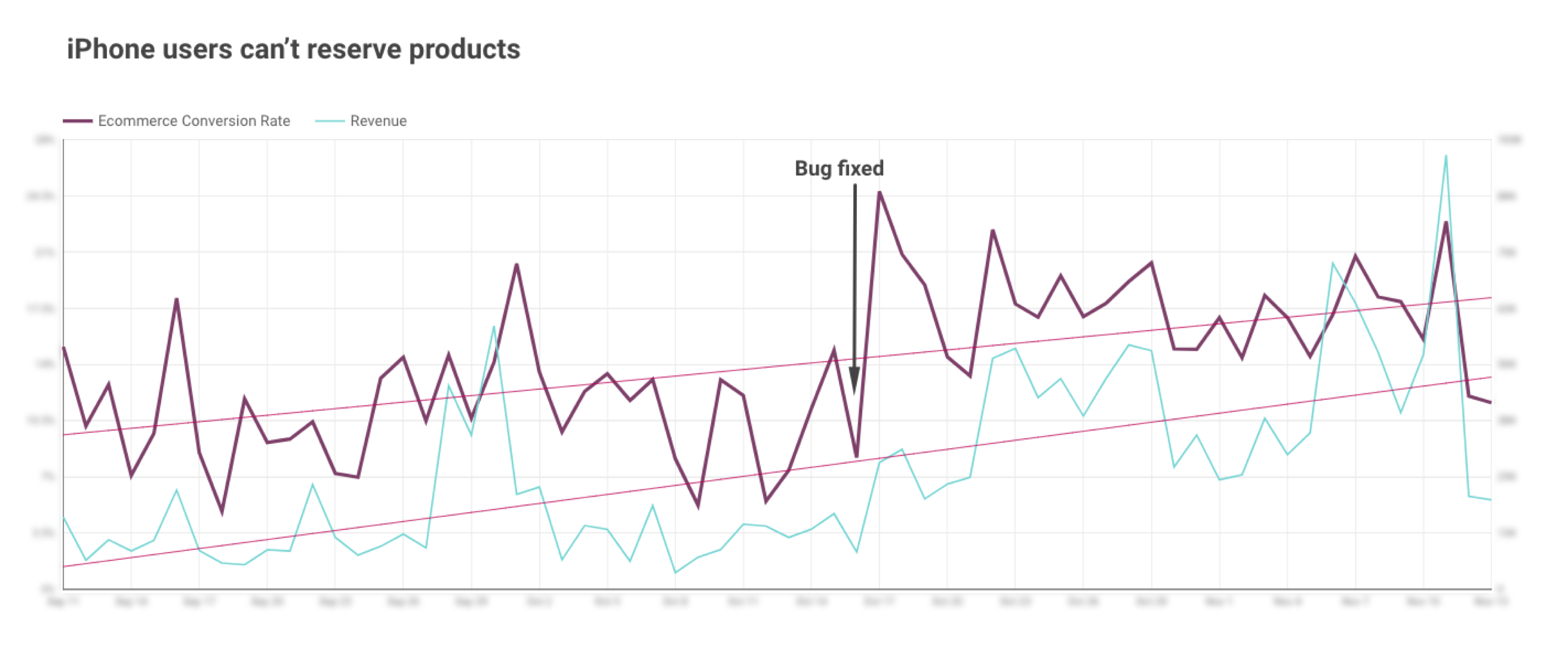
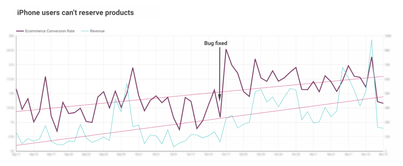
After four weeks, we proceeded to evaluate the data to see if the bug fix had any effect on the reservation funnel. It did indeed, and in only four weeks, we saw:
- +148,35% in revenue
- +48,20% in eCommerce conversion rate
- –13,21% in drop-off from the personal info step for reservations on iPhones
Here’s the timeline illustrating the eCommerce conversion rate and revenue before and after the bug on iPhones was fixed:

Is your site/store struggling? Get in touch with scandiweb’s Growth team, and let’s get started with an audit of your site. Any issues identified will be quickly fixed by our in-house developer team!


Share on: