A state-of-the-art eCommerce ecosystem that would take any company through business growth and expansion in the next five years—sounds good? Now, imagine that’s your company. Even better, right? In this article, we want to share with you how to achieve just that through a customer-centric eCommerce redesign.
eCommerce goals and solutions
scandiweb has a great team of many creative people who create beautiful and functional designs every day. But an eCommerce redesign is not just about changing up the appearance of an online store by introducing a new color scheme or repositioning visual elements. So, that’s where our CRO experts, who live and breathe eCommerce, take center stage.
For every project we take on, it’s crucial that we understand the goals our clients want to achieve so we can find the best solutions to match their needs. Say these are the goals for the project we are discussing here:
- Effectively showcase a wide range of products on the online store
- Provide customers a premium experience while shopping online
- Best-in-class UX and UI for desktop, mobile, app
- New services and integrations: loyalty program, AR, online quizzes
To achieve such goals, we need to understand how the customers behave, what they want or expect from the brand, and what their pain points are. Why? Because the ultimate goal of an eCommerce redesign is to redesign the customer experience in such a way that engagement is maximized, purchase friction is minimized, and customers are happy—all leading to significantly increased conversion rates and a higher ROI.
eCommerce benchmarking and data analysis are standard steps in any new eCommerce concept creation. But, additional testing methods can be implemented to make data collection more thorough.
An eCommerce redesign project is typically divided into three segments: research, site structure, and wireframes. And a team consisting of UX researcher/s, data analyst/s, and a project manager is assembled.
It is through research that we identify UX gaps for which we later offer solutions.
After the research phase is completed, we proceed to map out a new sitemap and structure for the main page templates, showing examples for each suggested block and functionality. Wireframes are worked on once the client approves the new eCommerce concept we present.

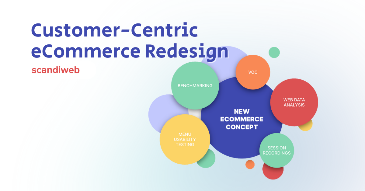
CRO research
We can develop a comprehensive and customer-centric eCommerce concept based on CRO research consisting of the following:
- eCommerce benchmarking – comparing the current site against eCommerce and UX best practices to identify areas that should be improved in the redesign
- Voice of customer – gathering feedback from customers by running customer surveys and on-site polls
- Web data analysis – supporting ideas for UX improvements with real numbers from GA, substantiating their importance
- Session recording replays – watching users interact with the site to identify patterns in behavior and common usability flaws they faced
- Menu tree testing – understanding whether the menu structure matched the mental models of users and if products were easy to find, which is very important considering the extensive product assortment offered in the store
By creating proto-personas, we are able identify the key shopping behaviors of customers. And then, we can imagine the journey each of them is likely to take, plus the features and services that would interest them the most.
Here are some of the proto-personas we create for eCommerce stores:
- Shopaholics – always hunting for sales and the best deals; their key user journey is through sales campaigns and product promotions
- Price sensitive customers – always looking for ways to spend less and shops for a particular need through product categories
- Loyal customers – returning customers and holders of the brand’s loyalty card who are willing to shop more to gain more points that they could spend on future purchases
Based on such proto-personas, we could anticipate which offerings and services would add the most value to the customers’ shopping journey.
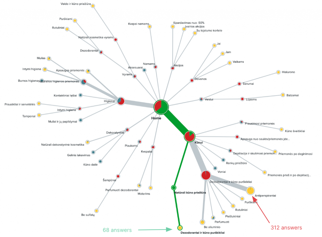
Menu tree testing
First click testing and tree testing are conducted to assess the navigation menu usability of an eCommerce store, i.e., how convenient it is for users to find specific products or sections within the menu.
First click test
This navigation menu usability test aims to identify where on the page users click first to find specific information.
Tree test
This usability test aims to bring to light whether users could find specific products by clicking through the category tree.
Customer-centric eCommerce redesign
The CRO research we conduct provide us with valuable insights that guide the new eCommerce concept we develop for clients.
For example, for one client, we found out that 39.7% of customers almost did not complete a purchase because of an out-of-stock item. And 63.7% of respondents said that special offers for loyal customers were extremely important for them when shopping online. Such insights are incredibly important when prioritizing new offerings, services, and fixes to be implemented in an eCommerce redesign.
Continue reading and learn from the many interesting information that could come out of a CRO research. The following are examples of actual results we gathered from CRO research conducted for various clients and the actionable insights we derived from them.
Also read:
eCommerce Redesign Workflow: Funnel Optimization
Your Guide to eCommerce Customer Experience (CX) Audit
Checkout Optimization: Reducing Friction for The MET Store
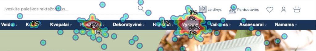
Header & navigation menu
VOC and test results
- 26% of users thought that the Search bar was the main element on the website that needed to be improved in order to make the website more user-friendly
- Session recordings revealed that there could be more than 22 unsuccessful searches per session
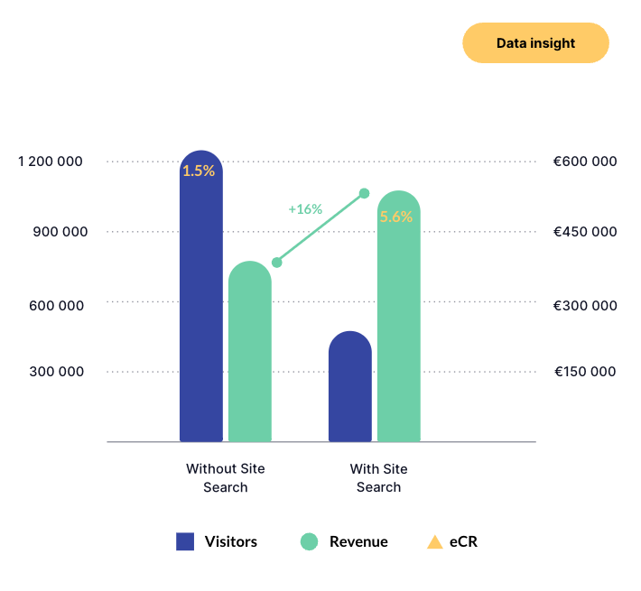
- Visits with site search comprised only 26% of all site visits, and yet they yielded 58% of overall revenue; top searches are mostly brand driven
Actionable insights
If relevant products do not show up when searching by product type, users will see no results, unwanted results, or just a very small fraction of products under a product category. This makes it difficult for users to find desired products altogether—resulting in no items getting added to the cart, or lost revenue. Site search performance should be improved.
Catalog
VOC and test results
- Only 0.8% of users have visited the Catalog page in the past 3 months, suggesting that it is hard to find for the majority of website visitors
- 58.4% of users exited the Catalog page after viewing it, implying that the purpose and value of the Catalog page could be communicated better
- Users who visited the Catalog page ended up converting 2x more
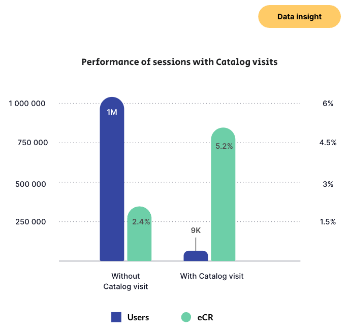
Actionable insights
Such a small percentage of total users visiting the Catalog page suggests that the Catalog page button styling and/or placement is not effective and could be improved—especially on the homepage, where 40% of the Catalog clicks occurred. The improvement would be particularly useful for the desktop users who lag behind the mobile segment in terms of Catalog page visits twice over. The catalog page should be better promoted and made more conspicuous on the page.
Homepage
VOC and test results
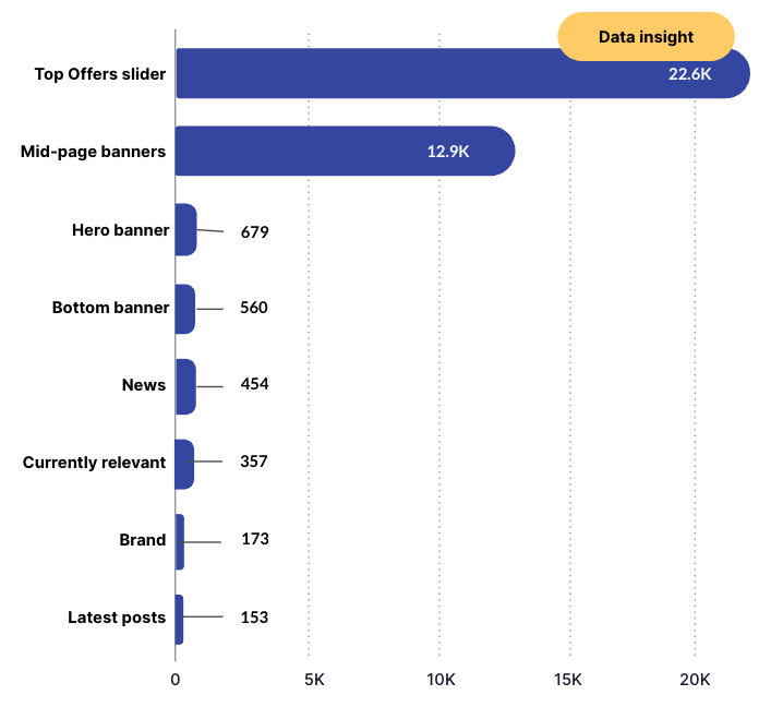
- Homepage visitors mostly interacted with the Top Offers slider and mid-page banners
- Click tracking on the homepage revealed that the hero banner gets almost completely overlooked
- The Top Offers section received 33.3x more unique clicks than the hero banner, which is located above it
Actionable insights
The hero banner changes dynamically and offers different deals, which might be too complex for visitors to process upon their visit. This could lead to a cognitive overload, causing them to disregard the hero banner altogether and move to something less stressful and more defined instead. In this case, users focus their attention on the Top Offers slider. The hero banner should be easier on the eyes and made less complex while still featuring various deals.
Product list page (PLP)
VOC and test results
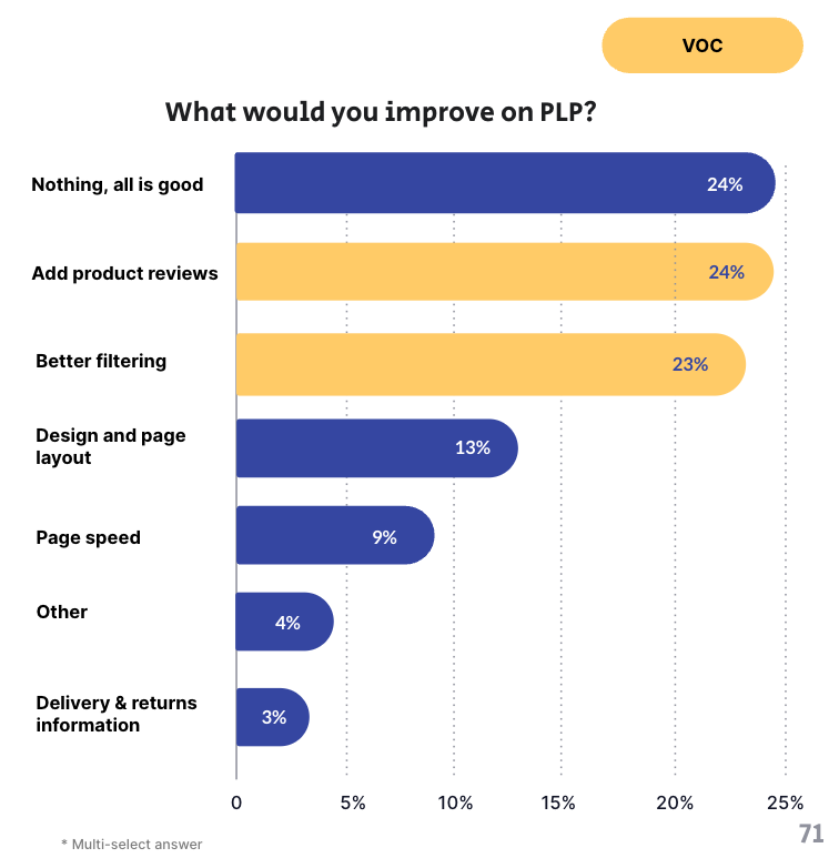
- Most PLP visitors would like to see product reviews and have better filtering options
- 30% of users agreed that product filtering was the second most important thing behind product information to be improved on in order to make the website more user-friendly
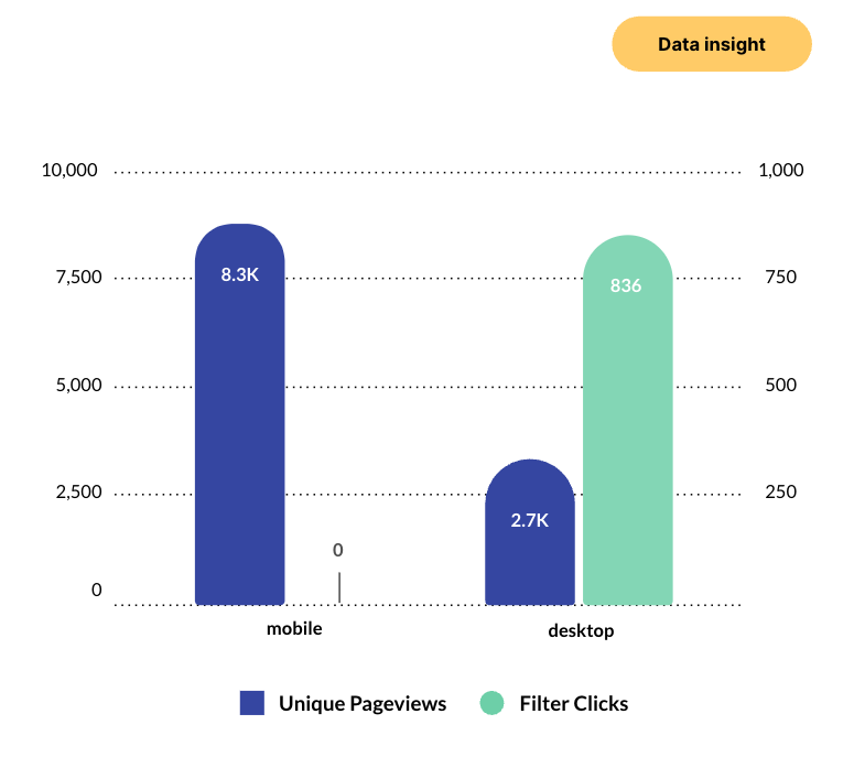
- The filter menu was predominantly clicked on desktop devices, with 25.3% of clicks made on the Top 5 PLPs; there were 0 clicks on these pages on mobile
Actionable insights
The PLP is where an eCommerce store’s product catalog is presented, and the usability of this page is an important factor determining whether users can find the products matching their needs.
62.5% of users visit the client’s store from their mobile devices. Improving the filter menu on PLPs, especially for mobile users, would lead to better user experience and could increase the chances of users adding items to their cart if they find what they are looking for.
Checkout
VOC and test results
- 33% of users abandoned the checkout confirmation step
- Users were leaving the 2nd checkout step to go to the homepage, privacy policy page, 1st checkout step, and shopping cart page
- Mobile users were 2.1x more prone to abandon the checkout than desktop users
- The number of users who reached the 2nd checkout step was 3.6% higher on mobile than the 5.6% figure on desktop
Actionable insights
Available data suggests that certain elements on the checkout page may be distracting to users, slowing them down or encouraging them to exit the checkout process.
Users on the checkout page have already indicated interest in finalizing the order by initiating the checkout flow, so it is crucial to identify the elements on the checkout page that contribute to checkout abandonment. In this case, the main issue is that the checkout is not enclosed, so the elements that distract users from completing the checkout are exactly the header and main navigation menu.
Additionally, as more users access the checkout page from a mobile device, improving and optimizing the mobile checkout page would also be a good move to promote checkout completion.
New services and integrations
When creating a new eCommerce concept, we always have to consider the new services and/or integrations the client wants to include.
For the introduction of a loyalty program, for example, we have to consider how to do the following:
- promote it on the store
- allow customers to collect points
- include it in the user journey
- highlight the possibility of paying with the loyalty card, if applicable
- showcase the special “loyalty prices,” if applicable
For other new features, like AR and online quizzes, we also have to find a way to promote and include them in the user journey.
All new services and integrations are included in the new structure, page designs, and user journey. For example, we can motivate customers to explore the catalog by providing them with inspiring AR tools and quizzes right on the home page. And then we can design the product pods to include a portion where the “loyalty price” is displayed.
Next steps
After the research is completed and the new site structure is designed, the next step is to work on the wireframes. The CRO & UX team typically creates high fidelity wireframes for the following templates:
- Header & footer
- Navigation menu
- Homepage
- Product list page (PLP)
- Product details page (PDP)
- Shopping cart
- Checkout page
And once the wireframes are confirmed, the team proceeds to specify the technical requirements for the intended functionalities and the design behavior of the redesigned site.
Want a customer-centric eCommerce redesign of your own?
Not all eCommerce stores are the same, and neither do customers behave alike. The data and insights we’ve shared here are specific to the clients for which the CRO research was conducted, so they don’t necessarily apply to your business. But we know you can learn from what we’ve discovered here so we’ve happily shared the information with you.
If you want to know your customers better, find ways to improve their experience, and redesign your eCommerce store so that you can ace all your eCommerce KPIs, scandiweb is your ideal growth partner. We are a full-service eCommerce agency with expert UX & CRO specialists, developers, designers, and business strategists that will guide you all the way from planning to execution.
Explore our popular eCommerce services
Learn more about our eCommerce design services or send us an email at [email protected] to get the conversation started. Here’s an opportunity to unlock your next business potential. Don’t make it wait!

Share on: