Back to basics
Even though it might seem straightforward, it’s important to define what a homepage is.
Homepage is the ‘front door’ for the many users who begin their browsing experience there. It also can act as a navigational anchor and a ‘safe’ fallback.
When we think about the homepage, we can imagine the reception desk at a large hotel. It’s one of the first things we see in the building, and it’s the place we turn to in case we get lost.
Main tasks of a homepage
There are 2 main tasks a homepage has to accomplish:
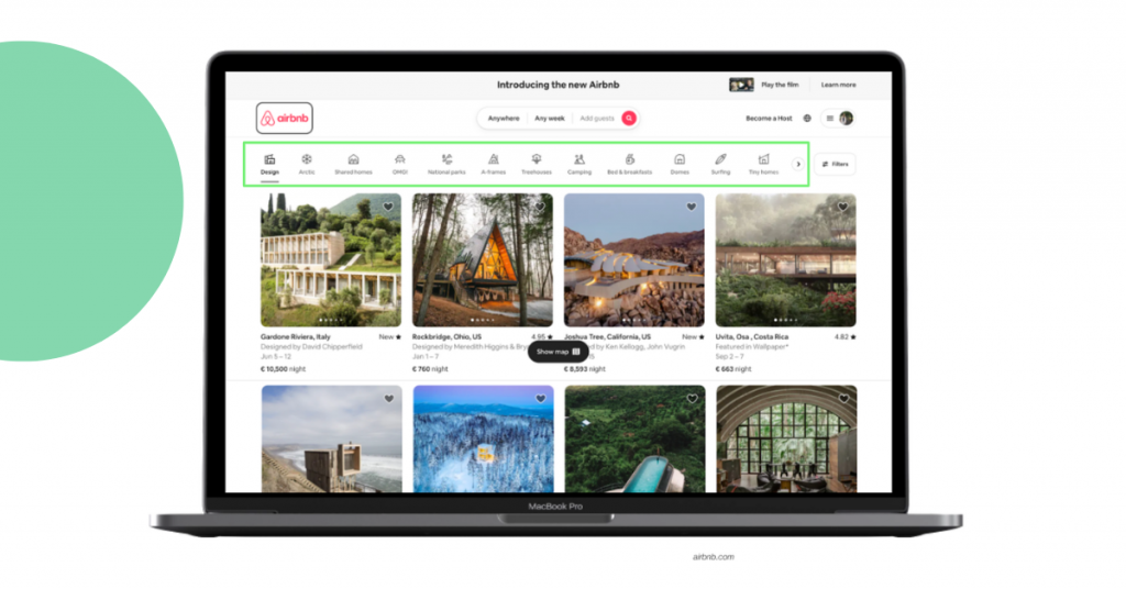
1. Showing how to find products (for both new and repeated visitors) through
- Category navigation
- Search
- Curated paths (product recommendations)
2. Shaping the user’s perception and answering questions like
- What type of site is this?
- What can I do here?
- What should I expect to find?
The homepage should have a balance between the following aspects:
Let’s dive into the best homepage design practices to follow!
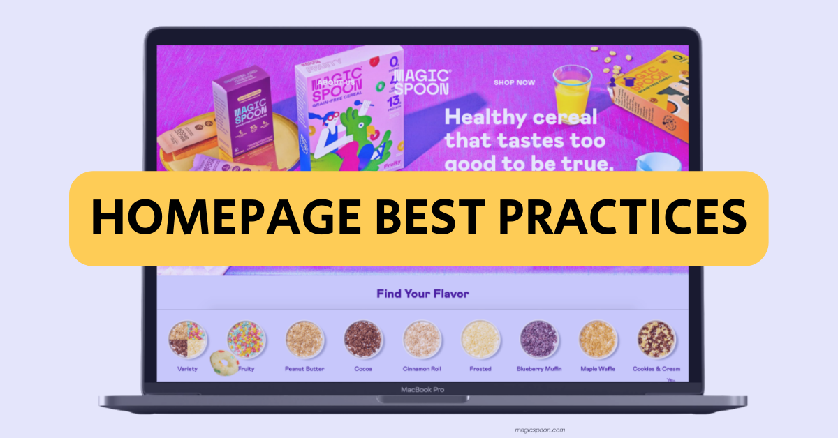
Homepage best practices
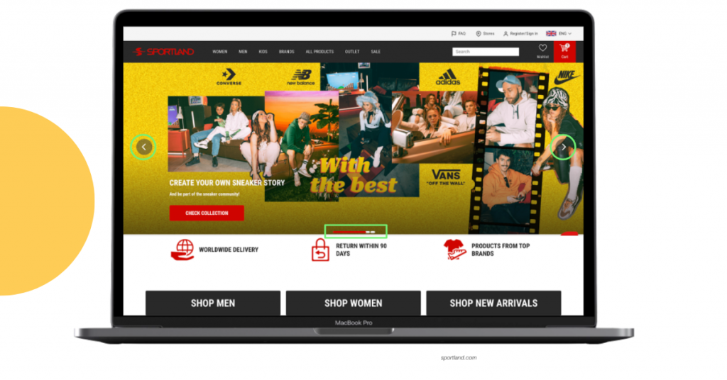
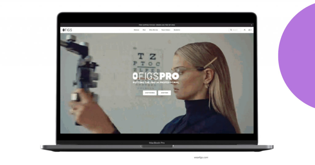
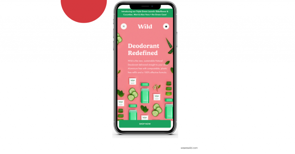
1. The hero banner
The hero banner is an effective way how to deliver a message to website visitors, as well as form first impressions.
Best practices for hero banners
- Don’t use more than 3 sliders
- Make sliders manually controllable
- Includes a clear value proposition in one of the sliders
Hero banners also give the chance to differ from the competition and show creativity in various formats:
- Photos
- Videos
- Graphics
- Gifs
- A mix of photo and video
Here are some tips for an effective homepage banner!
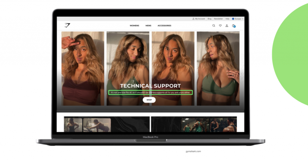
2. Answers to visitor questions
Is this website for me? When users land on the homepage for the very first time, answering all of their potential questions is crucial.
They need to understand what kind of brand is in front of them, what products you are selling and if the products are meant for them, and what is the price category.
Best practices to answer visitor questions
- Present the main product categories
- Display a clear price range for products
- Use high-quality images
- Show your products in action
- Represent the target demographic in the visuals
3. User guidance
Once users, especially new visitors, land on the homepage, they should have a clear understanding of the best way to proceed with the user journey.
Best practices for user guidance
- Present a clear CTA—what should users do?
- Provide guided product browsing
4. The first fold
When analyzing heatmaps, recorded sessions, scroll patterns, etc., we see that users don’t like to scroll. Most users view the first fold of the homepage and then begin their user journey to other pages of the website.
Best practices for the first fold
- Make your product and target customer clear in the first fold, without them having to click anywhere
- Present a clear next action
Note—a 5-second usability test is an excellent method to check if you’re getting the message across!
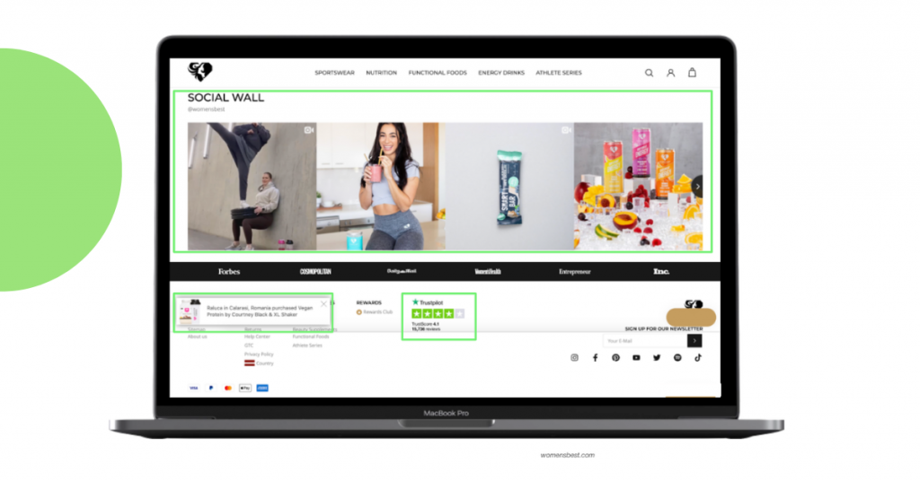
5. Extra reassurance
The homepage should also predict and answer questions that potential customers might worry about.
Best practices to provide extra reassurance
- Display USPs to differ from the competition and show users why your brand is worth considering
- Use social proof techniques, e.g., reviews, to encourage users and give peace of mind that others are also buying this product
- Highlight delivery and returns information to avoid losing customers to unnecessary investigation on other pages
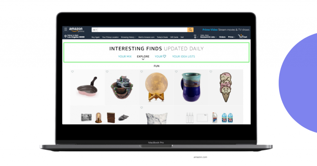
6. Personalization
For both new and returning visitors, it’s important to show potentially attractive products early in the user journey. They also need to feel valued by the brand as customers.
Best practices for personalization
- Display product recommendations, e.g., Recommended for you
- Display Recently viewed products for returning visitors
- Re-engage existing customers
- If detectable, display shipping prices and closest stores according to user location
7. Mobile-first
Nowadays, the majority of users browse websites on mobile, therefore, most of the traffic comes from these devices.
Best practices for being mobile-first
- Always check designs and layouts so that nothing is broken on mobile
- Check for usability issues—what works on desktop doesn’t always work on mobile
- Implement horizontal scrolling or swiping instead of endless scrolling down the page
- Always have sticky CTA
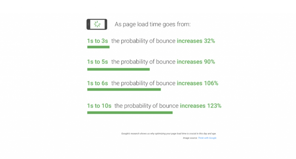
8. Speed
Users are used to getting everything at incredible speed. Any issues with page load time increase the chances of a high bounce rate.
Best practices for homepage speed
- Check homepage speed and loading times
- The more complicated the hero banner, the longer the load time
Conclusions
There is no single recipe for a perfect homepage but these practices help to get close. Keep in mind that every homepage structure and content will strongly depend on:
- The industry
- The ideal user journey
- The size of the company
- Company’s priorities and resources
- User persona
Need help with your homepage design? Scandiweb’s CRO experts can help you determine your user persona and their ideal user journey to craft the best homepage for them. Contact us at [email protected] or browse our services page!


Share on: